
19 TV Shows Where Set Decorators Added Personal Touches

Set decorators and production designers often go unnoticed despite their massive contribution to television storytelling. These artists fill the background with intricate details that add depth and realism to fictional worlds. Many decorators use the opportunity to insert hidden gems or character-specific items that reward observant fans. These distinct visual choices help define the personality of the show and its characters. The following series feature some of the most memorable examples of set decoration enhancing the narrative.
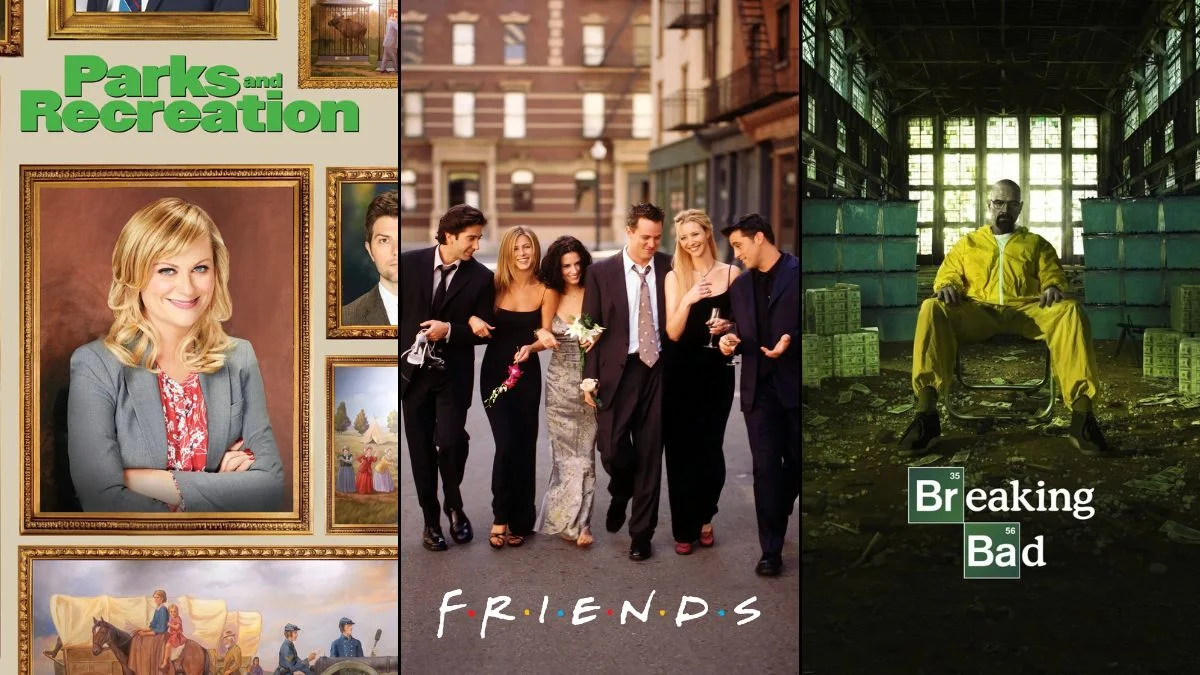
‘Friends’ (1994–2004)
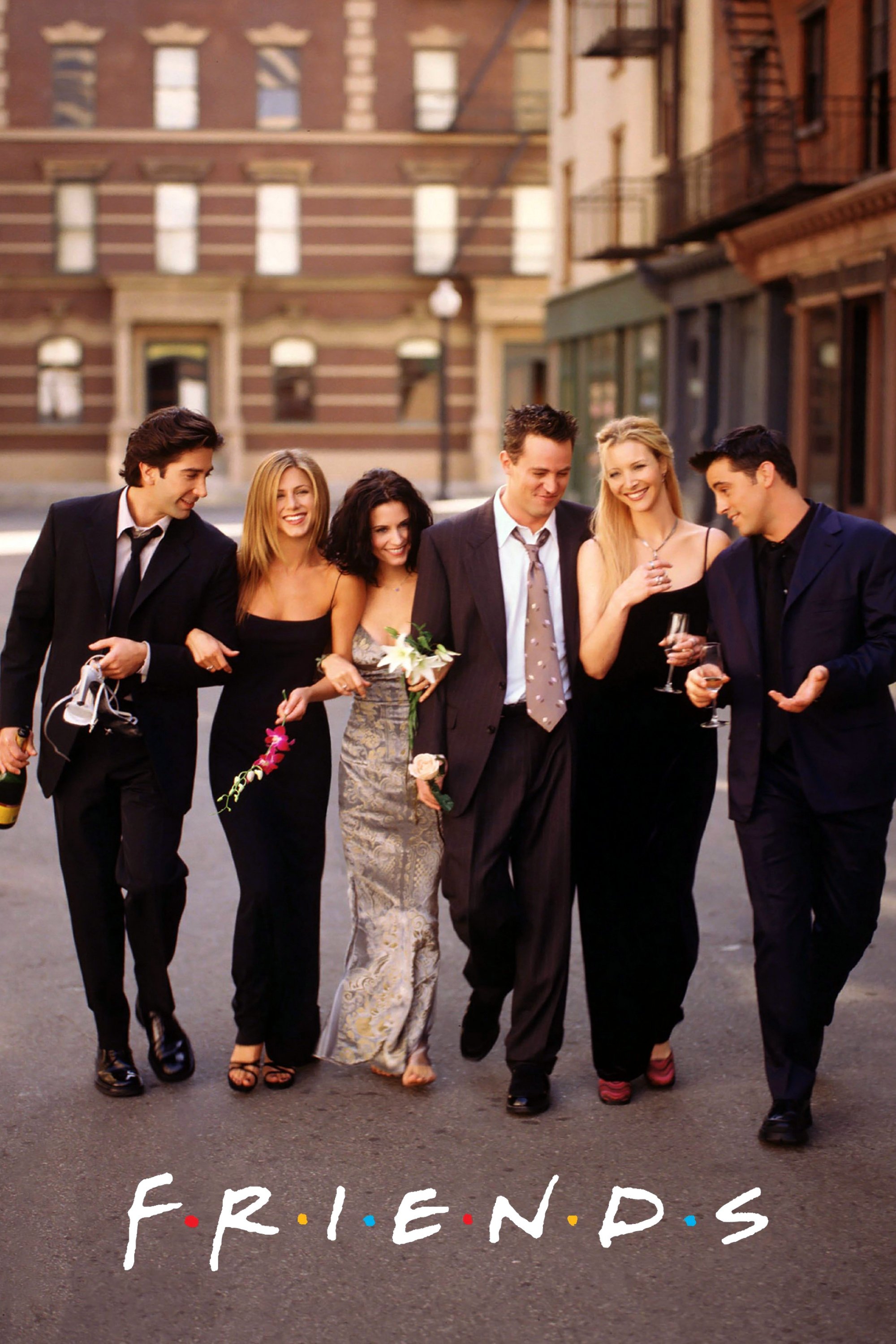
The apartment shared by Monica and Rachel became iconic largely due to the eclectic mix of furniture and decor. Set decorator Greg Grande utilized a Magna Doodle on the back of the front door to leave changing messages or drawings. This small prop became a canvas for inside jokes and plot references throughout the series run. The purple walls were another bold choice that immediately distinguished the show when viewers flipped through channels. Fans frequently paused episodes to decipher the latest sketch added by the crew.
‘The Office’ (2005–2013)
The documentary style of this workplace comedy required the set design to feel authentically mundane yet full of character. Michael Scott decorated his office with items that reflected his desperate need for approval and his questionable taste. Viewers can spot a certificate of authenticity for his watch that noticeably misspells the brand name as Seyko. He also displays a framed certificate that features an incredibly jagged cut job on the side. These subtle touches perfectly encapsulate the incompetence and lack of self-awareness of the branch manager.
‘Breaking Bad’ (2008–2013)
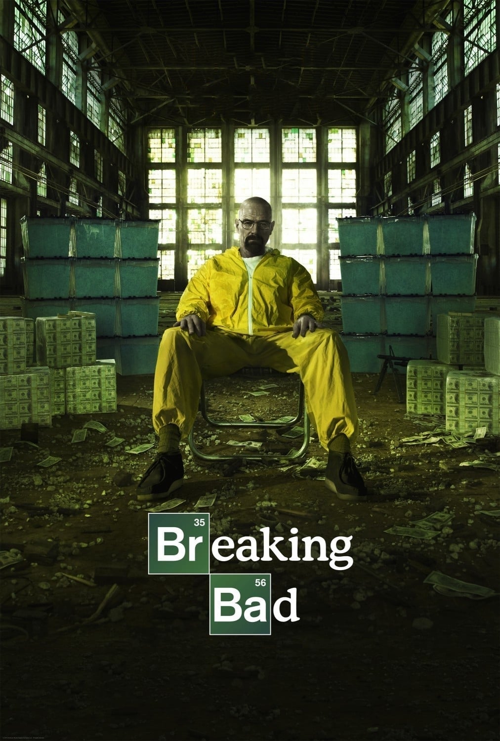
Vince Gilligan and his production team used color theory extensively to represent character arcs and moral decay. The set decorators meticulously matched the wardrobe and props to specific color palettes for each character. Walter White is frequently associated with the color green as he descends further into the criminal underworld. The infamous pink teddy bear that falls into the pool serves as a jarring burst of color against the bleak landscape. Every item in the background was placed with the intent to foreshadow events or symbolize internal states.
‘Psych’ (2006–2014)

The production team for this detective comedy turned a spontaneous improvisation into a long-running visual gag. A pineapple appears in nearly every single episode of the series hidden somewhere in the background or used as a prop. This tradition began when actor James Roday Rodriguez grabbed a pineapple during a scene and the crew decided to keep the joke alive. Spotting the tropical fruit became a beloved game for the dedicated fanbase of the show. The set decorators found increasingly creative ways to incorporate the item into the scenery.
‘Community’ (2009–2015)

The creators of this show filled the Greendale Community College sets with elaborate background jokes that sometimes took years to pay off. One particularly famous gag involved the character Beetlejuice appearing in the background after his name was mentioned for the third time over the course of three seasons. The decorators also filled the study room with chalkboards that often displayed relevant notes or meta-humor. Visual gags in this series were often layered deep within the frame to reward repeat viewings. The attention to detail helped establish the cult status of the series among comedy fans.
‘Parks and Recreation’ (2009–2015)
The government building in Pawnee was designed to reflect the quirky and often problematic history of the fictional town. Set decorators commissioned a series of offensive murals that lined the hallways of City Hall. These paintings depicted horrific historical events in a cheerful and artistic style that contrasted with the subject matter. The sheer number of these murals added a rich layer of satire to the bureaucratic setting. They served as a constant visual reminder of the absurdity surrounding the characters.
‘How I Met Your Mother’ (2005–2014)
The production designers for this sitcom often hid clues about future plot points directly in the set dressing. One episode features a countdown from fifty down to one displayed on various background objects leading up to a tragic event. The numbers appear on items like ketchup bottles and pamphlets as the scenes progress. This subtle visual countdown created a subconscious tension that culminated in the death of a major character’s father. It stands as a prime example of how set decoration can actively participate in storytelling.
‘The Big Bang Theory’ (2007–2019)
The apartment shared by Leonard and Sheldon was filled with scientific paraphernalia and pop culture collectibles. The set decorators worked with a physics consultant to ensure the equations on the whiteboards were always accurate and relevant to current scientific discussions. These formulas changed frequently to reflect the passage of time and the specific projects the characters were working on. The background shelves were also stocked with real vintage comic books and action figures that would be prized by actual collectors. This dedication to authenticity helped ground the exaggerated characters in a believable reality.
‘Arrested Development’ (2003–2019)
The model home where the Bluth family resided was filled with visual foreshadowing and callbacks to earlier jokes. Viewers can spot handprints on the walls that reference Buster losing his hand to a loose seal later in the series. The shoddy construction of the house itself served as a recurring visual punchline about the family business. Decorators ensured that the background details constantly reinforced the incompetence and dishonesty of the main characters. The show relied heavily on these visual cues to construct its complex and layered humor.
‘Stranger Things’ (2016–2025)
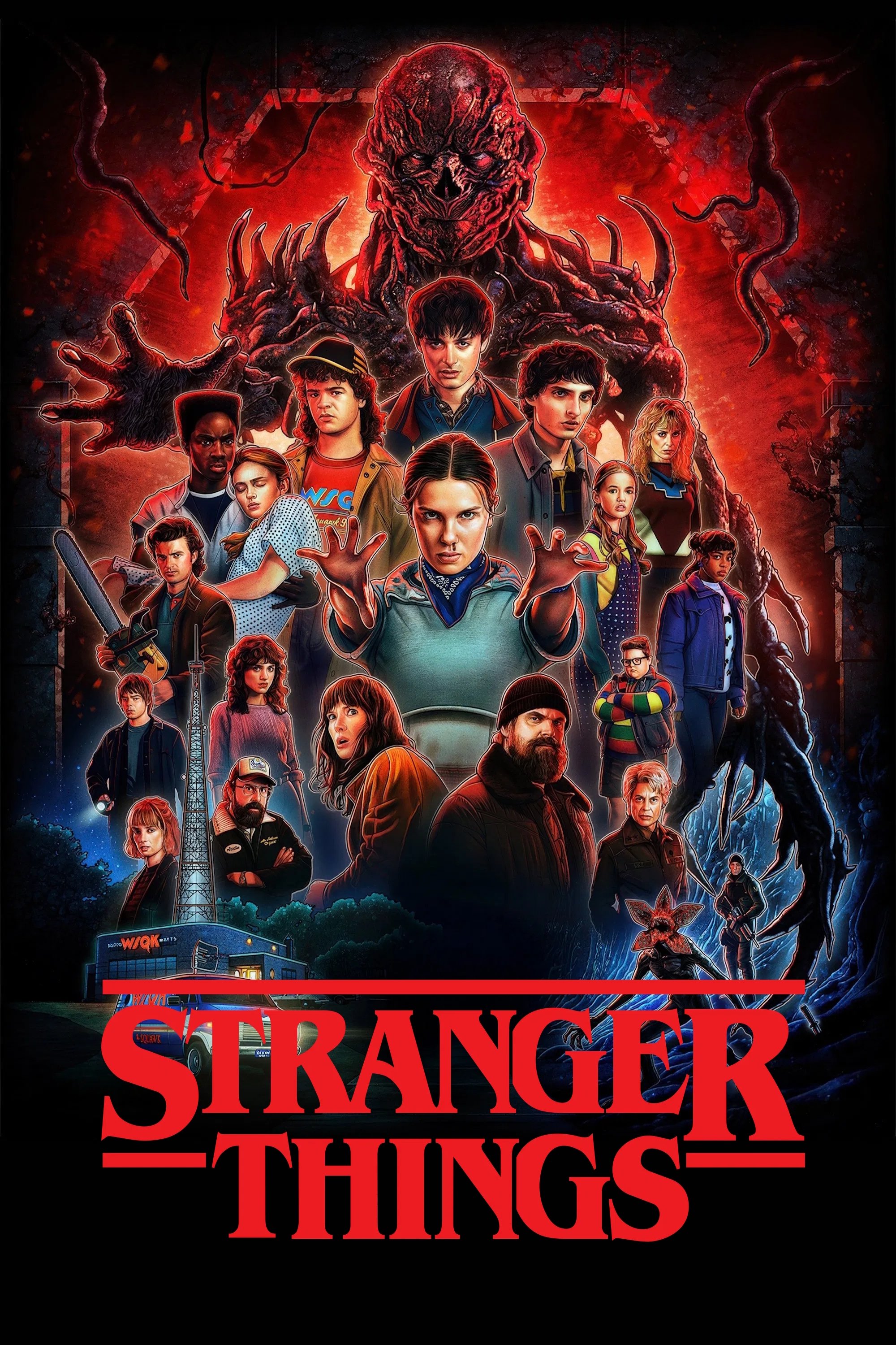
The Duffer Brothers tasked their team with recreating the 1980s with absolute fidelity to evoke nostalgia. Set decorators sourced vintage toys and furniture to dress the bedrooms of the young protagonists. The elaborate Christmas light communication wall in the first season became an instant piece of pop culture iconography. Every poster and household item was vetted to ensure it was available during the specific year the season took place. This immersive environment was essential for selling the supernatural elements of the story.
‘Mad Men’ (2007–2015)
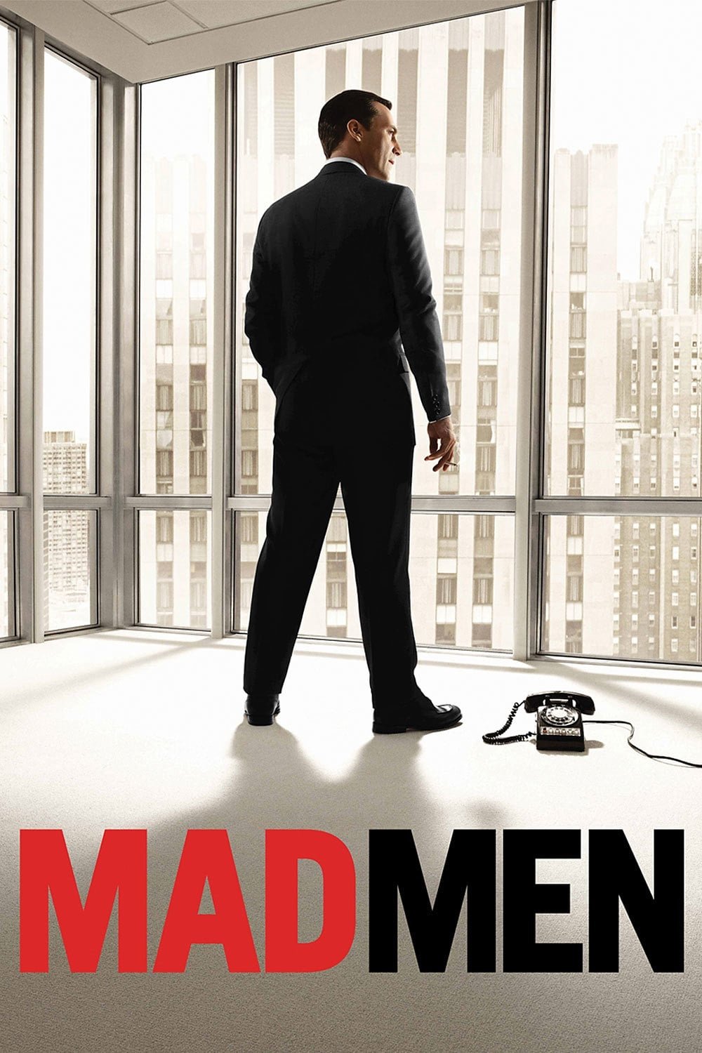
The production design of this period drama was celebrated for its obsessive historical accuracy. Set decorators ensured that even the contents of kitchen drawers and the undersides of furniture were period-appropriate. They utilized vintage packaging for food and household products that would have been found in the 1960s. The office decor evolved each season to reflect the changing aesthetics and social norms of the decade. This visual precision allowed the audience to feel fully transported to the era of advertising executives on Madison Avenue.
‘The Good Place’ (2016–2020)
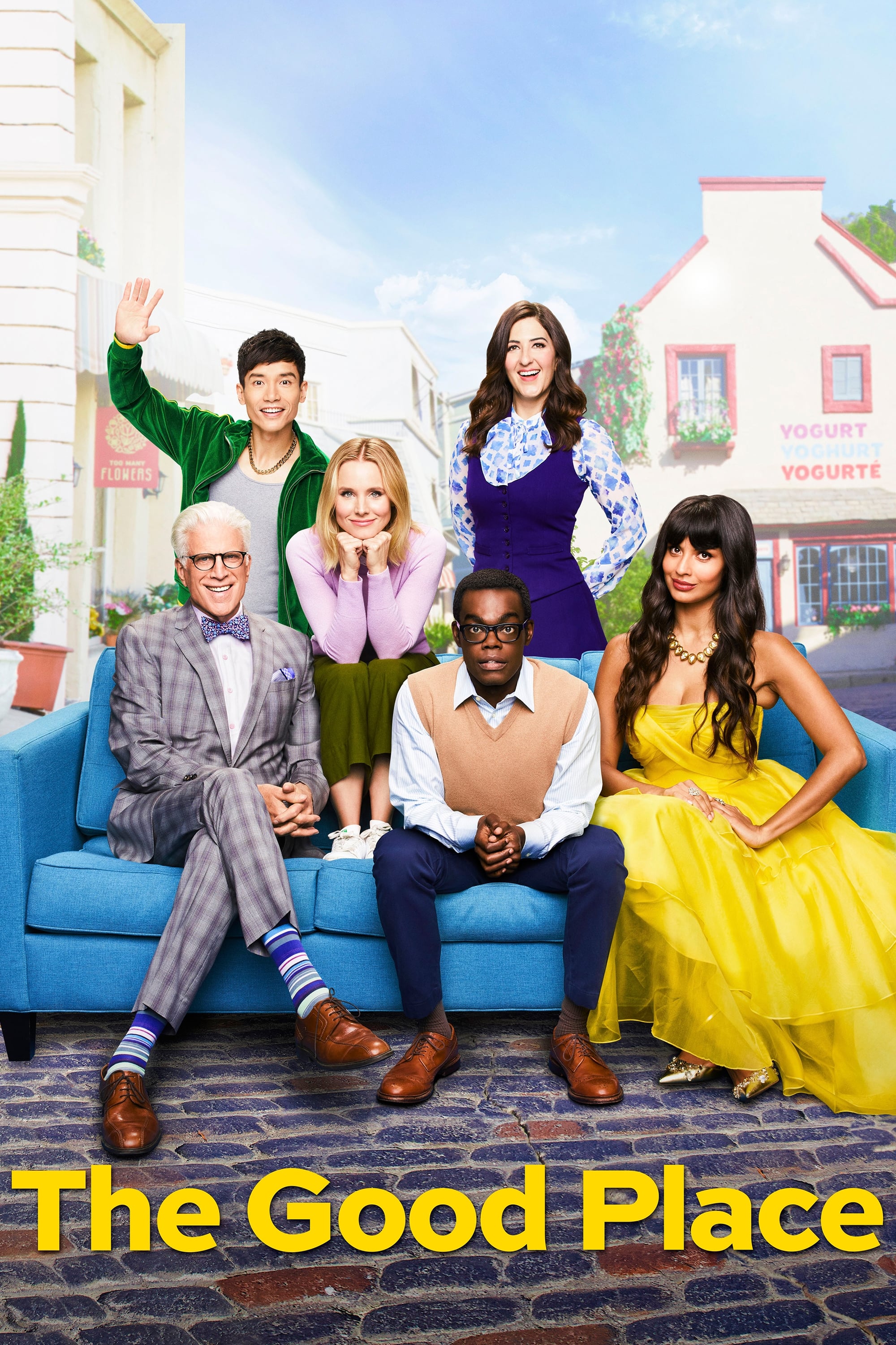
The visual landscape of the afterlife was bright and colorful but filled with hidden puns and jokes. The seemingly idyllic town featured restaurant names with food puns that often hinted at the true nature of the setting. Stores in the background had names like The Pesto’s Yet to Come and Knish from a Rose. These linguistic visual gags added a layer of whimsy that matched the surreal tone of the show. The bright colors disguised the sinister reality that the characters eventually uncovered.
‘New Girl’ (2011–2018)

The loft apartment in this sitcom had a distinct lived-in feel that reflected the personalities of its four roommates. The set decorators included the Douchebag Jar as a central prop that evolved into a key piece of the group dynamic. Quirky items like the melon painting and various eclectic chairs gave the space a bohemian atmosphere. The messy rooms and random objects made the large industrial space feel like a genuine home for young adults. These details helped ground the wacky antics of the characters in a relatable setting.
‘Sherlock’ (2010–2017)
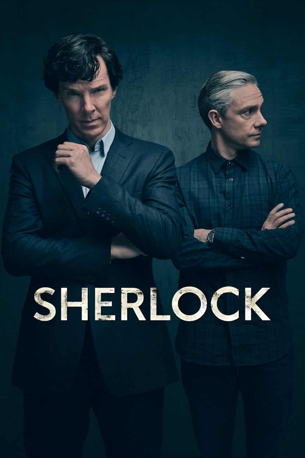
The interior of 221B Baker Street was updated for modern London while retaining the spirit of the original stories. Set decorators filled the flat with chaotic clutter that represented the disorganized genius of the protagonist. A skull on the mantelpiece and bold wallpaper designs became signature elements of the visual style. The show often projected text and diagrams onto the set to visualize the detective’s deduction process. This integration of set design and visual effects created a unique perspective on the classic character.
‘Gilmore Girls’ (2000–2007)
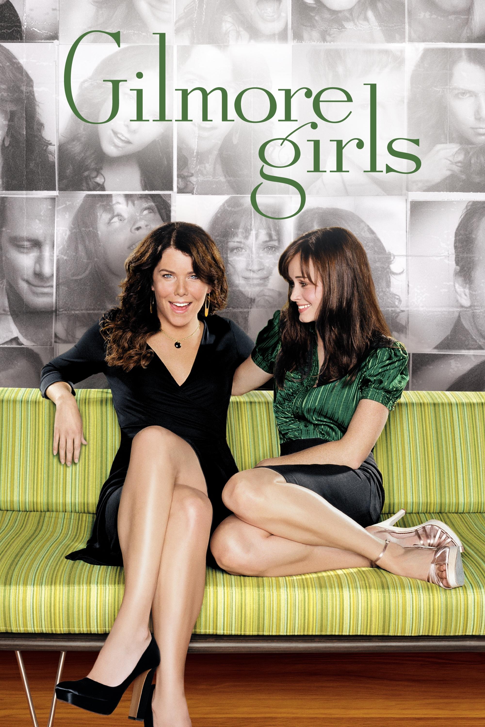
The town of Stars Hollow was designed to look like the quintessential charming New England hamlet. The set decorators packed the Gilmore house with flea market finds and eclectic knick-knacks to reflect the close relationship between mother and daughter. Kim’s Antiques was another set that required immense attention to detail with its floor-to-ceiling clutter of vintage items. The cozy and cluttered aesthetic became synonymous with the comforting vibe of the series. These visual choices made the town feel like a character in its own right.
‘Game of Thrones’ (2011–2019)

The production design for this fantasy epic required distinct visual identities for various regions and noble houses. Set decorators incorporated house sigils into the architecture and weapons of each faction. The Iron Throne itself was constructed to look like hundreds of melted swords fused together. Small details on tables and in bedchambers hinted at the wealth and culture of the different families. The immersive sets were critical in making the sprawling geography of Westeros understandable to the audience.
‘Modern Family’ (2009–2020)
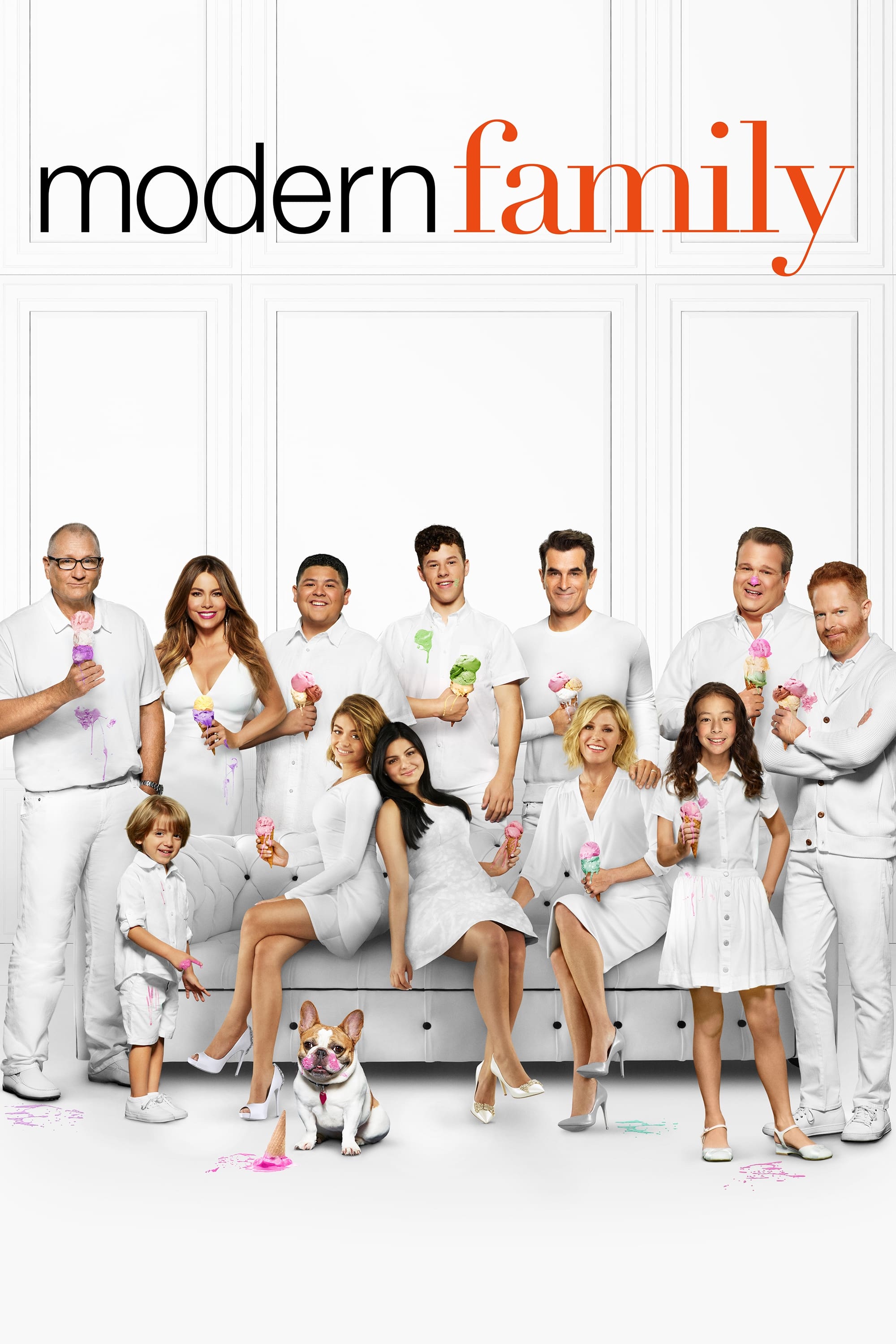
The three households in this mockumentary were designed to reflect the different financial situations and tastes of the family members. The Dunphy house famously featured a broken step on the staircase that Phil constantly promised to fix. This recurring visual gag symbolized the chaotic but loving nature of the household. The set decoration in Mitch and Cam’s home featured more artistic and theatrical touches to match their personalities. These distinct environments helped visually separate the storylines while keeping them connected.
‘Twin Peaks’ (1990–1991)
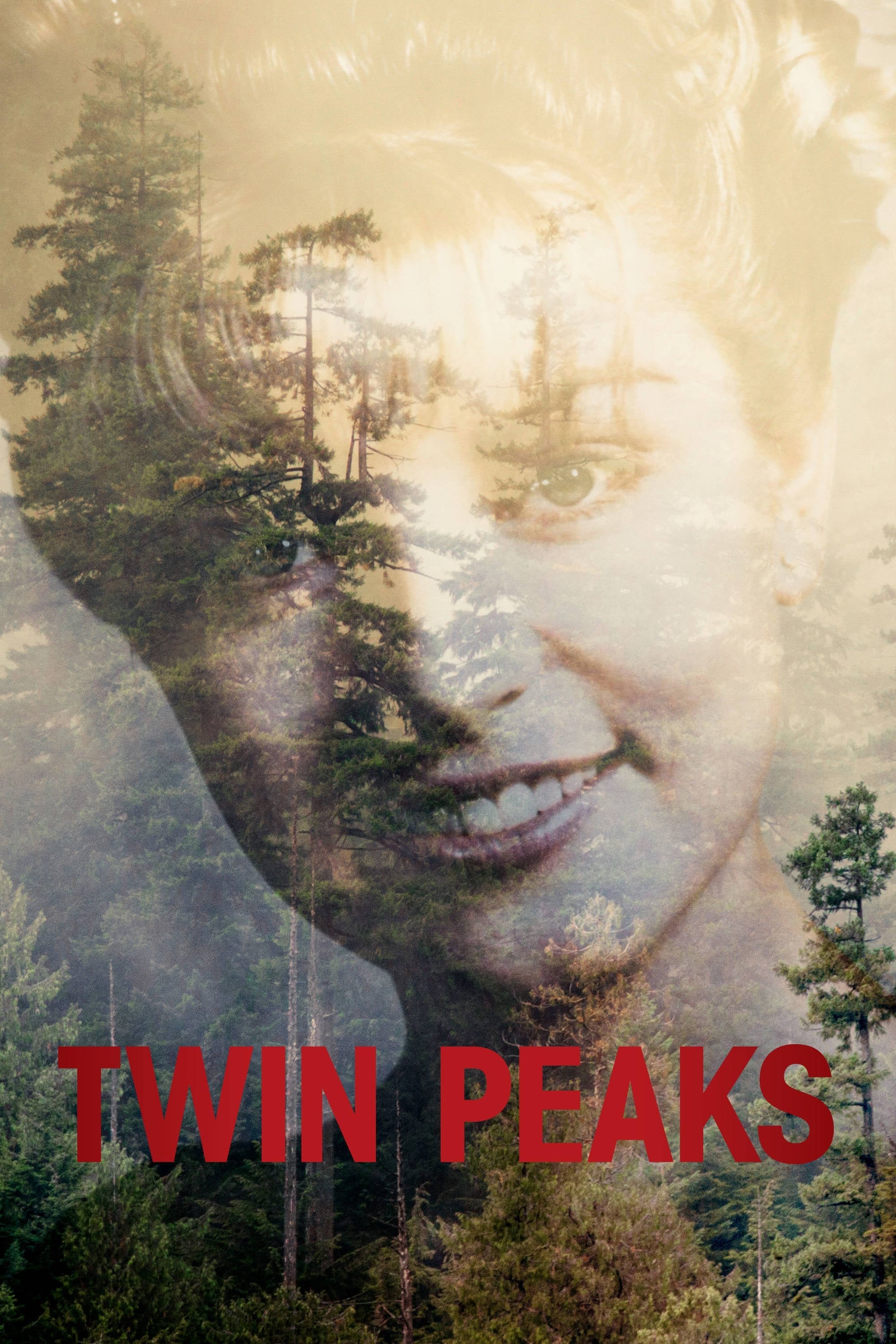
David Lynch used set design to create a surreal and unsettling atmosphere that defined the series. The Red Room with its zig-zag floor pattern and heavy velvet curtains is one of the most recognizable sets in television history. Decorators used seemingly mundane objects like ceiling fans and traffic lights to evoke dread and mystery. The juxtaposition of cozy small-town aesthetics with nightmarish imagery was central to the show’s impact. The visual language established in the original run continues to influence supernatural dramas today.
‘BoJack Horseman’ (2014–2020)
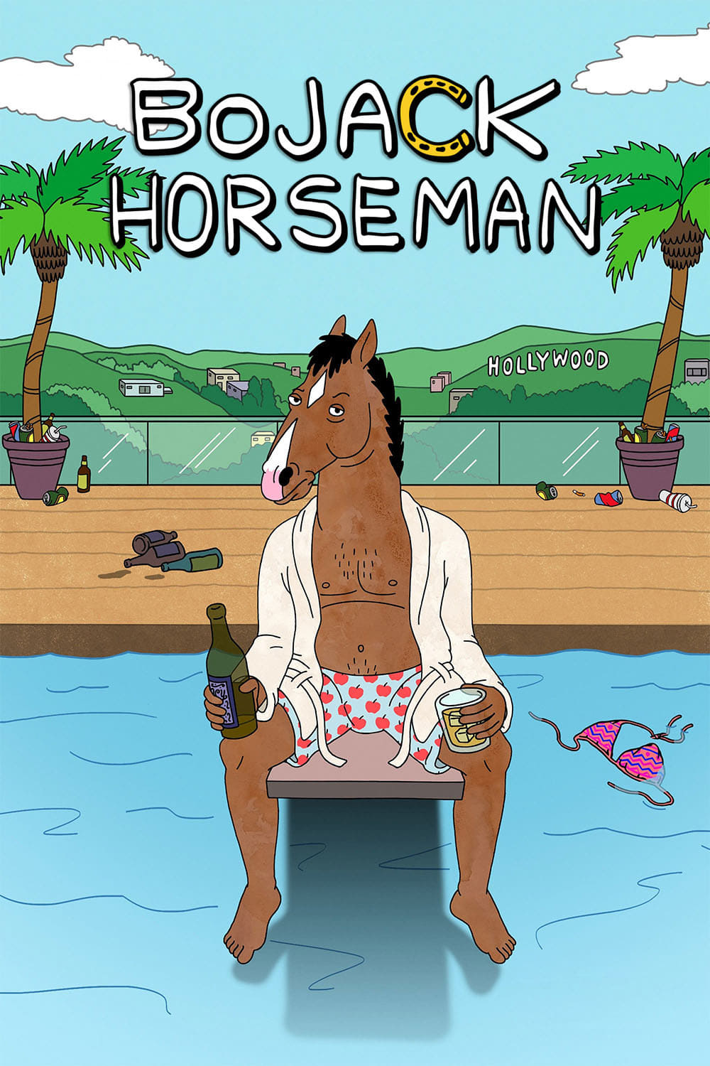
The animators and designers for this series filled the background with animal-themed puns and art parodies. Famous paintings were reimagined with animal subjects to fit the anthropomorphic world of Hollywoo. Viewers could spot titles on bookshelves and headlines on newspapers that offered satirical commentary on the events of the episode. The background art often changed to reflect the mental state of the protagonist or the passage of time. These visual jokes rewarded fans who paid close attention to every frame.
Please share your favorite background details from these shows in the comments.