25 Games With Genius Level Design Tricks


Great level design doesn’t just look nice—it teaches, guides, and surprises without breaking flow. The games below use clever spatial layouts, visual language, and rule-bending mechanics to quietly steer you, reward curiosity, and turn problems into “aha” moments. From diegetic signposting to interconnected worlds and systems that teach themselves, these examples show how craft and constraint shape unforgettable play. If you’re hunting for practical tricks to borrow or simply love seeing how games communicate, this list is a goldmine of smart solutions.
‘Dark Souls’ (2011)

FromSoftware builds Lordran as a fully interlinked map where shortcuts fold back to hubs, converting long, risky runs into tight loops. Sightlines—like glimpses of the Undead Parish bell or the distant bridge—act as visual goals that pull you through danger. Enemy placement teaches timing and stamina use before escalating to mixed groups that test learned patterns. Bonfire spacing, plus the risk of losing souls, calibrates route choice and mastery over repetition while publisher Bandai Namco supports the series’ signature online hints.
‘Half-Life 2’ (2004)

Valve designs chapters around environmental puzzles that tutorialize physics without pop-ups—see seesaw planks and rollermines teaching force and counterweight. The “breadcrumb” method uses light, motion, and sound to point you toward exits while keeping UI minimal. Combat arenas include multiple ingress routes and cover pieces that subtly suggest flanking and grenade use. The Gravity Gun, backed by Source physics, turns junk into tools, letting the environment become the lesson.
‘Portal’ (2007)

Valve’s test chambers escalate a single verb—portals—through gated scenarios that isolate one idea at a time. Checkerboard panels, arrow decals, and fizzlers establish a visual grammar for what surfaces accept or block portals. Momentum puzzles demonstrate “speedy thing goes in, speedy thing comes out” using safe micro-spaces before combining hazards. GLaDOS’s audio timing reinforces goals while keeping the space readable without traditional tutorials.
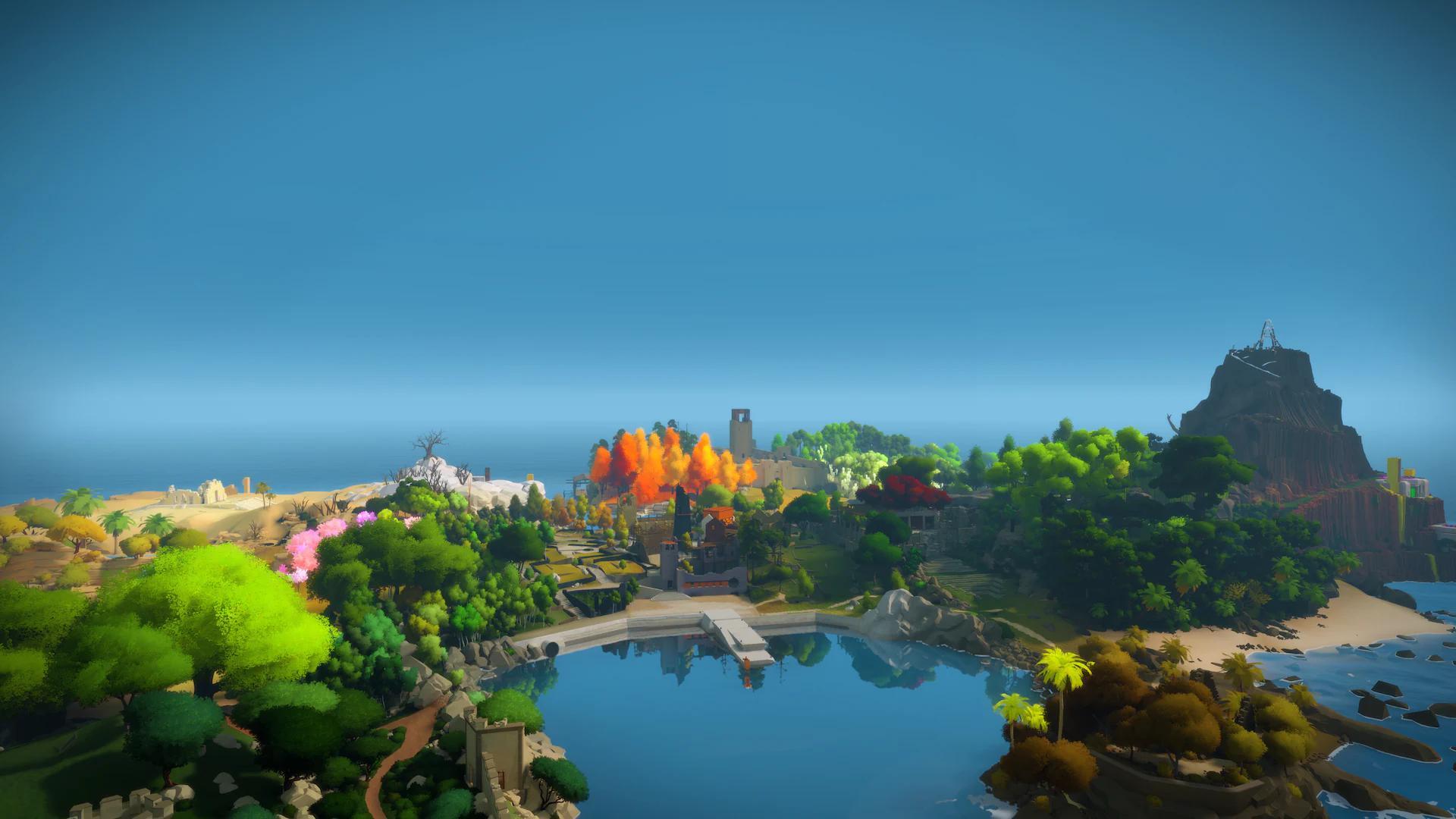
‘The Legend of Zelda: Breath of the Wild’ (2017)

Nintendo EPD uses triangle composition—peaks framed by valleys—to pull players across Hyrule without quest markers. A consistent systemic ruleset (metal conducts, fire spreads, wind pushes) turns weather and terrain into puzzle components. Shrines isolate a single concept so experimentation is low-risk but transferable to the open world. Climb-anywhere plus paraglider ensures multiple solution paths, with stamina and temperature acting as soft gates.
‘Super Metroid’ (1994)
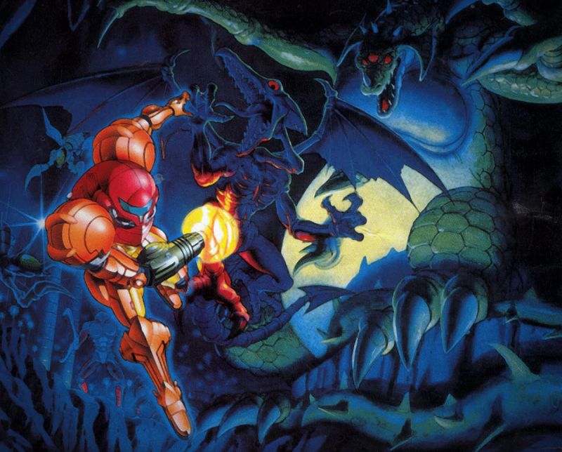
Nintendo’s map layers one-way doors, crumble blocks, and loopbacks to teach navigation while preventing sequence breaks early on. Subtle “tutorial rooms” show required moves—like the Alcatraz escape—without text. Enemy behavior and background clues hint at hidden paths (notably the glass tube and cracked tiles). Item progression—Morph Ball, Missiles, Speed Booster—reconfigures old spaces into new puzzles, a hallmark of the team’s design.
‘Super Mario Bros.’ (1985)
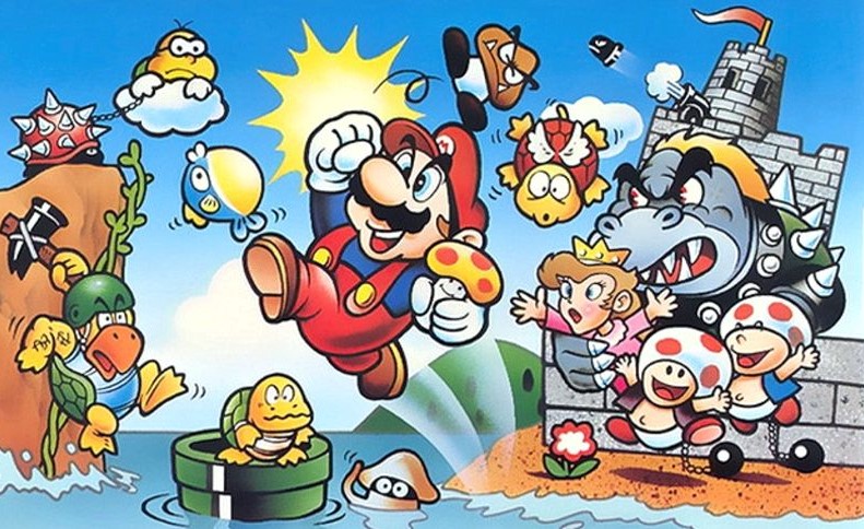
Nintendo EAD’s 1-1 uses placement and pacing to teach every core rule in seconds: a Goomba demonstrates hazard avoidance, a question block shows rewards, and a pipe implies verticality. The staircase of bricks before the flag teaches running jumps with low punishment. Power-up behavior—moving away from the player—encourages pursuit while explaining collision rules. The layout calibrates difficulty through spacing rather than complex enemies.
‘Outer Wilds’ (2019)

Mobius Digital designs a solar system as a time-loop logic puzzle where clues—not stats—unlock progress. Planets communicate their rules through landmarks and natural hazards: sand flows, quantum objects, and crumbling cities. The ship log organizes discovered facts into a graph, turning knowledge into the key resource. No quest markers are needed because observation and inference drive routing across the 22-minute loop.
‘Return of the Obra Dinn’ (2018)
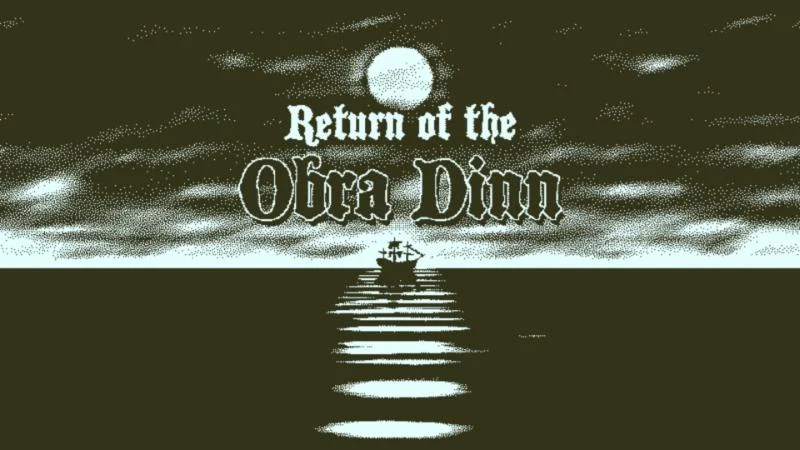
Lucas Pope structures deduction around consistent constraints: one corpse, one moment, fixed audio-visual context. The ship’s layout becomes a spatial index as cabins, decks, and roles narrow possible identities. The book UI encodes rule-based logic—nationality, job, relationships—so cross-referencing yields proofs rather than guesses. 1-bit visuals reduce noise while preserving crucial silhouettes and props from developer 3909 LLC.
‘Fez’ (2012)

Polytron’s perspective-rotation mechanic turns 3D space into solvable 2D planes, with platform routes emerging from alignment. A layered cipher system—Tetrominoes, alien script, input codes—creates optional metapuzzles that reward observation. World signage and architecture teach rotation affordances without overt prompts. The hub-and-spoke world map helps track cube fragments while preserving non-linear exploration.
‘Braid’ (2008)
Number None structures worlds around distinct time laws—rewind, time-and-shadow, ring-based slowdown—so each level is a focused study. Puzzles are designed to forbid brute-force platforming, forcing players to engage with time mechanics. Collectible pieces lock behind single-idea setups that telegraph required insights by layout. The rewind system doubles as failure-proofing, enabling rapid iteration on solutions.
‘The Witness’ (2016)
Thekla, Inc. teaches a visual language through panels that escalate constraints: symmetry, tetris blocks, suns, and environmental alignment. Island regions serve as classrooms where each rule is isolated before cross-pollination. Perspective puzzles tie line-drawing to physical sightlines, merging 2D and 3D reasoning. Minimal text ensures discovery comes from pattern recognition rather than instruction.
‘Hollow Knight’ (2017)

Team Cherry’s Hallownest uses soft gates—enemy density, platforming asks, acid pools—to hint “come back later” without hard locks. Benches and stag stations create safe nodes that restructure routes as you progress. NPCs and subtle ambient sound draw attention to secrets and branching paths. Area theming communicates expected hazards and move checks, simplifying mental mapping.
‘Dead Space’ (2008)

EA Redwood Shores (later Visceral Games) removes the HUD by embedding health on Isaac’s suit and ammo on weapons, focusing attention on diegetic space. Necromorph dismemberment flips shooter expectations, with enemy weak points dictating aim and resource use. Lighting, steam, and audio stingers guide direction and readiness in the Ishimura’s tight corridors. The breadcrumb locator gives optional guidance without overriding spatial cues.
‘Resident Evil 4’ (2005)
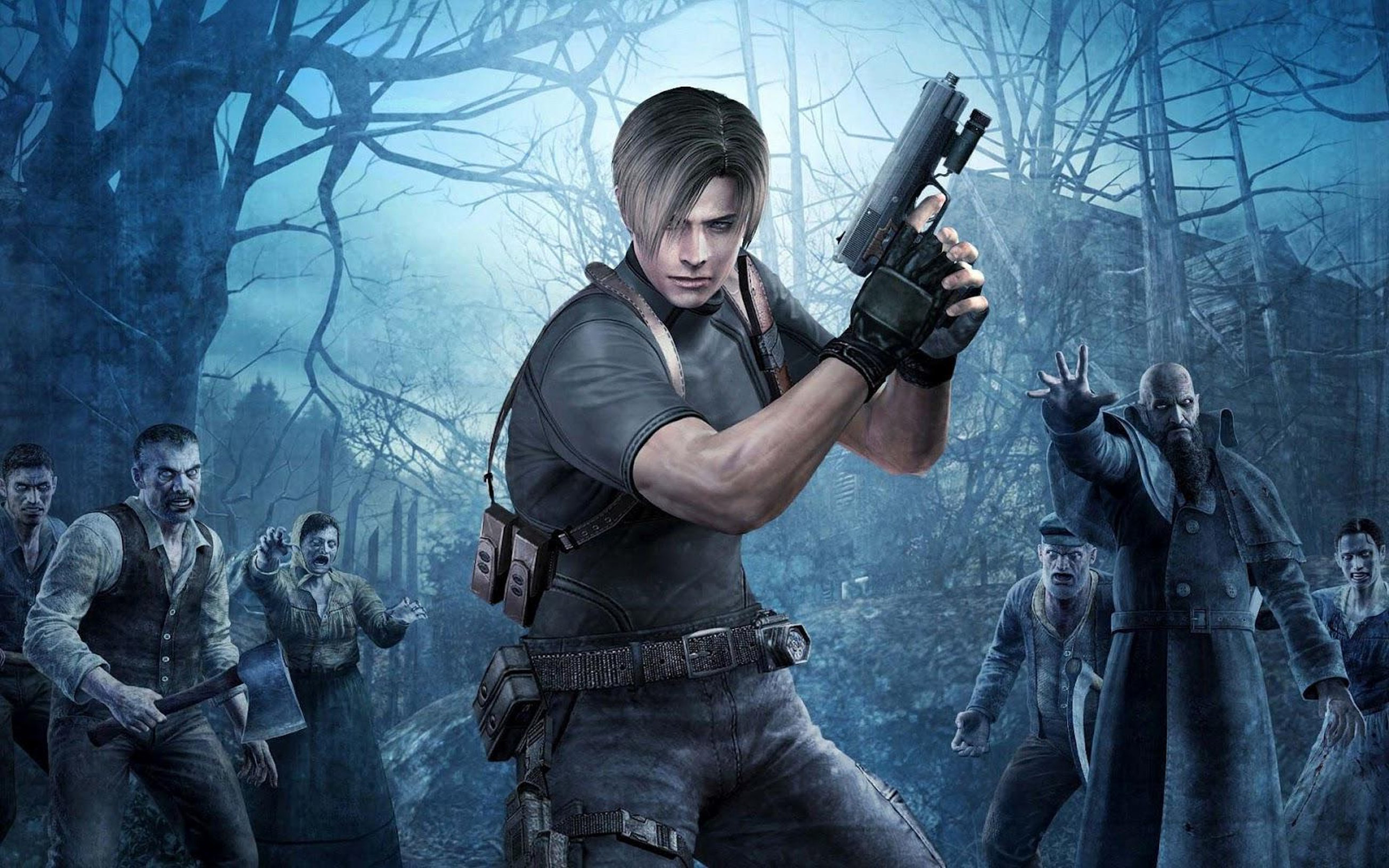
Capcom Production Studio 4 designs arenas with multiple elevation changes, chokepoints, and breakable routes that encourage kiting and resource triage. Contextual melee prompts reward precise stagger timings learned from enemy reactions. Merchant and typewriter placements create risk-reward rhythms between set pieces. Adaptive difficulty quietly adjusts spawn intensity, smoothing pacing without on-screen messaging.
‘God of War’ (2018)

Santa Monica Studio uses a single-shot presentation to maintain orientation and minimize cuts that could disorient pathfinding. Leviathan Axe recall doubles as a puzzle tool—freezing gears, redirecting water wheels—teaching interaction by consistent rules. Realms loop back with new traversal tools to recontextualize earlier spaces. Environmental runes and Nornir chests provide optional micro-puzzles that reinforce observation.
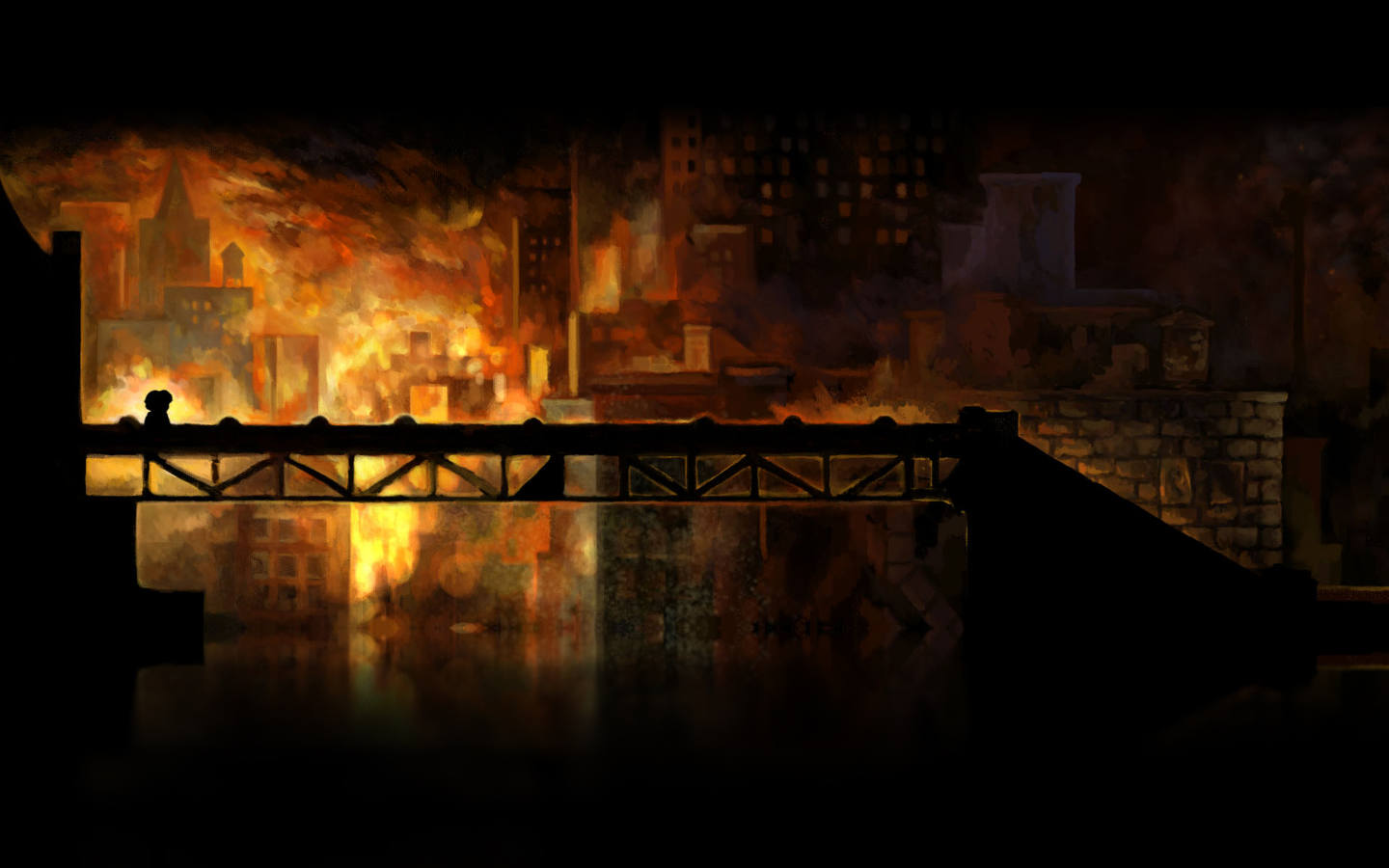
‘Inside’ (2016)
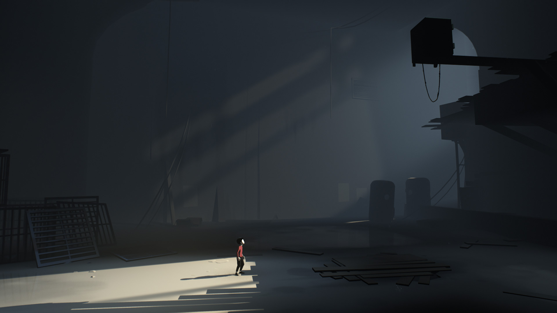
Playdead’s puzzle chain uses cause-and-effect staging where a new mechanic appears safely before it becomes lethal. Background motion and light steer movement while foreground hazards stay clearly readable. Mind-control boxes and water physics escalate in controlled increments, avoiding text prompts. Checkpointing supports quick iteration so solutions emerge from experimentation, not trial fatigue.
‘Celeste’ (2018)
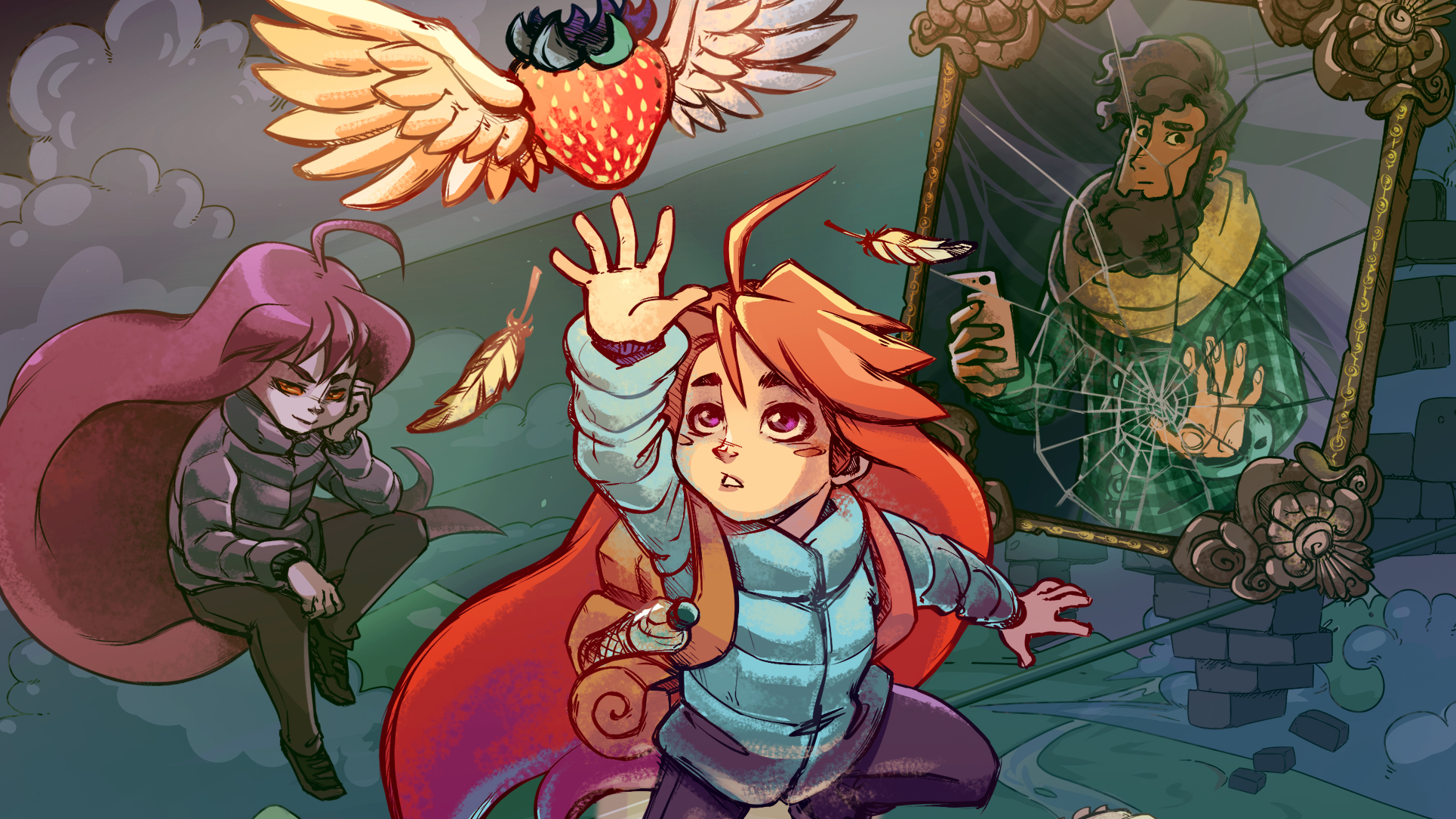
Maddy Makes Games structures screens as single challenges with clearly communicated hazards and stamina-limited climbs. Assist options expose tweakable rules—speed, invincibility—that turn difficulty into learnable parameters. Strawberries teach optional mastery without blocking progress, separating completion from challenge. Chapter-specific mechanics (e.g., cassette rhythm blocks) appear in controlled contexts before remix levels layer them.
‘Super Mario 64’ (1996)

Nintendo EAD’s hub, Peach’s Castle, organizes missions by paintings that preview themes and movement asks. Stars reorder levels, letting players approach challenges non-linearly while reusing spaces efficiently. Camera and level shapes teach analog stick finesse—Big Bob-omb’s battlefield is a sandbox for slope and momentum learning. Secrets and one-ups are placed to reward curiosity along safe detours.
‘Prey’ (2017)
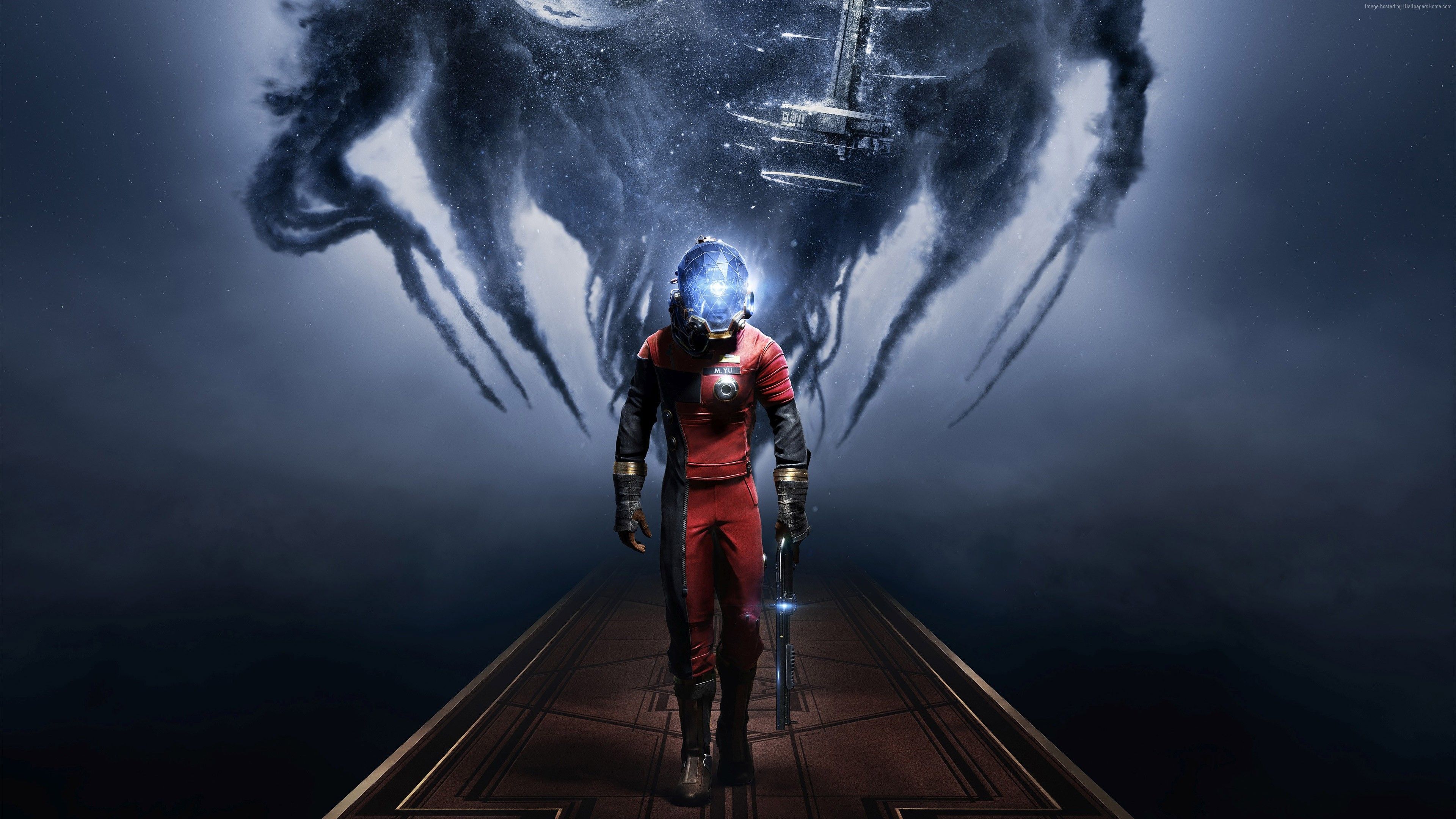
Arkane Studios turns Talos I into a layered immersive-sim where tools like the GLOO Cannon create improvised routes. The station’s believable signage, departments, and keycard hierarchy make backtracking legible. Neuromods expand verbs in ways that reopen earlier areas, while Mimics teach threat identification through silhouette reading. Environmental storytelling—emails, labs, damage states—conveys objectives without heavy UI.
‘Deus Ex’ (2000)

Ion Storm structures missions around multiple vectors—ventilation, social checks, hacking—that the simulation supports consistently. Skill and augmentation systems change approach rather than raw stats, encouraging planning. Level geometry telegraphs options with readable vents, keypad placements, and sightlines. Consequence tracking carries choices forward via flags, altering patrols and access in later maps.
‘Dishonored’ (2012)
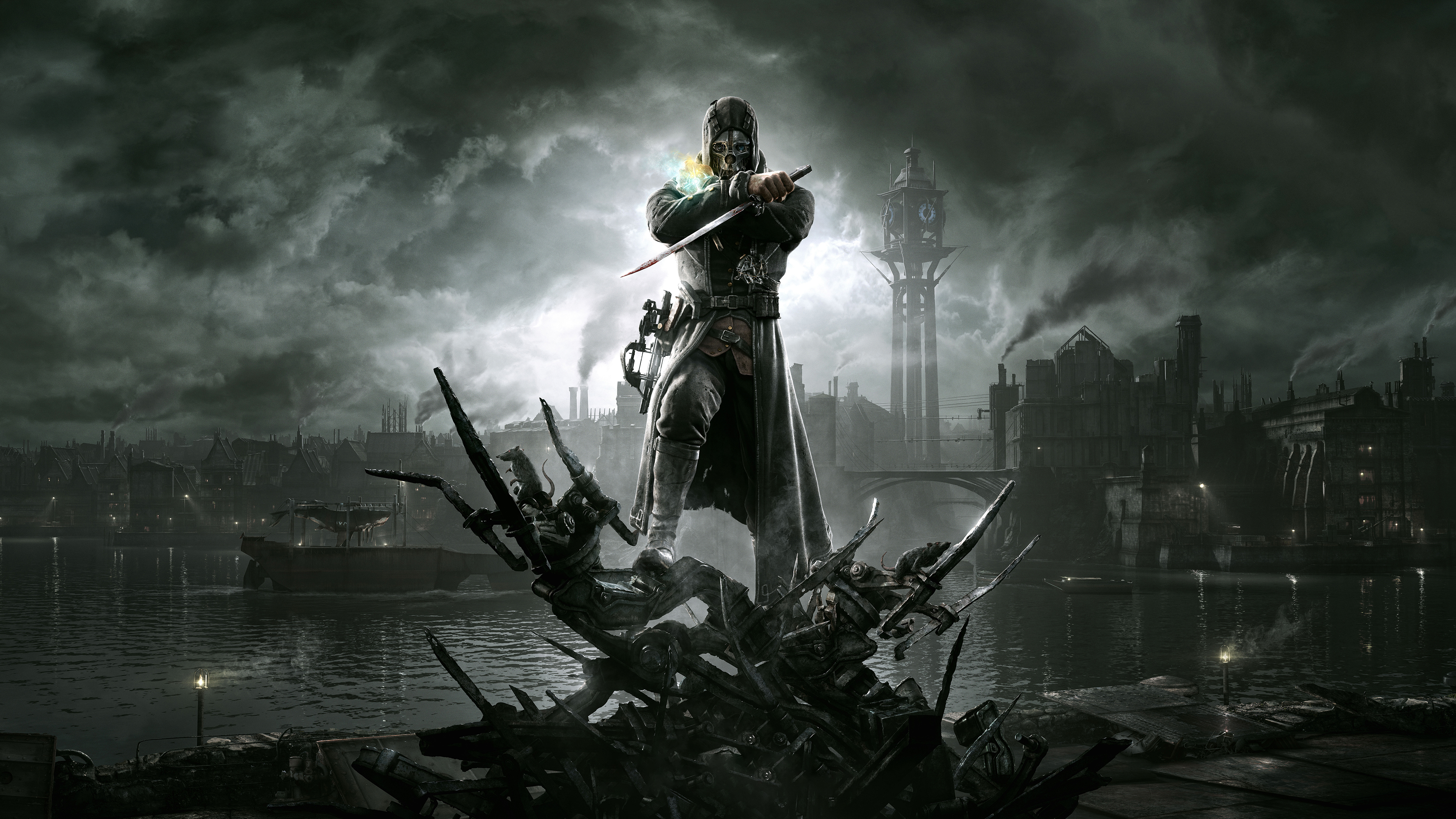
Arkane Studios designs “clockwork” levels like The Golden Cat with interlocking patrols, vertical routes, and line-of-sight puzzles. Powers—Blink, Dark Vision, Bend Time—are balanced so each affords distinct infiltration paths. Rune and bone charm placement nudges exploratory detours without mandatory objectives. Chaos systems react to lethality, shifting enemy density and environmental states across missions.
‘Metal Gear Solid V: The Phantom Pain’ (2015)

Kojima Productions builds outposts as modular spaces readable by patrol loops, power grids, and vantage points. The iDroid map and binocular tagging create pre-engagement planning phases that are mechanically meaningful. Time-of-day and sandstorms alter stealth affordances, converting familiar camps into new puzzles. Systems like Fulton extraction and base development transform objectives into resource tradeoffs.
‘Tunic’ (2022)
Isometricorp Games, published by Finji, uses a self-translating manual to drip-feed rules through collectible pages. The isometric camera hides ladders, shortcuts, and doors that reframe routes once spotted. Golden path illusions lead you forward while true solutions often involve wrap-around spaces or perspective tricks. Late-game “holy cross” inputs connect visual motifs across the world into a unified meta-language.
‘Spelunky’ (2012)
Mossmouth’s procedural level rules create fair but demanding spaces by guaranteeing reachable exits and key-item placements. Tile subsets communicate danger and utility—arrow traps, spikes, shop layouts—at a glance. Secret chains (Udjat Eye, Black Market, Hedjet) embed long-term goals into short runs. Physics and enemy interactions allow emergent solutions that feel authored because constraints are tight.
‘Control’ (2019)

Remedy’s Oldest House uses brutalist architecture and shifting geometry to reconfigure navigation while remaining internally consistent. Diegetic UI—boards, signage, hotline visions—replaces heavy HUD elements and orients you inside a bureaucratic labyrinth. Ability gating (Levitate, Launch) reopens earlier sectors, turning office spaces into vertical playgrounds. The fast-travel and sector labels keep routing legible even as rooms transform, supported by publisher 505 Games.
Share your favorite smart level-design moments in the comments and tell us which tricks you think more games should use!