25 Games With Minimal UI That Still Guide You
Some of the smartest games keep the screen clean and still nudge you exactly where you need to go. They use landmarking, sound, lighting, animation, and diegetic tools instead of cluttered waypoints and quest arrows. The picks below show how strong environmental design, systemic cues, and subtle feedback can replace heavy HUDs without leaving you lost. If you love getting absorbed in a world without a minimap shouting at you, these are the standouts to try.
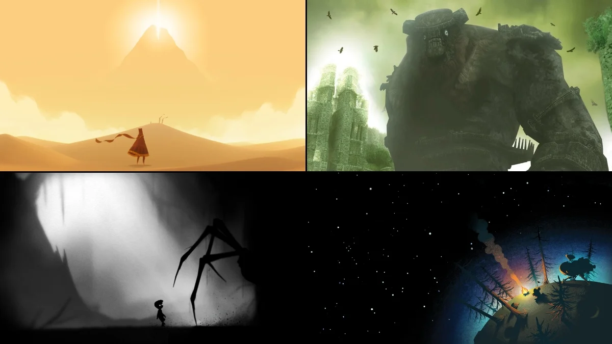
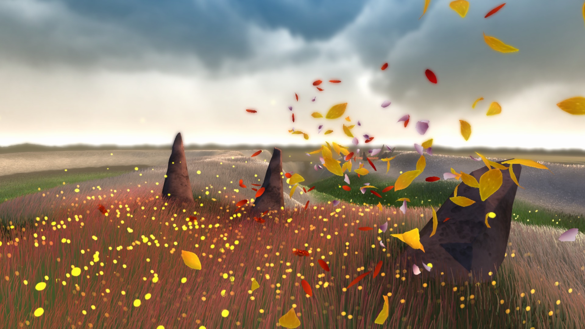
‘Journey’ (2012)
Thatgamecompany shapes navigation with mountain-summit sightlines, wind patterns, and glowing cloth paths that visually “flow” toward the next area. A musical chime mechanic pings nearby objects and charges scarves without intrusive prompts. Sand-surfing lines, color contrast, and heat shimmer guide you through ruins and canyons. Sony Santa Monica supported the release, but the design is pure minimalism in motion.
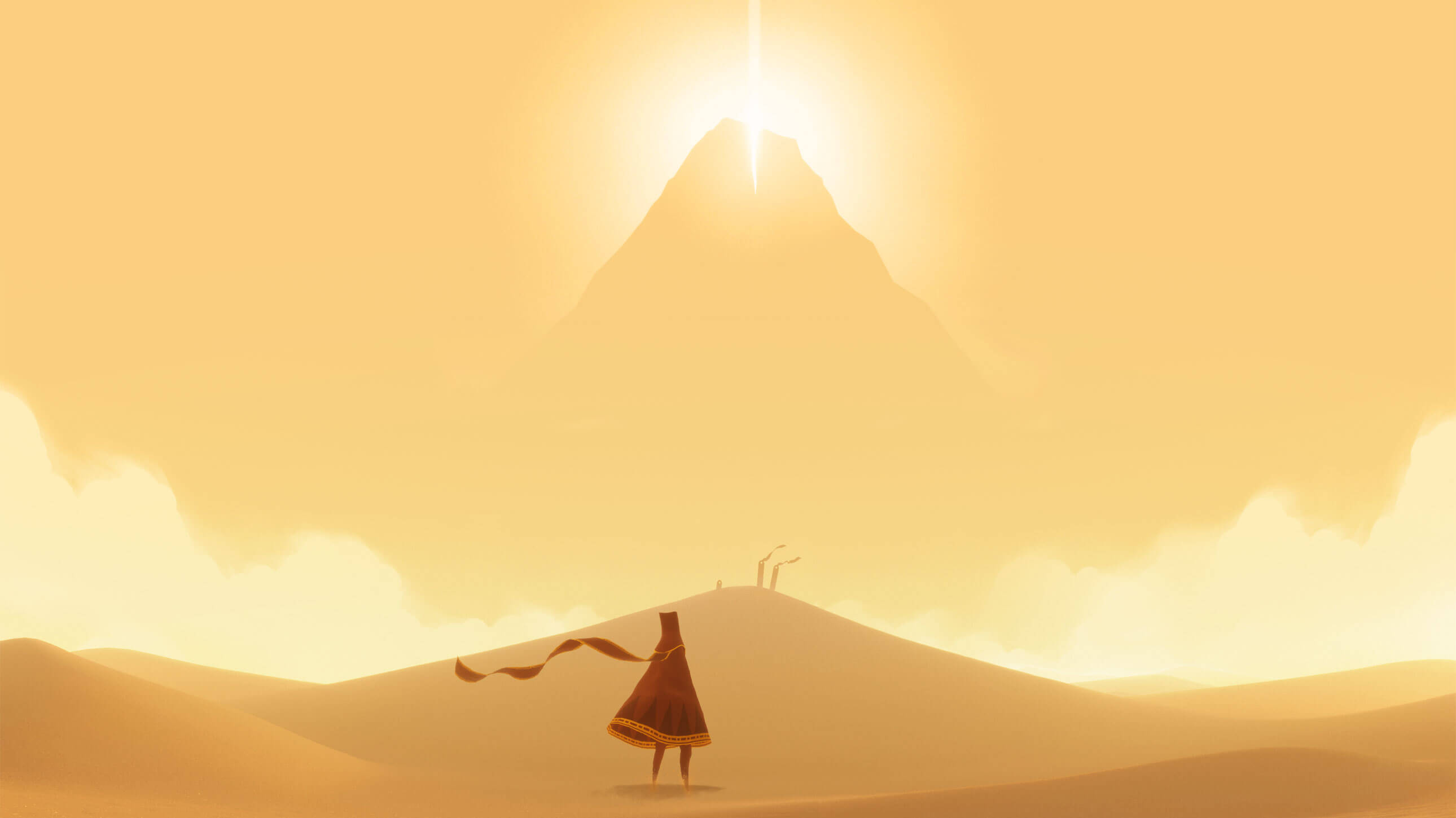
‘Shadow of the Colossus’ (2005)
Team Ico uses a single beam of sunlight from Wander’s sword to indicate direction, avoiding markers or quest logs. The open plains rely on terrain silhouettes and the colossi themselves as moving landmarks. Agro’s riding feel and camera framing naturally funnel you toward points of interest. Sony Computer Entertainment published the original, keeping UI elements spare to heighten scale and solitude.
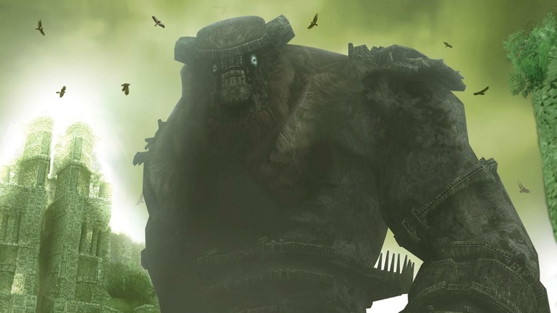
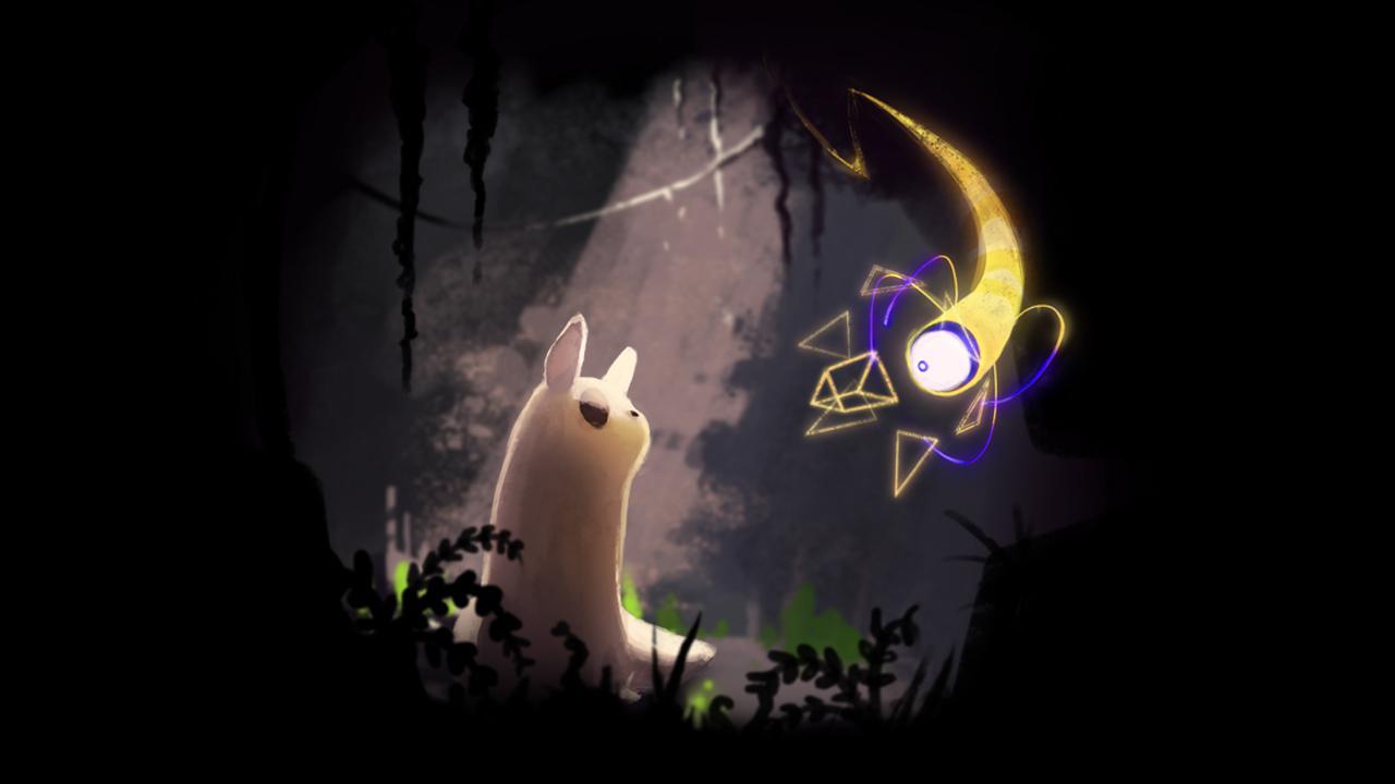
‘Inside’ (2016)
Playdead communicates paths through motion, light cones, and enemy routines rather than buttons on screen. Background parallax and foreground contrast signal climbable edges and safe routes. Sound cues—like dogs barking or engines revving—telegraph timing windows. With no dialogue or HUD, the studio’s animation readability becomes the tutorial.
‘Limbo’ (2010)
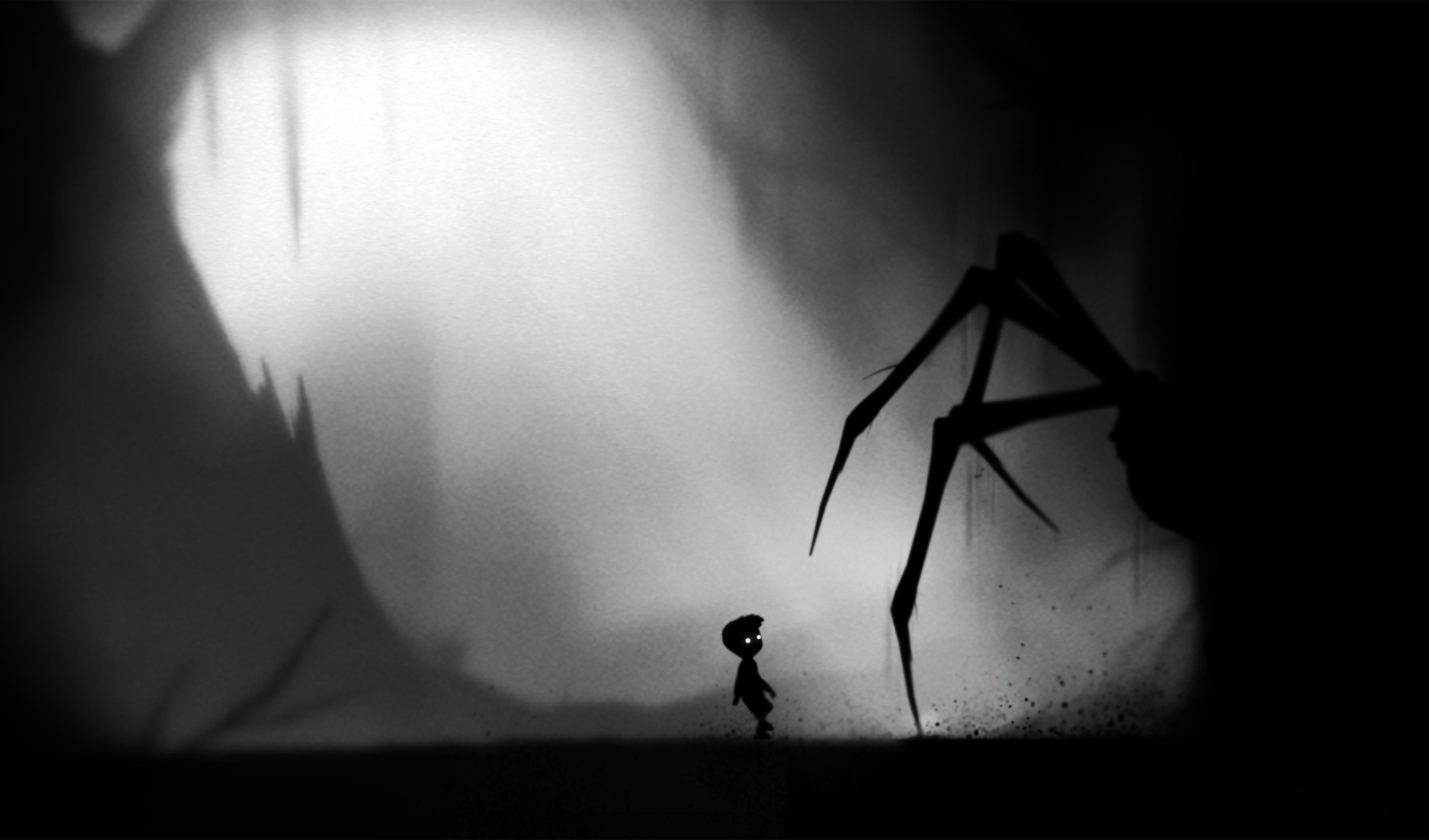
Also from Playdead, this monochrome platformer guides through silhouette contrast and trap foreshadowing. Environmental loops teach mechanics—rolling logs, swing ropes, and water depth—before raising the stakes. Vignettes use framing to pull your eye toward exits. Minimal text and UI keep attention on physics and pattern recognition.
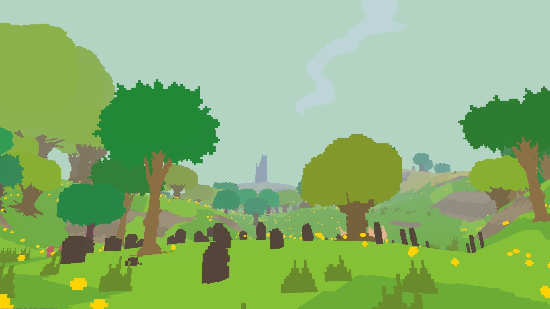
‘The Witness’ (2016)
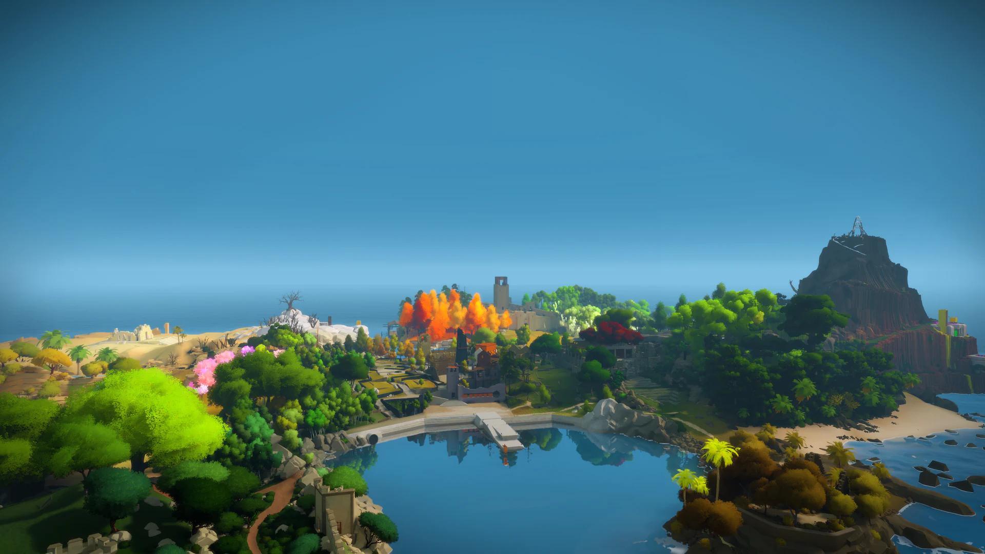
Thekla, Inc. turns the island itself into a lesson plan, introducing rules through puzzle placement and sightlines. Colored cables and panel orientation gently lead you between regions without a quest list. Perspective tricks—like aligning shapes from a certain angle—teach observation through discovery. The clean interface keeps focus on spatial reasoning rather than prompts.
‘The Legend of Zelda: Breath of the Wild’ (2017)

Nintendo relies on landmark-driven exploration—towers, shrines, and the castle skyline—so you can travel with the HUD pared down. Smoke plumes, wildlife behavior, and weather patterns hint at activities and threats. Sheikah Slate beacons and sound cues are optional, letting geography carry most of the guidance. The world’s systemic interactions—fire, wind, physics—often point to solutions without pop-ups.
‘Ghost of Tsushima’ (2020)

Sucker Punch swaps a waypoint arrow for the Guiding Wind, a diegetic gust that sweeps the environment toward your objective. Birds, foxes, and smoke columns act as moving signposts to side activities. Subtle controller vibration and audio swells reinforce direction without clutter. The studio’s cinematic framing makes paths readable even with the HUD minimized.
‘Outer Wilds’ (2019)
Mobius Digital uses a diegetic ship log and rumor map to suggest leads, not checklist chores. Planetary phenomena—sand cycles, volcanic eruptions, quantum objects—create timed opportunities you learn by observation. Sound carries across space to hint at distant signals and instruments. The absence of waypoints turns the solar system’s rules into your guidebook.
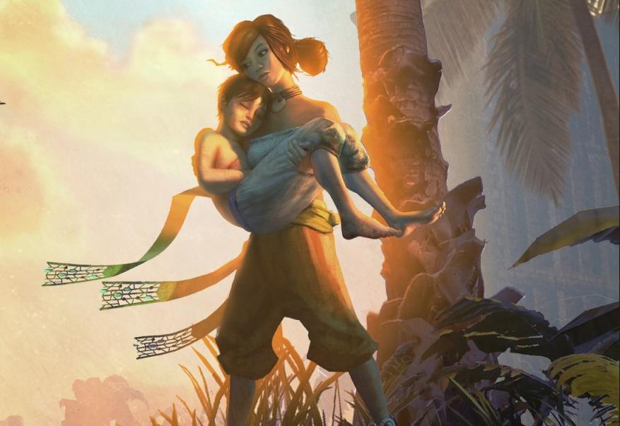
‘Hellblade: Senua’s Sacrifice’ (2017)
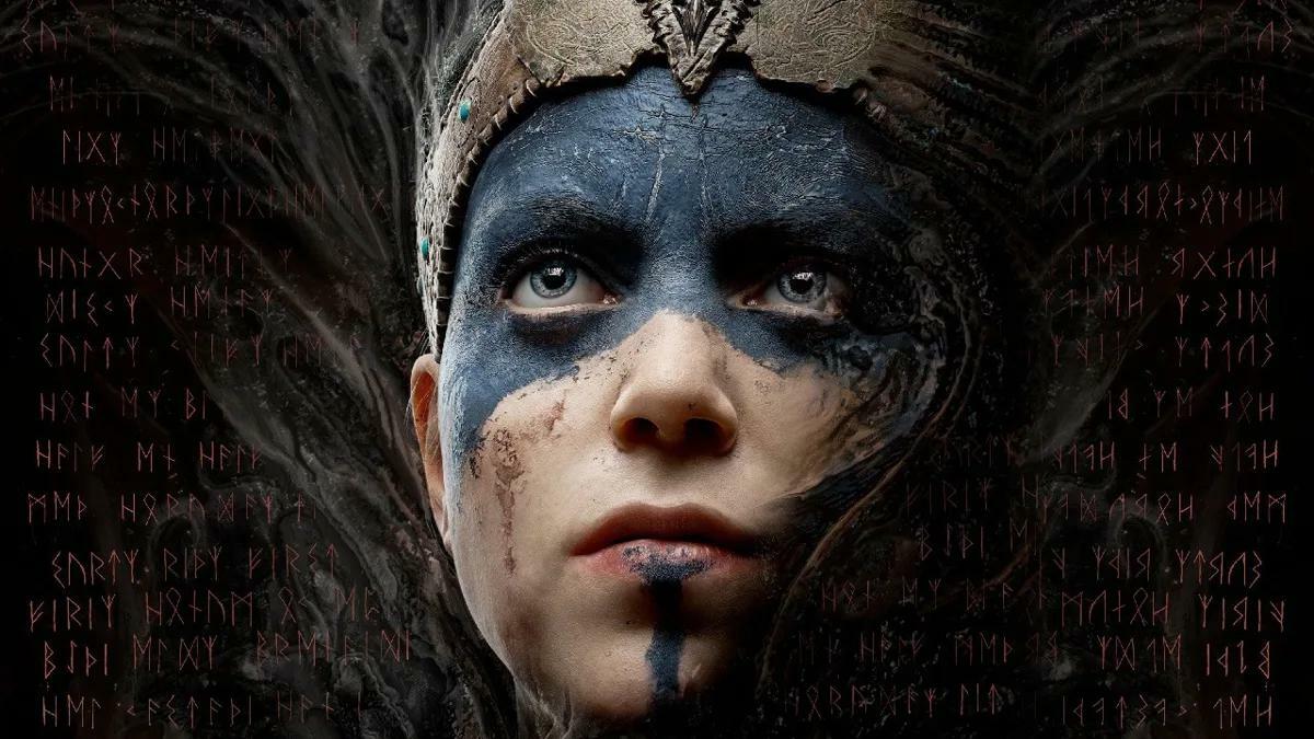
Ninja Theory employs binaural audio to steer attention and timing, with voices shifting around the player to suggest threats or paths. Symbol-hunting puzzles align shapes in the environment, encouraging careful framing. Minimal HUD leaves combat readability to animation and sound design. Environmental storytelling nudges you forward without objective markers.
‘A Short Hike’ (2019)
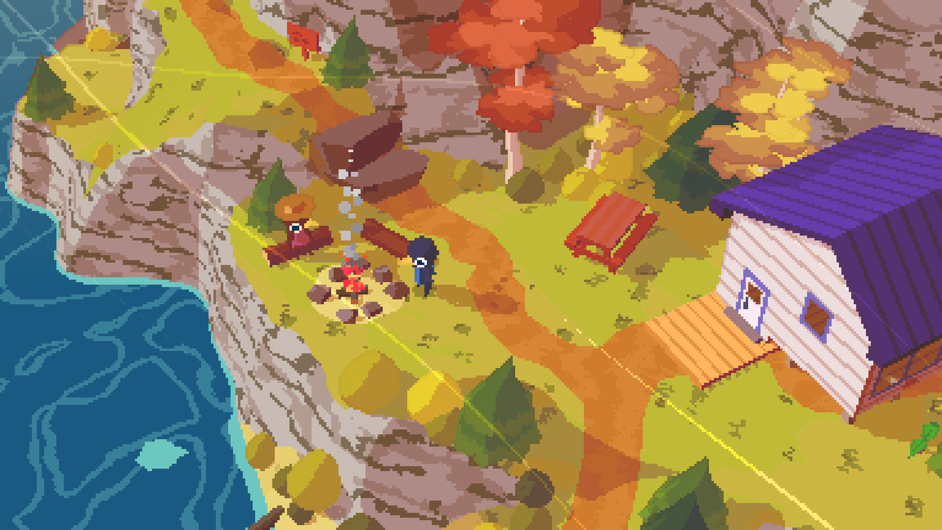
Developed by Adam Robinson-Yu, this cozy adventure uses verticality and sightlines to lead you up Hawk Peak. NPC chatter, signposts, and trail color shifts indicate new areas without dense UI. Collectible golden feathers telegraph progression by gating climbs subtly. The map is simple, letting terrain and curiosity do most of the work.
‘Hyper Light Drifter’ (2016)
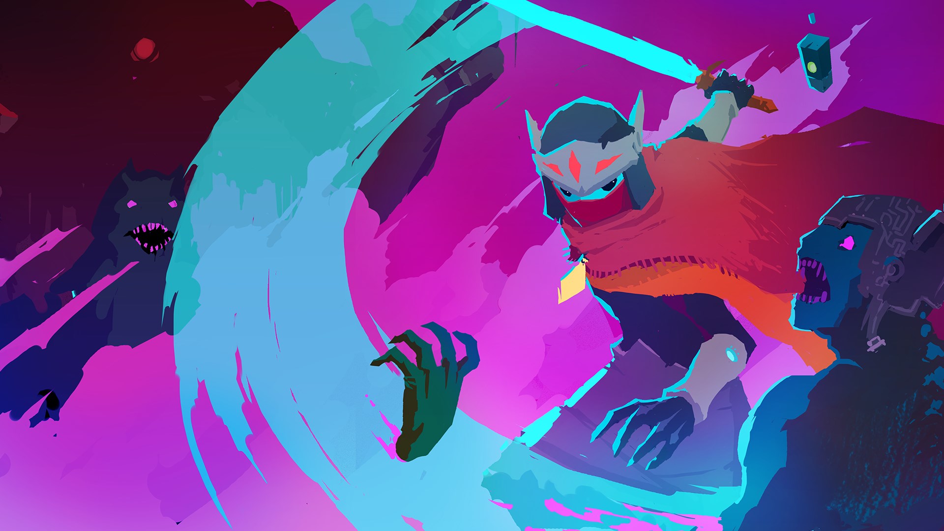
Heart Machine teaches through iconography and encounter design rather than text-heavy tutorials. The world’s neon wayfinding—glowing doors, floor patterns, and environmental arrows—gently directs progress. Enemy arenas indicate strategy through layout and hazard placement. Sparse UI keeps combat and exploration feedback clean and immediate.
‘ABZÛ’ (2016)

Giant Squid guides underwater exploration with schools of fish, light shafts, and currents that “flow” toward points of interest. A meditation mechanic highlights regional species and landmarks without a minimap. Color gradients and architectural ruin lines lead you through chambers. Annapurna Interactive published the game, preserving the tranquil, uncluttered presentation.
‘ICO’ (2001)
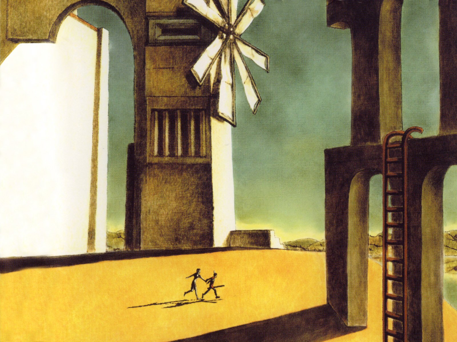
Team Ico leans on hand-holding mechanics and Yorda’s gaze to signal routes. Architectural rhythm—courtyards, bridges, and towers—creates natural forward momentum. Puzzles introduce tools in isolation, then combine them to teach sequencing. With almost no HUD, camera placement and sound sell spatial relationships.
‘The Last Guardian’ (2016)
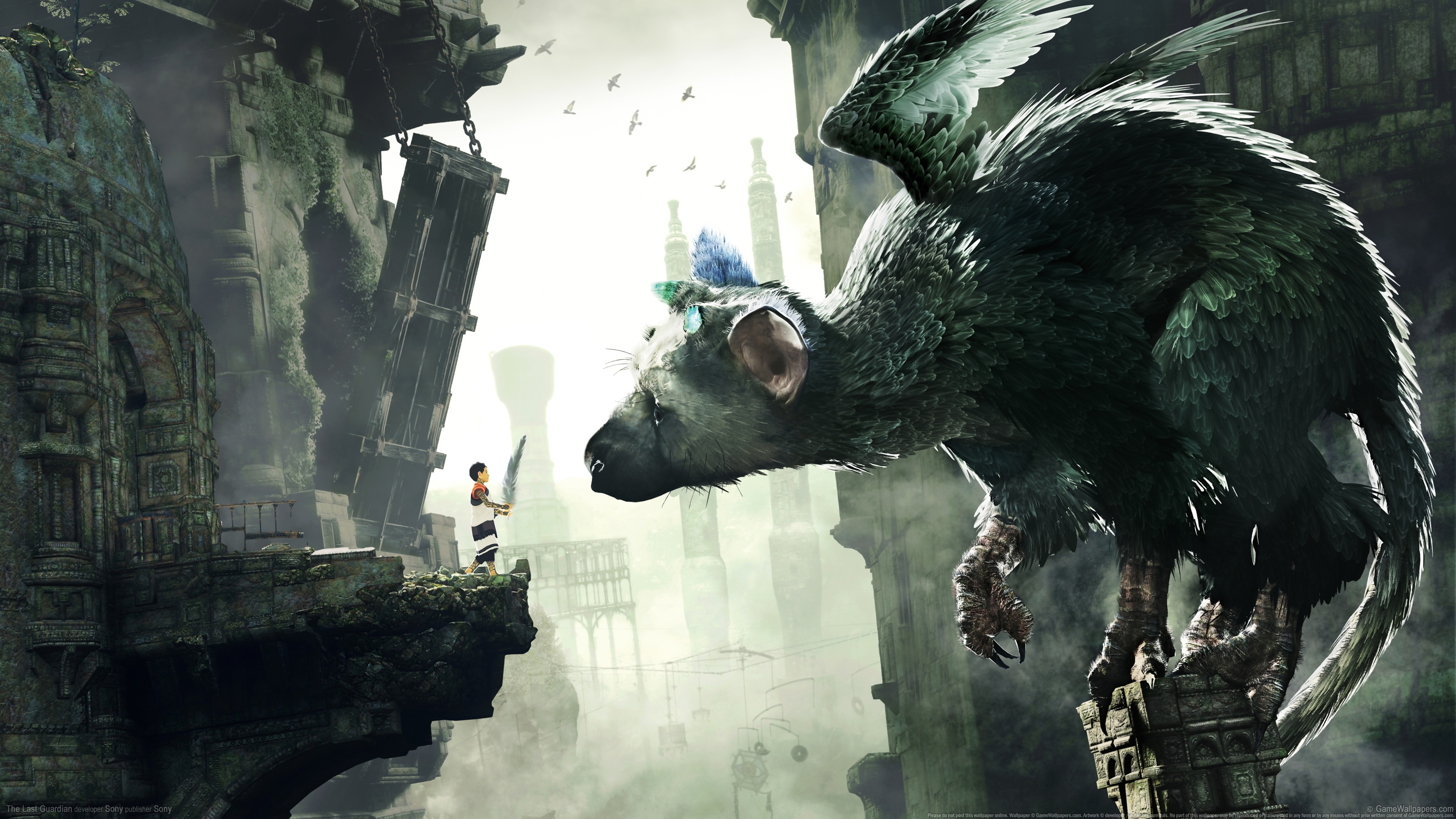
genDESIGN and SIE Japan Studio use Trico’s behavior—stares, growls, and posture—to indicate interactable spaces. Environmental geometry, broken ledges, and dangling chains imply traversal without button prompts. Light beams and stained-glass talismans serve as visual language for obstacles. Minimal UI keeps the boy–beast bond at the core of navigation.
‘Sable’ (2021)
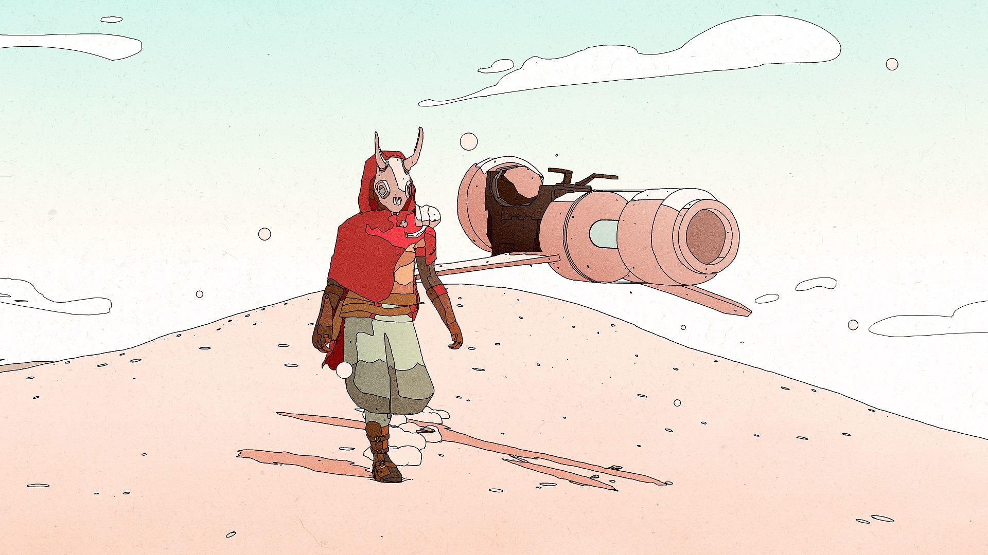
Shedworks lets you explore with a simple compass and a hoverbike, relying on rock formations and monolithic structures as beacons. Quest givers provide plain-language directions instead of map spam. Climbing stamina and line-of-sight scanning reward surveying the terrain. Raw Fury published the game, keeping its Moebius-inspired world uncluttered.
‘The Pathless’ (2020)
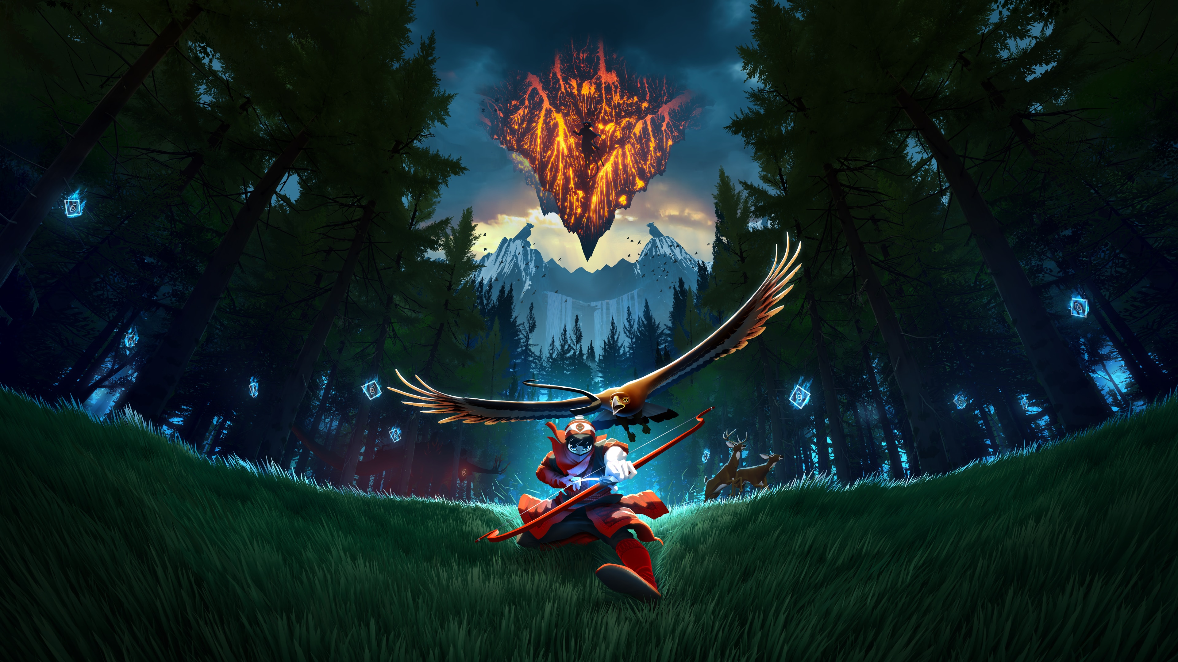
Giant Squid replaces waypoints with eagle-assisted traversal and a spirit mask that reveals distant energy trails. Archery crystals on the ground create momentum lines you learn to chain by feel. Tower purification beams and mask echoes outline objectives without a UI checklist. Annapurna Interactive’s release emphasizes flow-first navigation.
‘Sea of Thieves’ (2018)

Rare builds navigation around diegetic tools—paper maps, compasses, telescopes, and constellations. Islands are identified by silhouette and landmark features rather than markers. Crew callouts and instrument emotes create guidance through teamwork. With the HUD kept minimal, the ship itself becomes your interface.
‘Return of the Obra Dinn’ (2018)
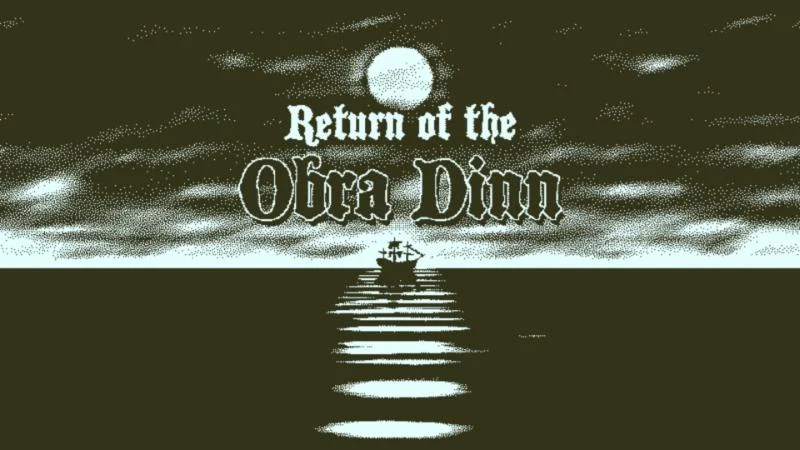
Created by Lucas Pope and published by 3909 LLC, this mystery guides solely through deduction tools: a pocket watch, a manifest, and a sketch. Spatial audio and scene composition indicate who’s who without UI highlights. The ship’s layout and repeated paths teach you to cross-reference locations. The notebook system organizes leads without quest arrows.
‘Dark Souls’ (2011)
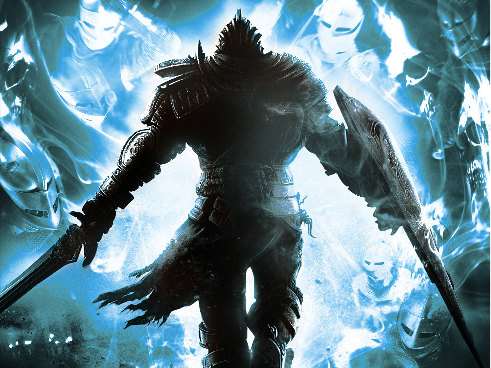
FromSoftware relies on level architecture—loops, shortcuts, and sightlines—to orient players. Enemy placement teaches caution and route viability more than on-screen warnings. Bonfires, item descriptions, and NPC hints form a loose web of direction. The HUD stays unobtrusive so the environment can do the heavy lifting.
‘Metroid Prime’ (2002)
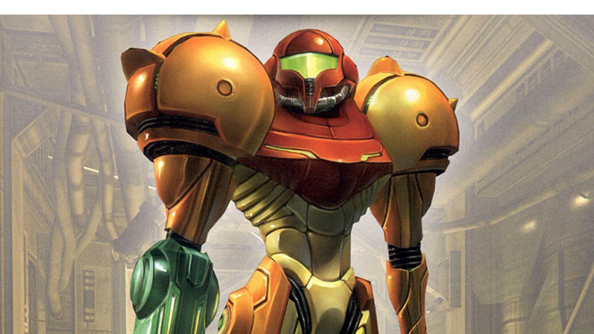
Retro Studios embeds the interface in Samus’s visor, making scanning and mapping feel like real tools. Colored doors, enemy resistances, and environmental hazards telegraph required upgrades. Subtle lock-on cues and room geometry guide combat positioning. Nintendo’s design emphasizes readable spaces over waypoint dependence.
‘Flower’ (2009)
Thatgamecompany guides with wind currents, petal trails, and color restoration that fans outward from objectives. Controller tilt and haptic feedback suggest direction changes without on-screen prompts. Musical layering increases as you flow toward completion points. The presentation remains nearly UI-free, focusing attention on motion and mood.
‘Submerged’ (2015)
Uppercut Games builds a flooded city where binoculars, skyline silhouettes, and supply crates lead exploration. The boat’s movement and climbable ivy lines subtly outline routes. Collectibles and murals provide narrative context that points to new districts. The minimalist HUD keeps discovery front and center.
‘Proteus’ (2013)
Developers Ed Key and David Kanaga use procedural landscape sounds and color shifts as navigational cues. Points of interest generate distinct audio motifs that draw you closer. Seasonal changes and time of day reveal different paths without explicit markers. With no text or objectives, curiosity and ambience become the compass.
‘Rain World’ (2017)
Videocult designs levels where creature behaviors and weather cycles dictate safe movement windows. The karma system and hibernation shelters create a loop that teaches risk management organically. Visual language—pipes, ledges, and garbage routes—suggests traversal options. Adult Swim Games published it with a deliberately sparse interface.
‘Death Stranding’ (2019)
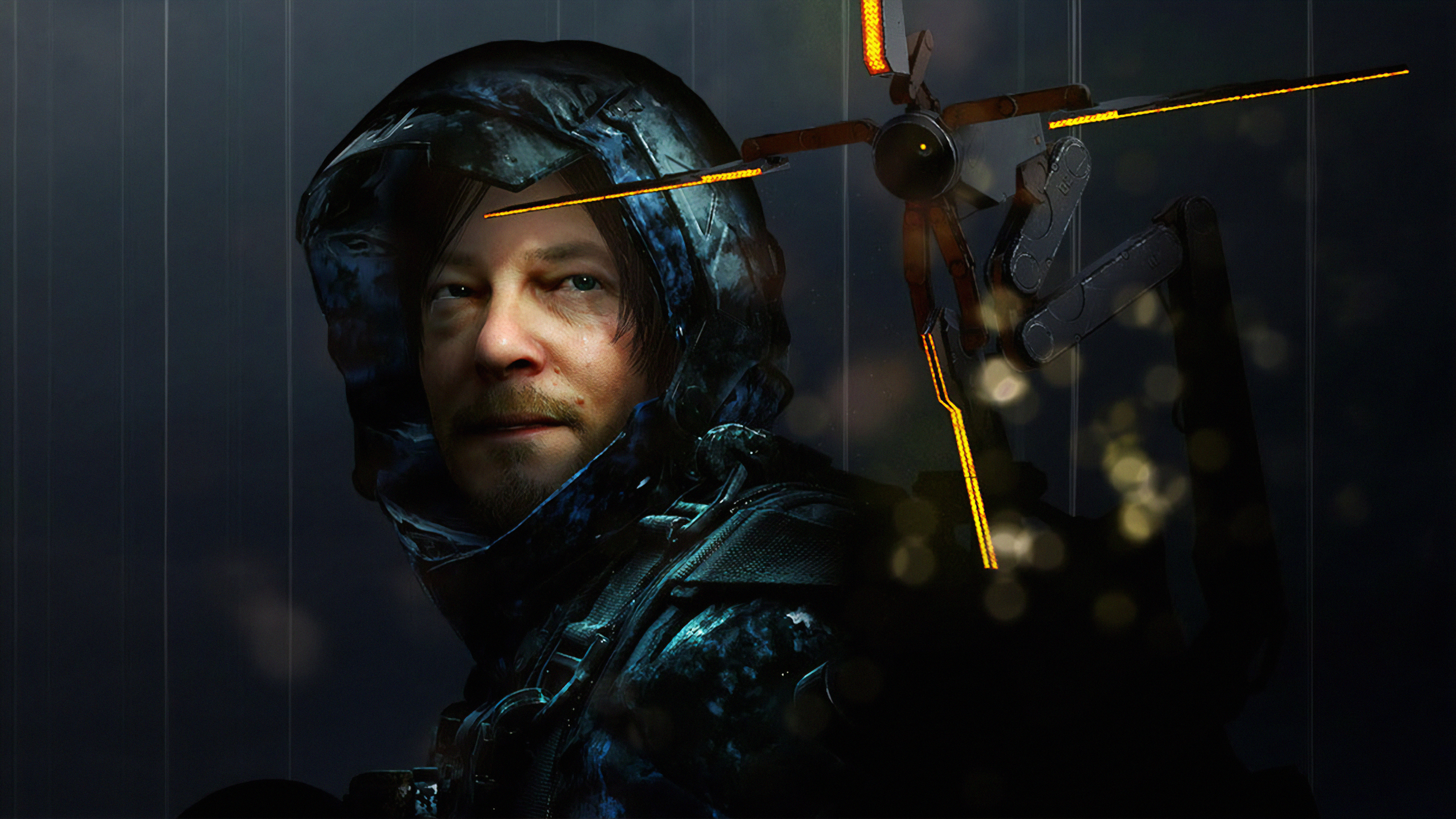
Kojima Productions centers navigation on terrain reading, balance, and line planning rather than waypoint chasing. Scanner pulses and footwear wear offer diegetic status without busy overlays. Player-placed signs, ladders, and zip-lines form a social guidance network. The minimalist UI lets landscapes and tools communicate your next move.
Share your favorite minimal-UI guidance moments in the comments and let us know which games we should add next!