20 Games With The Cleanest HUD Redesigns Over Time
Clean HUDs can make a game feel faster and more readable, and many studios have kept tuning their interfaces with patches, seasons, and sequels. The picks below each made specific changes that trimmed clutter and improved how information appears when you need it. You will see smarter fade behavior, better icon systems, and menus that surface key details without extra steps. These are practical upgrades players notice the moment they jump back in.
Cyberpunk 2077
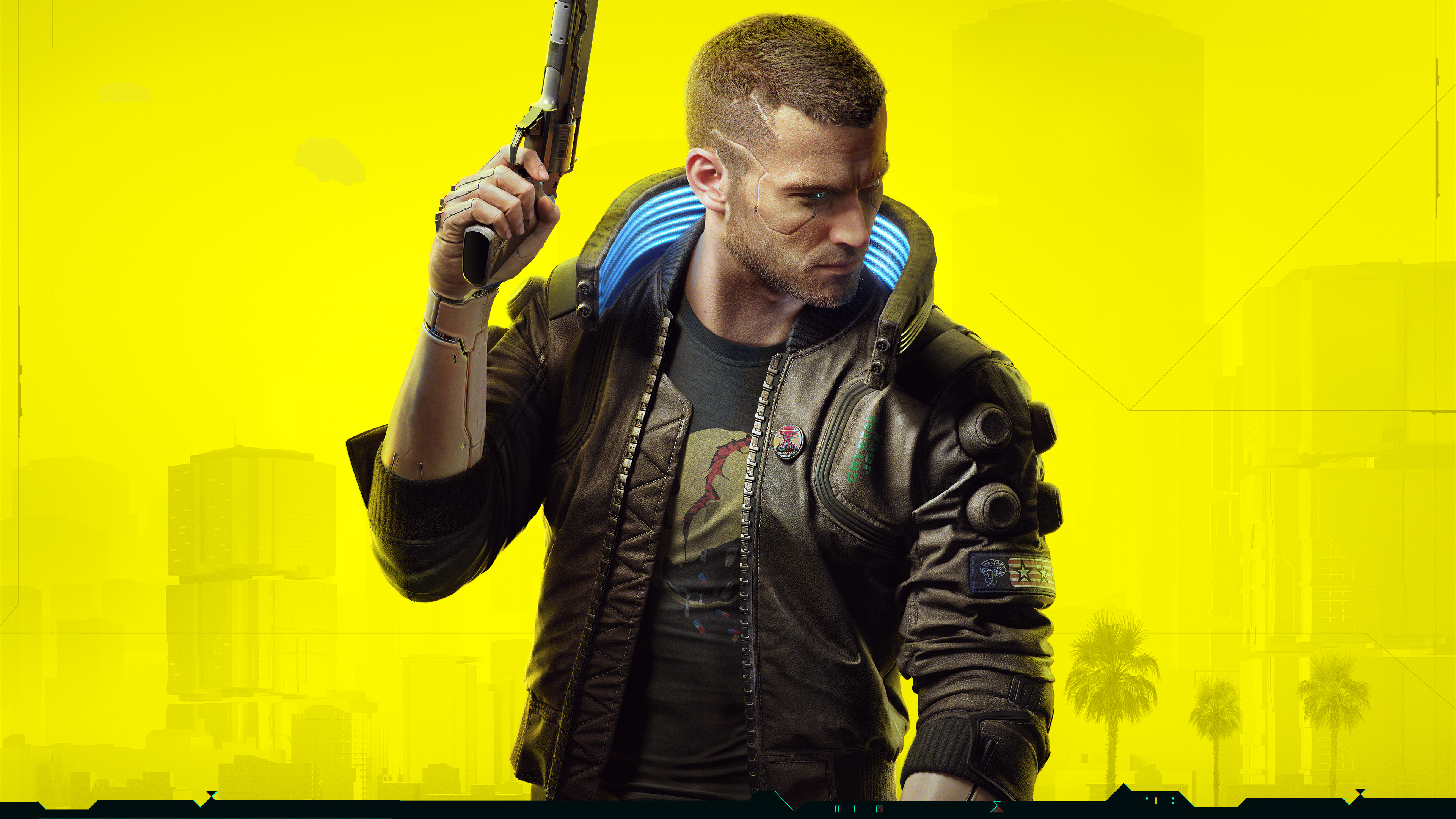
Major updates overhauled enemy markers, status effects, and police alerts so fights read clearly at a glance. The perk and cyberware screens were rebuilt to show summaries first and deeper stats on demand. Driving and combat widgets fade when idle to keep the city view open. Weapon swapping and item notifications were simplified to reduce overlapping prompts during action.
Helldivers 2

Interface passes clarified stratagem inputs with cleaner on screen callouts that appear only during activation. Armor, ammo, and reinforcement info was grouped near the reticle to shorten eye travel. Objective text and extraction timers were condensed so team chatter and threats stay visible. Frequent balance patches kept the HUD readable during heavy effects and large enemy waves.
Baldur’s Gate 3

Launch and post launch patches refined hotbars and context prompts so class actions sit in predictable slots. Inspect and examine panels now surface resistances and conditions without deep tabbing. Turn order and status icons gained clearer spacing to limit overlap in busy encounters. Controller layouts added radial groups that mirror the keyboard setup for quick muscle memory.
Marvel’s Spider-Man 2

The sequel streamlined traversal popups and moved ability cooldowns to cleaner corner clusters. Suit power and gadget indicators brighten only when available and dim once spent. Activity tracking collapsed into compact cards that can be pinned or hidden during free roaming. Photo friendly options let you pare the HUD to only health and objective crumbs.
Final Fantasy VII Rebirth
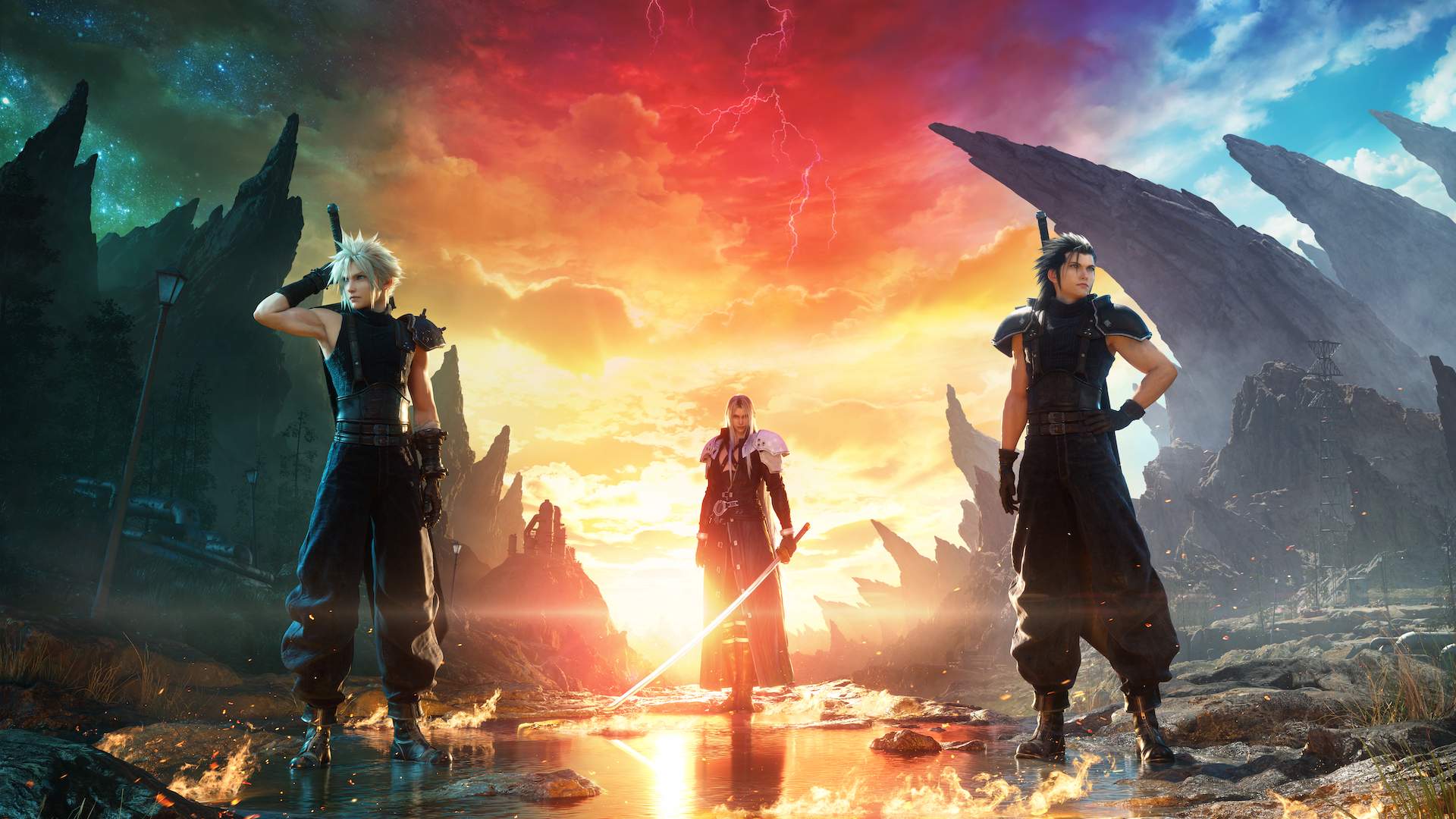
Party gauges and ability timers were resized and aligned so swaps and synergy skills are easy to read. Accessibility settings added opacity and size controls for key widgets. Map and quest panels combine tracking and rewards in one place to cut menu flips. Combat tips and tutorials now collapse after first use to keep the screen clear.
Diablo IV
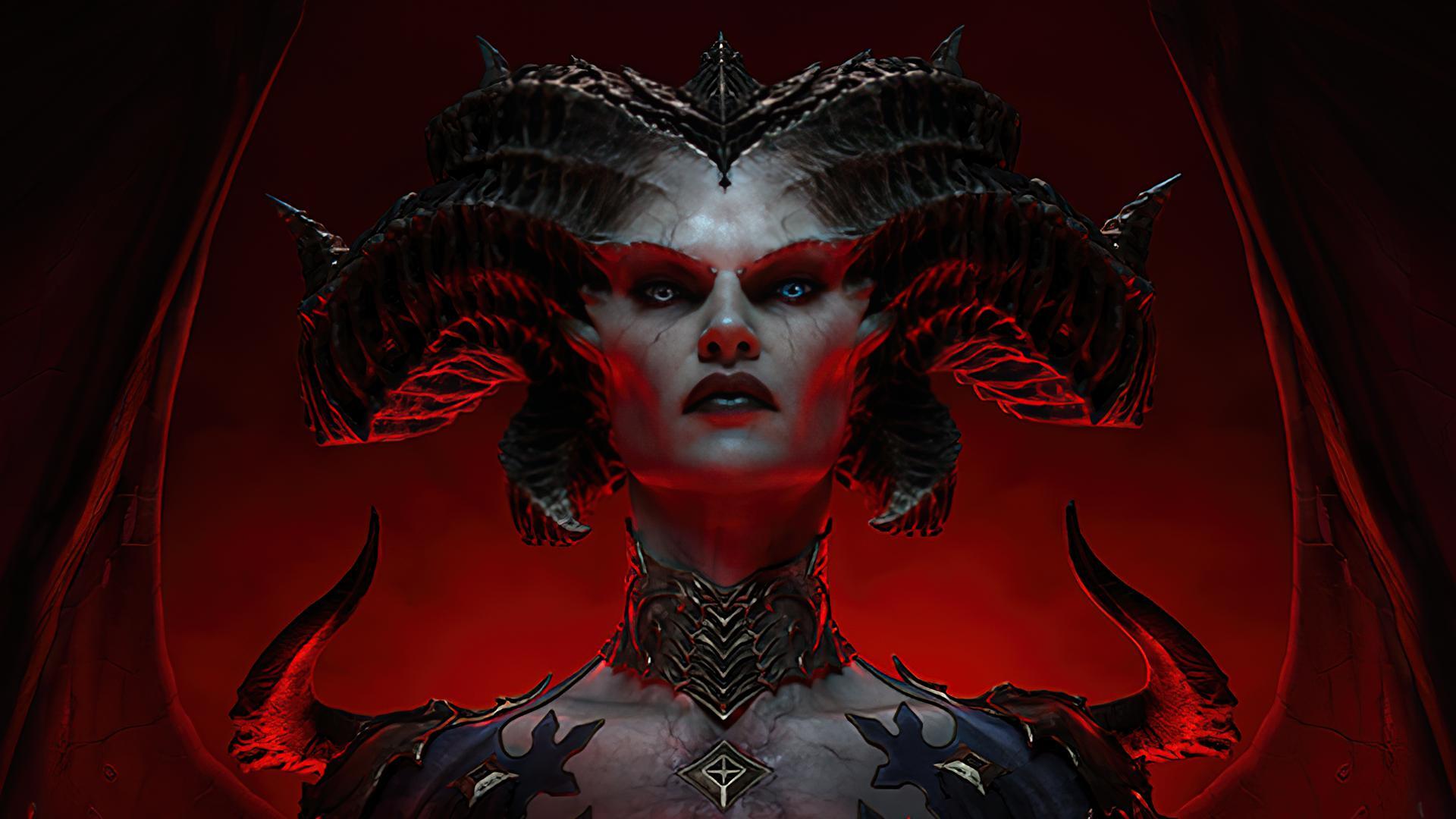
Seasonal updates reorganized the skill and paragon UIs to show build summaries before granular nodes. World event and whisper trackers were compressed into a single corner stack. Drop callouts prioritize upgrades and hide routine items after quick filters are set. Boss telegraphs and affix icons gained consistent shapes so threats parse faster.
Counter-Strike 2
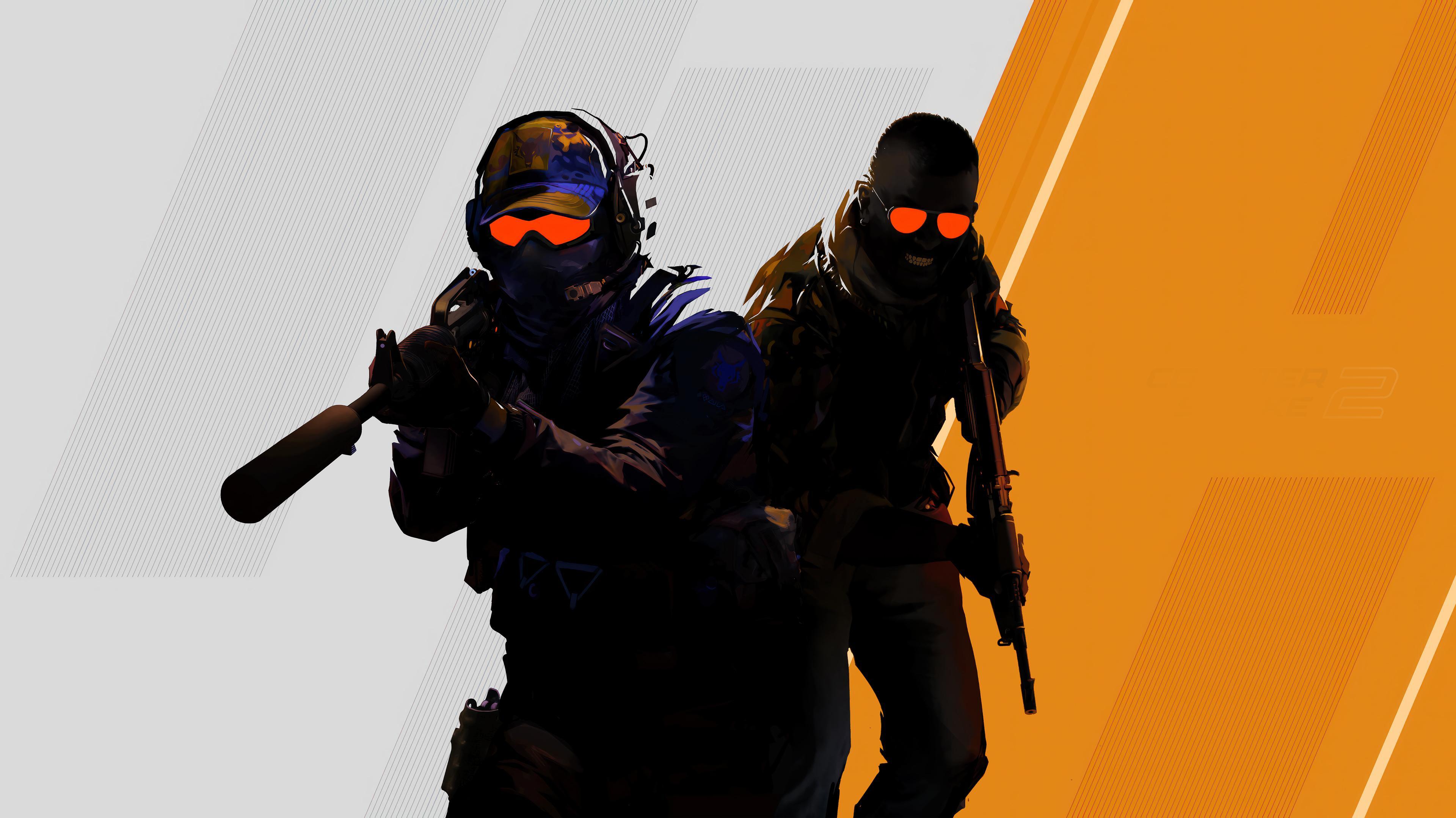
The move to the new engine brought a cleaner radar and simplified kill feed with steadier spacing. Money, armor, and utility are aligned to reduce flicking between corners. Grenade trajectory practice and buy menus highlight team loadouts without extra panels. Spectator and replay overlays were trimmed so key rounds read instantly.
The Finals
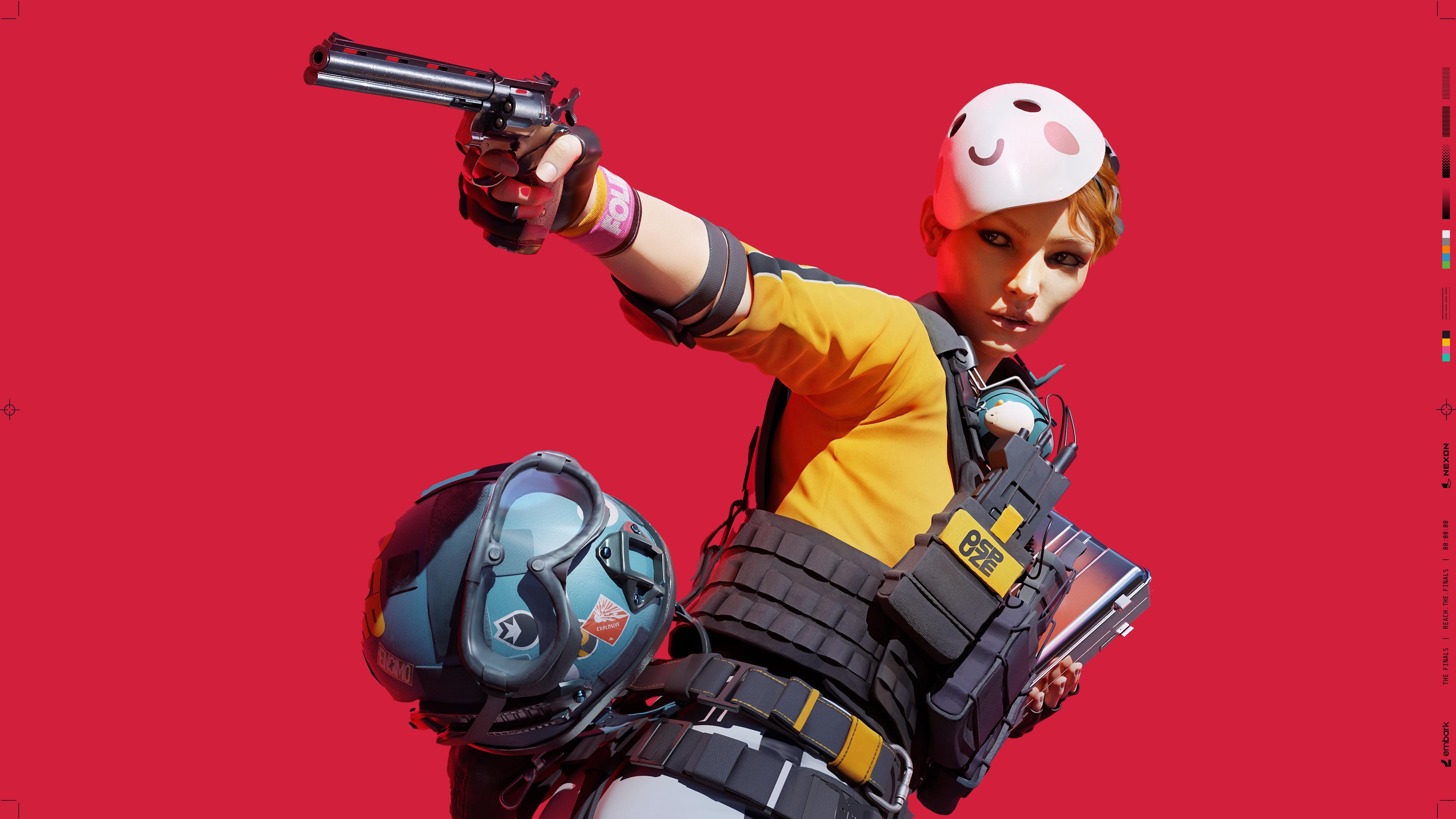
Seasonal passes tightened the scoreboard and team frames for better role clarity. Objective and cashout indicators were tuned so they stop stacking over players. Equipment and gadget wheels now group by category for faster selection under pressure. Damage, armor, and revive info pulses briefly and then fades to keep the center clean.
Starfield

Patches added HUD visibility toggles for scanning, ship readouts, and mission breadcrumbs. Compass and objective markers were spaced to prevent overlapping labels in cities. Ship combat consolidated shield, hull, and power routing into clearer bands. Inventory and outpost menus surfaced weight and resource links to reduce repeated tabbing.
Alan Wake 2

The interface leans on diegetic elements like the case board while keeping combat widgets minimal. Health, ammo, and flashlight charge appear only during threats or active aiming. Objective hints and puzzle clues were shifted to context popups that dismiss quickly. The menu layout groups investigation, upgrades, and collectibles to limit deep nesting.
Dragon’s Dogma 2
Updates added options to scale UI, tone down pawn chatter prompts, and reduce repeated tutorial cards. Quest tracking now favors concise steps rather than long text strings. Combat readouts for stamina and grabs were clarified so big monster fights stay readable. Map markers were reorganized to separate services from quest points.
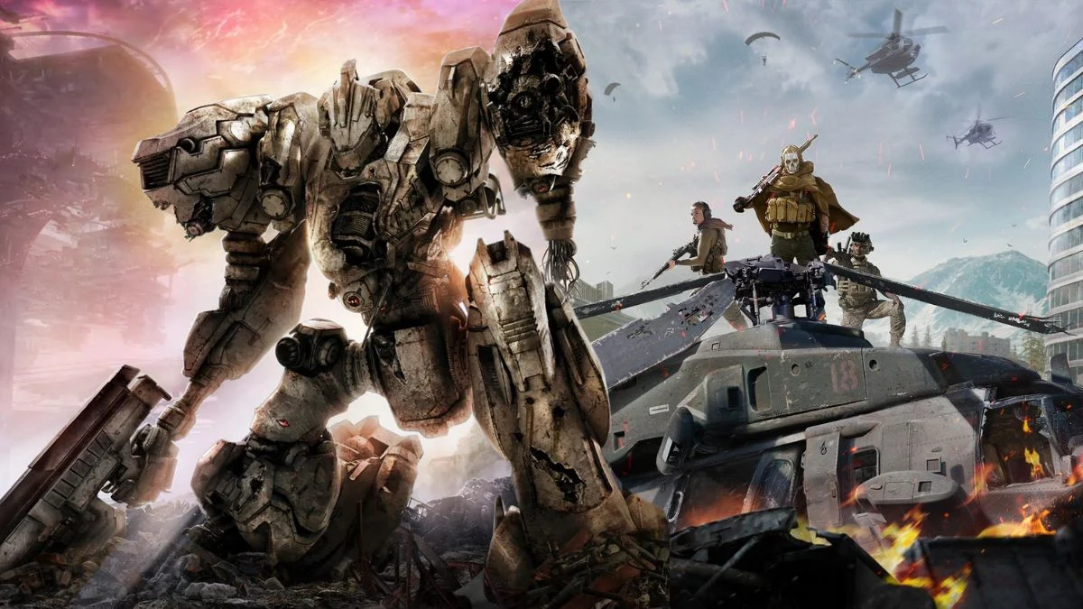
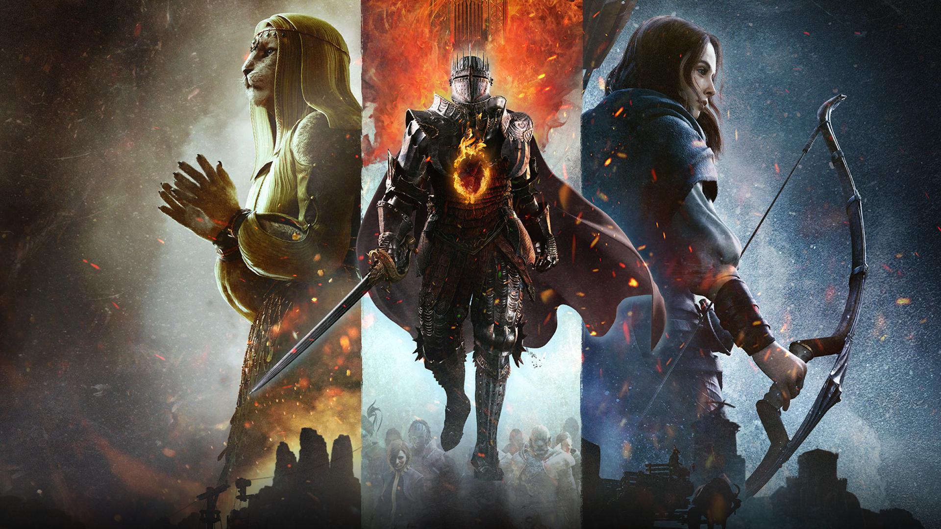
Armored Core VI: Fires of Rubicon
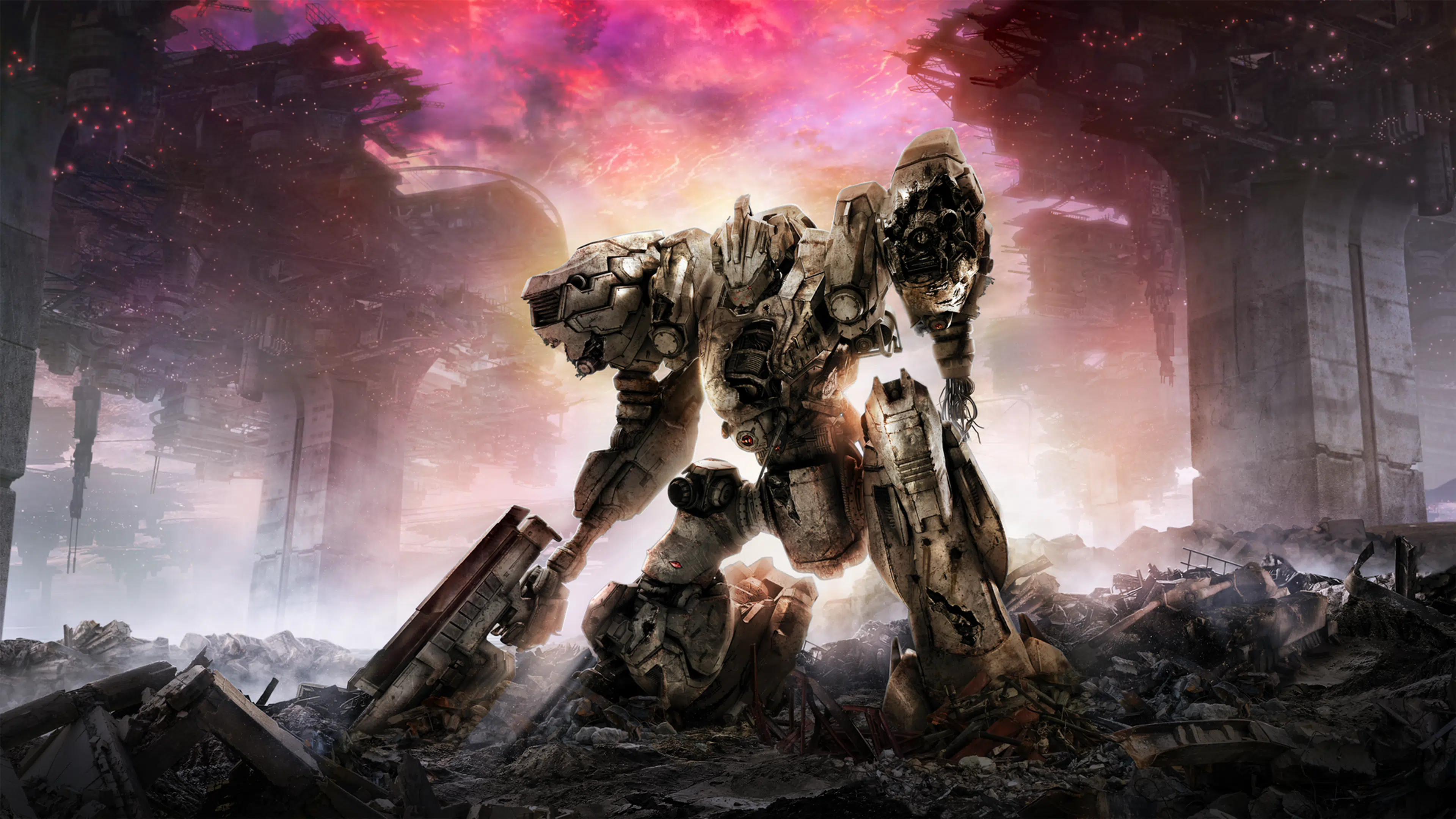
Targeting and lock indicators were brightened and centered to help with high speed tracking. Parts and build screens highlight weight and energy constraints in one summary bar. Mission objective updates moved to compact ticker style messages. Damage types and stagger windows use consistent icons that stay visible without covering targets.
Forza Motorsport

Racing overlays prioritize speed, lap delta, and track limits with better spacing from the center view. Tire and fuel widgets can be toggled per event type to avoid duplicate data. Replays and photo tools hide controls quickly so you can frame shots without UI edges. Accessibility presets adjust telemetry density for newcomers and advanced drivers.
Horizon Forbidden West
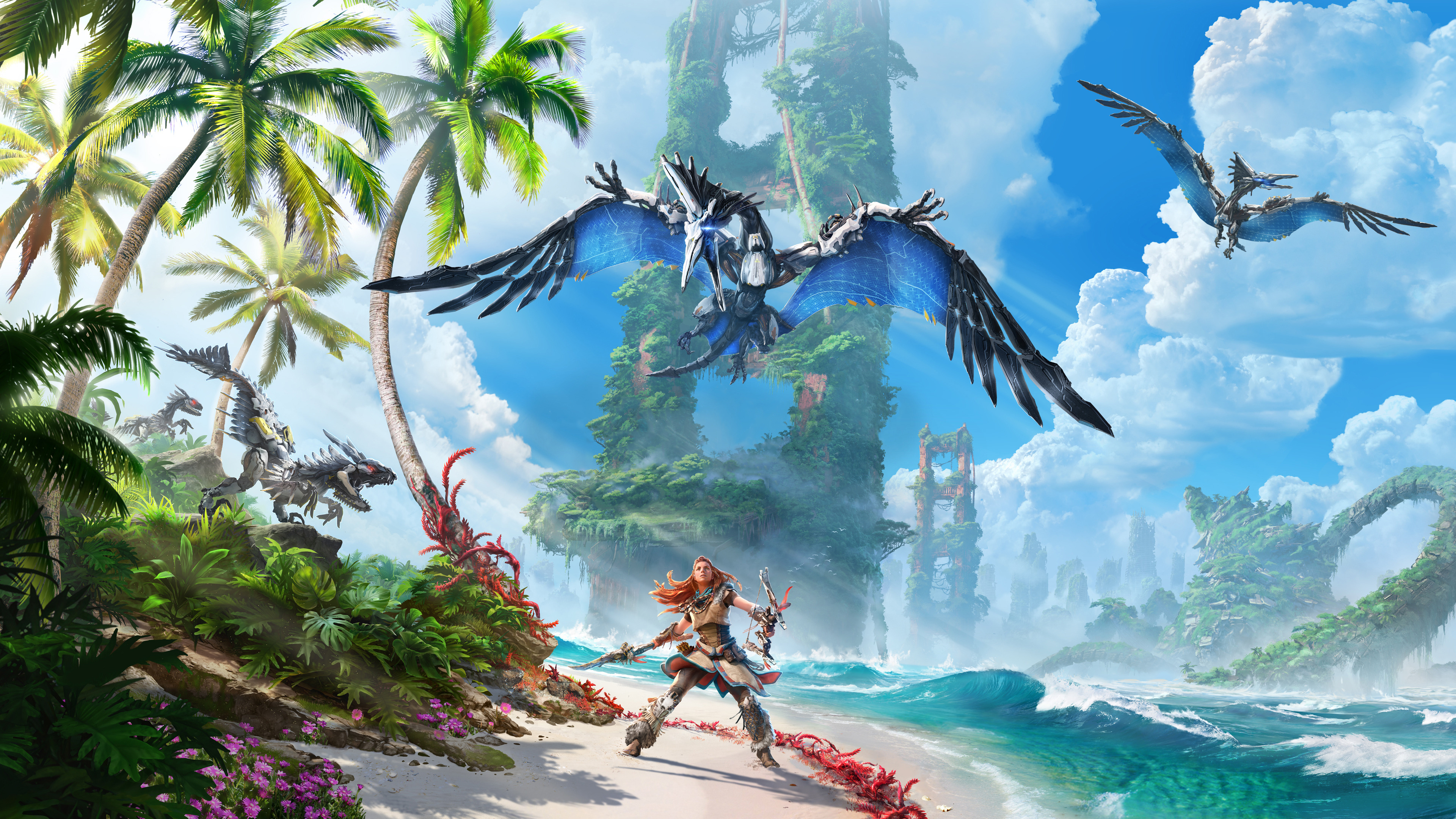
A dynamic HUD hides health, ammo, and tool readouts until you draw a weapon or craft. Focus highlights interactables in the world so fewer constant icons are required. Options let you pin objectives or auto hide them during exploration. Patch tuning improved font clarity and resize controls for long sessions.
Elden Ring
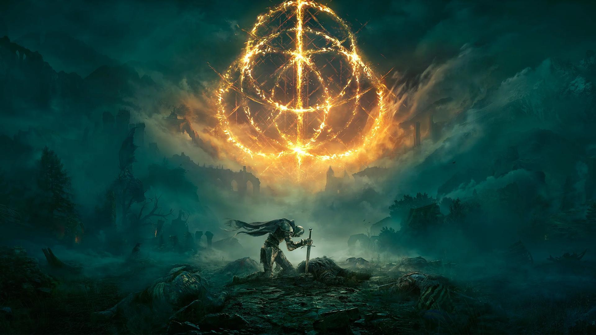
The default setup keeps UI elements hidden until combat or interaction begins. Players can set the HUD to auto show briefly after inputs and then fade again. Buffs, debuffs, and compass cues are compact so status checks are quick. Inventory screens surface weapon scaling and weight to reduce submenu hopping.
Destiny 2
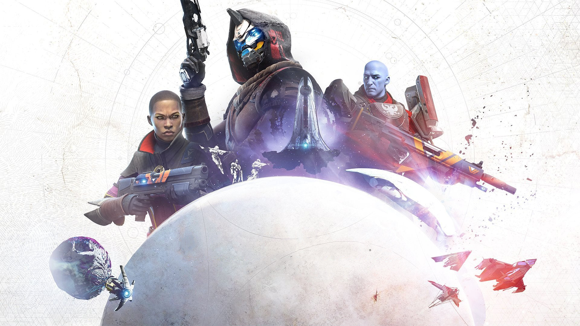
Regular tuning rebalanced ability timers, buff rows, and threat indicators for raids and competitive play. Buildcrafting screens now group armor mods and stats in one overview. Subclass UIs share icon language so you can swap kits without relearning panels. Exploration keeps patrol and activity cards minimized until you accept them.
Fortnite

The HUD editor lets you toggle quest tracking, party status, and widgets you do not need in a match. Map pings show distance and elevation with fewer constant labels. Weapon and resource bars were compressed so aiming space stays open. Performance and zero build modes trim nonessential prompts to emphasize situational awareness.
Apex Legends
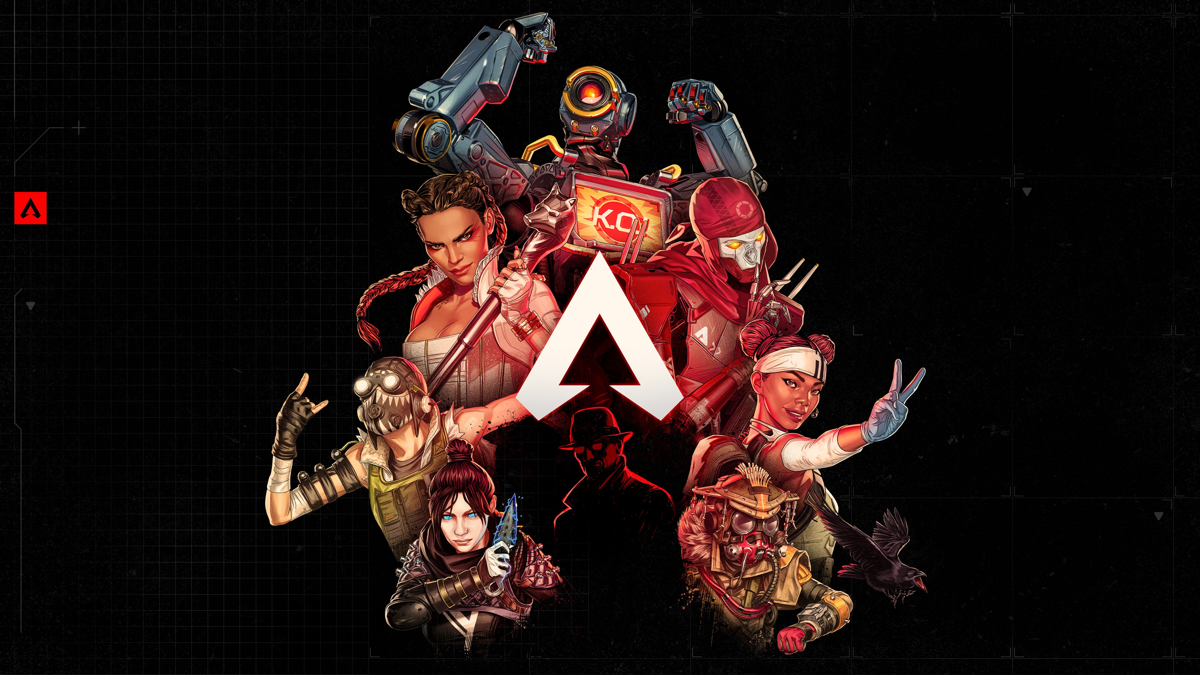
Shield and health bars use segmented designs that communicate swap decisions instantly. Ping prompts and teammate callouts appear only when marked to reduce baseline noise. Inventory highlights attachment compatibility so you spend less time sorting. Ongoing seasons refine the kill feed and banner spacing for faster parsing.
Call of Duty: Warzone
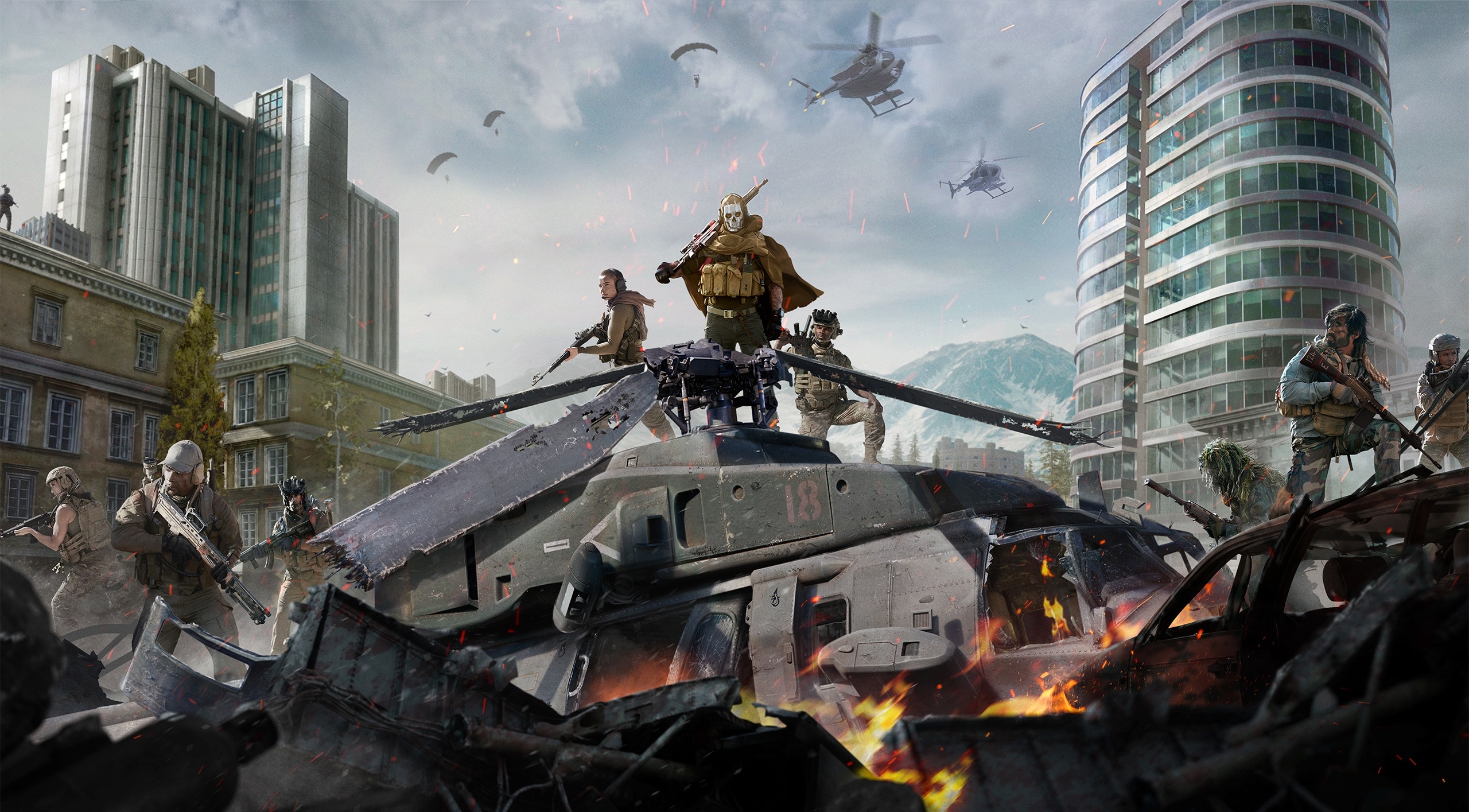
Plating, ammo, and cash indicators were reorganized to stop overlapping the center action. Contract and event text was grouped in collapsible panes that you can ignore during fights. Circle timers and gas info use clearer typography and spacing for quick reads. HUD scale and opacity options help different screens and viewing distances.
No Man’s Sky
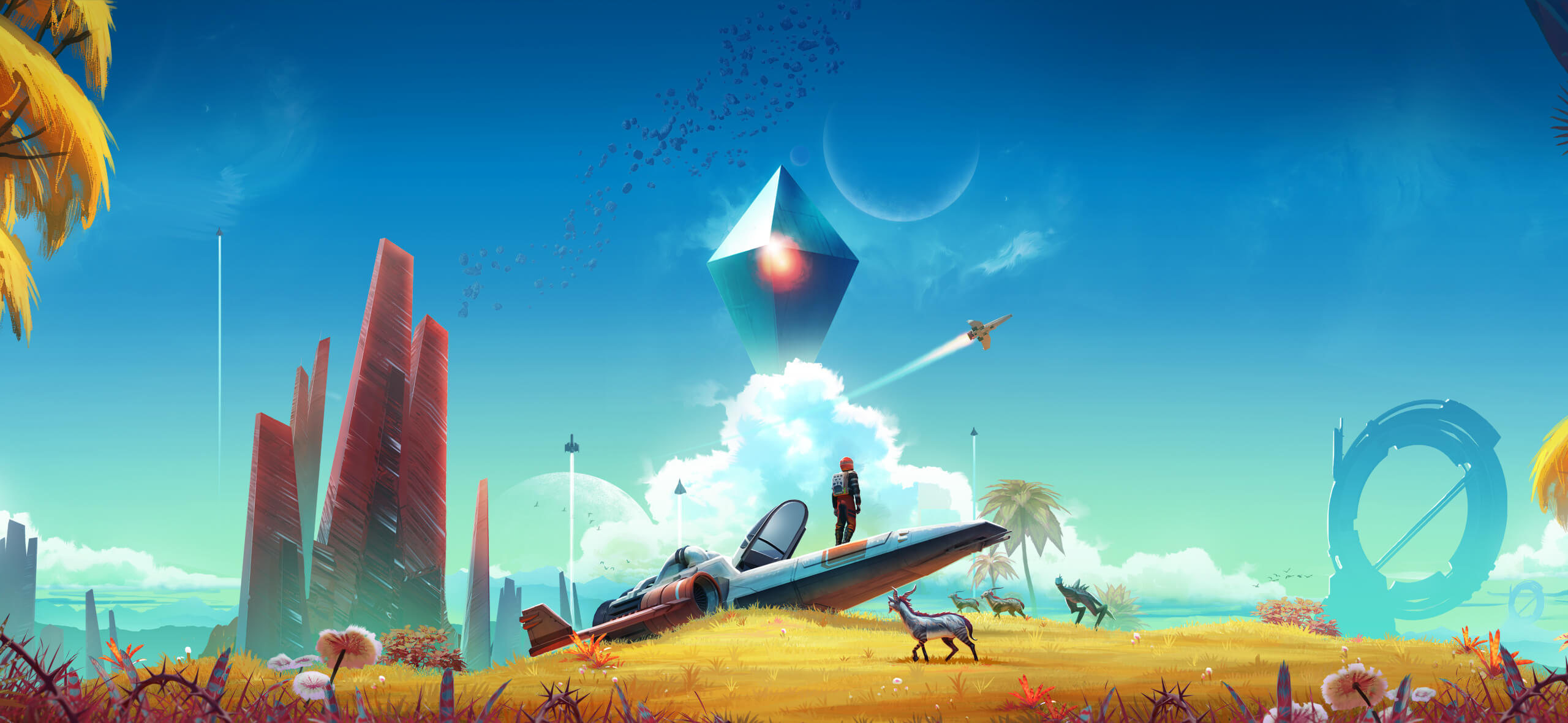
Multiple updates shifted routine readouts into context popups during flight, scanning, and survival events. The quick menu consolidates tools and summons so fewer panels linger. Icons and fonts were standardized across space, planets, and inventory for easier scanning. Minimal exploration presets keep only hazard and life support visible until danger rises.
Share your picks for smart HUD glow ups in the comments and tell us which recent games cleaned things up the best.