25 Iconic Movie Posters That Are Better Than the Trailers
Movie marketing often relies on explosive trailers to sell a film to mass audiences but sometimes the still images leave a longer lasting impression. A great poster captures the essence of a narrative through composition and color without revealing too many plot points. These singular pieces of art can transcend the promotional cycle to become cultural touchstones that stand independently from the footage they advertise. The following films feature key art that arguably outshines their respective theatrical previews through sheer design excellence.
‘Star Wars: Episode I – The Phantom Menace’ (1999)
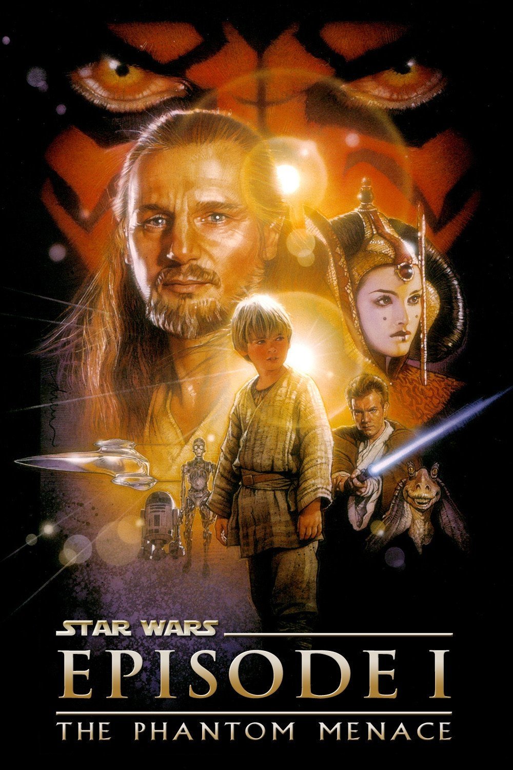
The teaser poster for this prequel features young Anakin Skywalker casting the shadow of Darth Vader against a rustic Tatooine building. This visual metaphor perfectly encapsulates the tragic trajectory of the entire trilogy without showing a single lightsaber or space battle. It promises a character study about the loss of innocence and the rise of a galactic tyrant. The image remains one of the most potent pieces of visual storytelling in the entire franchise history.
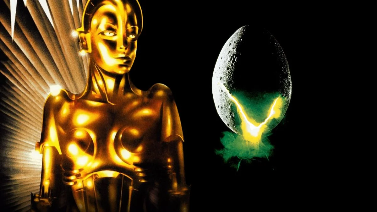
‘Alien’ (1979)
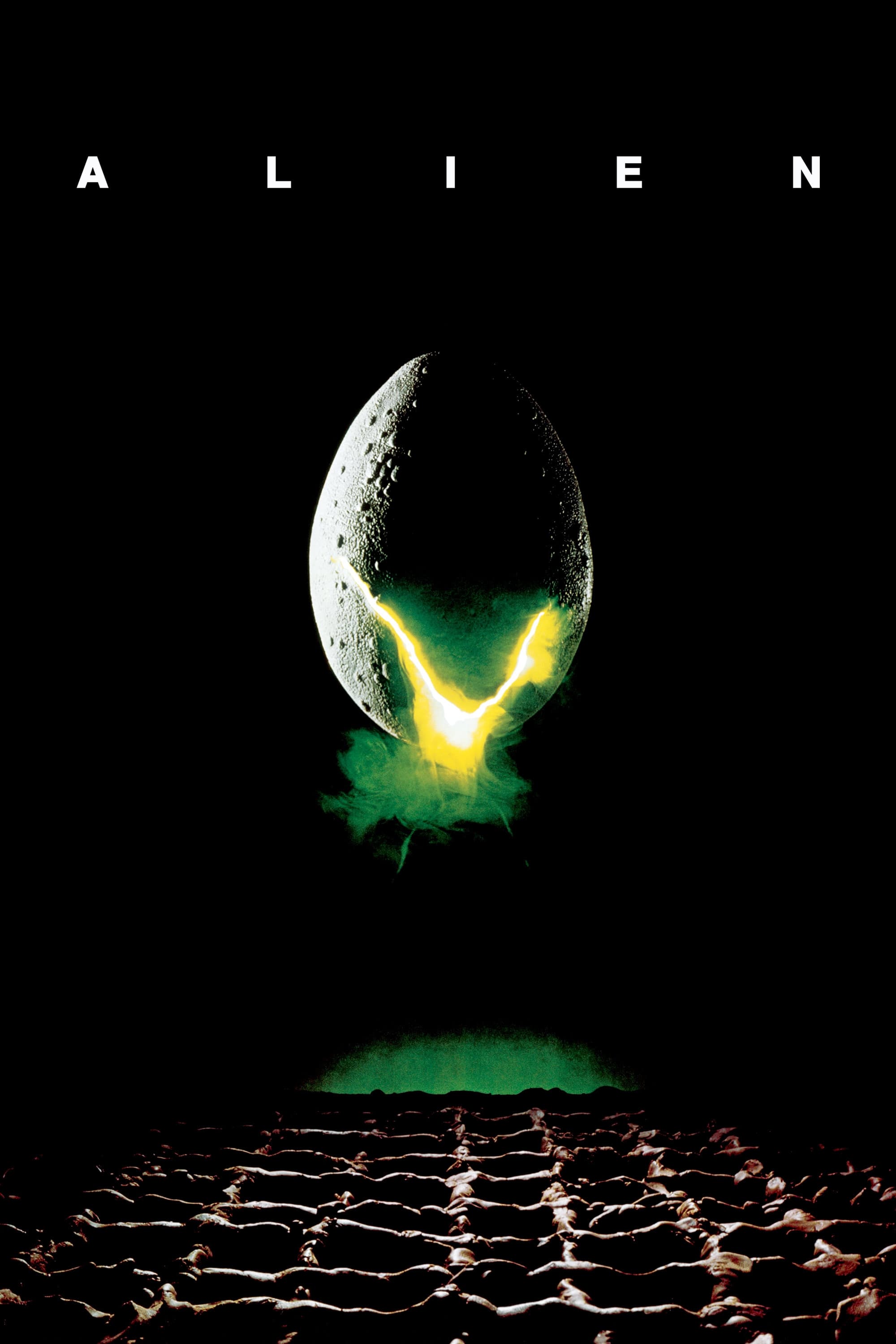
The design features a cracking egg hovering over a mysterious grid with a glowing light breaking through the shell. The tagline states that in space no one can hear you scream and reinforces the theme of absolute isolation. This minimalist approach creates a sense of dread that is far more effective than the quick cuts found in the original theatrical trailer. It relies on the fear of the unknown to sell the premise of this science fiction horror classic.
‘The Social Network’ (2010)

Key art for this biographical drama displays the face of Jesse Eisenberg covered by a browser bar and the tagline regarding the cost of success. The bold typography and the intense stare of the protagonist convey the themes of ambition and betrayal central to the narrative. It creates a modern and digital aesthetic that defines the tone of the film instantly. This graphic treatment became an instant classic that inspired countless parodies and homages across the internet.
‘Jaws’ (1975)
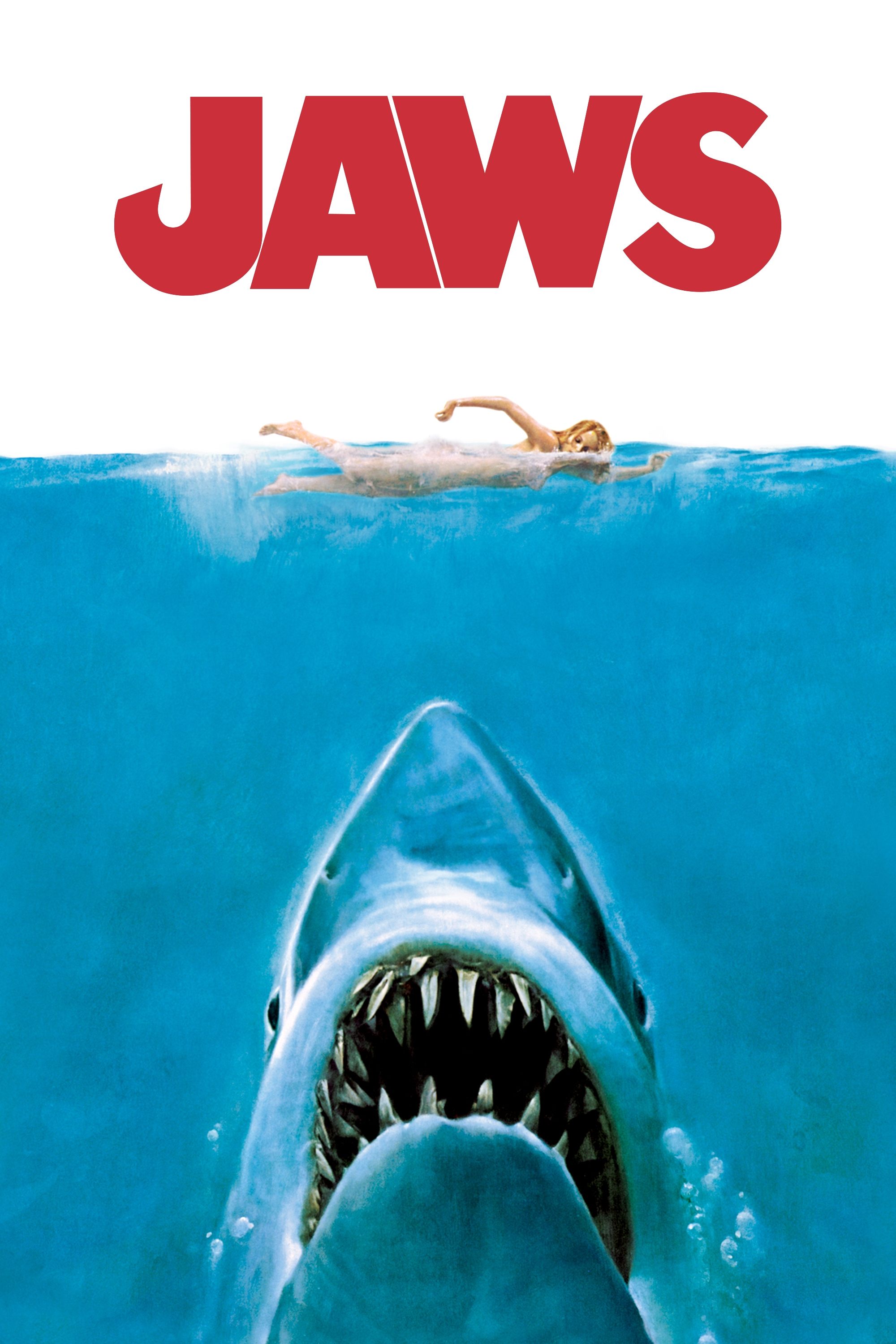
Roger Kastel created an image of a massive great white shark rising from the depths toward an unsuspecting female swimmer. The composition plays on primal fears of what lurks beneath the surface of the water. It effectively communicates the high stakes and terror of the film without needing to show the mechanical shark in motion. This artwork became the definitive visual representation of the summer blockbuster phenomenon.
‘The Silence of the Lambs’ (1991)
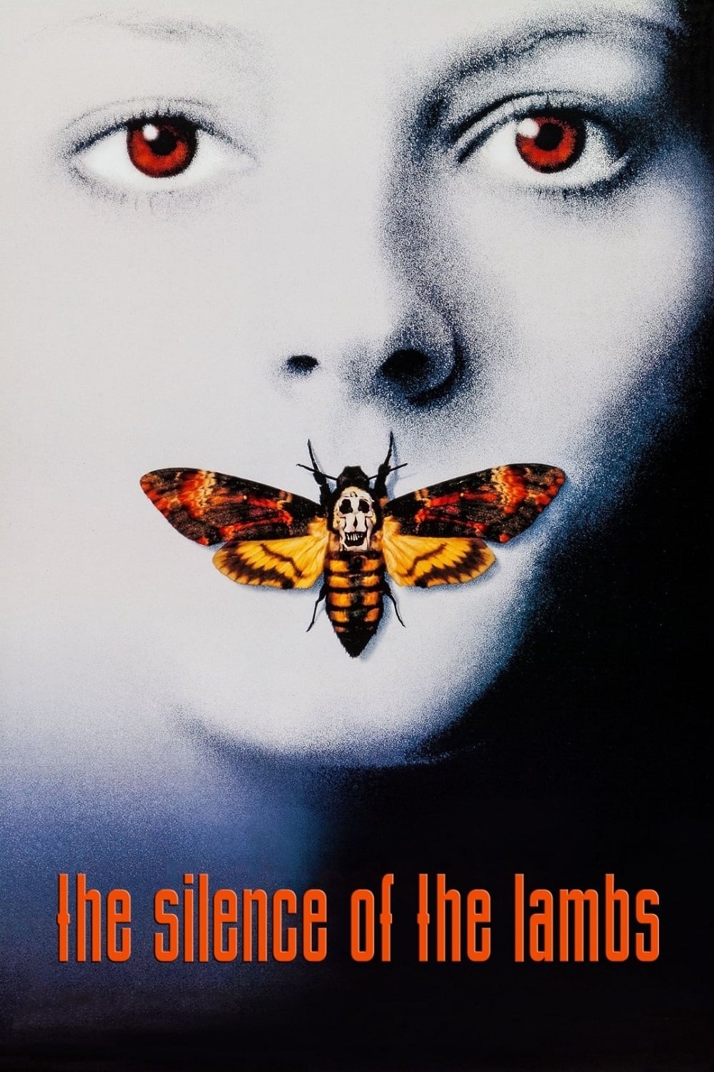
The poster showcases the pale face of Jodie Foster with a death’s-head hawkmoth covering her mouth. Closer inspection reveals that the skull on the moth is actually a composition of naked women from a photograph by Salvador Dalí. This intricate detail adds layers of psychological horror and artistic depth to the marketing campaign. It remains a haunting image that signals the twisted and complex nature of the thriller.
‘Vertigo’ (1958)
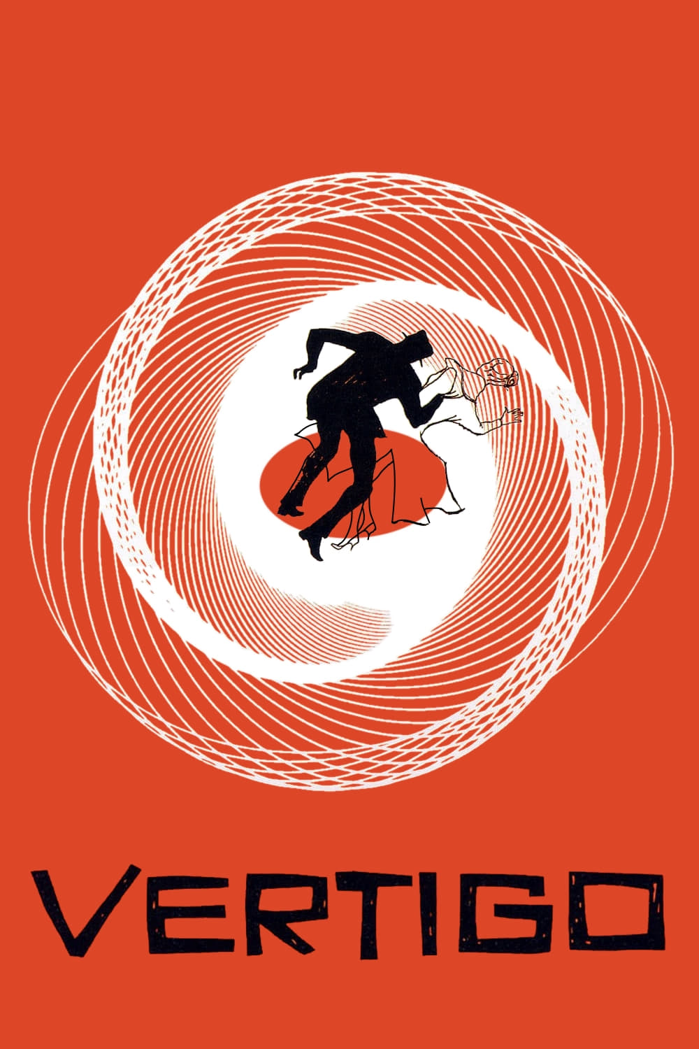
Graphic designer Saul Bass created a dizzying array of spirals to represent the acrophobia and obsession central to the plot. The bright orange background contrasts with the silhouette of a falling man to create visual disorientation. This abstract representation captures the psychological instability of the protagonist better than any standard reel of footage. It stands as a masterpiece of mid-century graphic design that revolutionized film promotion.
‘A Clockwork Orange’ (1971)
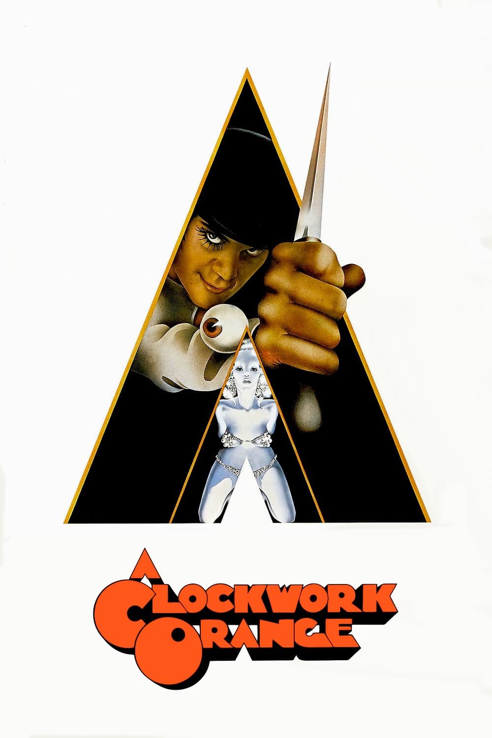
Philip Castle designed the artwork featuring the protagonist Alex DeLarge wielding a knife inside a triangular frame. The stark white background and the menacing expression of the lead character create an immediate sense of unease. It encapsulates the violent and dystopian themes of the film with a pop art sensibility. The image is provocative and memorable enough to define the cult status of the movie on its own.
‘Metropolis’ (1927)
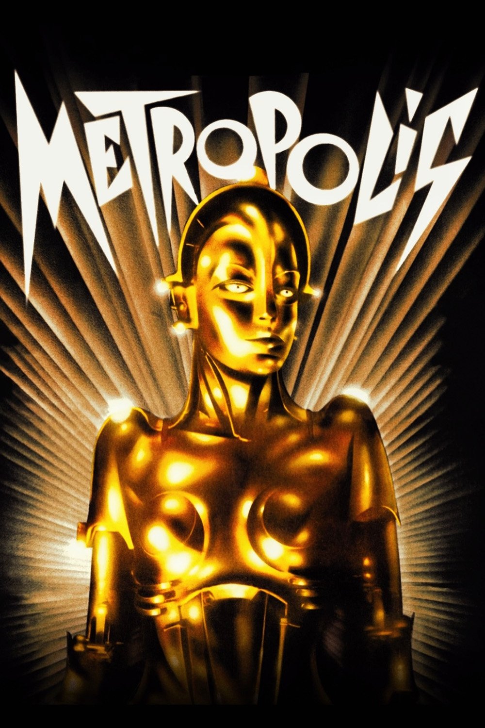
The art deco poster by Heinz Schulz-Neudamm presents the robot Maria against a backdrop of towering skyscrapers and geometric beams. Its sharp angles and futuristic aesthetic perfectly visualize the themes of industrialization and class struggle. Copies of this original lithograph are among the most valuable and sought after in the world of collecting. The design conveys the scale and ambition of the silent masterpiece more effectively than surviving footage.
‘E.T. the Extra-Terrestrial’ (1982)
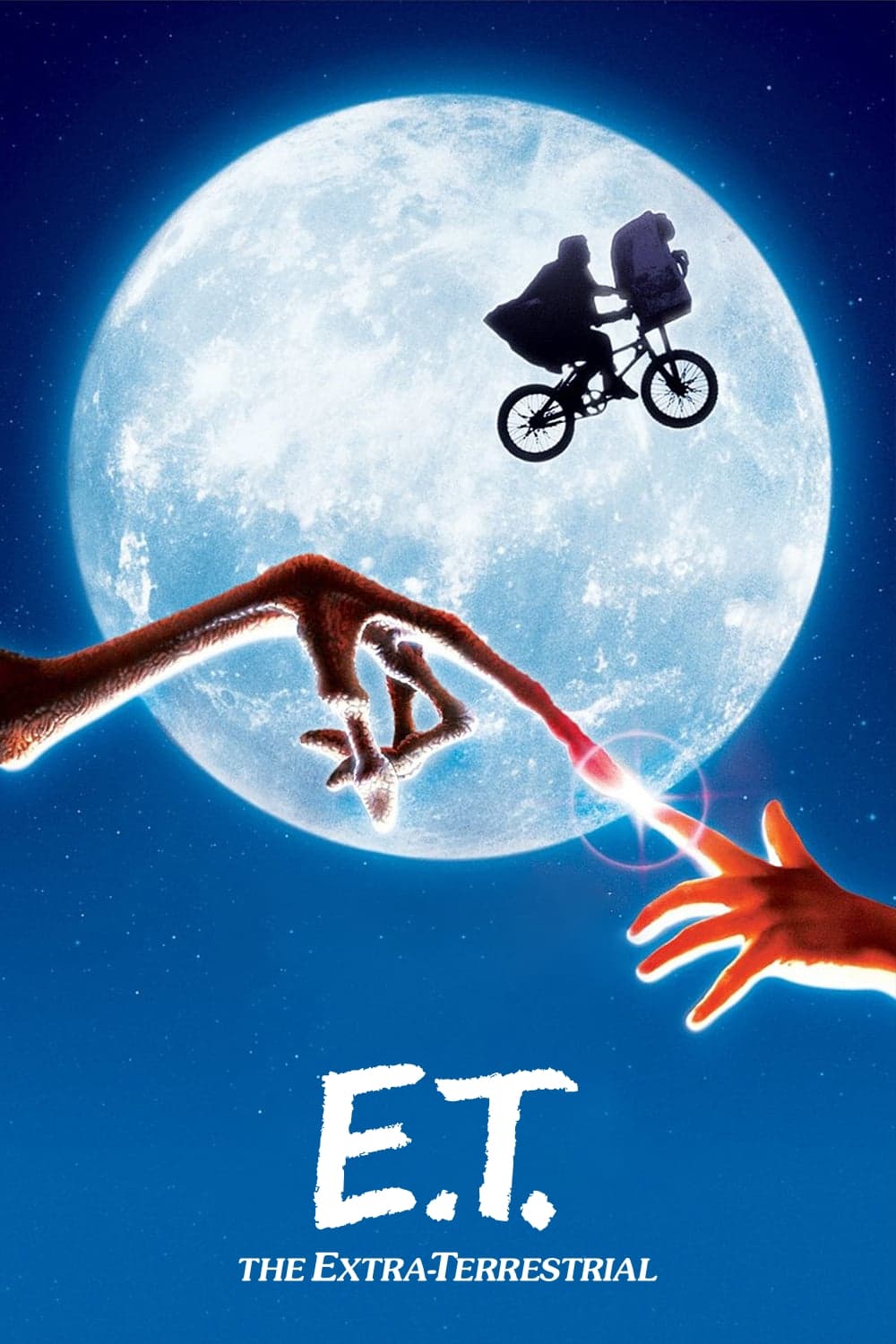
The image of a human finger touching a glowing alien finger mimics the composition of Michelangelo’s The Creation of Adam. It symbolizes the connection and friendship between two different species at the heart of the story. The star-filled background emphasizes the cosmic origin of the visitor while keeping the focus on intimacy. This poster evokes an emotional response that captures the wonder of the film without revealing the creature design.
‘Jurassic Park’ (1993)

Chip Kidd designed the iconic logo featuring a T-Rex skeleton silhouette against a red and yellow background. The decision to use a fossil rather than a living dinosaur builds mystery and links the film to the scientific concept of extinction. It serves as both the in-world branding for the park and the marketing symbol for the movie itself. This duality makes the design incredibly versatile and instantly recognizable across the globe.
‘Pulp Fiction’ (1994)
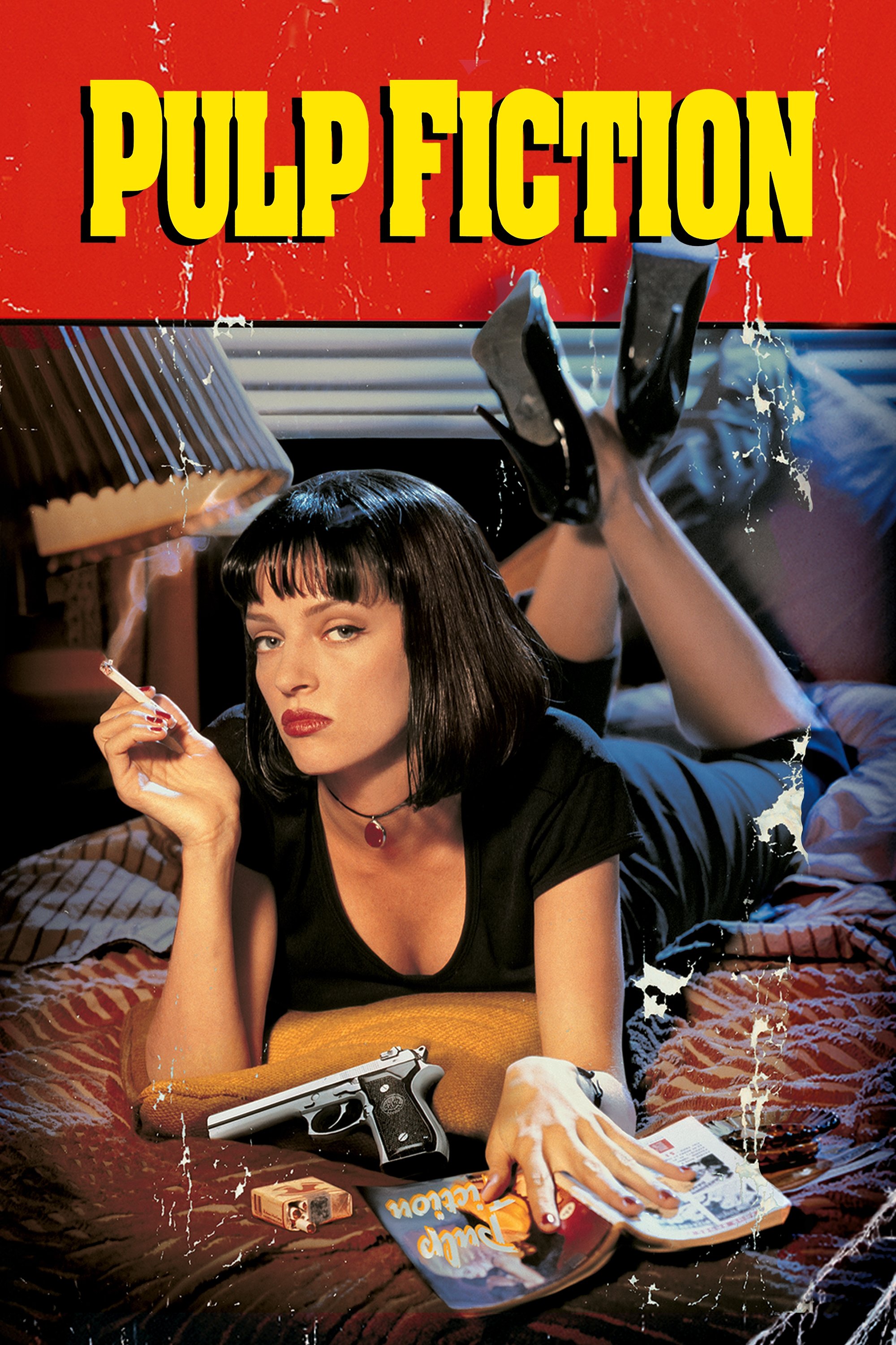
The poster resembles the cover of a cheap dime store novel with Uma Thurman smoking a cigarette on a bed. Surrounding props like a gun and a pack of cigarettes hint at the crime and noir elements of the anthology story. The scratched texture and bold title font evoke a retro aesthetic that matches the directorial style of Quentin Tarantino. It sells a mood of cool detachment and vintage homage that became synonymous with 1990s independent cinema.
‘The Exorcist’ (1973)

Bill Gold designed the atmospheric image of Father Merrin standing outside a lit house in the fog. The contrast between the beam of light from the window and the surrounding darkness suggests a battle between good and evil. It sets a somber and terrifying mood without showing any supernatural effects or possessed children. The stillness of the image makes the anticipation of the confrontation even more frightening.
‘Moon’ (2009)
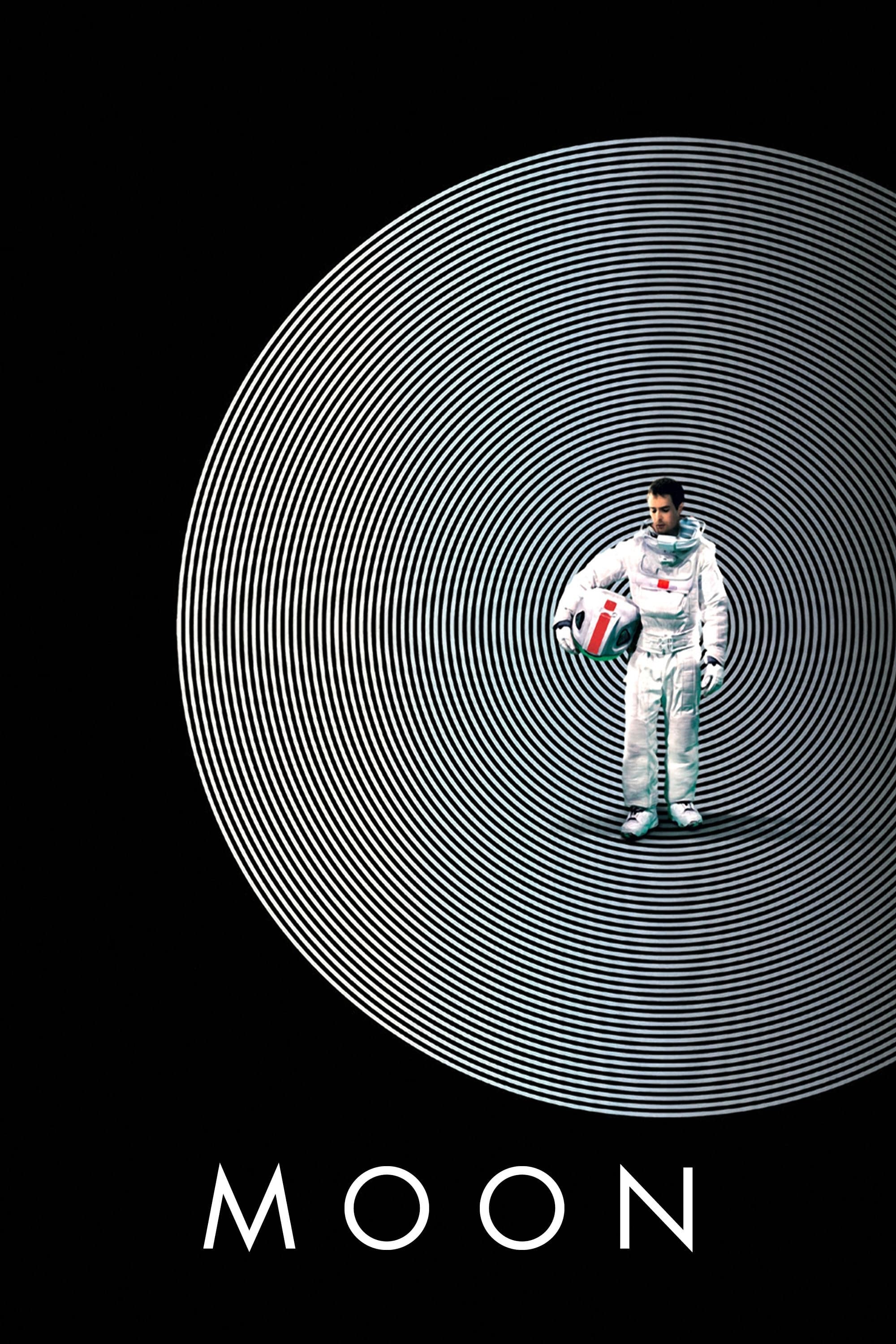
The artwork features Sam Rockwell surrounded by concentric circles that create a hypnotic and disorienting tunnel effect. This geometric pattern reflects the repetitive and isolating nature of the protagonist’s tenure on the lunar base. The design channels the aesthetic of 1970s sci-fi graphics while hinting at the psychological unraveling within the plot. It creates a visual puzzle that draws the viewer in to investigate the mystery of the film.
‘Little Miss Sunshine’ (2006)
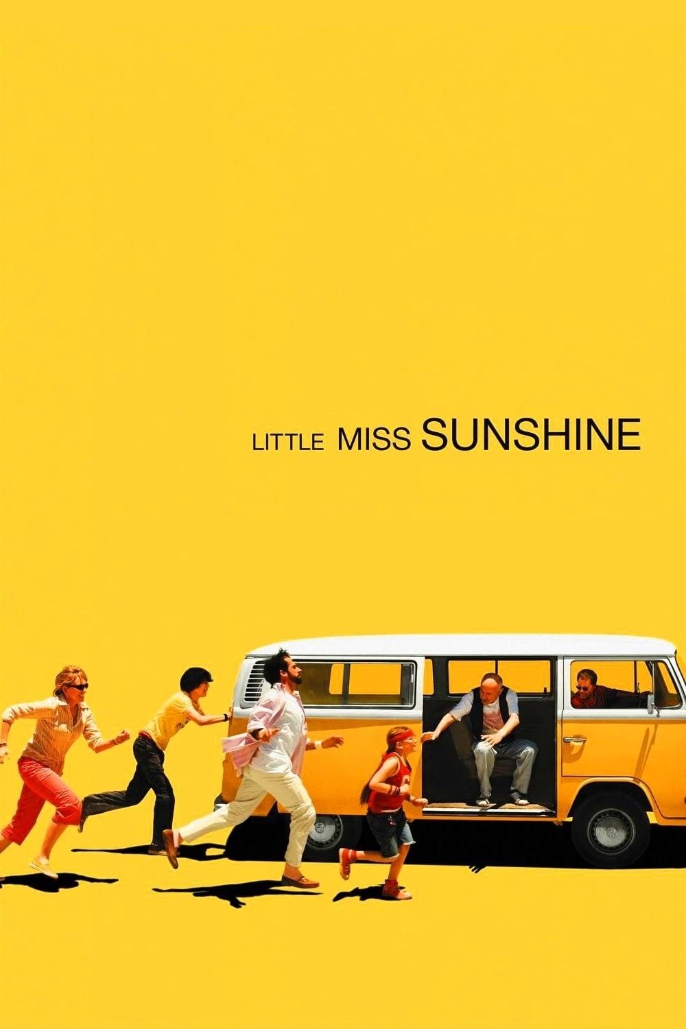
A bright yellow background frames the main cast running desperately toward a VW bus. The vibrant color and the kinetic energy of the characters signal the comedic and chaotic tone of the road trip movie. It efficiently introduces the ensemble cast and their dysfunction without saying a word. The distinctive yellow hue allows the poster to pop visually against more traditional movie marketing materials.
‘American Beauty’ (1999)
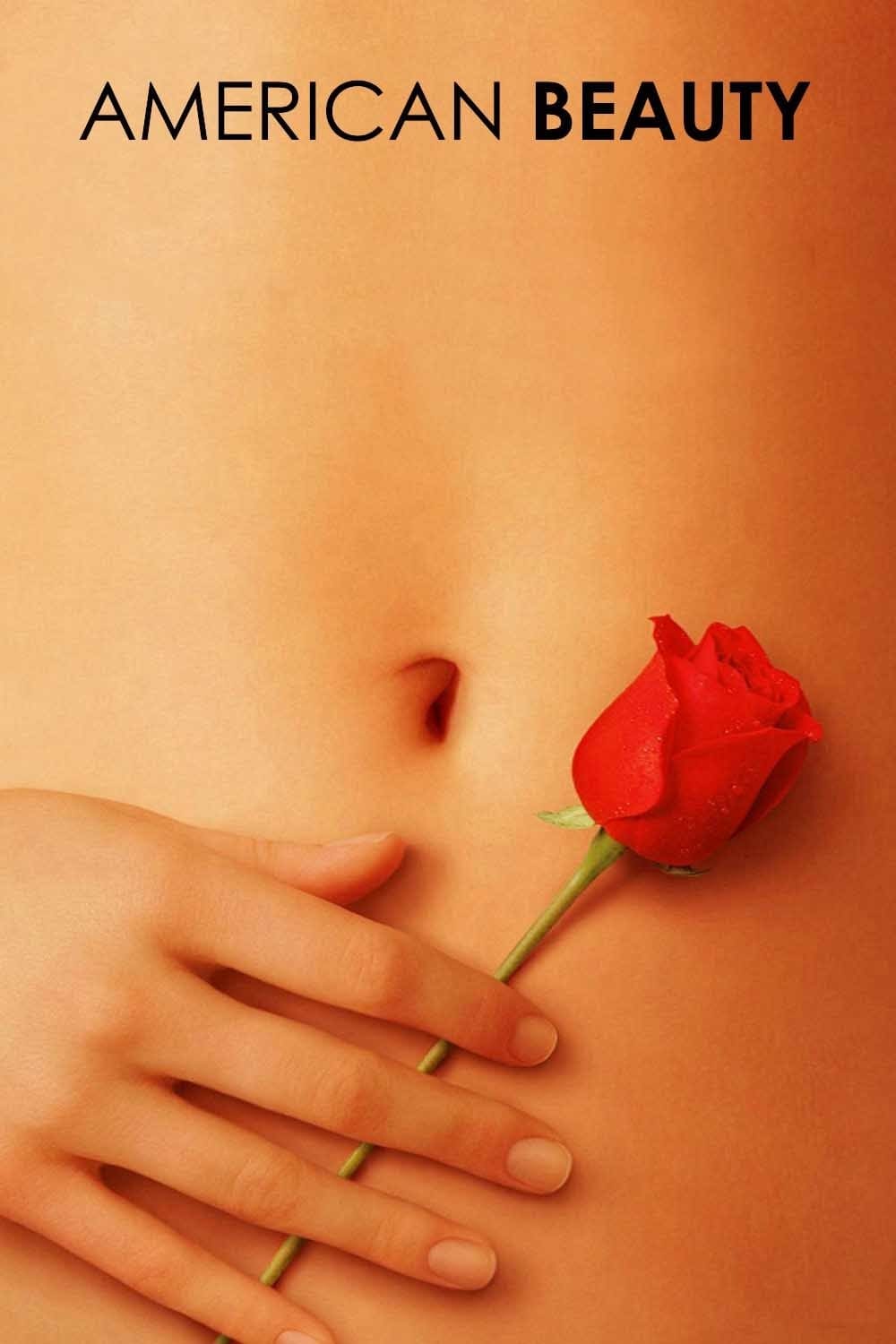
The image features a midriff holding a single red rose against the skin. It alludes to the fantasies of the protagonist and the themes of desire and beauty found in mundane places. The composition is simple yet provocative and captures the suburban satire element of the story. This visual became the defining symbol of the film and overshadowed the actual trailer footage in pop culture memory.
‘The Truman Show’ (1998)
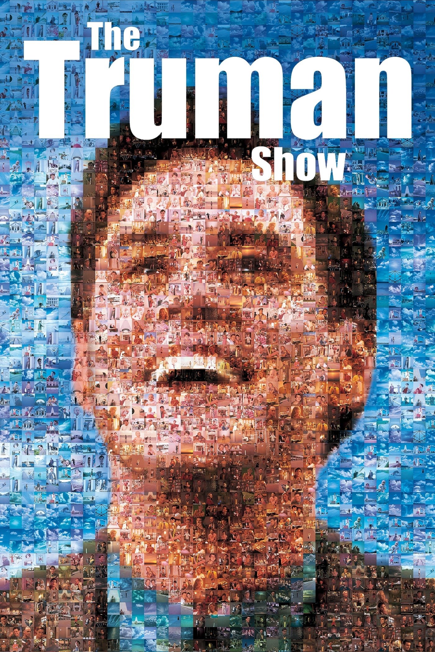
The poster is a photomosaic of Jim Carrey’s face constructed from hundreds of smaller images of scenes from the film. This visual trick represents the idea that the protagonist’s entire life is fabricated for the entertainment of others. It brilliantly communicates the high concept premise of a reality TV existence through a single static image. The design invites closer inspection which parallels the voyeuristic nature of the movie’s audience.
‘Scarface’ (1983)

Al Pacino stands in a split black and white composition holding a weapon with bold red lettering splitting the frame. The stark contrast represents the binary nature of his rise and fall within the criminal underworld. It is a minimalist design that exudes power and aggression fitting for the gangster genre. This poster became a staple of pop culture and dorm room decor due to its striking simplicity.
‘Trainspotting’ (1996)
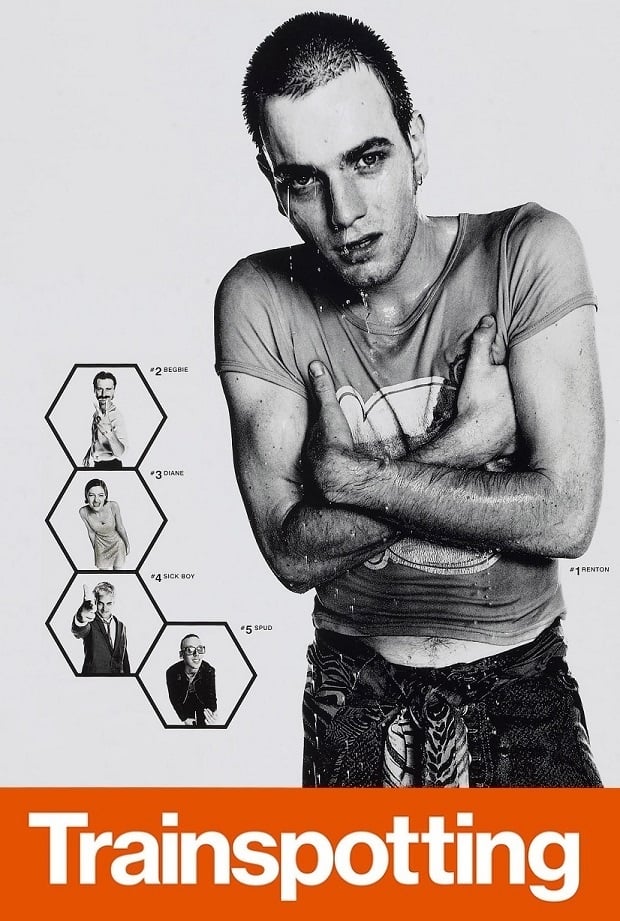
The marketing campaign utilized a layout featuring the characters in black and white strips with bright orange Helvetica typography. It mimics the warning labels on prescription medication or hazardous materials. This stylistic choice emphasizes the drug culture themes and the rebellious energy of the Scottish setting. The bold graphic identity helped the film stand out as a defining piece of the Cool Britannia era.
‘Rosemary’s Baby’ (1968)
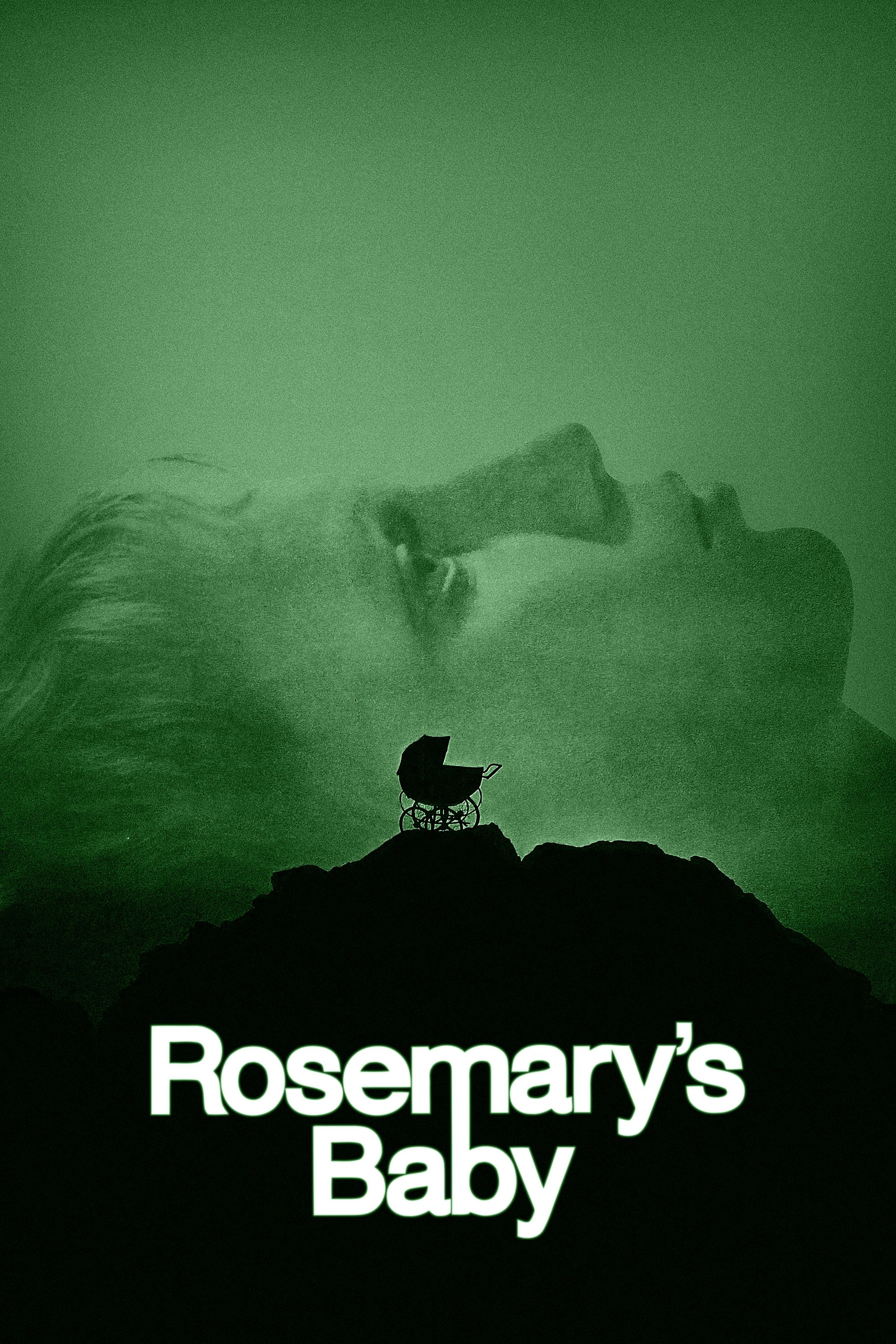
A pram sits in silhouette on a rocky precipice while the face of Mia Farrow looms in the background. The green tint and the tagline about praying for the baby create an atmosphere of sickness and unease. It suggests the danger surrounding the unborn child without showing any explicit horror elements. This psychological approach effectively markets the film as a sophisticated thriller rather than a standard monster movie.
‘Full Metal Jacket’ (1987)
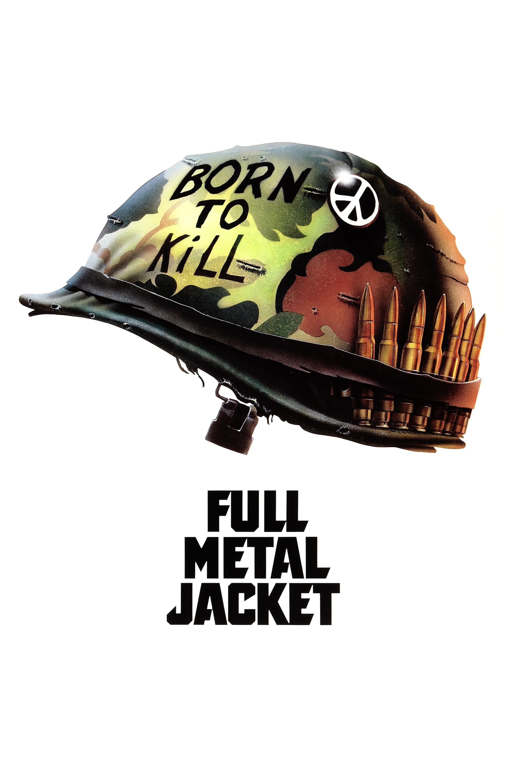
The artwork centers on a military helmet featuring the words Born to Kill next to a peace sign button. This juxtaposition highlights the duality of man and the contradictions of the Vietnam War explored in the narrative. The stark white background forces the viewer to focus entirely on the symbolic implications of the helmet. It remains a powerful commentary on conflict that transcends the specific events of the film.
‘Anatomy of a Murder’ (1959)
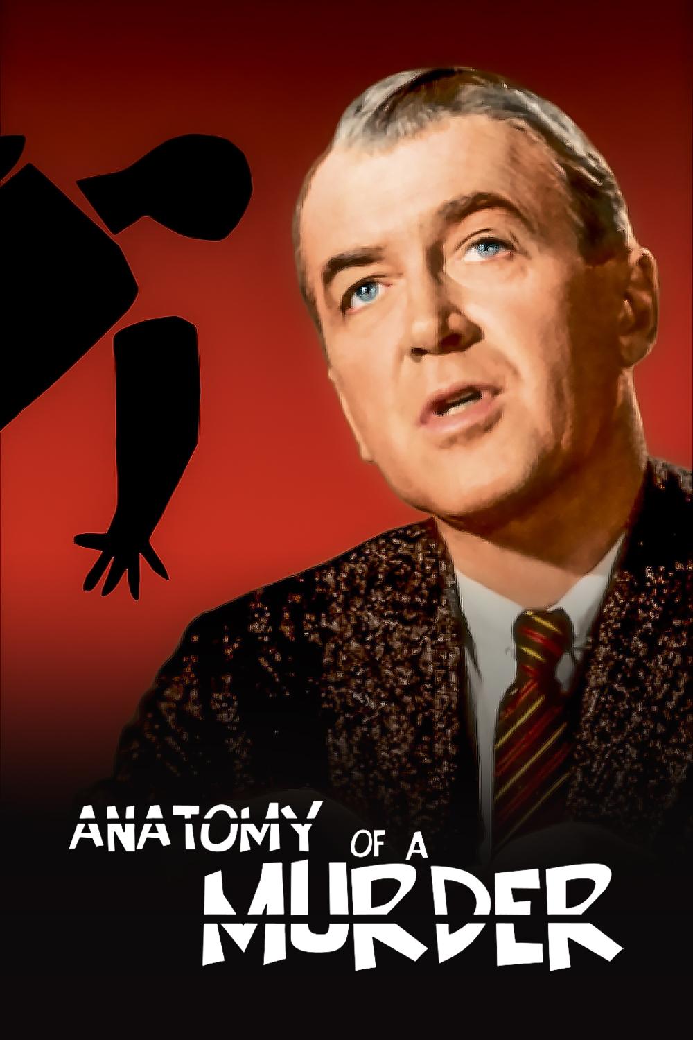
Saul Bass designed a disjointed body composed of separate black pieces against a red background. The segmented figure represents the dissection of the crime and the legal process detailed in the courtroom drama. Its abstract nature avoids the clichés of crime thrillers and elevates the material to high art. The typography aligns perfectly with the shapes to create a cohesive and rhythmic visual experience.
‘The Thing’ (1982)

Drew Struzan painted a figure in a parka with a glowing light obscuring the face. The lack of identifying features on the character reflects the paranoia and identity theft central to the plot. The cold blue tones surrounding the warm light emphasize the harsh Antarctic setting. It captures the mystery and isolation of the story without revealing the grotesque nature of the alien entity.
‘Blade Runner’ (1982)
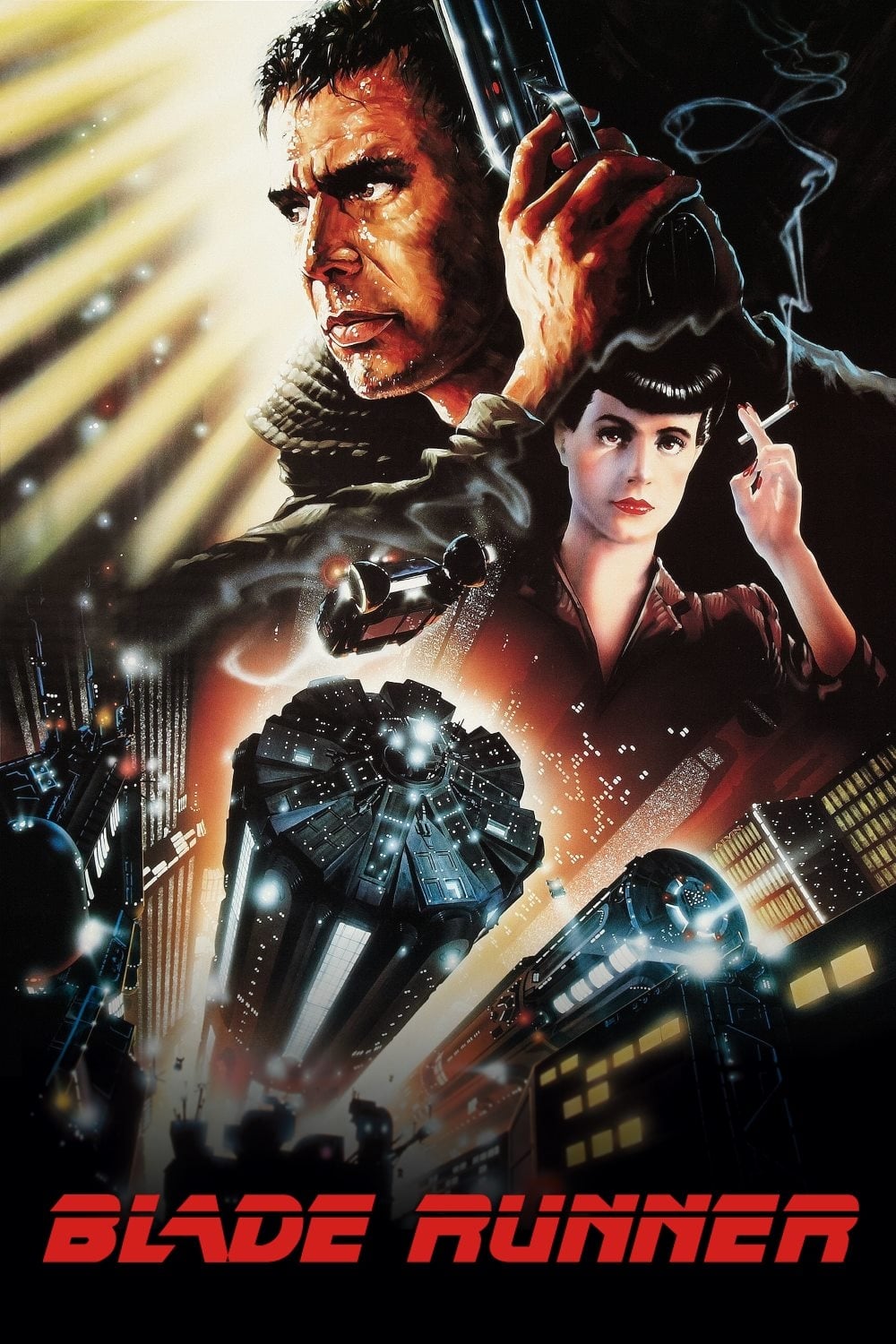
The composition by John Alvin features Harrison Ford and Sean Young with futuristic architecture and a flying car. It blends the style of 1940s film noir detective stories with high-tech science fiction imagery. The smoking gun and the neon lights perfectly summarize the tech-noir genre that the film helped establish. This artwork builds a world of atmosphere that remains more evocative than the original voice-over trailer.
‘Raiders of the Lost Ark’ (1981)
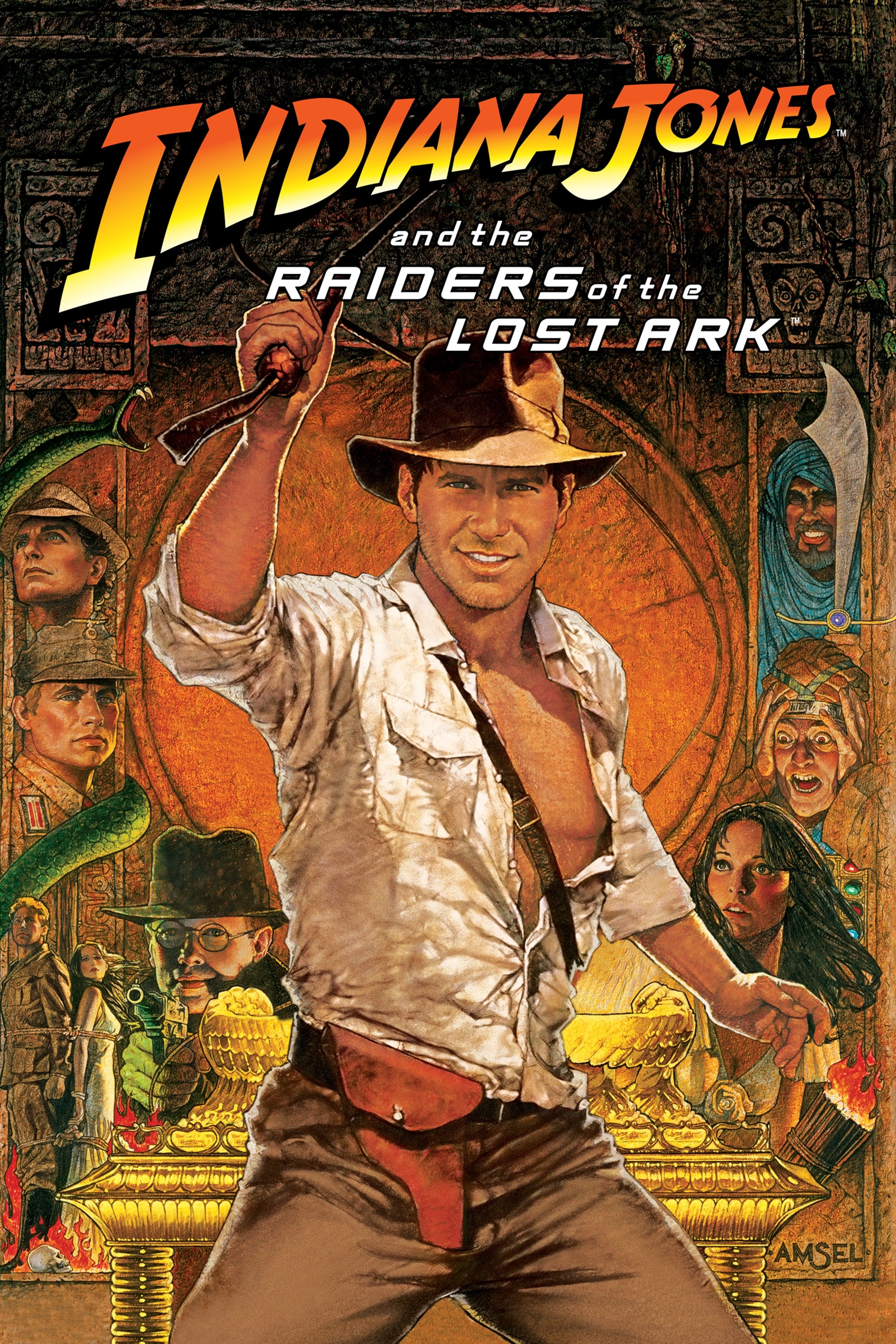
Richard Amsel created a classic adventure composition with Indiana Jones front and center surrounded by action vignettes. The warm golden tones and the heroic stance evoke the spirit of the 1930s serials that inspired the movie. It promises excitement and romance through a traditional painting style that feels timeless. The art captures the swashbuckling energy of the character perfectly.
‘Ghostbusters’ (1984)
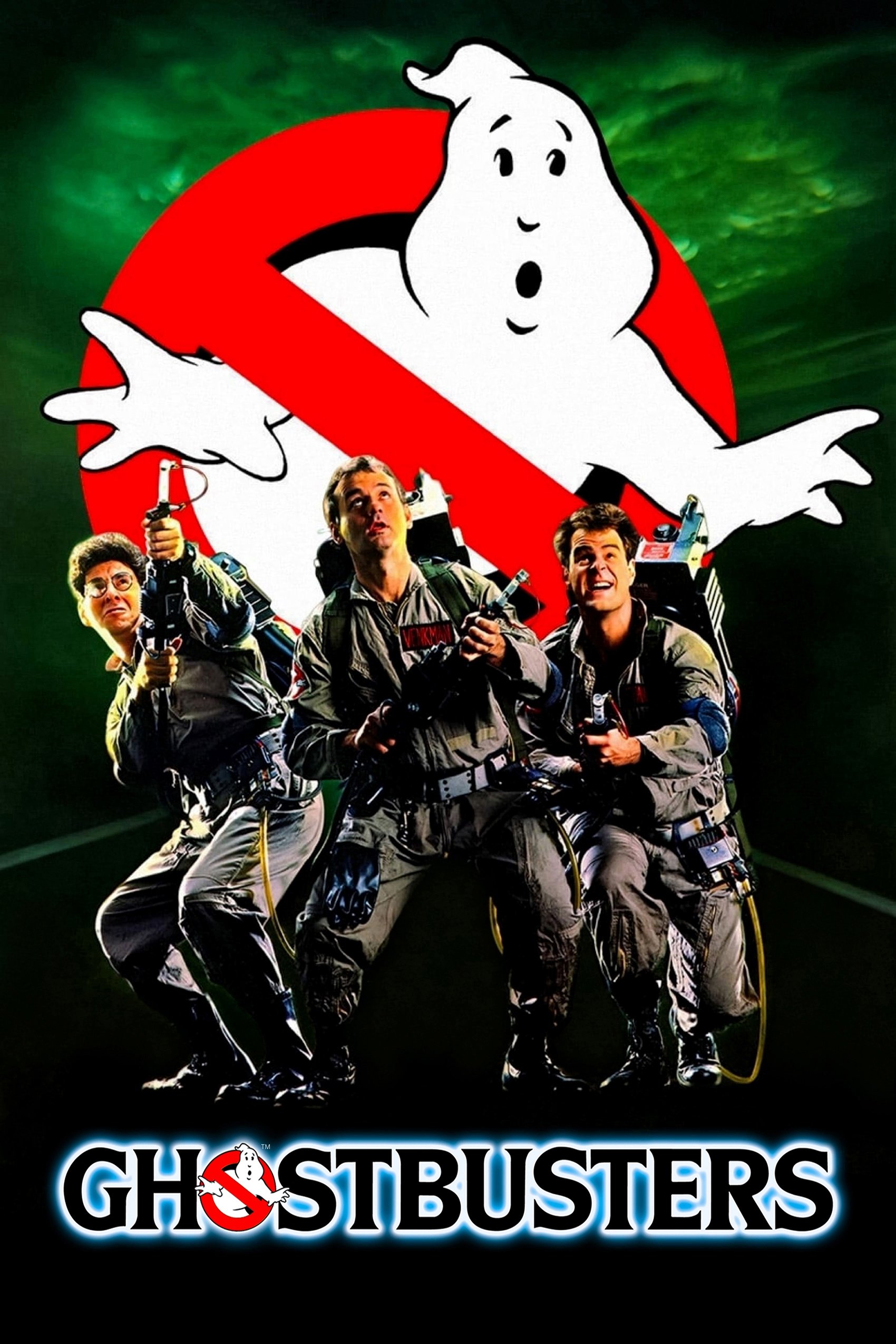
The logo features a white ghost trapped behind a red prohibition sign. This design was used as a teaser before the film was released and became a ubiquitous symbol in the real world. It communicates the premise of the film immediately without showing the actors or the special effects. The logo is a masterclass in branding that allowed the marketing to become part of the public consciousness.
Please share which of these artistic masterpieces is your favorite in the comments.