
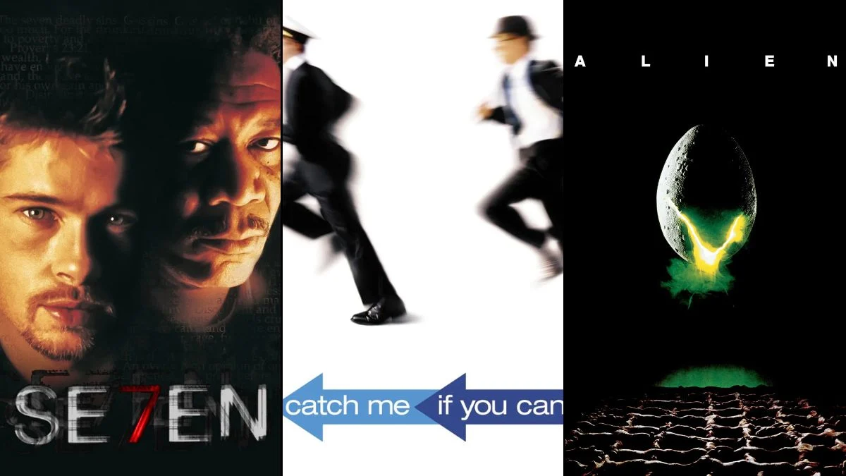
25 Movie Title Cards That Are Instant Works of Art

The opening moments of a film are crucial for establishing tone and capturing the audience’s attention before the story truly begins. Graphic designers and filmmakers often collaborate to turn these introductory credits into standalone masterpieces that rival the movie itself. Some sequences use kinetic typography and abstract animation to hint at the themes of the narrative. Others utilize live-action footage or practical effects to ground the viewer in the specific world of the characters. This collection highlights the most visually striking and innovative title cards in cinema history.
‘Vertigo’ (1958)
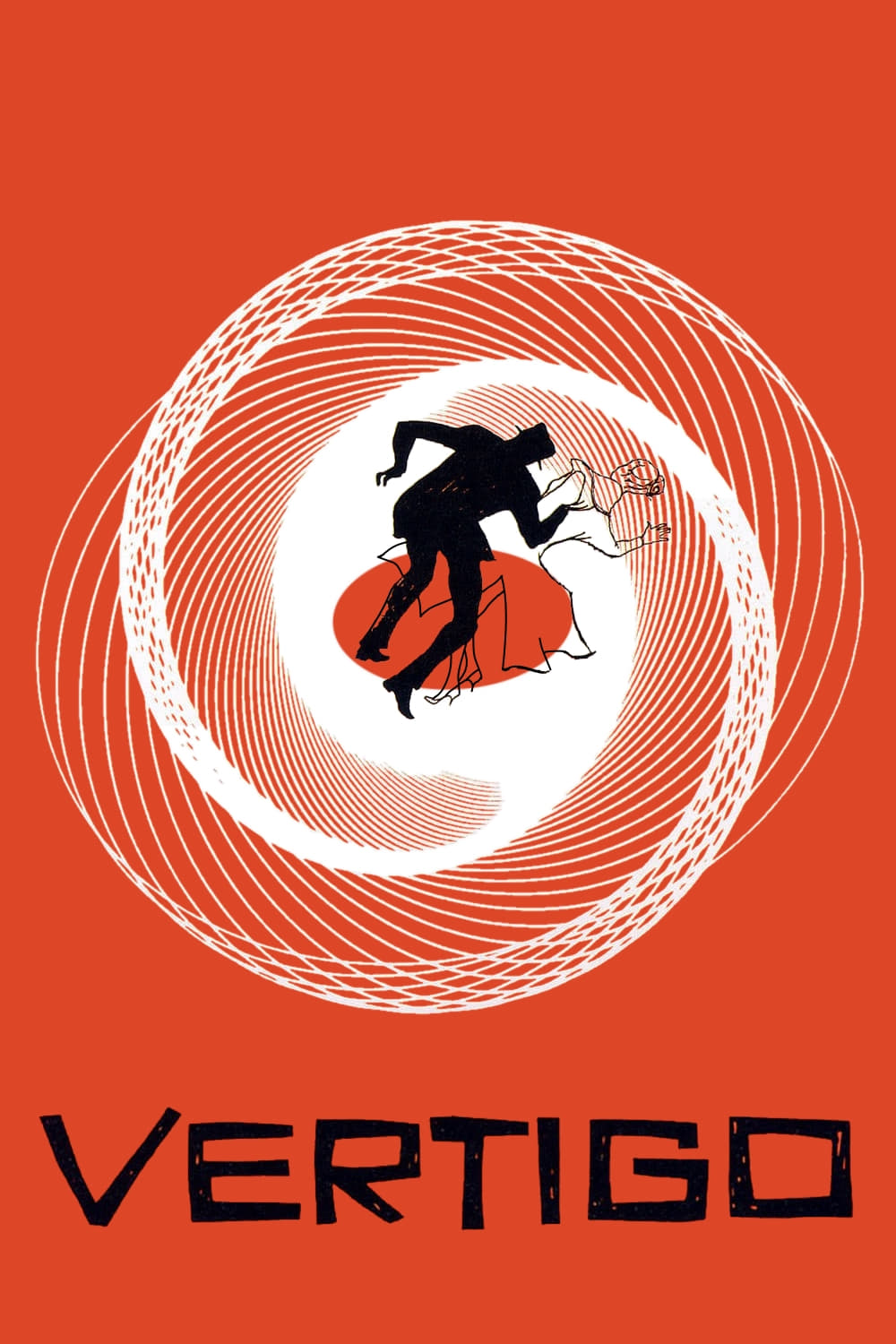
Saul Bass created a dizzying array of spiraling graphics that perfectly encapsulate the themes of the film. The camera zooms into a woman’s eye to reveal abstract shapes spinning in hypnotic patterns. Bernard Herrmann’s haunting score accompanies the visuals to create an immediate sense of unease. This sequence establishes the mood of psychological obsession long before the narrative begins.
‘Alien’ (1979)
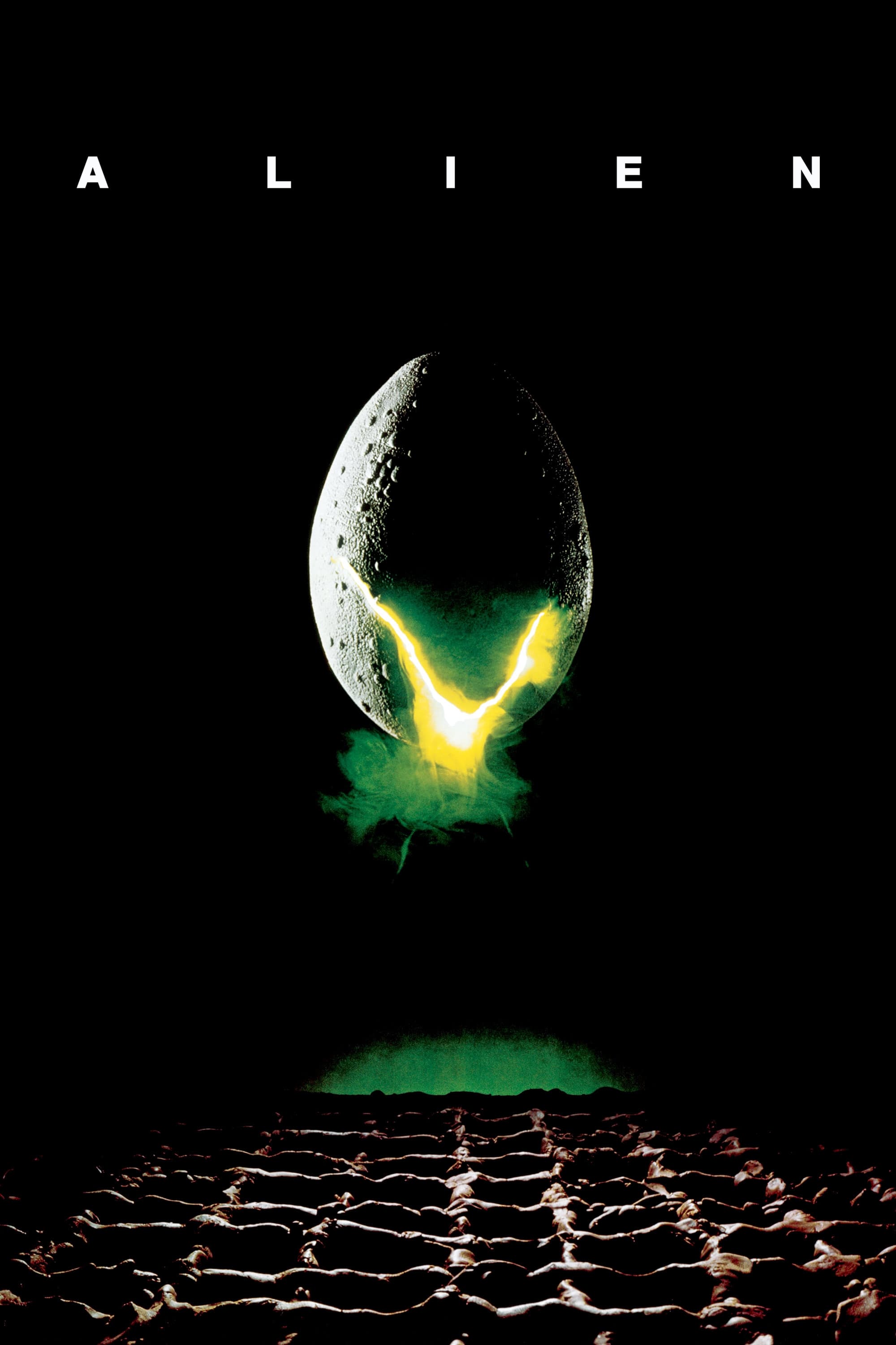
Minimalism defines the opening title sequence as disjointed lines slowly form the word Alien in space. The letters appear gradually against the stark black backdrop of the cosmos. This slow reveal mimics the creeping tension and isolation the crew faces aboard the Nostromo. Jerry Goldsmith’s eerie score underscores the feeling of dread associated with the void of deep space.
‘Dr. Strangelove or: How I Learned to Stop Worrying and Love the Bomb’ (1964)
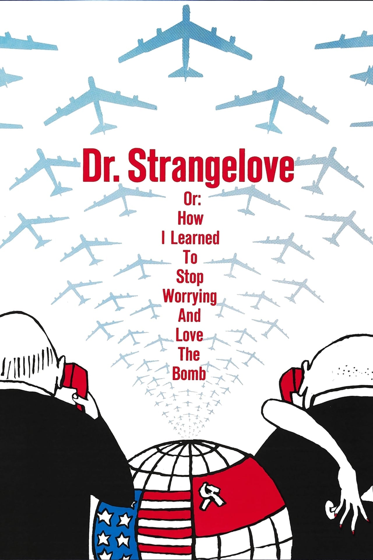
Pablo Ferro designed the hand-drawn lettering that overlays footage of mid-air refueling. The rough and shaky text contrasts sharply with the precise mechanical actions of the aircraft. This juxtaposition highlights the absurdity of the nuclear conflict theme central to the narrative. The playful font choice serves as an immediate indicator of the dark satire to follow.
‘Se7en’ (1995)
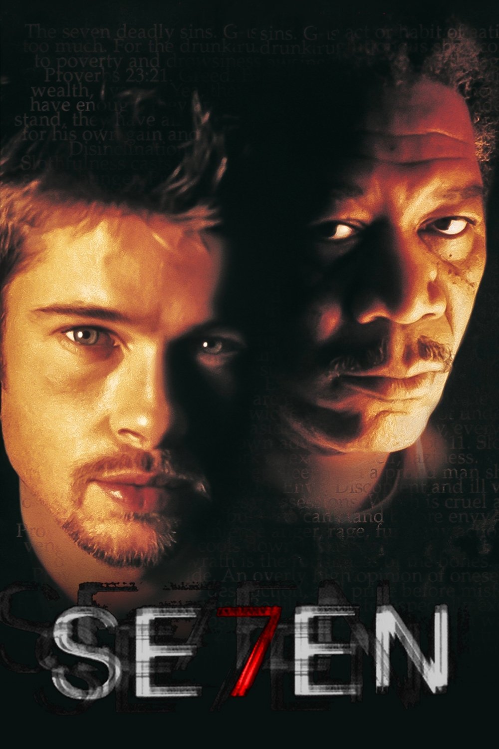
Kyle Cooper revolutionized modern title design with a sequence that feels like a glimpse into a deranged mind. Distorted text and jittery footage of diaries and medical instruments flash across the screen. The scratchy typography and glitchy transitions create a texture of decay and obsession. Nine Inch Nails provides the industrial soundtrack that amplifies the disturbing atmosphere of the crime thriller.
‘Catch Me If You Can’ (2002)
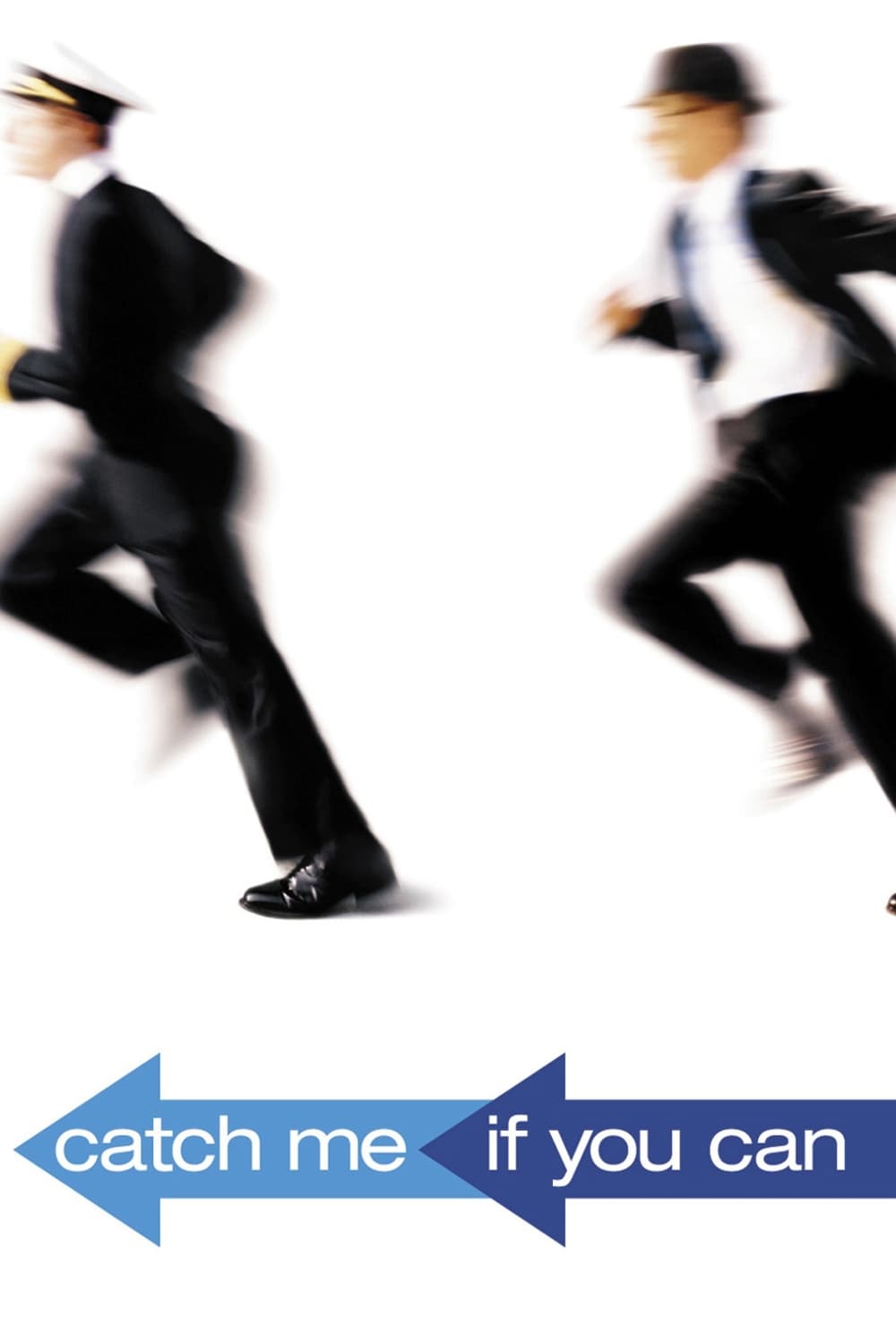
The animated opening sequence tells a simplified version of the chase between the con artist and the FBI agent. Stylish silhouettes move through smooth transitions that depict various eras and locations. John Williams delivers a jazz-infused score that complements the 1960s aesthetic of the visuals. The design pays homage to classic title sequences from the era in which the film is set.
‘Napoleon Dynamite’ (2004)
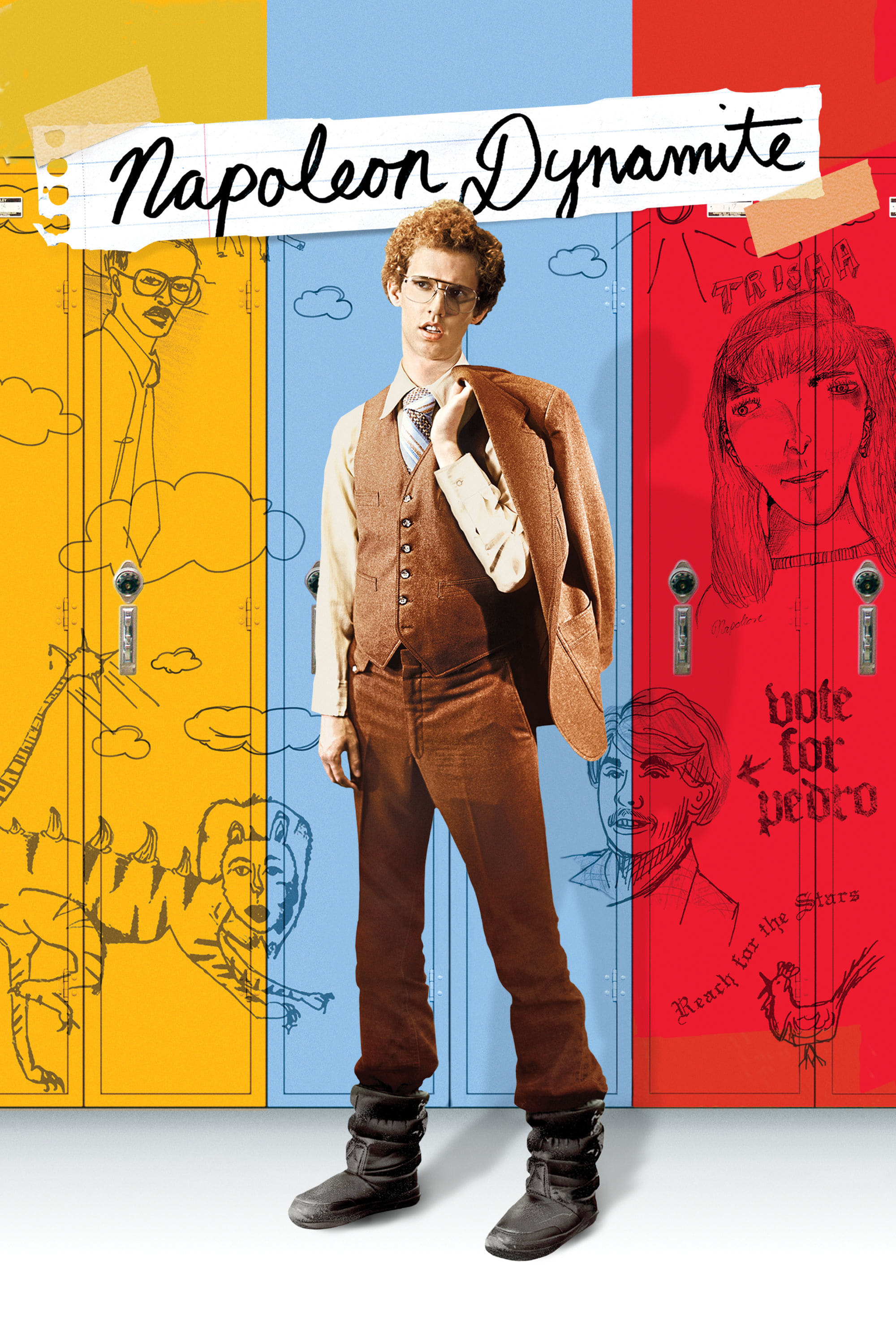
The credits appear as tangible items such as food and library cards placed within the scene. Each name is written in condiments or ink on everyday objects found in a high school setting. The camera pans over these plates of nachos and corn dogs to establish the quirky tone. This practical approach grounds the movie in its awkward and lo-fi aesthetic immediately.
‘Enter the Void’ (2009)
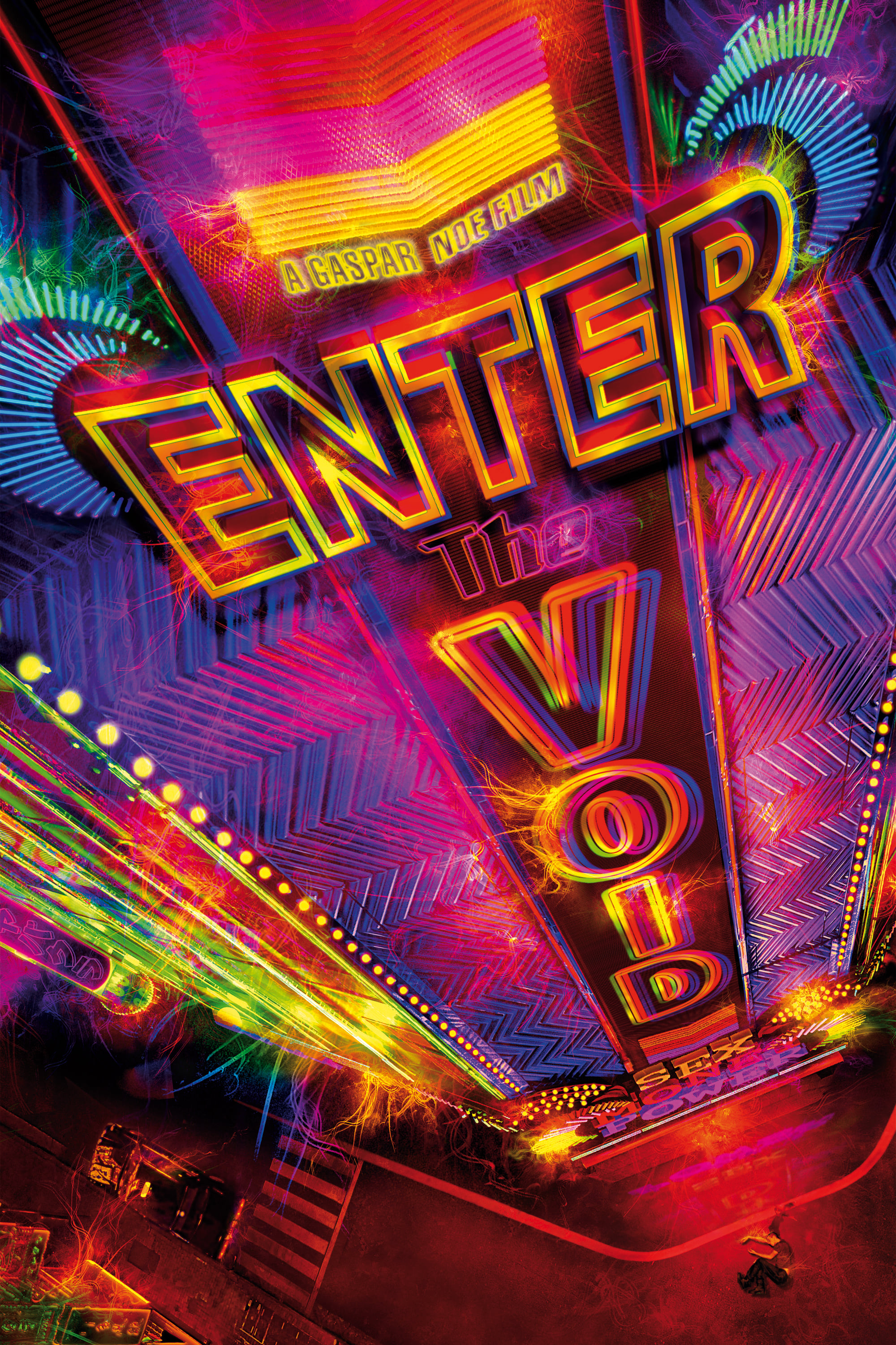
Gaspar Noé assaults the senses with a rapid barrage of neon fonts and pulsating colors. The titles flash at an aggressive speed that mimics the effects of a psychedelic trip. Techno music drives the sequence forward with an intensity that matches the visual overload. It serves as a warning and a preparation for the immersive hallucinogenic experience of the film.
‘The Pink Panther’ (1963)
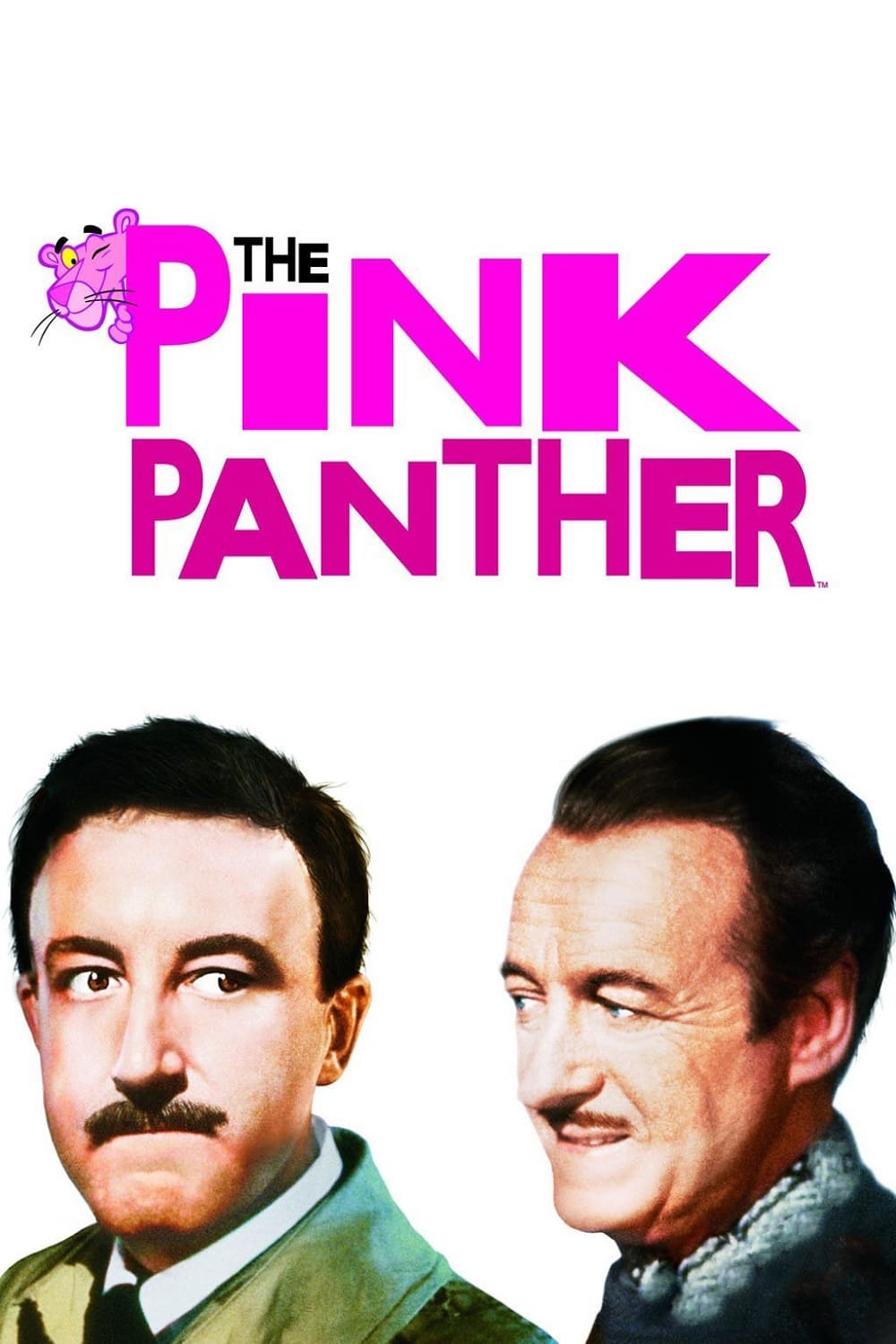
The animated feline character makes his debut in this sequence and interacts with the credits. He paints and rearranges the letters while evading the phantom figure of the Inspector. This introduction became so popular that it spawned its own cartoon series independent of the live-action films. Henry Mancini composed the iconic saxophone theme that became synonymous with the character.
‘North by Northwest’ (1959)
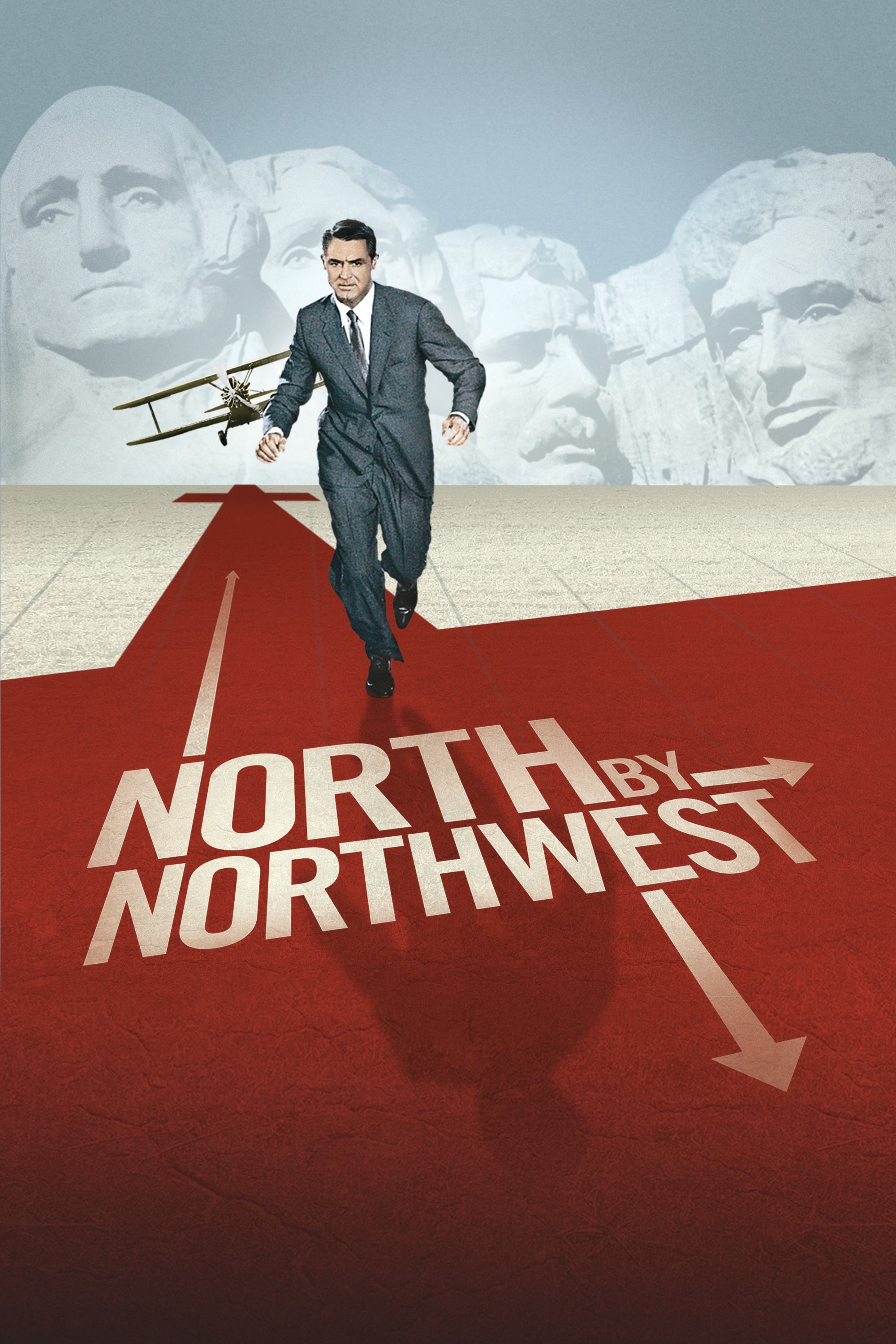
Kinetic typography slides across a grid of lines that eventually transforms into the facade of a skyscraper. Saul Bass used this geometric design to mirror the urban setting and the intricate plot. The text moves vertically and horizontally to create a sense of frantic motion. It remains one of the earliest and most effective uses of kinetic text in cinema history.
‘Panic Room’ (2002)
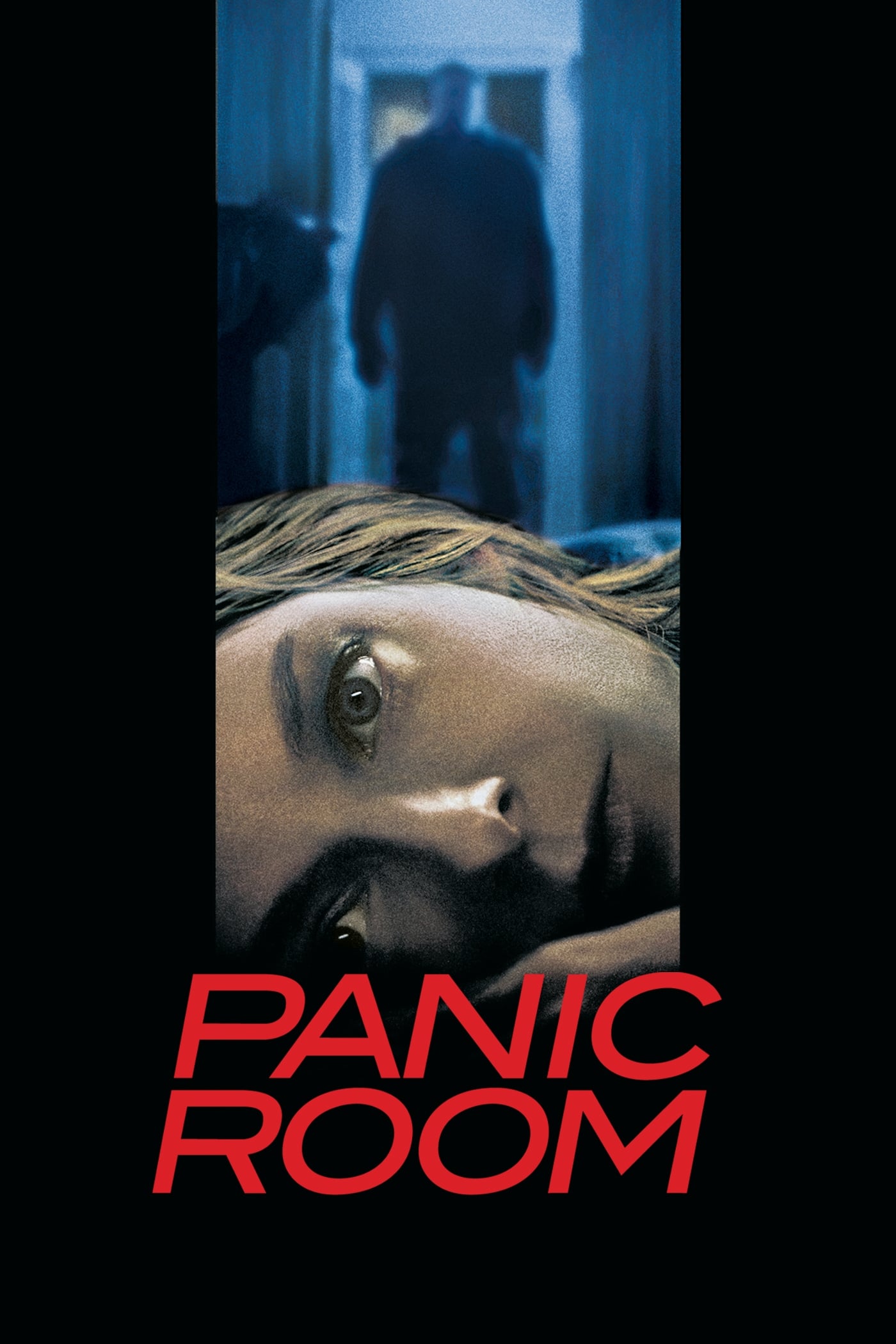
Giant three-dimensional letters float ominously among the skyscrapers of New York City. The text stays suspended in the air while the camera moves through the urban canyons. This integration of typography into the physical environment emphasizes the overwhelming scale of the city. The visuals suggest the characters are trapped within a massive concrete maze even before they enter the house.
‘Raging Bull’ (1980)
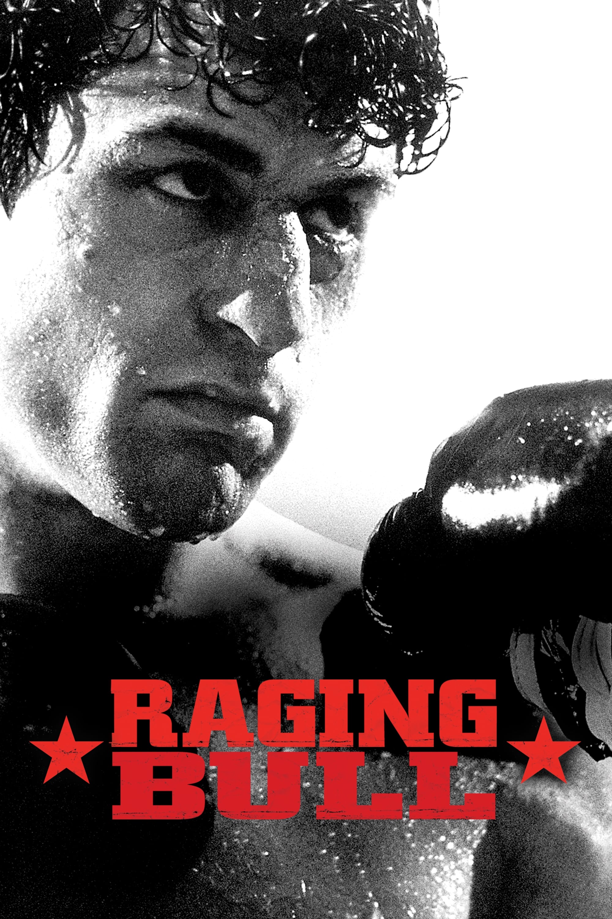
Robert De Niro warms up in the boxing ring in slow motion against a smoky background. The title appears in a bold red font that contrasts with the black and white cinematography. Pietro Mascagni’s opera intermezzo adds a tragic and graceful layer to the violent sport. This simple yet powerful image establishes the poetic brutality that defines the biography of Jake LaMotta.
‘Fight Club’ (1999)

The camera travels backward from the microscopic level of a brain’s fear center. Viewers rush through nerve endings and hair follicles before emerging at the barrel of a gun. The sequence visualizes the internal chaos and biological themes present throughout the narrative. The Dust Brothers provide a thumping electronic track that matches the frenetic energy of the visual journey.
‘Goldfinger’ (1964)
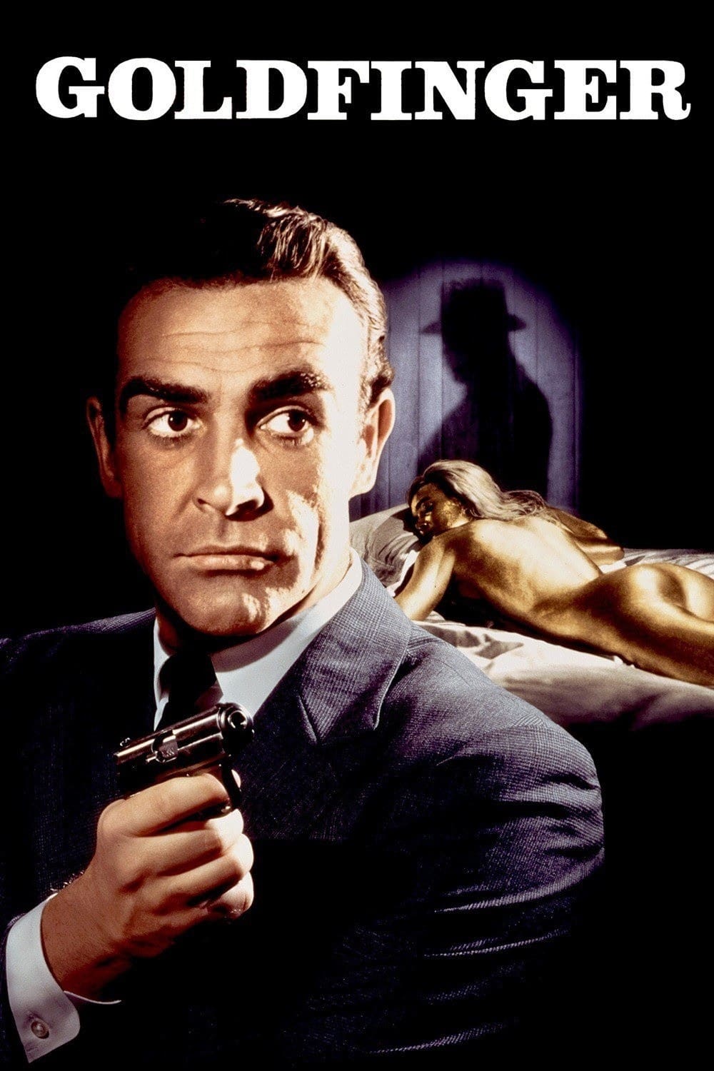
Projections of scenes from the film play across the golden-painted body of a model. Robert Brownjohn designed this sequence to hint at the plot points while maintaining a surreal atmosphere. Shirley Bassey belts out the powerful theme song as the images warp over the human form. The distinctive style set the gold standard for all subsequent James Bond opening credits.
‘Psycho’ (1960)
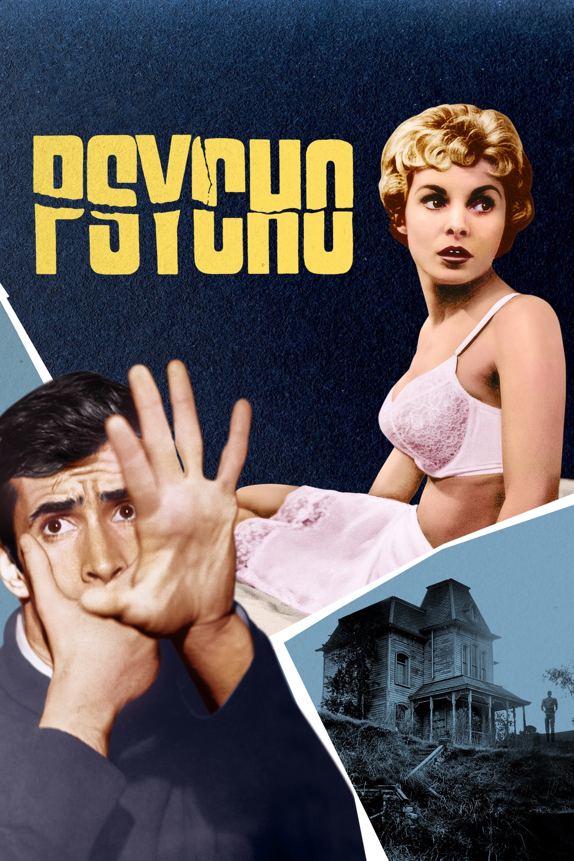
Saul Bass utilized vertical and horizontal gray bars to slice through the screen and the text. The frantic animation of the lines mirrors the violence of a knife attack. Bernard Herrmann composed the screeching violin score that became one of the most famous sounds in horror. This jagged aesthetic perfectly sets the stage for the fractured psyche of the antagonist.
‘Pulp Fiction’ (1994)
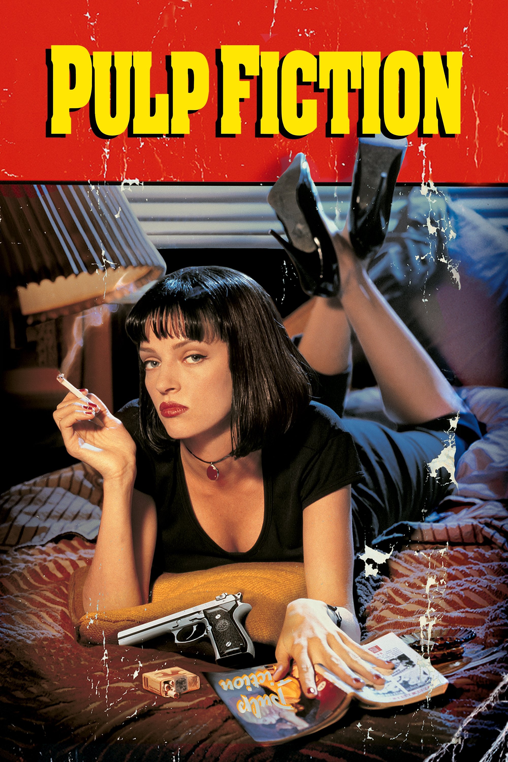
The screen displays the dictionary definition of the title in a classic typewriter font. Dick Dale’s surf guitar track kicks in to abruptly shift the energy from contemplative to explosive. The bright orange and yellow text evokes the cheap paper stock of old dime novels. This stylistic choice immediately informs the audience of the retro and trashy influences behind the storytelling.
‘To Kill a Mockingbird’ (1962)
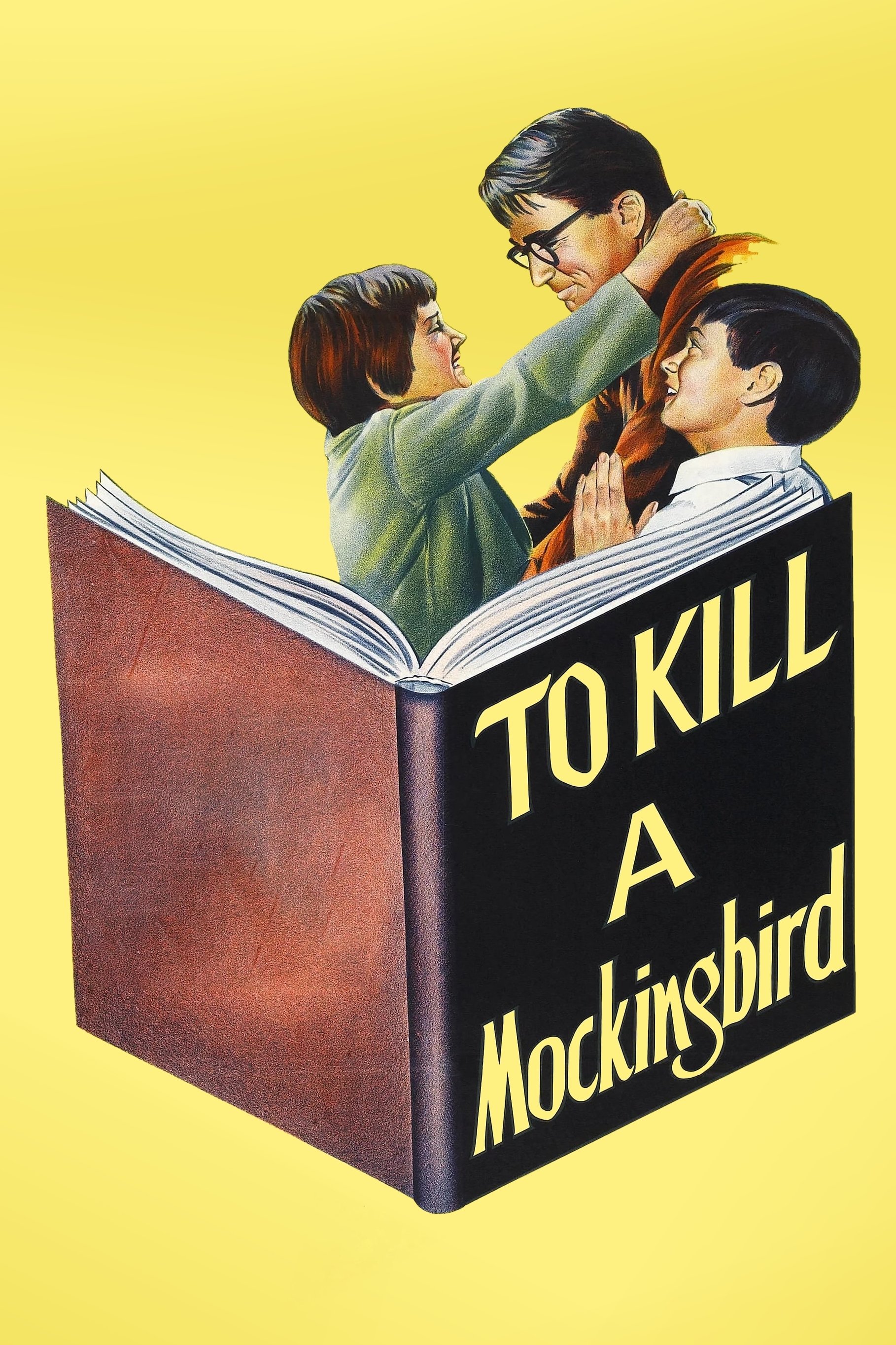
A child’s hand opens a cigar box filled with small treasures like marbles and crayons. The camera focuses on the act of coloring over a piece of paper to reveal the title. The sequence captures the innocence of youth that contrasts with the heavy themes of the trial. Elmer Bernstein provides a gentle piano melody that evokes a sense of nostalgia and warmth.
‘A Clockwork Orange’ (1971)
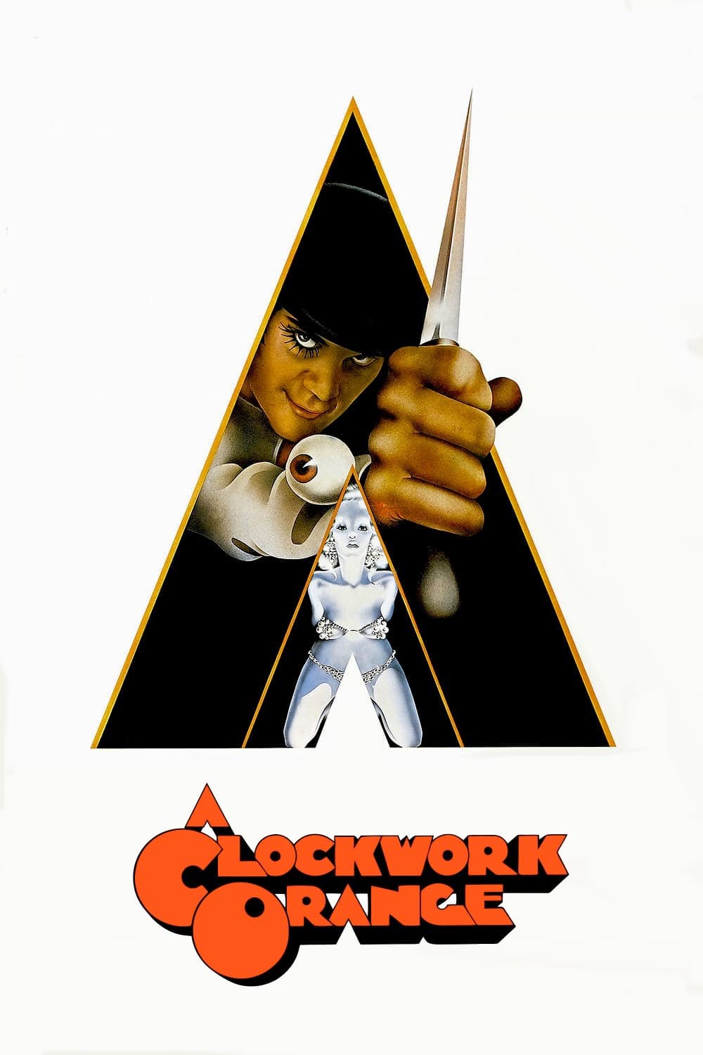
Bold white text stands out against stark blue and red backgrounds to create a jarring visual impact. The screen remains static except for the changing color cards that assault the viewer. Wendy Carlos synthesized a haunting version of classical music to accompany the visuals. This minimalist approach reflects the cold and calculated nature of the dystopian society.
‘Halloween’ (1978)
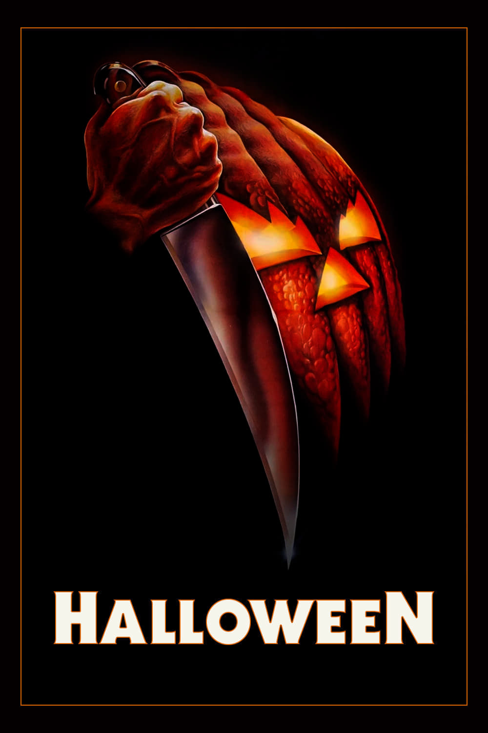
A jack-o’-lantern sits on the left side of the screen while the camera slowly zooms in. The flickering candlelight inside the pumpkin illuminates the otherwise black frame. John Carpenter composed the repetitive piano theme that builds tension with every measure. The eventual focus on the hollow eye of the pumpkin foreshadows the stalking presence of Michael Myers.
‘The Good, the Bad and the Ugly’ (1966)
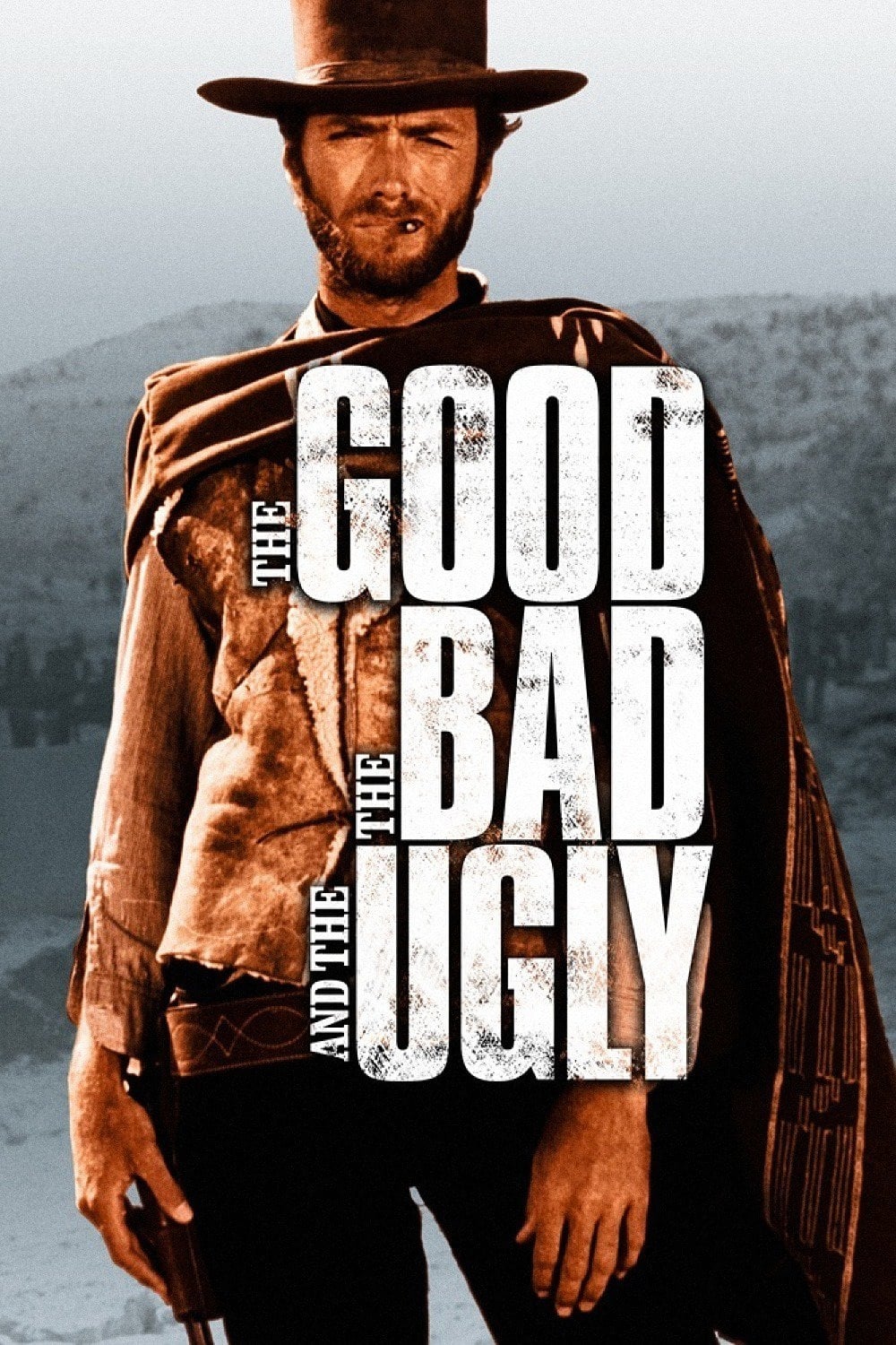
Gritty textures and high-contrast images of cowboys blend with kinetic typography. The text mimics the sound effects of gunshots and cannons through its movement and placement. Ennio Morricone introduced his legendary whistling score during this animated prologue. The style captures the raw and dusty essence of the Spaghetti Western genre perfectly.
‘Barbarella’ (1968)

Jane Fonda floats in zero gravity while stripping off her space suit in a playful manner. The letters of the credits move around her to cover strategic areas as she rotates. This sequence emphasizes the campy and erotic tone that defines the cult classic. It serves as a prime example of the psychedelic pop art aesthetic of the late sixties.
‘Lord of War’ (2005)
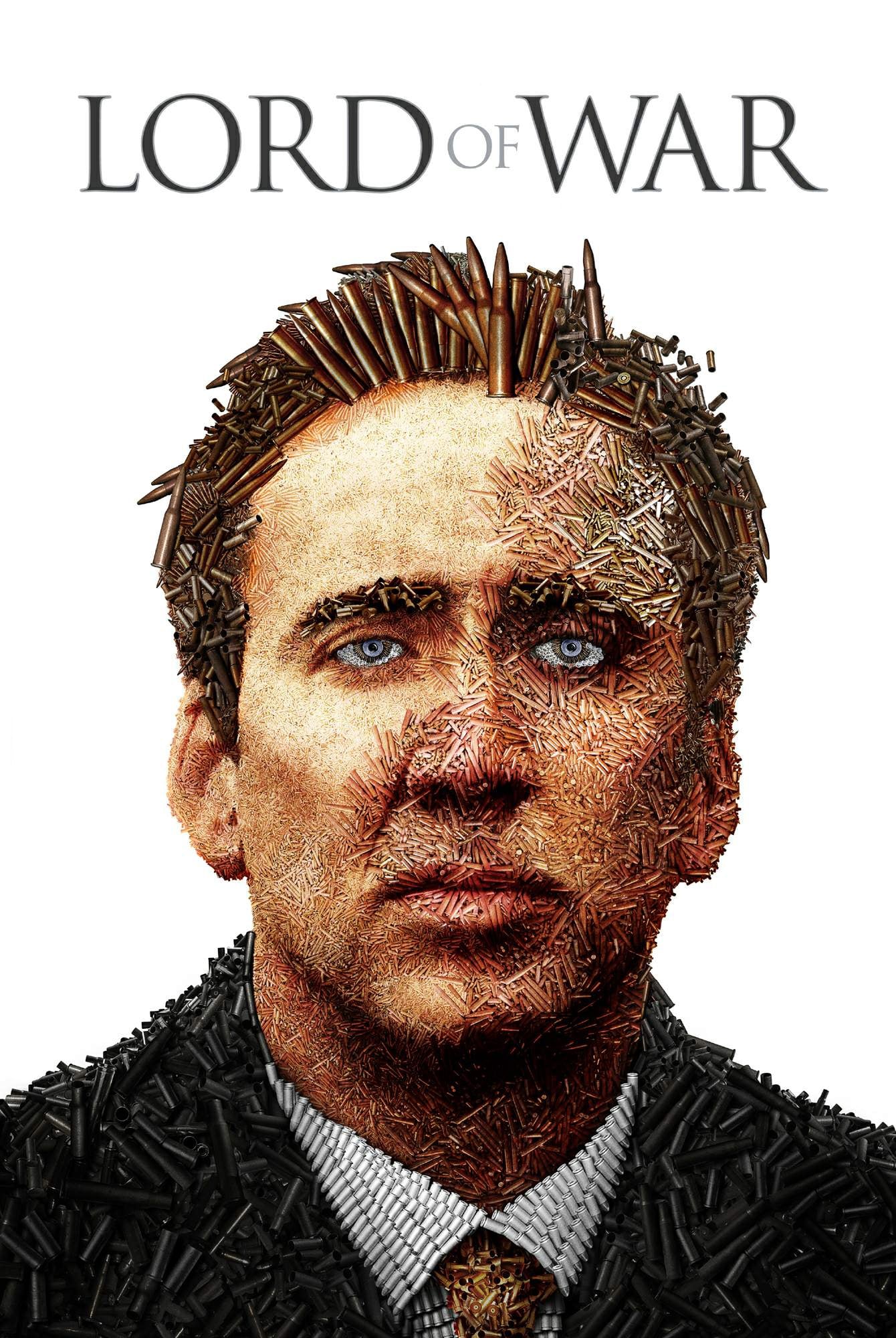
The life cycle of a bullet is shown from the factory floor to a war zone in Africa. The camera follows the projectile through manufacturing and shipping until it enters a human target. Buffalo Springfield’s song plays in the background to create an ironic contrast with the violent imagery. This creative perspective establishes the global arms trade theme instantly.
‘Funny Games’ (1997)
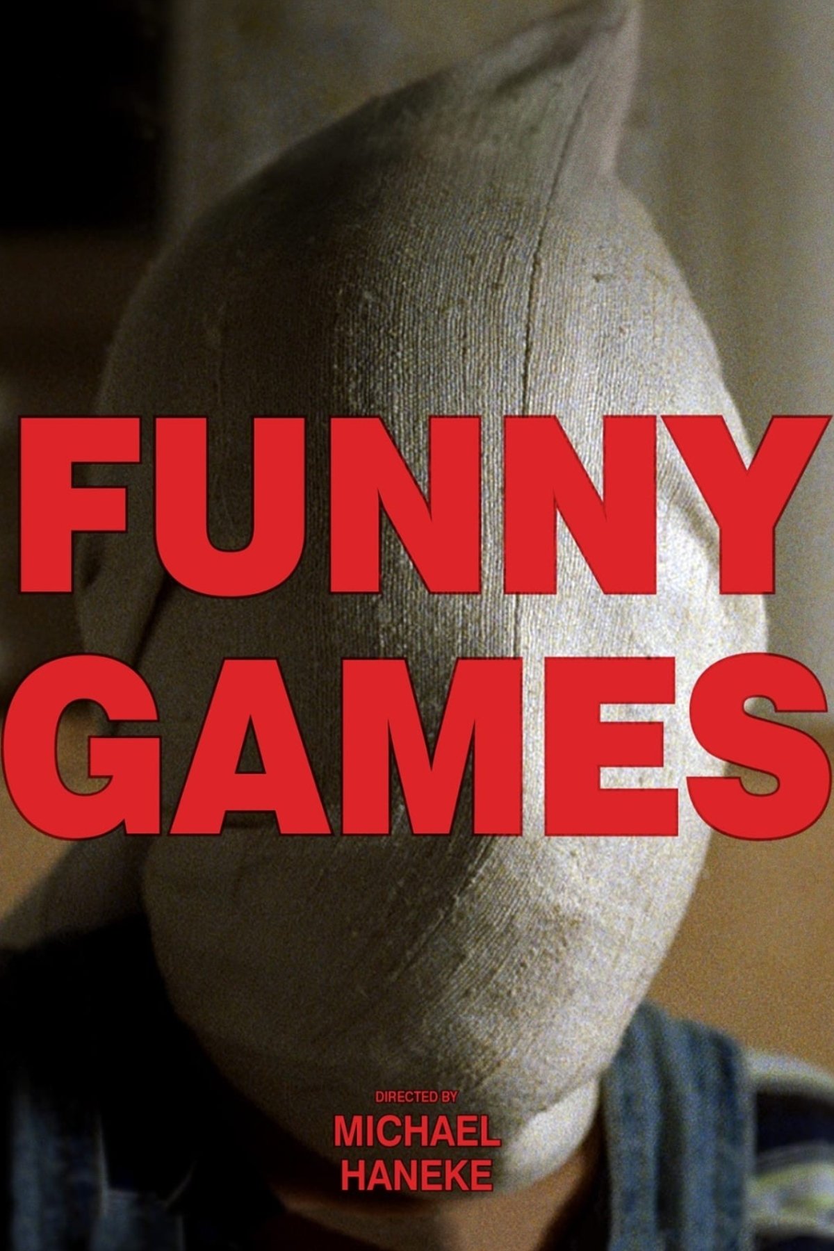
The family drives peacefully while listening to classical opera music in their car. Suddenly the title appears in giant red block letters accompanied by thrash metal screaming. This abrupt sensory assault disrupts the calm and signals the brutal invasion to come. Michael Haneke uses this contrast to mock audience expectations of a standard thriller.
‘Spider-Man 2’ (2004)
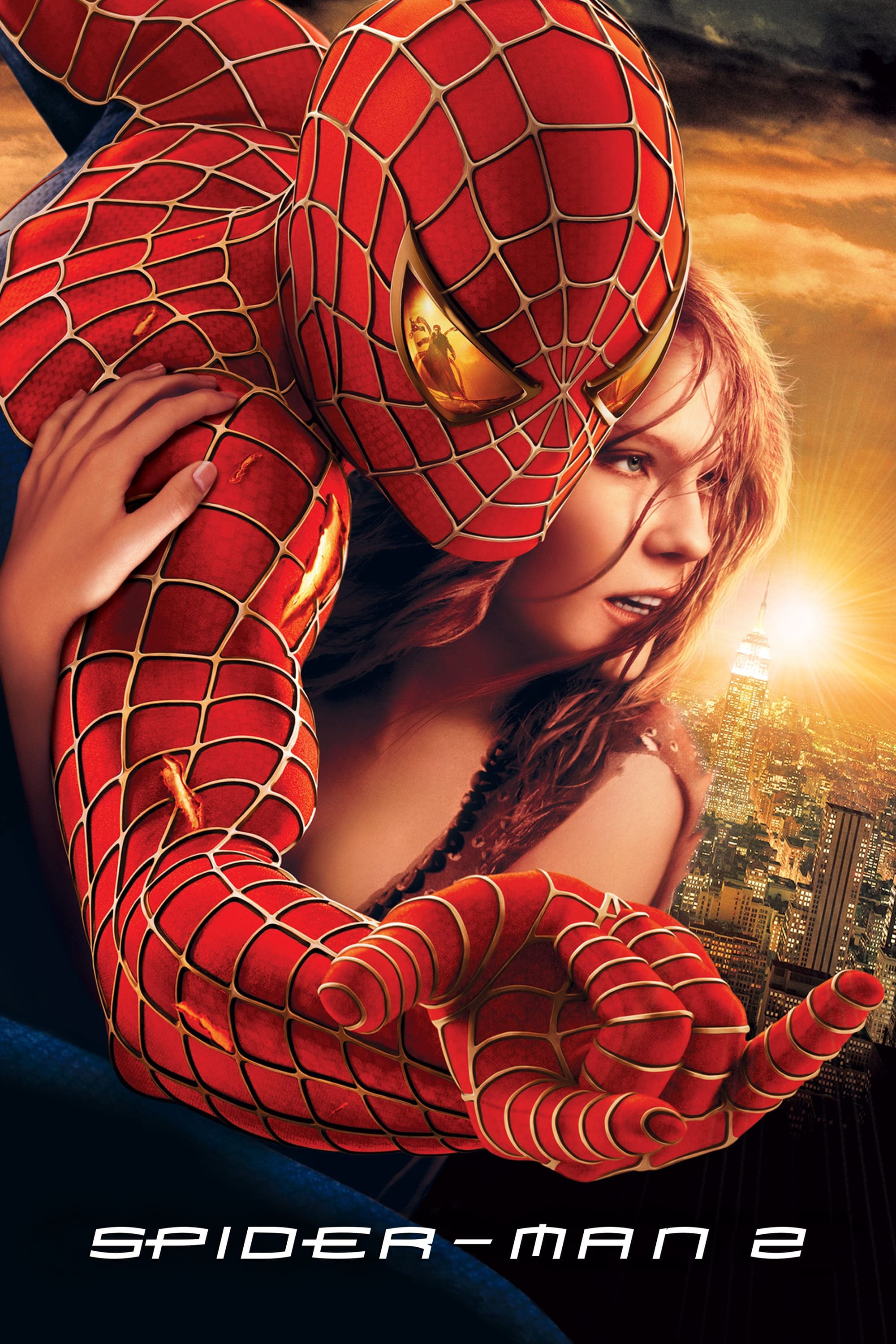
Alex Ross created original paintings that recap the events of the first film during the opening credits. The camera pans across the detailed artwork to remind viewers of the character’s emotional journey. Danny Elfman’s sweeping score elevates the comic book imagery to a cinematic level. The sequence serves as a beautiful bridge between the two chapters of the superhero saga.
‘Anatomy of a Murder’ (1959)
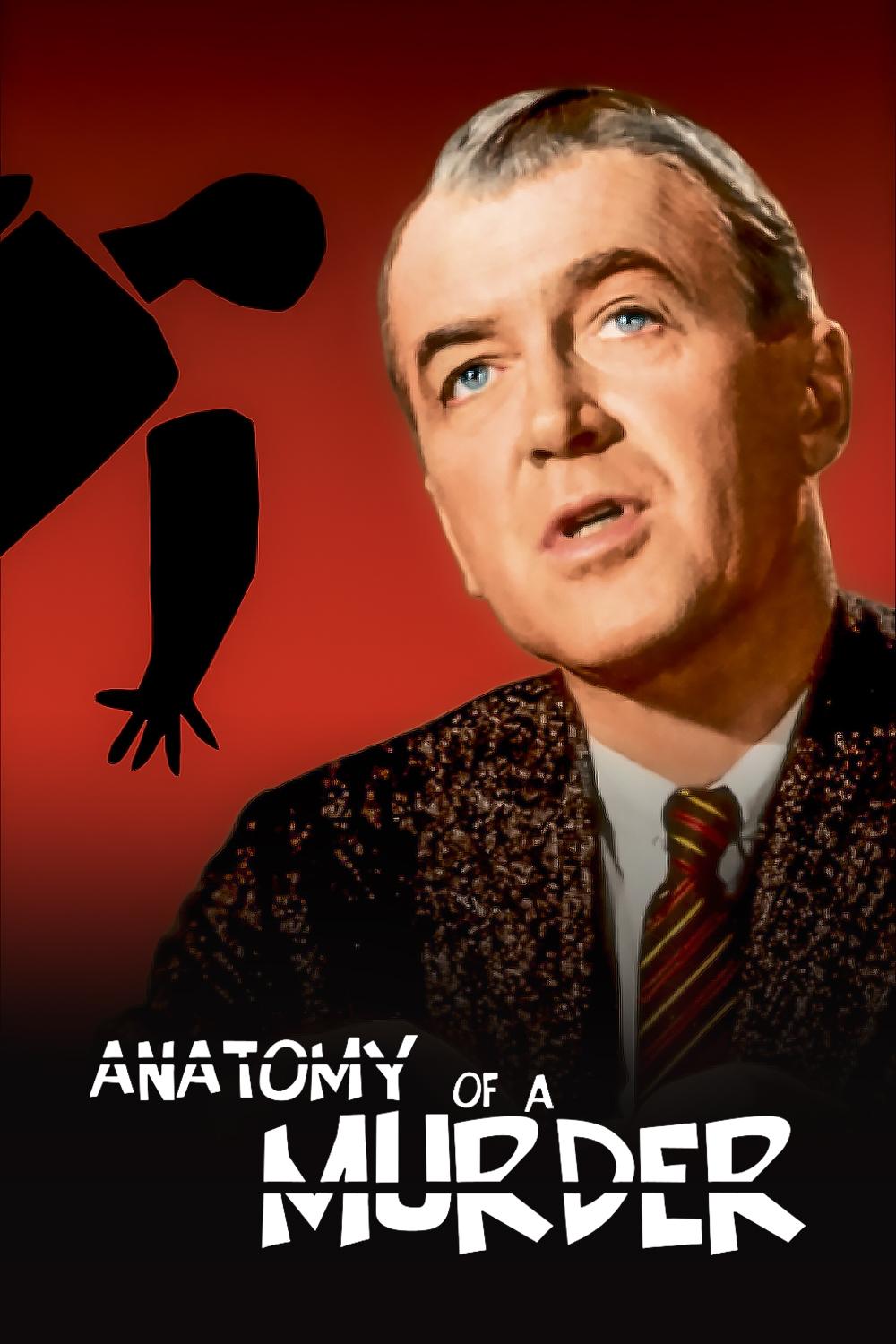
Cutout body parts slide together to form a disjointed figure against a grey background. Saul Bass designed these segmented shapes to represent the fragmented nature of the legal testimony. Duke Ellington composed the jazz score that adds a cool and sophisticated vibe to the visuals. The design remains a landmark in the history of graphic design for film.
‘Do the Right Thing’ (1989)
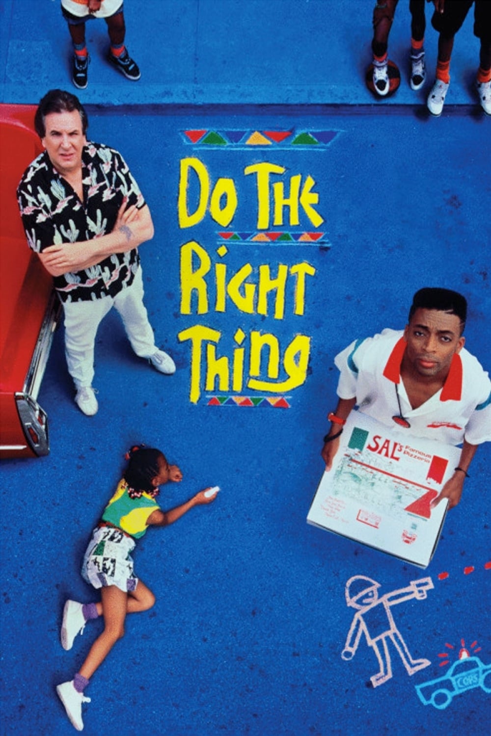
Rosie Perez dances aggressively to a hip-hop track in front of a Brooklyn brownstone backdrop. The lighting changes drastically between shots to highlight her energetic movements. Public Enemy’s anthem sets the political and combative tone for the narrative. Spike Lee uses this sequence to confront the audience with the vitality and frustration of the setting.
Tell us which movie title sequence is your personal favorite in the comments.