TV Series That Evolved Their Art Style Over Seasons
Long-running television shows often undergo significant visual changes as technology improves and budgets increase over time. Animation studios frequently refine character designs and switch from traditional hand-drawn methods to digital compositing to streamline production. Some series start with crude pilots that look nothing like the polished episodes that air years later. The evolution of an art style can redefine the tone of a series and attract new audiences. The following shows demonstrate the most dramatic visual transformations in television history.
‘The Simpsons’ (1989–Present)
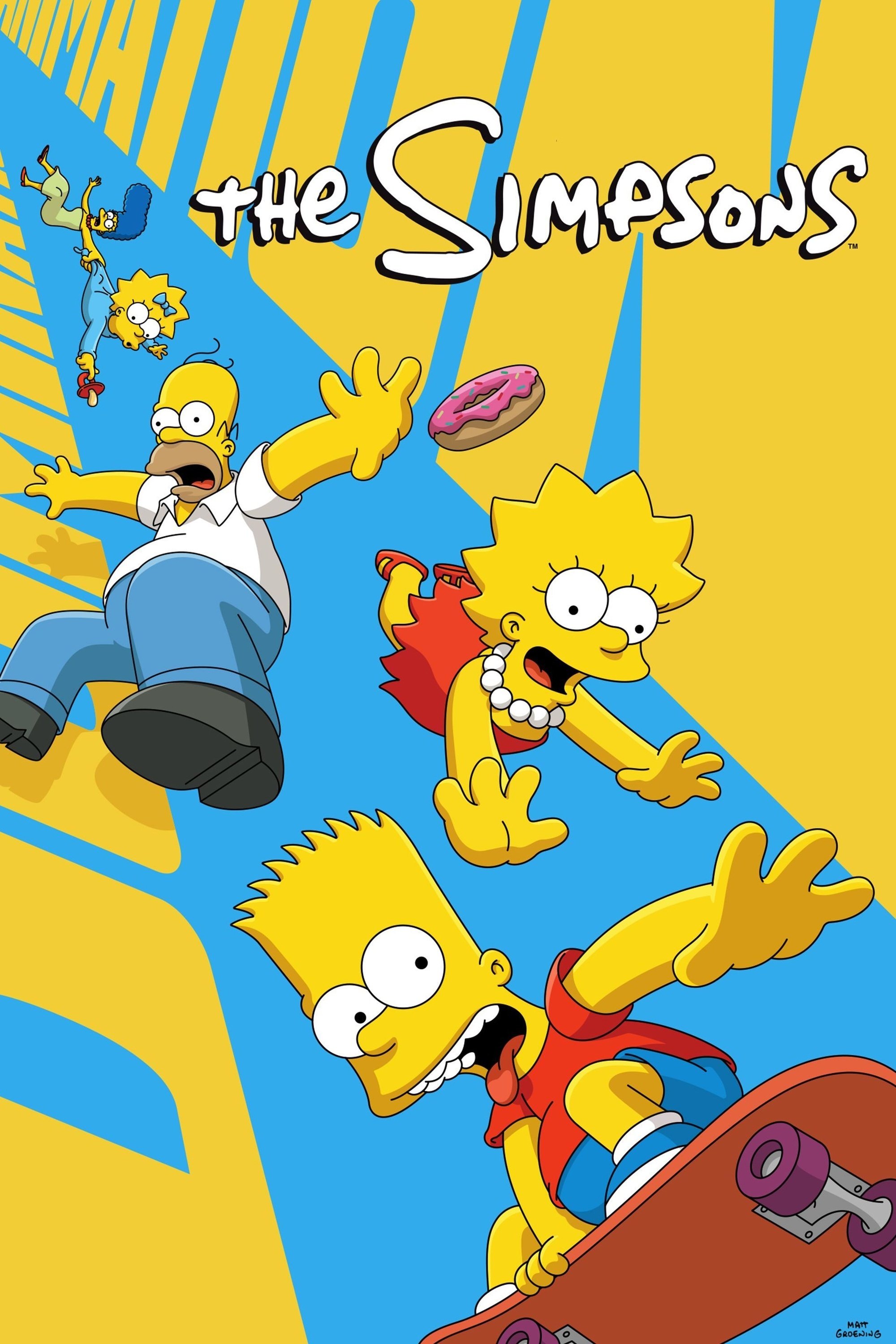
The earliest episodes of this sitcom featured crude character models with erratic line weights and awkward movements. The animation became cleaner and the colors more stabilized as the studio moved away from the rough Klasky Csupo style. A massive shift occurred when the series switched to high definition and adopted a purely digital ink and paint process. The characters now possess a consistent rigidity that contrasts sharply with the loose and expressive motion of the nineties.
‘South Park’ (1997–Present)
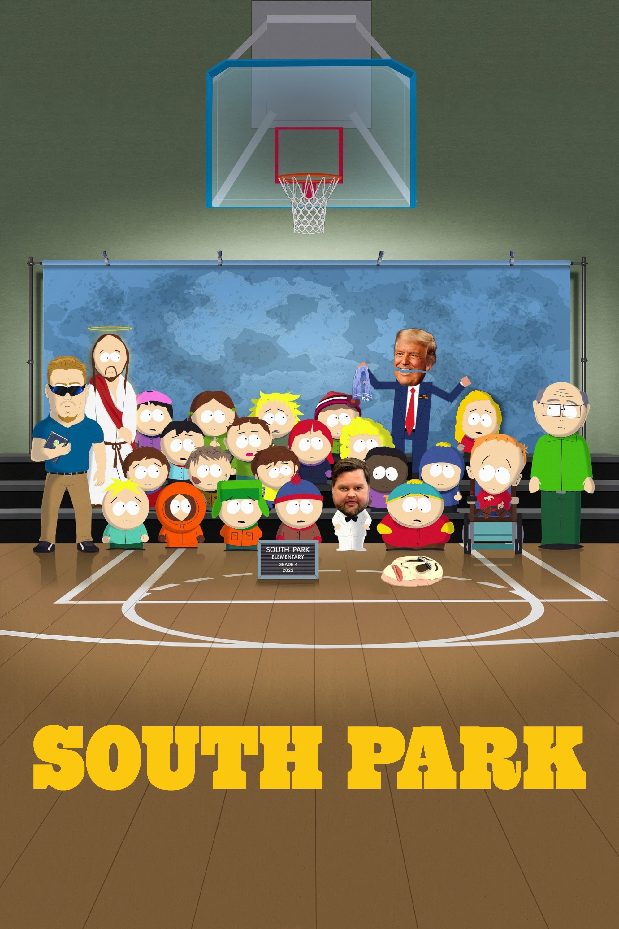
The pilot episode was painstakingly created using actual construction paper cutouts and stop-motion photography. The creators immediately switched to computer software to replicate the cutout look while drastically reducing production time. Later seasons began incorporating advanced lighting effects and dynamic shadows that gave depth to the flat world. The show currently utilizes high-end rendering tools that allow for cinematic visuals while maintaining its signature low-budget aesthetic.
‘Adventure Time’ (2010–2018)
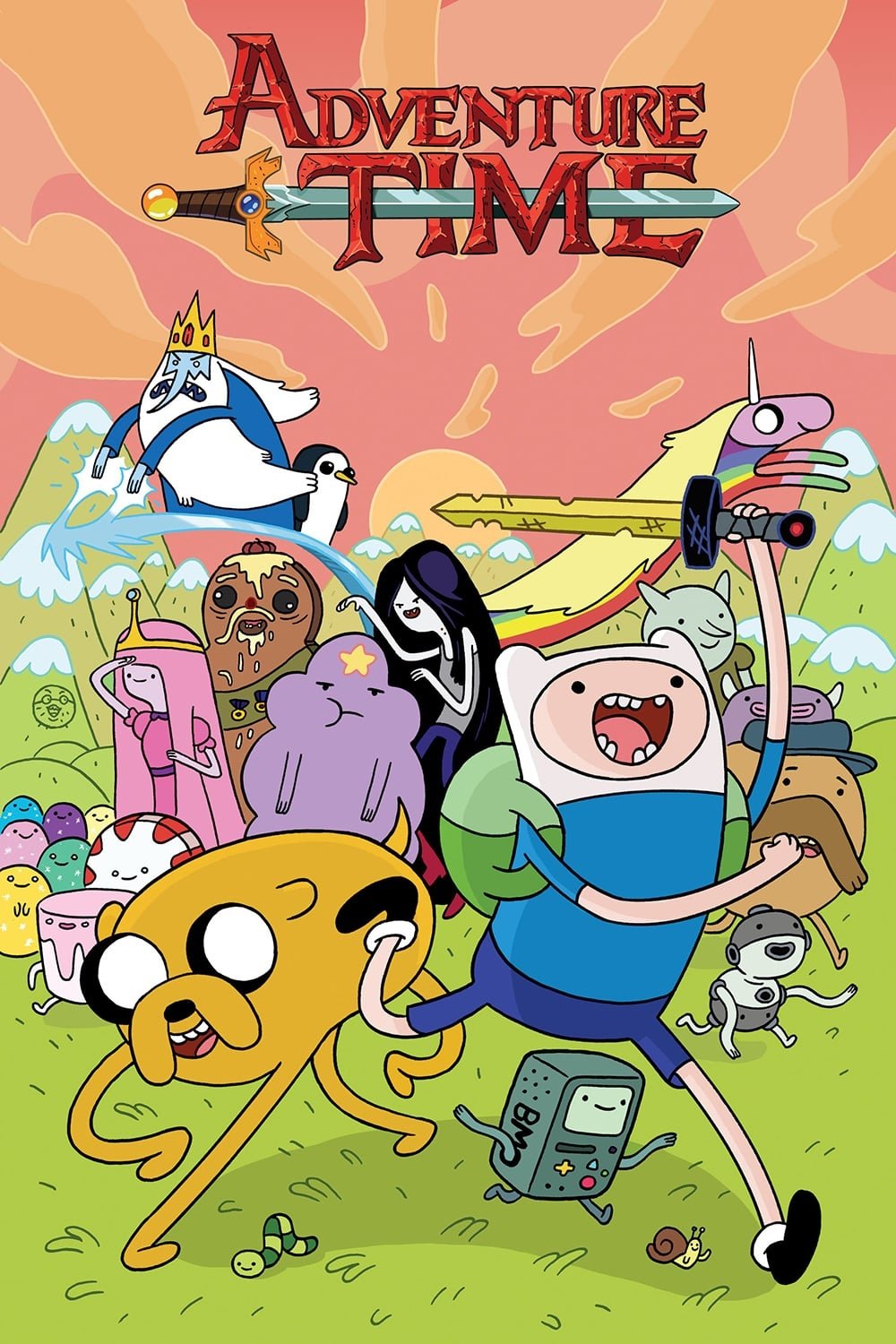
The first season featured noodle-like limbs and relatively simple character expressions during its more comedic phase. The art style gradually matured with more detailed backgrounds and consistent character models as the lore deepened. Lighting effects became more prominent during emotional scenes and added significant weight to the narrative. The evolution from a wacky comedy to a dark fantasy epic was mirrored by this gradual refinement in visual complexity.
‘Star Wars: The Clone Wars’ (2008–2020)
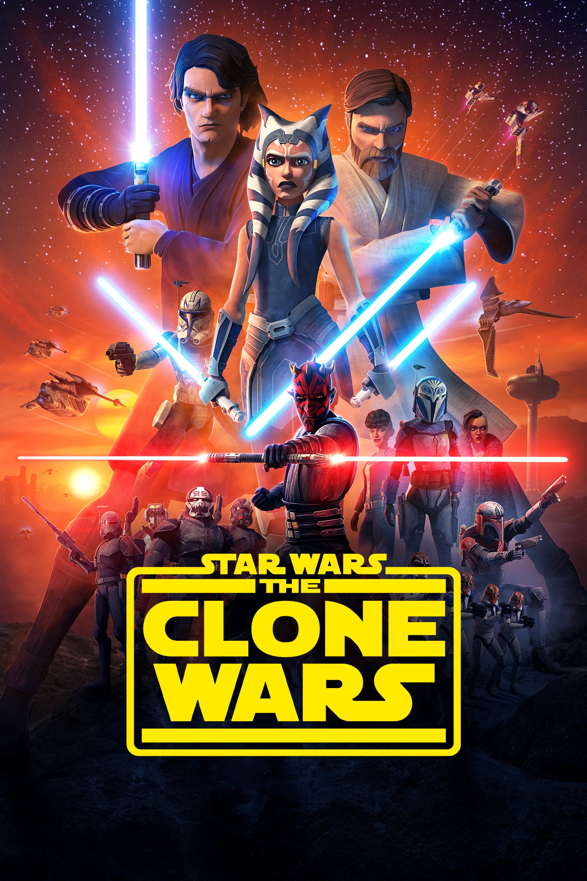
The early seasons featured stiff character movements and relatively flat textures that resembled wooden puppets. The animation quality improved exponentially as the budget increased and technology advanced over the decade. Later arcs introduced film-quality lighting and atmospheric effects that rivaled theatrical releases. The final season on Disney+ showcased the absolute peak of television CGI with fluid combat and expressive facial animations.
‘Samurai Jack’ (2001–2017)
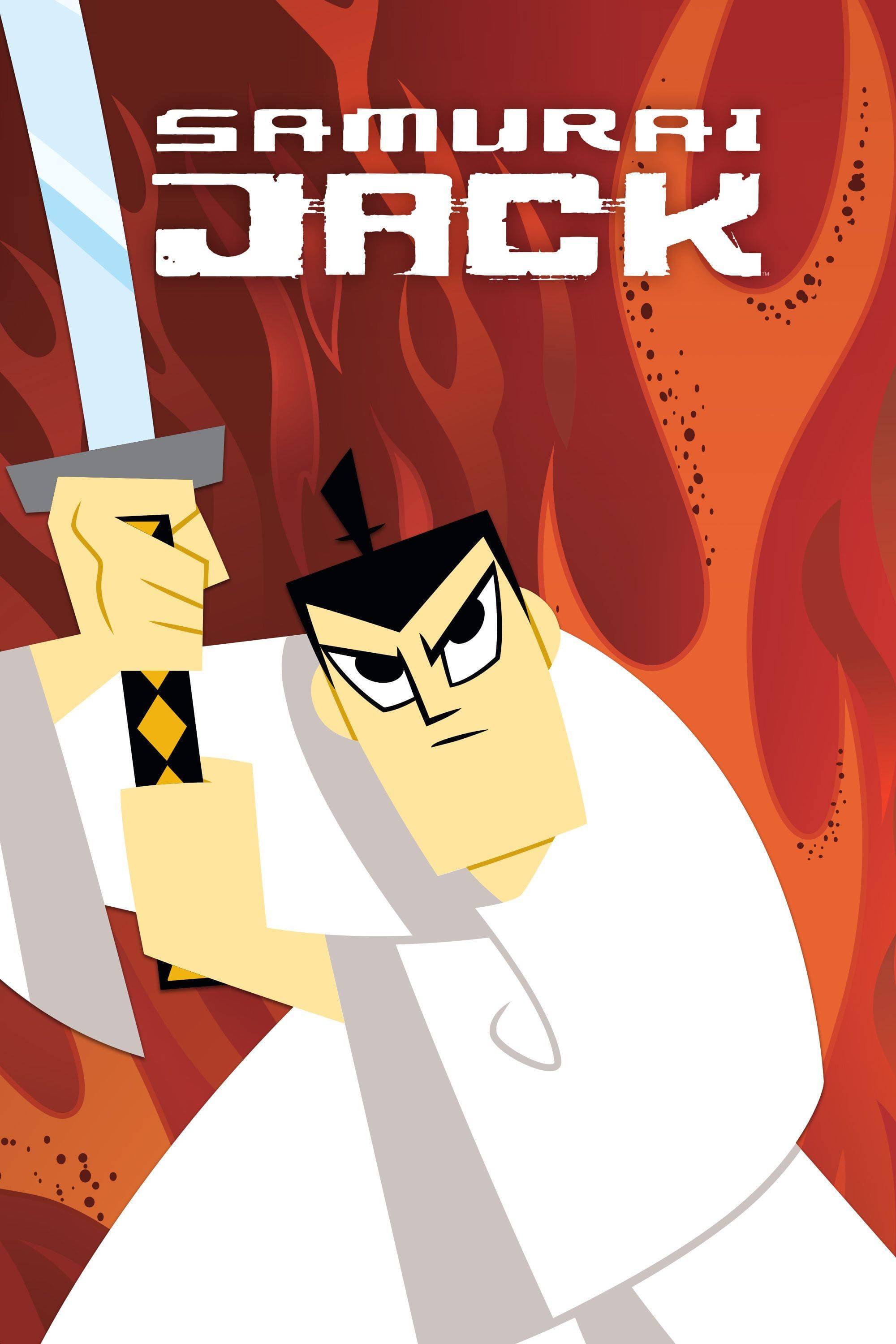
The original four seasons utilized a clean and outline-free style that relied heavily on geometric shapes. The revival season shifted to a darker aesthetic with more detailed texturing and composite effects to match the mature tone. The aspect ratio also widened to give the action sequences a more cinematic scope. This visual update preserved the artistic integrity of the original run while modernizing it for a new generation.
‘One Piece’ (1999–Present)
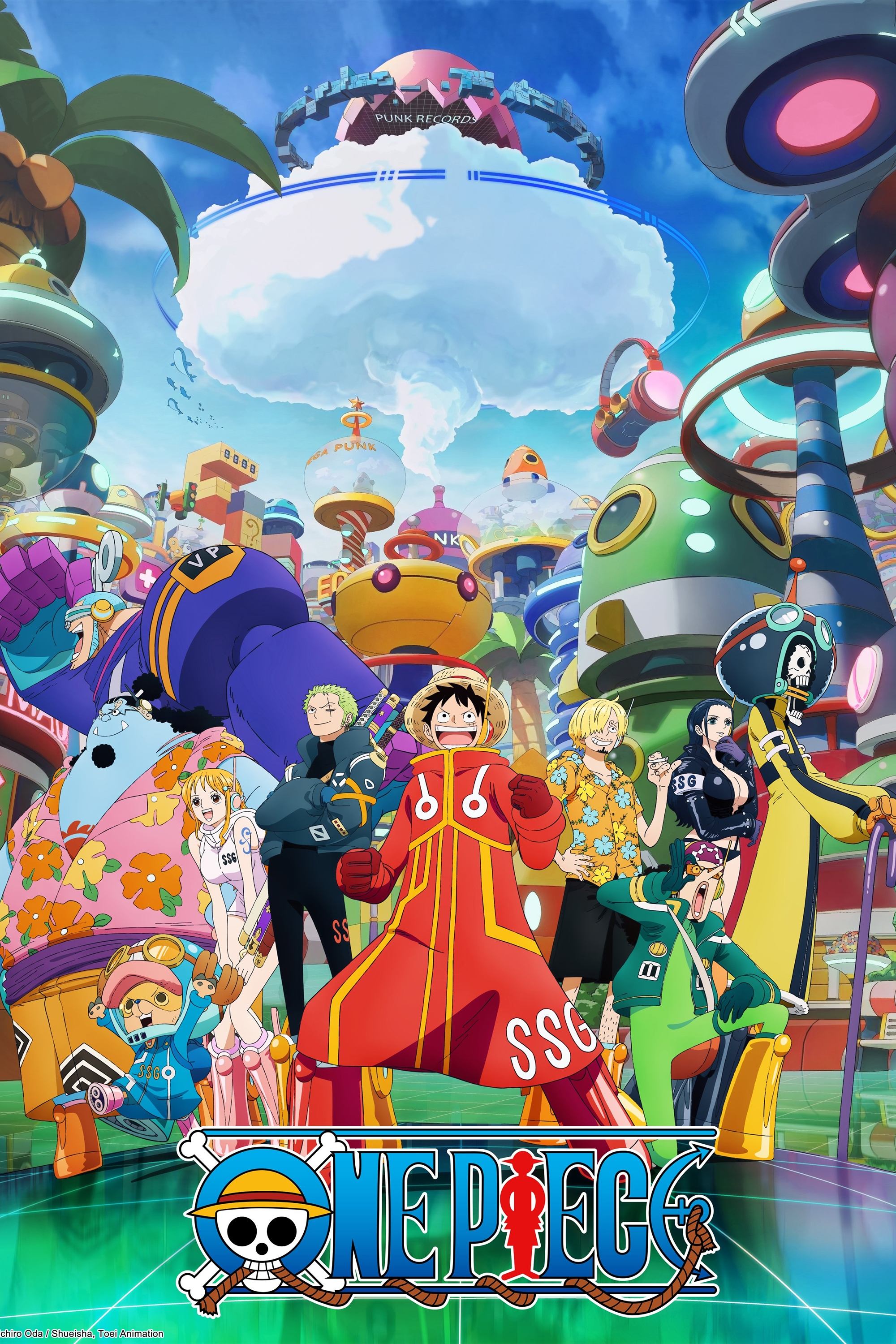
The early episodes utilized traditional cel animation with a washed-out color palette and simple character designs. The switch to digital animation brought brighter colors and sharper lines that transformed the look of the series. The Wano Country arc introduced a massive stylistic overhaul with thicker line work and soft filters that mimic traditional Japanese art. This recent change has resulted in some of the most fluid and dynamic fight choreography in the show’s history.
‘Family Guy’ (1999–Present)
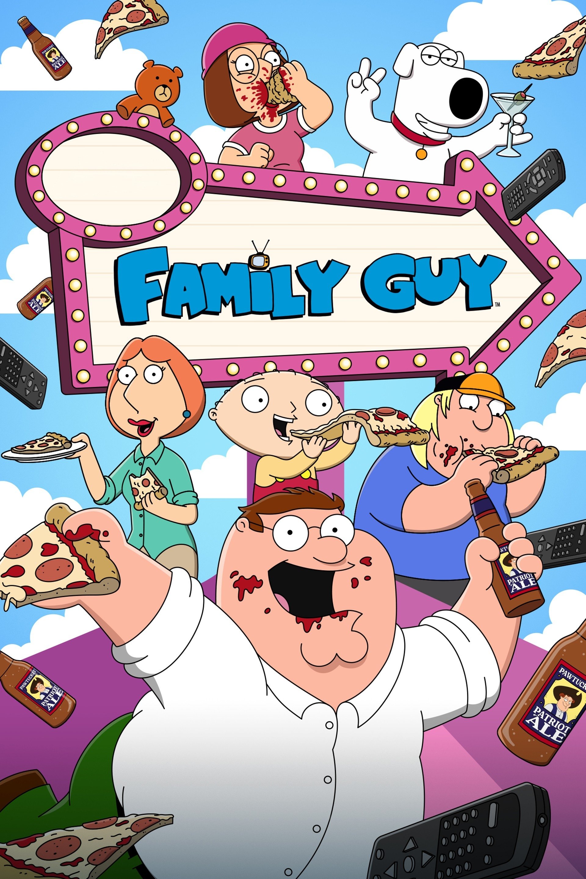
The first few seasons suffered from stiff animation and rough character designs due to a limited budget. The revival of the show brought a transition to digital coloring that made the visuals crisp and vibrant. Current episodes feature polished movements and occasional 3D elements that blend seamlessly with the 2D characters. The visual consistency has improved significantly even if the character models have remained largely unchanged.
‘King of the Hill’ (1997–2010)
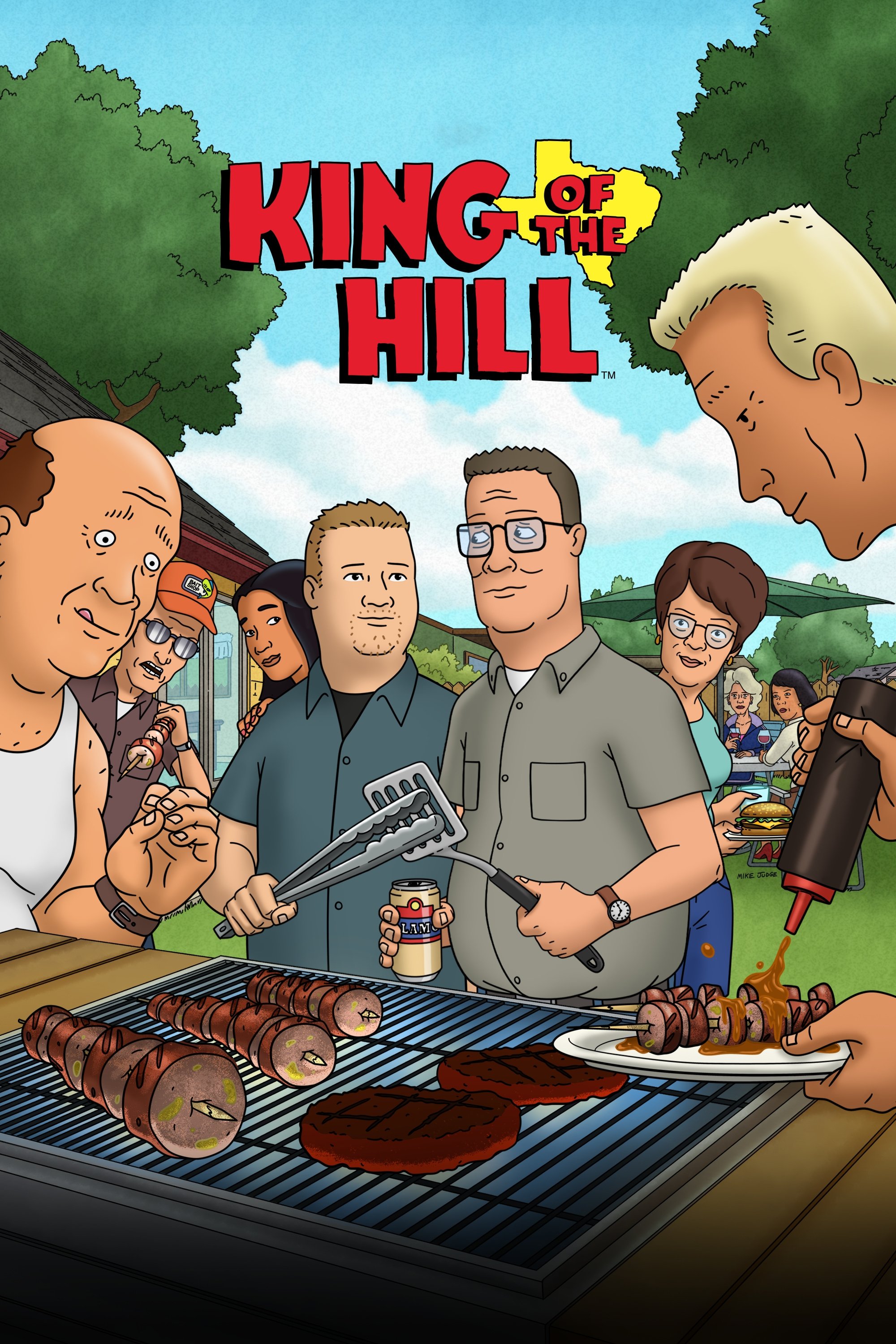
The animation in the first season was gritty and featured a distinct amount of line boil and roughness. The visuals cleaned up considerably in later seasons as the production moved to digital ink and paint. The colors became more saturated and the character movements lost their initial jerky quality. This cleaner look matched the more grounded and subtle storytelling that defined the later years of the series.
‘Beavis and Butt-Head’ (1993–Present)
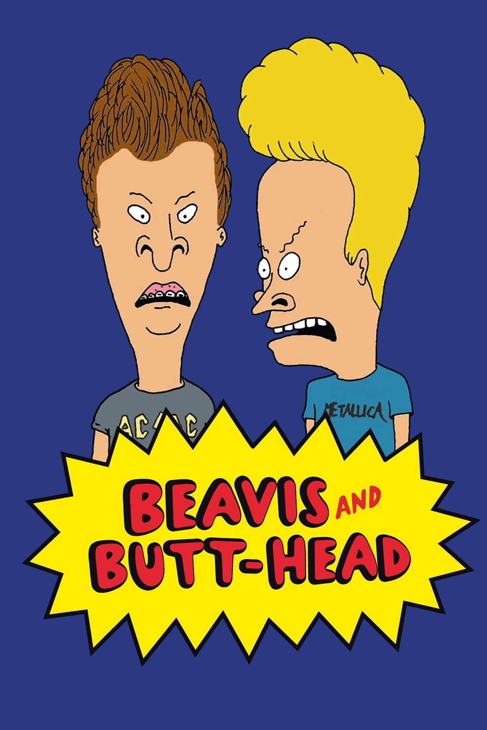
The original run on MTV defined the grunge era with its crude pencil sketches and intentional ugliness. The 2011 revival cleaned up the linework significantly while retaining the unpolished charm of the original designs. The most recent episodes on Paramount+ feature high-definition crispness that highlights every gross detail of the characters. The art style has successfully adapted to modern standards without losing the amateurish spirit that made it famous.
‘SpongeBob SquarePants’ (1999–Present)
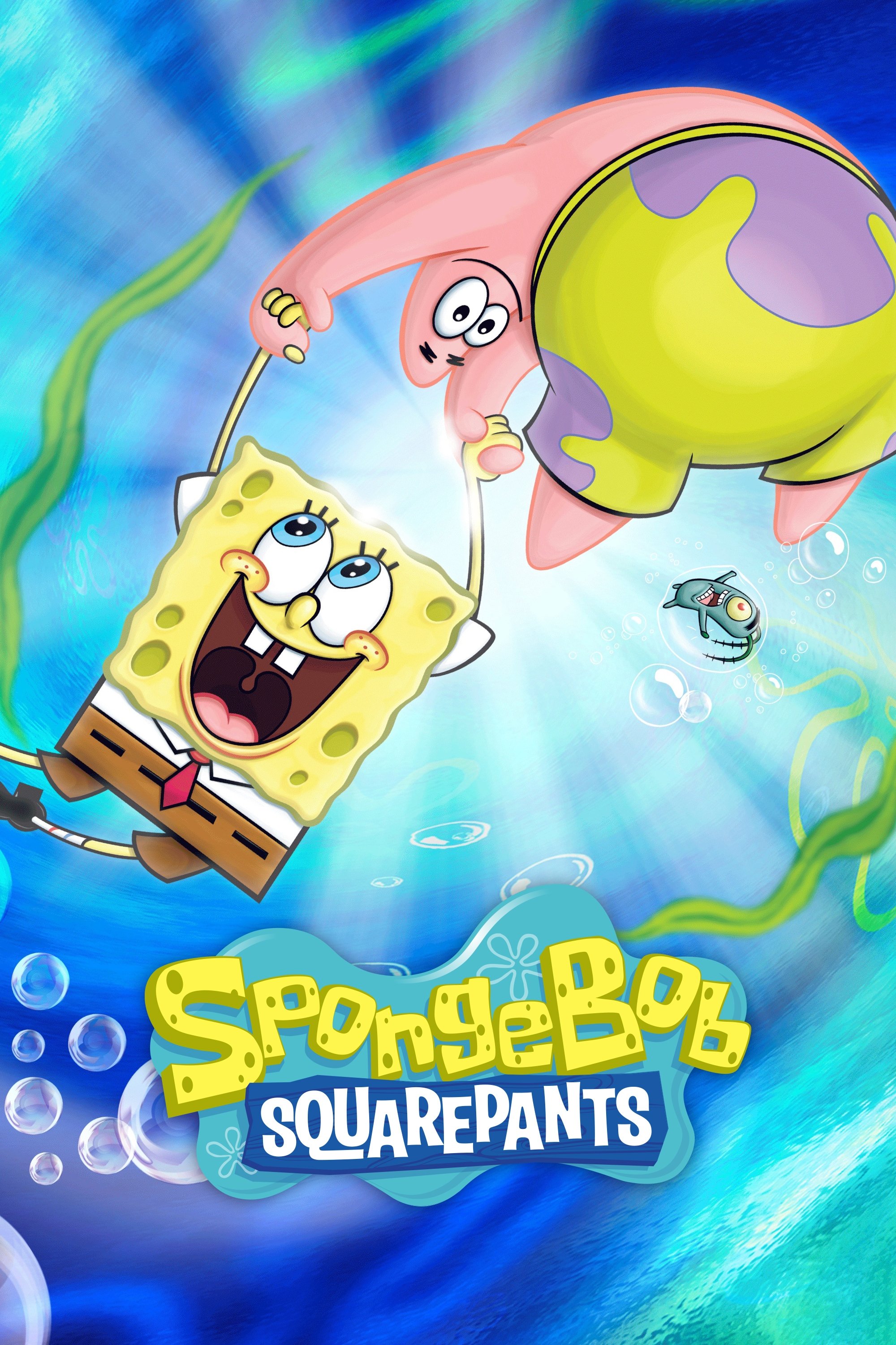
The first season utilized cel animation that gave the show a pale and somewhat textured appearance. The transition to digital production resulted in neon-bright colors and extremely clean character outlines. Recent seasons often employ exaggerated expressions and fluid squash-and-stretch techniques that differ from the stiffer movement of the early years. The visual identity of the show has shifted from a calm nautical vibe to a hyper-energetic cartoon.
‘ReBoot’ (1994–2001)
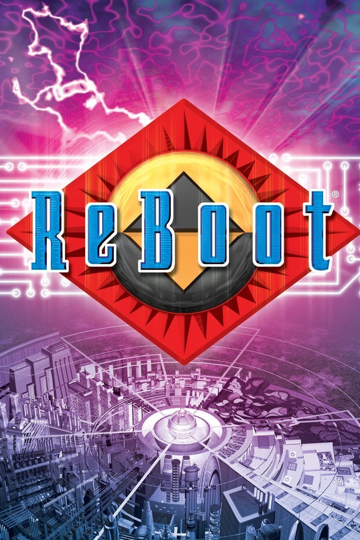
This series was a pioneer in computer-generated television and the early models look incredibly dated by modern standards. The texture quality and lighting improved drastically with each passing season as computing power increased. The final season featured character models with complex facial rigging and atmospheric environments that were impossible in the beginning. The show serves as a historical document of the rapid evolution of CGI technology in the nineties.
‘RWBY’ (2013–2024)
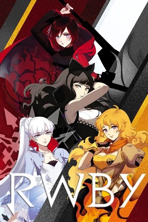
The first few volumes were created using Poser software and featured flat shading with “shadow people” as background extras. The production switched to Maya for the fourth volume and instantly improved the lighting and modeling quality. Characters gained distinct outlines and the animation became significantly more fluid and expressive. The visual jump from the web series beginnings to the final polished product is staggering.
‘The Venture Bros.’ (2004–2018)
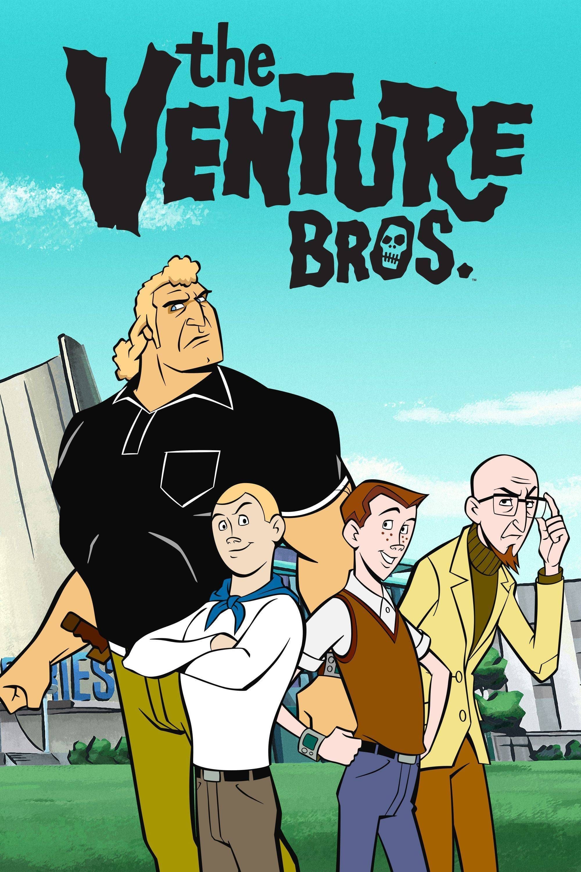
The pilot and first season were animated in Flash with a limited budget that resulted in stiff movements. The art direction evolved to embrace a rich comic book aesthetic with deep shadows and cinematic composition. Later seasons featured hand-drawn quality that rivaled high-budget feature films. The show transformed from a Hanna-Barbera parody into a visually stunned action noir.
‘Archer’ (2009–2023)
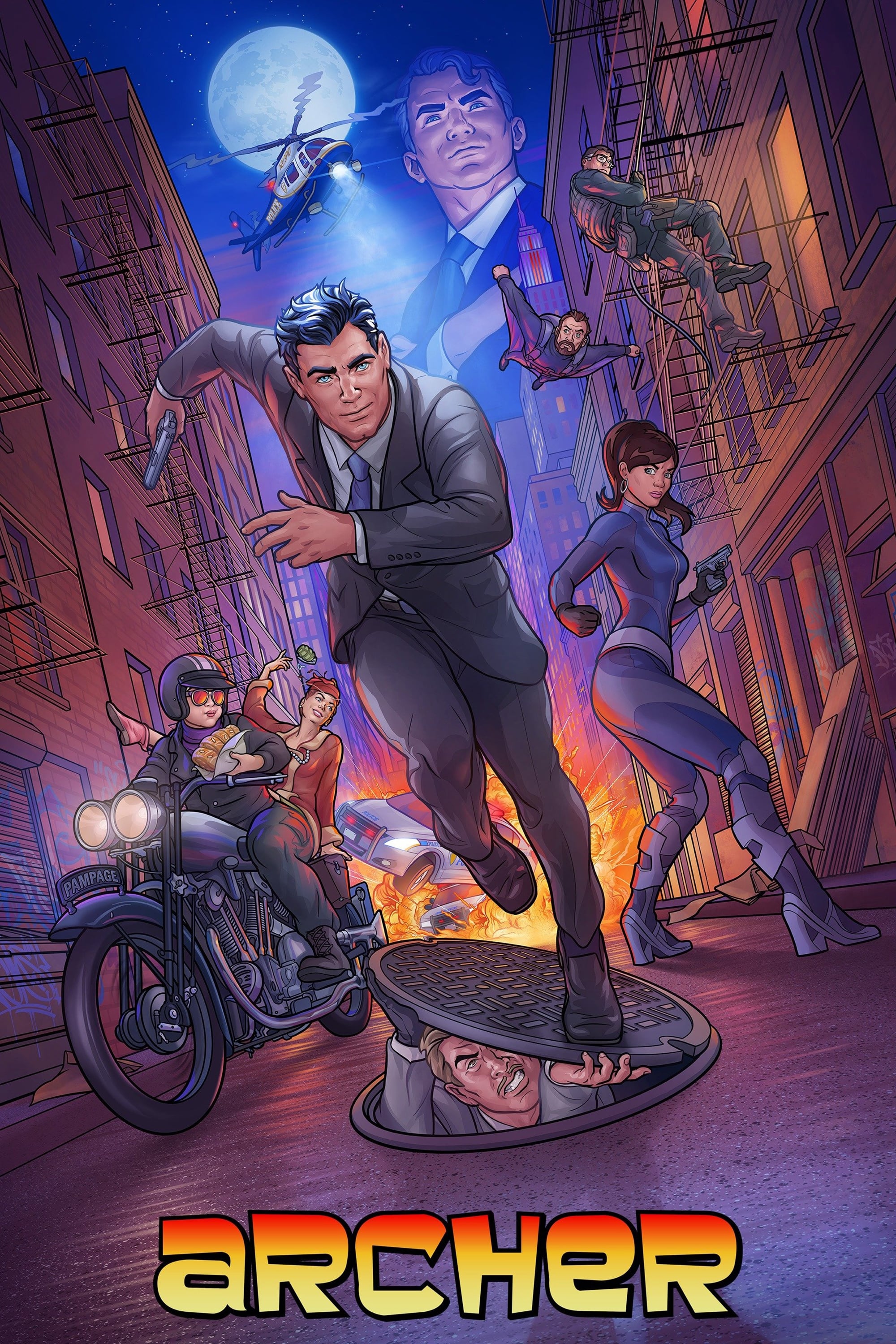
The early seasons used a rigid style where characters moved like paper dolls against static backgrounds. The animation gradually became more fluid as the animators mastered their digital puppet tools. Later seasons introduced 3D rendered vehicles and dynamic camera movements during action sequences. The character models also gained more detailed shading to fit the increasingly dramatic lighting of the show.
‘Attack on Titan’ (2013–2023)
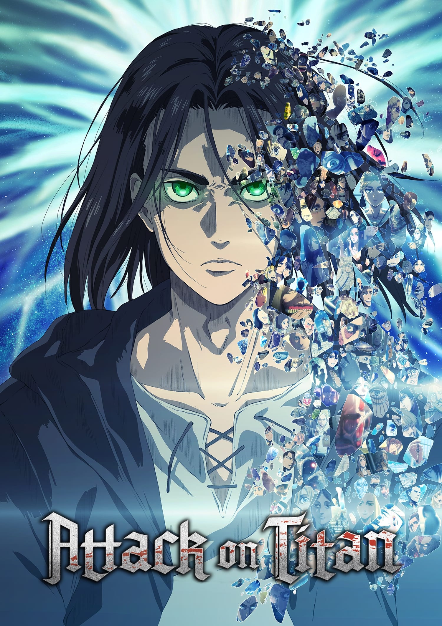
Wit Studio produced the first three seasons with distinct thick outlines and a saturated color palette. MAPPA took over for the final season and implemented a style that closely mimicked the manga with excessive hatching lines. The use of CGI for the Titans also became more prominent and blended differently with the 2D environments. The shift in studios created a noticeable visual divide that marked the darker turn in the narrative.
‘JoJo’s Bizarre Adventure’ (2012–2022)
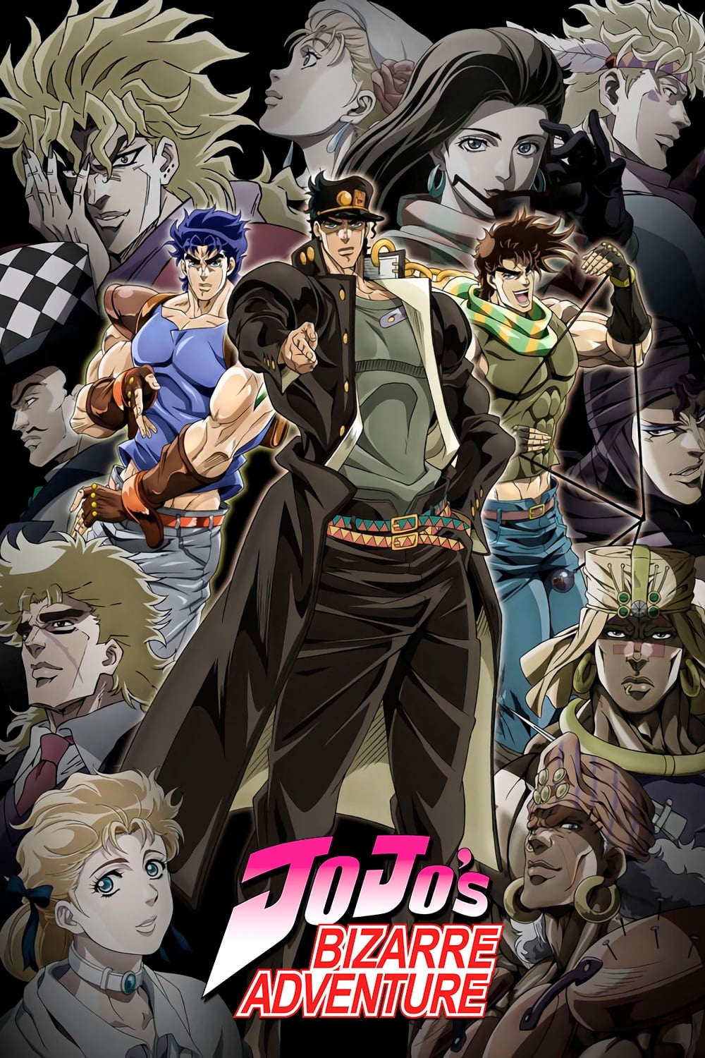
The art style changes with every part to match the evolution of the original manga author’s drawing technique. The first season featured bulky characters with thick lines and exaggerated muscles. Later parts like ‘Golden Wind’ adopted leaner character designs with more intricate fashion details and delicate shading. This constant reinvention keeps the series visually fresh and distinct from any other anime on the market.
‘Dragon Ball Z’ (1989–1996)

The Saiyan Saga featured characters with rounded muscles and softer facial features. The art style became progressively more angular and detailed as the series entered the Android and Buu arcs. Characters gained defined vascularity and the animation became faster to depict the escalating power levels. This shift towards sharp angles influenced an entire generation of action cartoons.
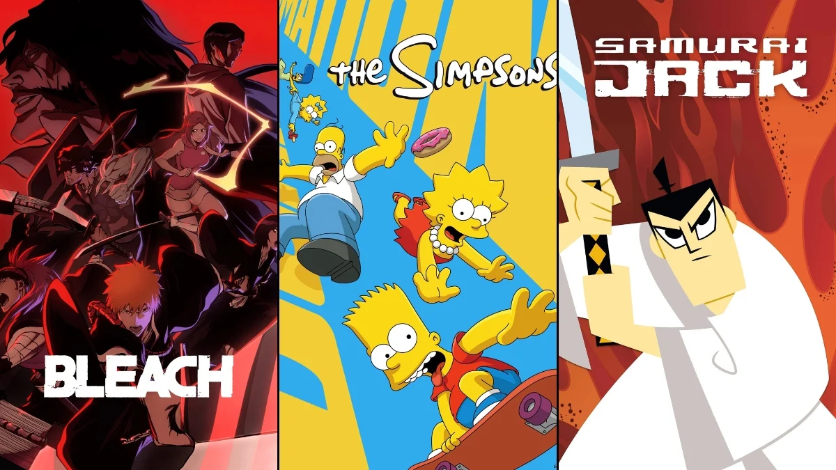
‘Bleach’ (2004–2023)
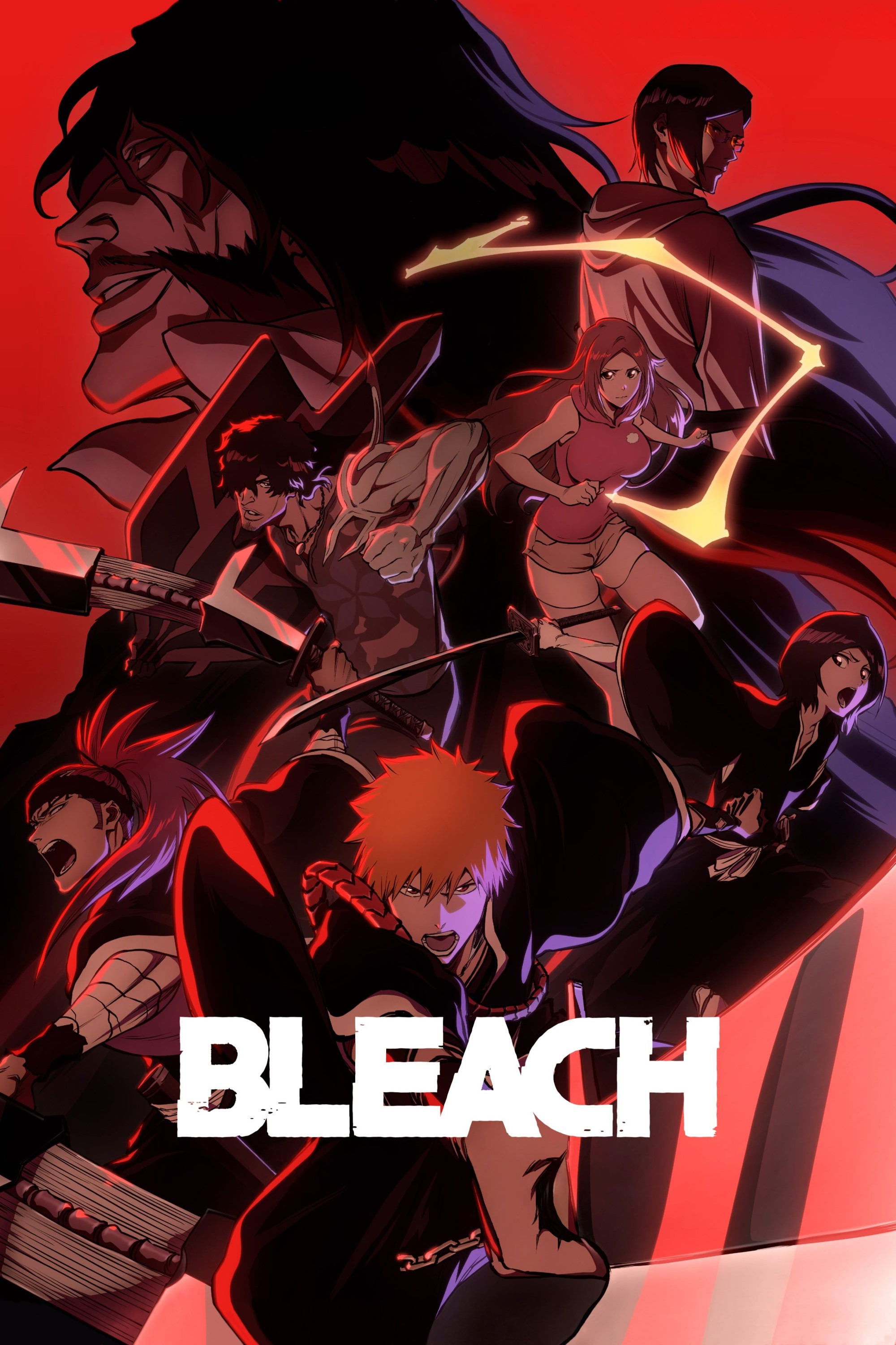
The original run had a standard early 2000s look with a 4:3 aspect ratio and simple digital coloring. The return of the series for the ‘Thousand-Year Blood War’ arc featured movie-quality compositing and dynamic lighting. The new art style utilizes high-contrast shading and vibrant color palettes that were absent in the original anime. The modernization of the visuals revitalized the franchise and set a new standard for shonen anime.
‘Pokémon’ (1997–Present)
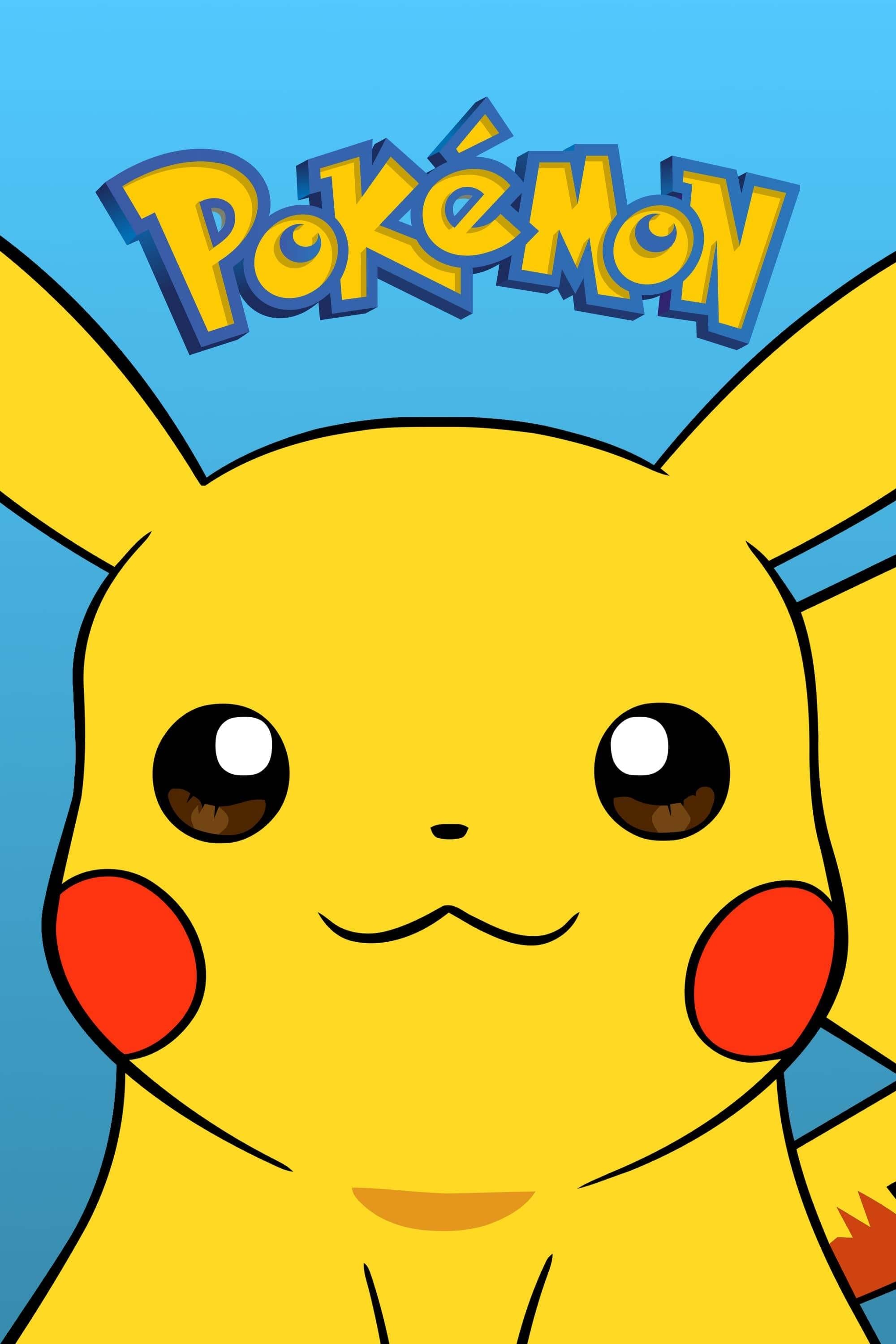
The original series utilized watercolor backgrounds and distinct hand-drawn cel animation. The visuals slowly modernized until the ‘Sun & Moon’ series introduced a radically simplified art style. This softer and rounder design allowed animators to create much more fluid and expressive movement during battles. The aesthetic shift was initially controversial but ultimately allowed for better animation consistency.
‘American Dad!’ (2005–Present)

The first season looked somewhat soft and the character movements were often rigid. The move to high definition brought sharper lines and more detailed background art. The animation on TBS has allowed for more fluid action sequences and gore that the network television budget did not support. The lighting effects in recent seasons have given the show a surprisingly cinematic look for a sitcom.
‘Home Movies’ (1999–2004)
The first season utilized a technique called Squigglevision where the outlines of characters constantly vibrated. The creators abandoned this method in the second season in favor of smoother Flash animation. This switch allowed for more complex character acting and removed the headache-inducing shaky lines. The improvisational nature of the dialogue felt much more natural with the relaxed visual style.
‘Beast Wars: Transformers’ (1996–1999)
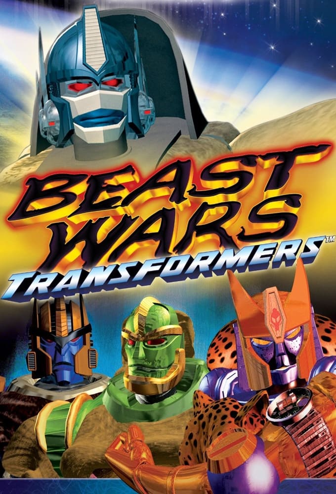
The CGI in the first season was groundbreaking at the time but featured barren landscapes and blocky textures. The character models became more detailed and the environments grew lush as the series progressed. Metallic textures and lighting effects improved significantly by the third season. The visual storytelling matured alongside the technology to create a surprisingly dark sci-fi war drama.
‘Star Wars Rebels’ (2014–2018)
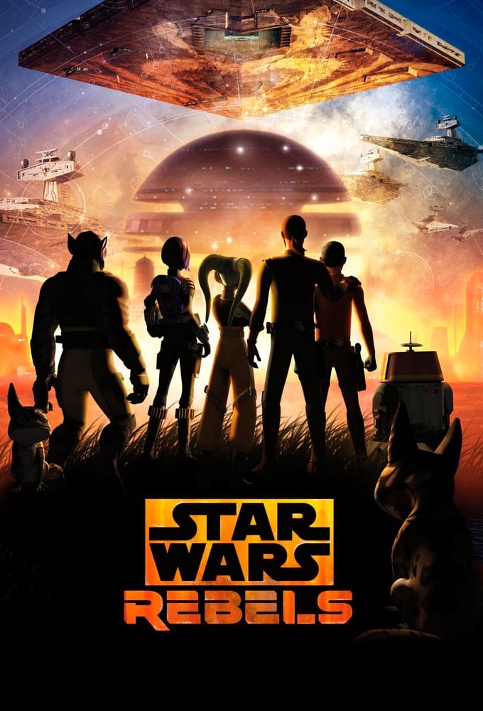
The early episodes were criticized for their simplified textures and thin lightsaber blades. The lighting engine and character models received subtle upgrades throughout the four seasons. The final season featured distinct atmospheric effects and detailed environments that looked far superior to the premiere. The art style eventually won fans over by consistently paying homage to the original Ralph McQuarrie concept art.
‘Daria’ (1997–2002)
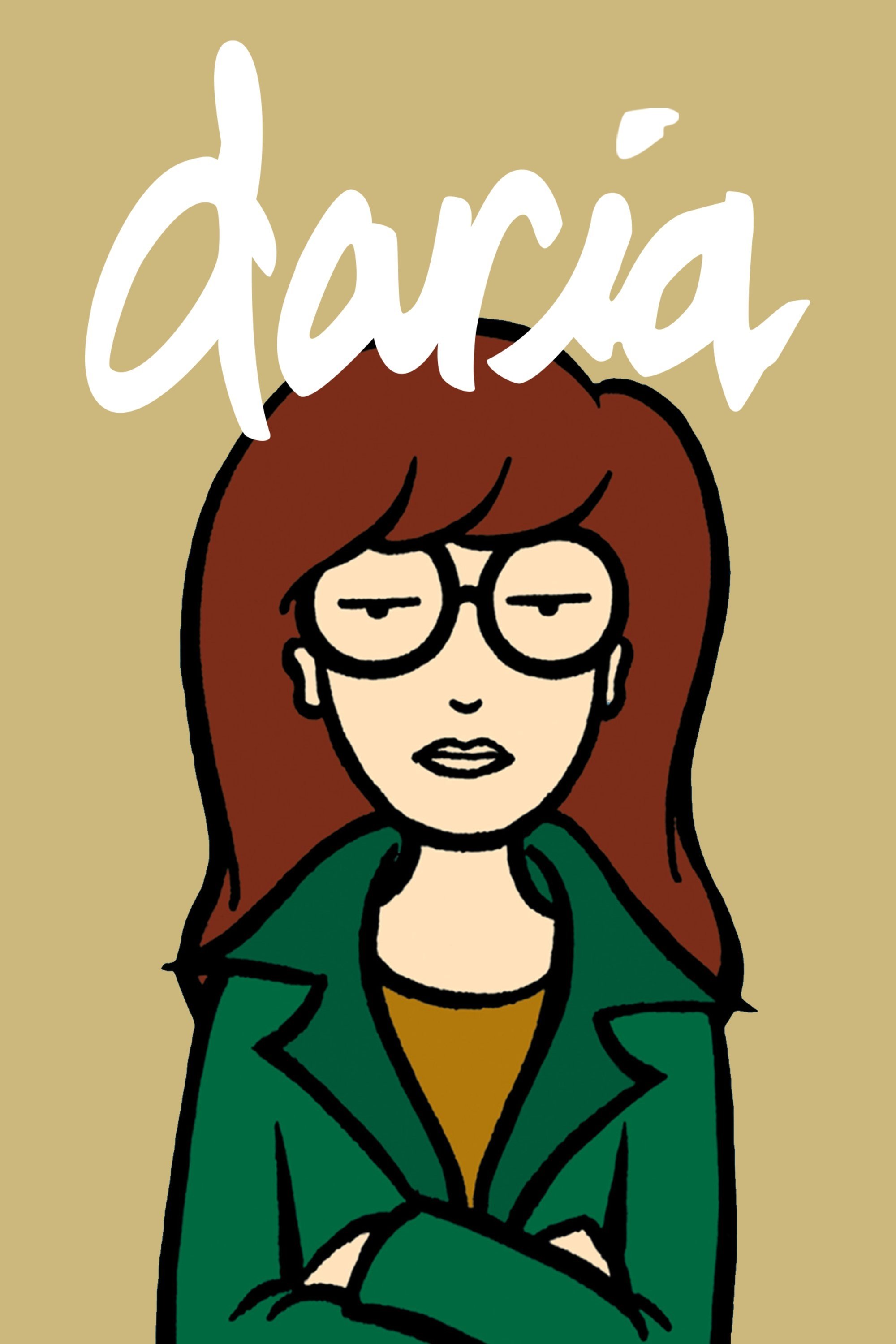
The show started with rough lines and a muted color palette that reflected its grunge roots. The animation became tighter and the colors brighter as the production switched to digital ink and paint. The background characters became more detailed and the overall image quality sharpened. The visual evolution mirrored the slight softening of the main character as she matured.
‘Sailor Moon’ (1992–1997)
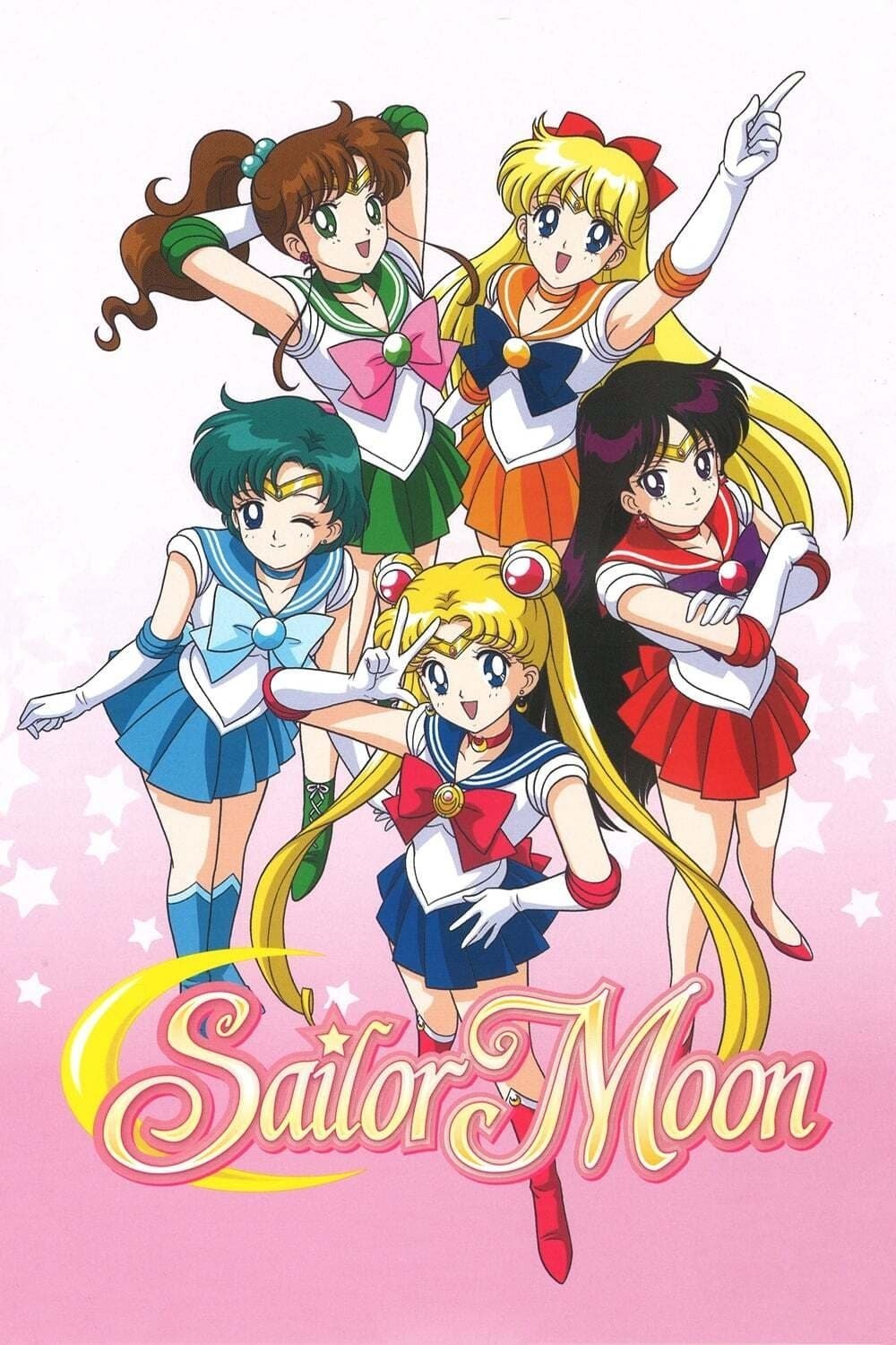
The art style in the nineties anime fluctuated wildly because different episode directors had unique drawing styles. Some episodes featured characters with sharp eyes and tall proportions while others looked round and soft. The final season generally maintained a high quality of animation with vibrant special effects. Fans can often identify the specific animation director just by looking at a single frame of the Sailor Guardians.
‘Steven Universe’ (2013–2020)

The pilot and early episodes featured characters with inconsistent heights and proportions. The art style stabilized into a soft and pastel aesthetic with heavy anime influences as the show found its footing. The backgrounds became increasingly intricate and painterly to contrast with the simple character designs. The visual identity of the show became one of its strongest assets by the time the movie was released.
‘Futurama’ (1999–2023)
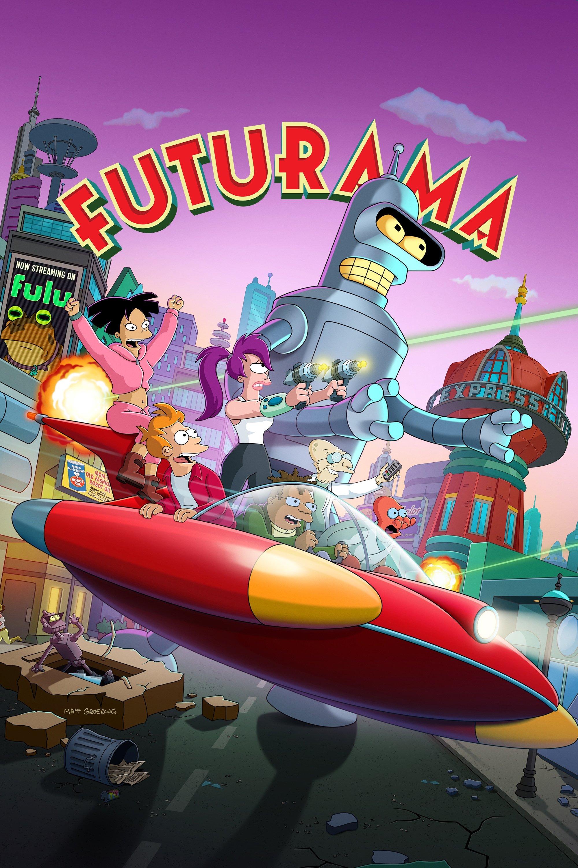
The original run on Fox combined traditional 2D characters with early 3D spaceships and cityscapes. The revival on Comedy Central brought the show into high definition with widescreen visuals and better 3D integration. The latest season on Hulu features 4K resolution that reveals the immense detail in the background art. The blend of 2D and 3D has become seamless compared to the obvious separation seen in the pilot.
‘Rick and Morty’ (2013–Present)
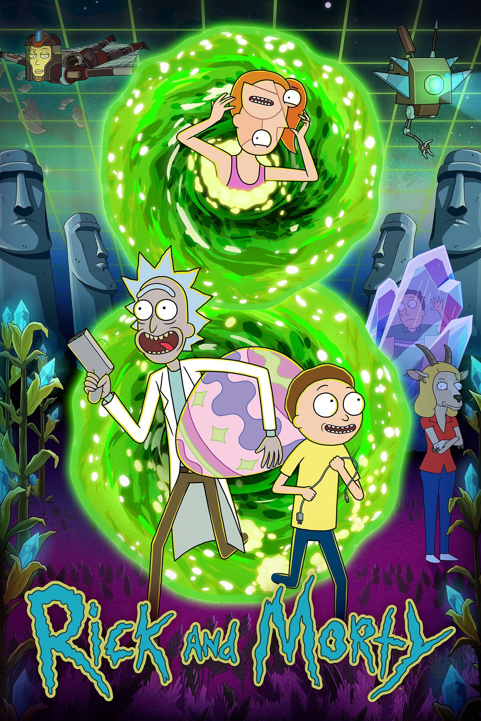
The pilot episode featured incredibly crude drawings with shaky lines that looked like a rough doodle. The series quickly tightened its art style with consistent character models and detailed sci-fi backgrounds. The pupils of the characters changed from scribbles to defined shapes as the animation budget grew. Recent seasons feature complex action sequences and alien worlds that require high-level artistic design.
‘Bob’s Burgers’ (2011–Present)
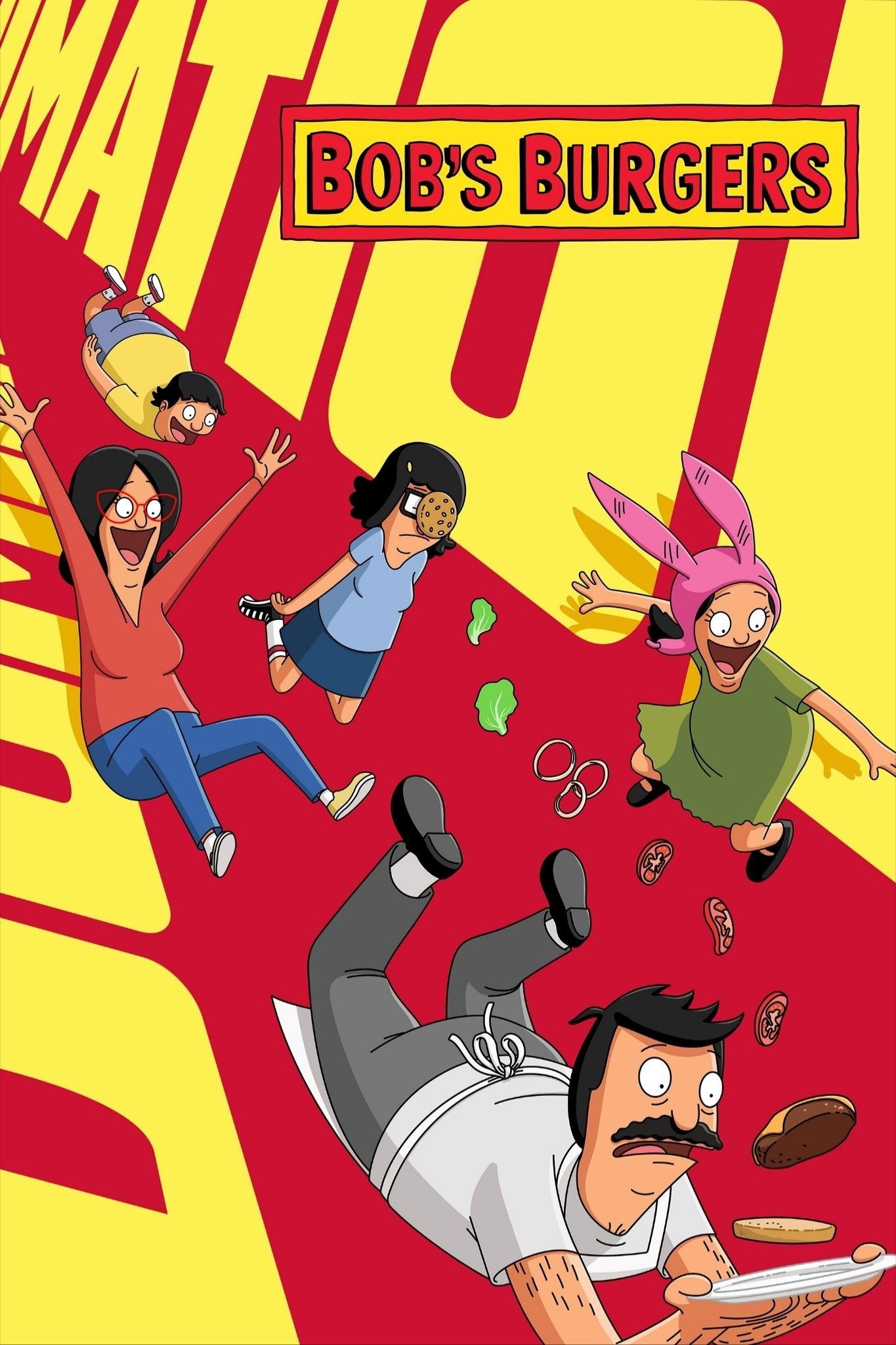
The first season utilized Flash animation that included zooming camera moves and thicker character outlines. The show later switched to a more traditional look with thinner lines and static camera angles. The lighting and shadows have become much more sophisticated in recent years compared to the flat look of the premiere. The visual charm lies in the small details of the background store signs which have remained a constant gag.
‘The Dragon Prince’ (2018–Present)
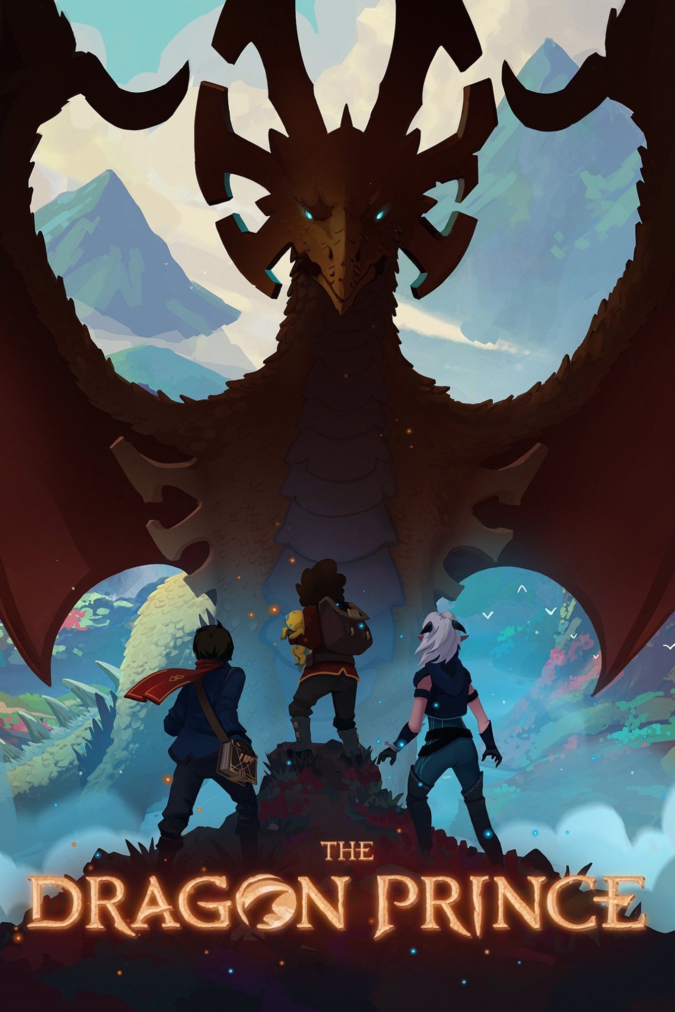
The first season utilized a reduced frame rate that made the 3D characters look like jerky stop-motion figures. The creators listened to fan feedback and increased the frame rate in subsequent seasons to smooth out the motion. The show maintained its beautiful 2D-painted backgrounds while fixing the technical stutter of the characters. This adjustment allowed the audience to focus on the story rather than the distracting visual hiccups.
Please share your favorite example of a TV show changing its look in the comments.