
25 TV Series Where Lighting Shifts Signal Time Jumps

Visual storytelling relies heavily on color grading and lighting to guide the audience through complex narratives. Television creators utilize these techniques to distinguish between timelines without the need for constant text overlays. This list explores series that masterfully employ visual cues to signal shifts in time or reality.
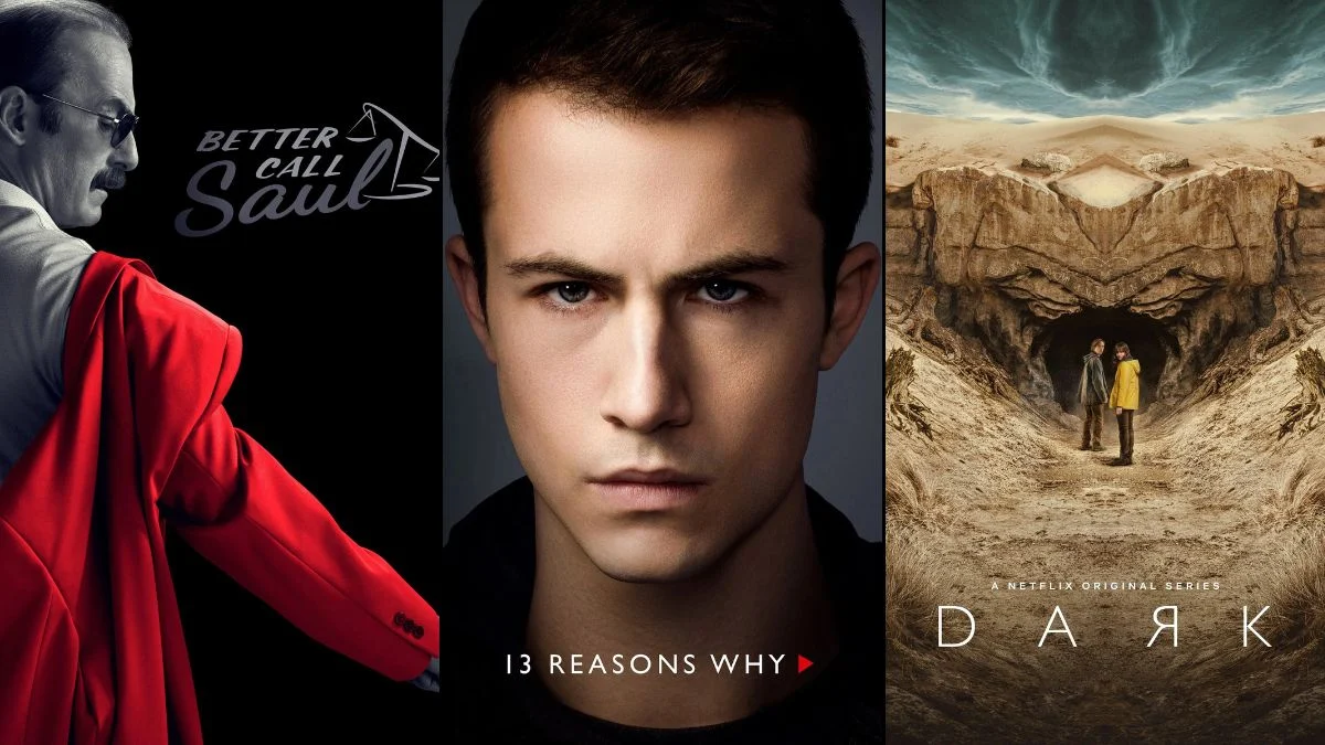
‘Better Call Saul’ (2015–2022)
The series acts as a prequel to ‘Breaking Bad’ but opens with flash-forwards set after the original show’s conclusion. These sequences feature a high-contrast black and white aesthetic that depicts the dreary life of Gene Takavic. The main narrative bursts into vibrant color to showcase the colorful scams of Jimmy McGill in the early 2000s. This visual dichotomy instantly informs the viewer of the timeline and sets the emotional tone for each era.
‘Dark’ (2017–2020)
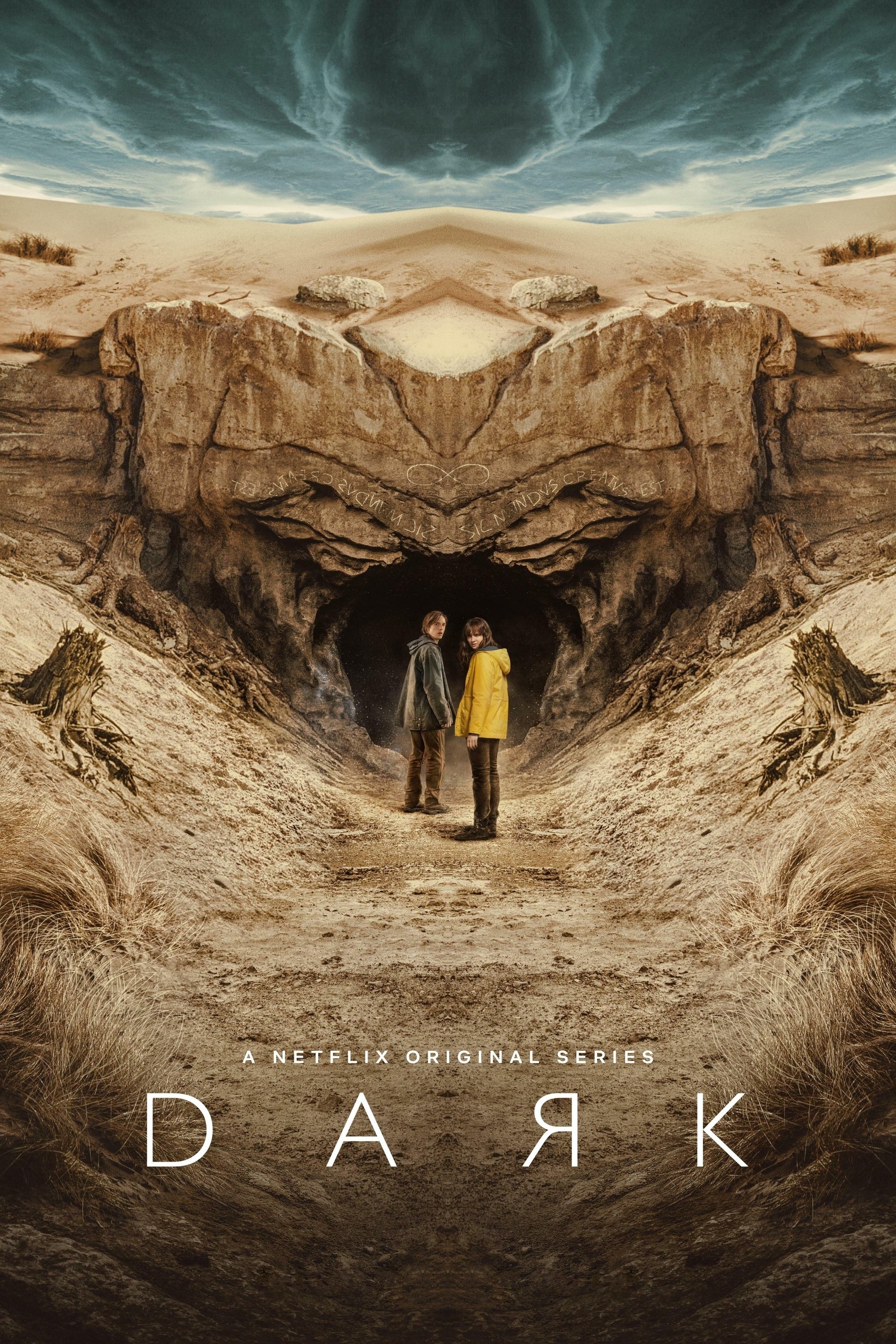
This German sci-fi thriller weaves a tangled web across multiple generations and time periods. The showrunners utilized distinct color palettes to help viewers navigate the complex knot of 1953, 1986, and 2019. The 1980s scenes often feature slightly warmer and softer lighting compared to the stark and desaturated look of the present day. Such visual coding is essential for tracking the characters as they traverse the Winden caves.
‘Cruel Summer’ (2021–Present)
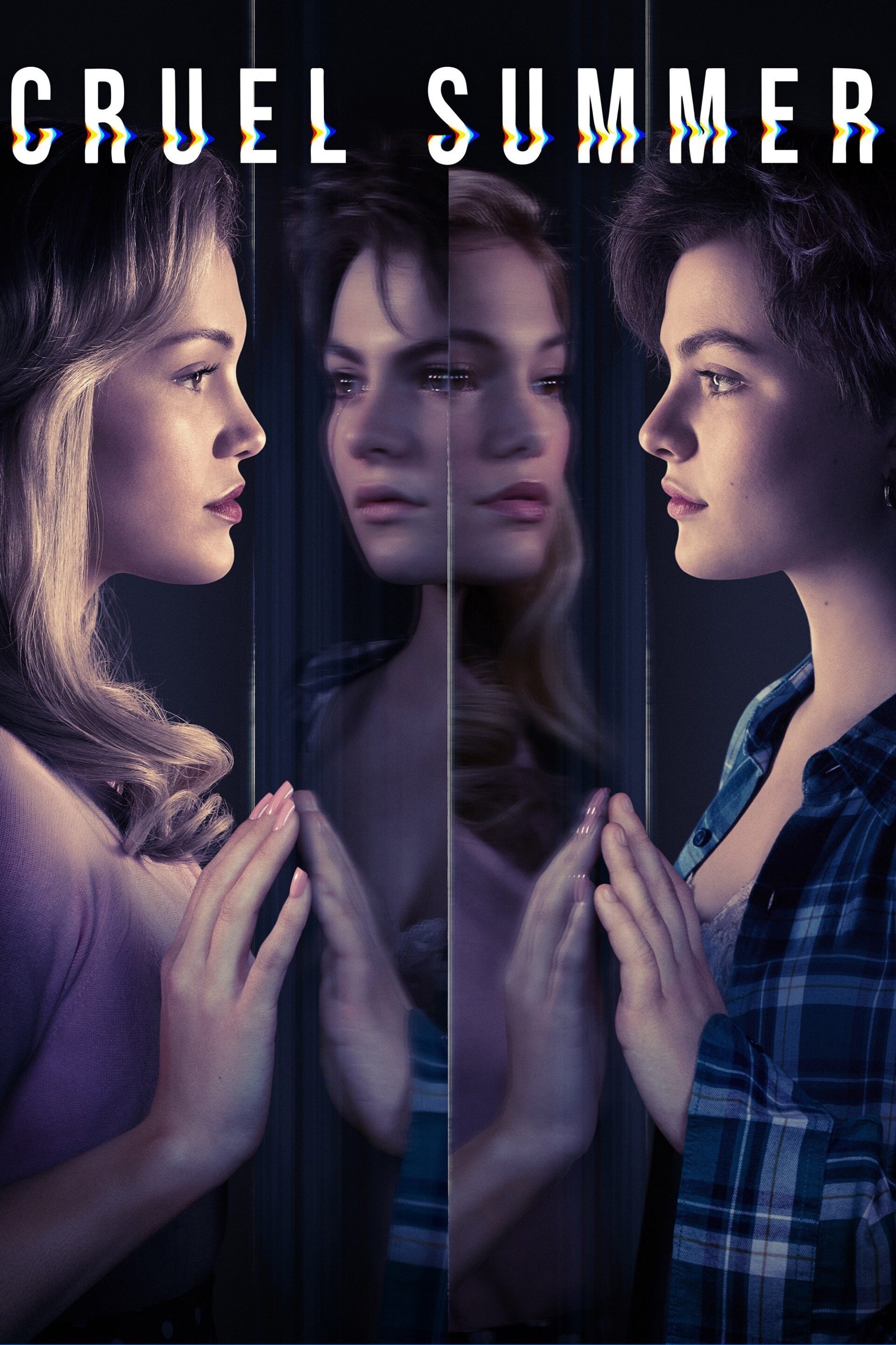
The narrative unfolds over three consecutive summers in the 1990s with each year bearing a specific visual signature. The events of 1993 appear bright and saturated to reflect the innocence and optimism of the characters. By 1994 the lighting becomes more neutral as the central mystery begins to darken the town’s mood. The timeline finally shifts to a gloomy and green-tinted 1995 to represent the legal battles and emotional fallout.
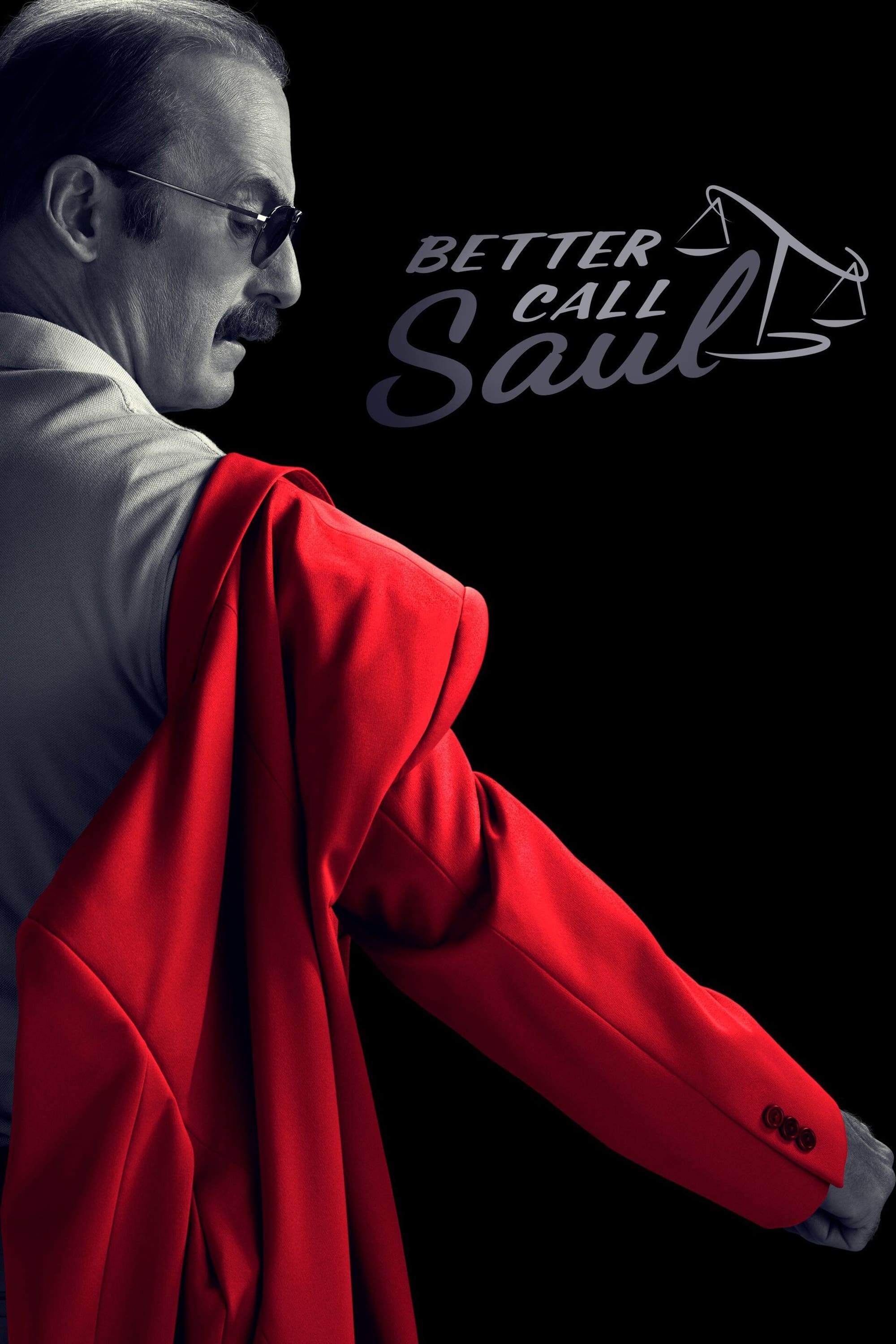
’13 Reasons Why’ (2017–2020)
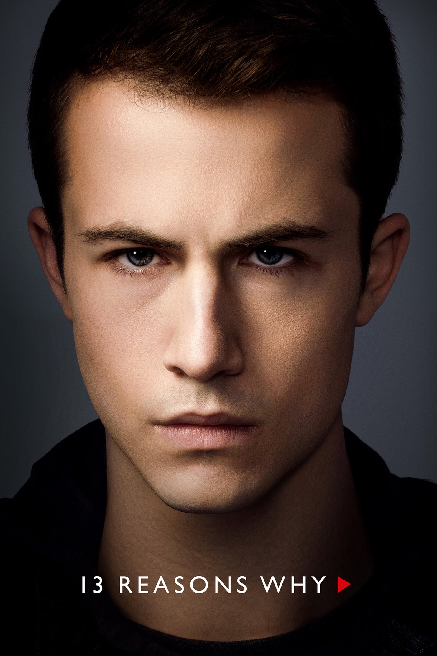
The first season alternates between the weeks leading up to Hannah Baker’s death and the aftermath of the tragedy. Scenes set in the past utilize a warm and golden color grading to signify the hope that still existed. The present timeline contrasts this with a cool blue filter that emphasizes the grief and bleakness of the characters. This constant shifting of color temperature serves as a primary navigation tool for the audience.
‘Yellowjackets’ (2021–Present)
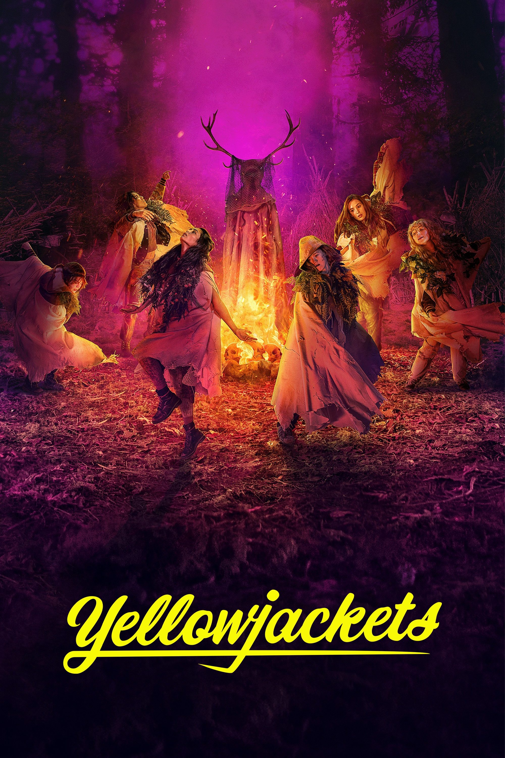
The story splits its focus between a high school soccer team stranded in the wilderness in 1996 and their adult counterparts in the present. The 1990s timeline employs a grainy and slightly warmer texture that evokes the era of analog film. The modern sequences feature a sharp and cold digital look that reflects the trauma lurking beneath the surface of their adult lives. These visual distinctions clarify the narrative flow between the survival horror past and the suburban mystery present.
‘Quantico’ (2015–2018)
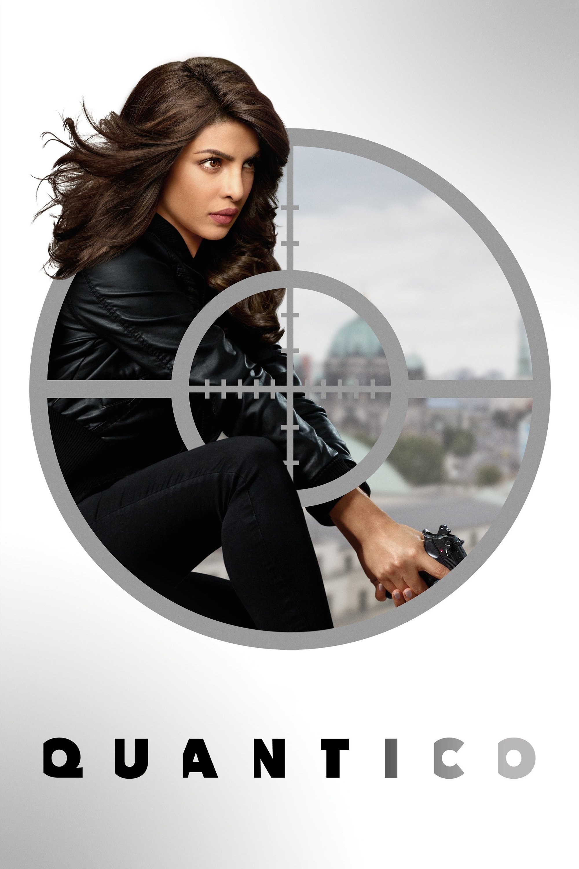
The first season operates on two timelines involving FBI recruits at the academy and a terrorist attack in the near future. The academy days are bathed in warm sunlight and golden hues to suggest promise and camaraderie. The future timeline switches to a cool blue palette that underscores the danger and suspicion among the former classmates. This heavy-handed color grading ensures the viewer always knows which part of the conspiracy is unfolding.
‘The Haunting of Hill House’ (2018)
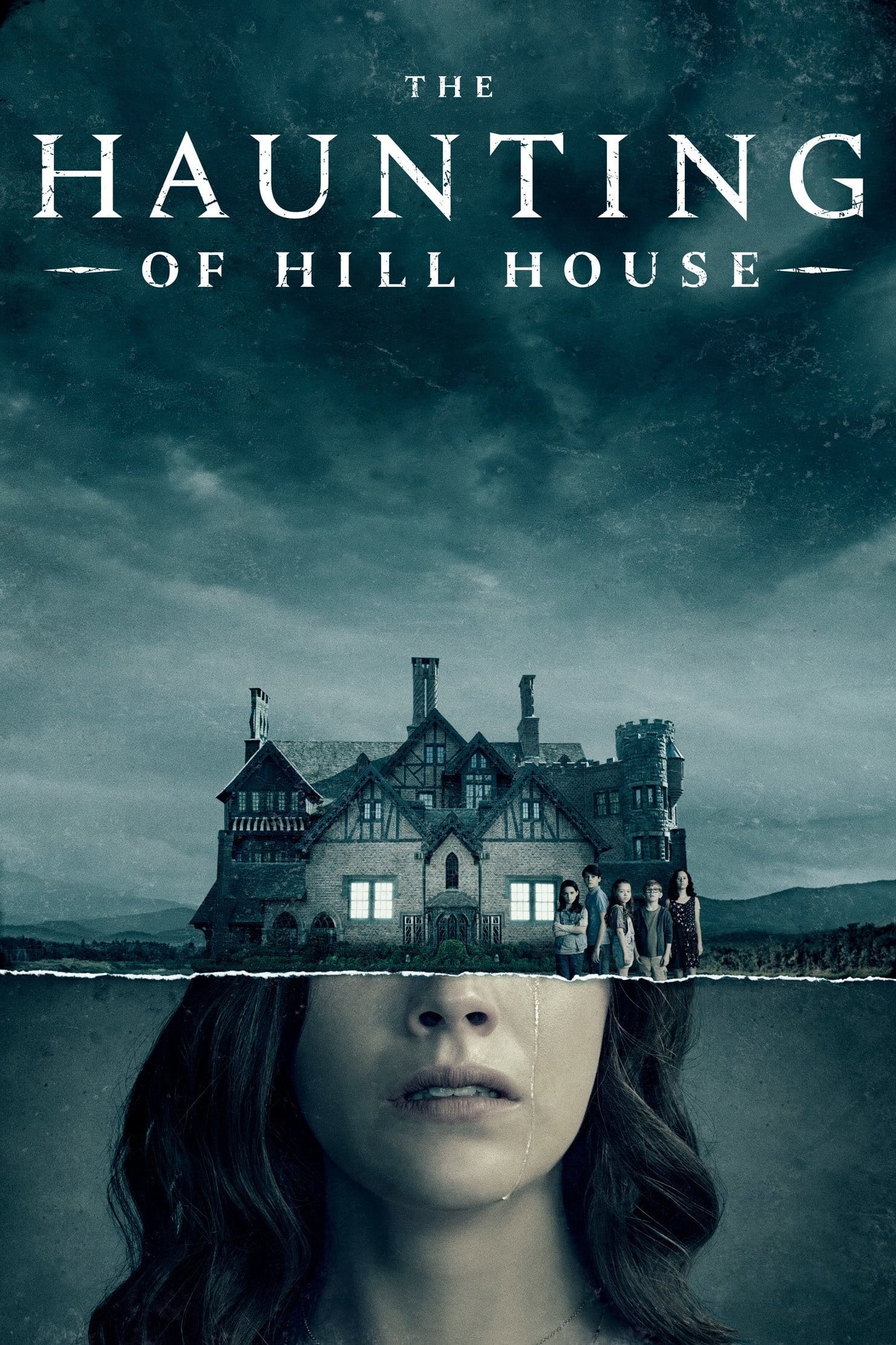
Mike Flanagan directs this horror drama that seamlessly blends childhood memories with adult trauma. The scenes set within the house during the past possess a warm and vintage quality despite the horrors within. The present-day sequences utilize a desaturated and blue-heavy look to convey the lingering grief of the Crain siblings. Lighting shifts often happen in real-time during long takes to merge the past and present into a single haunting experience.
‘Awake’ (2012)
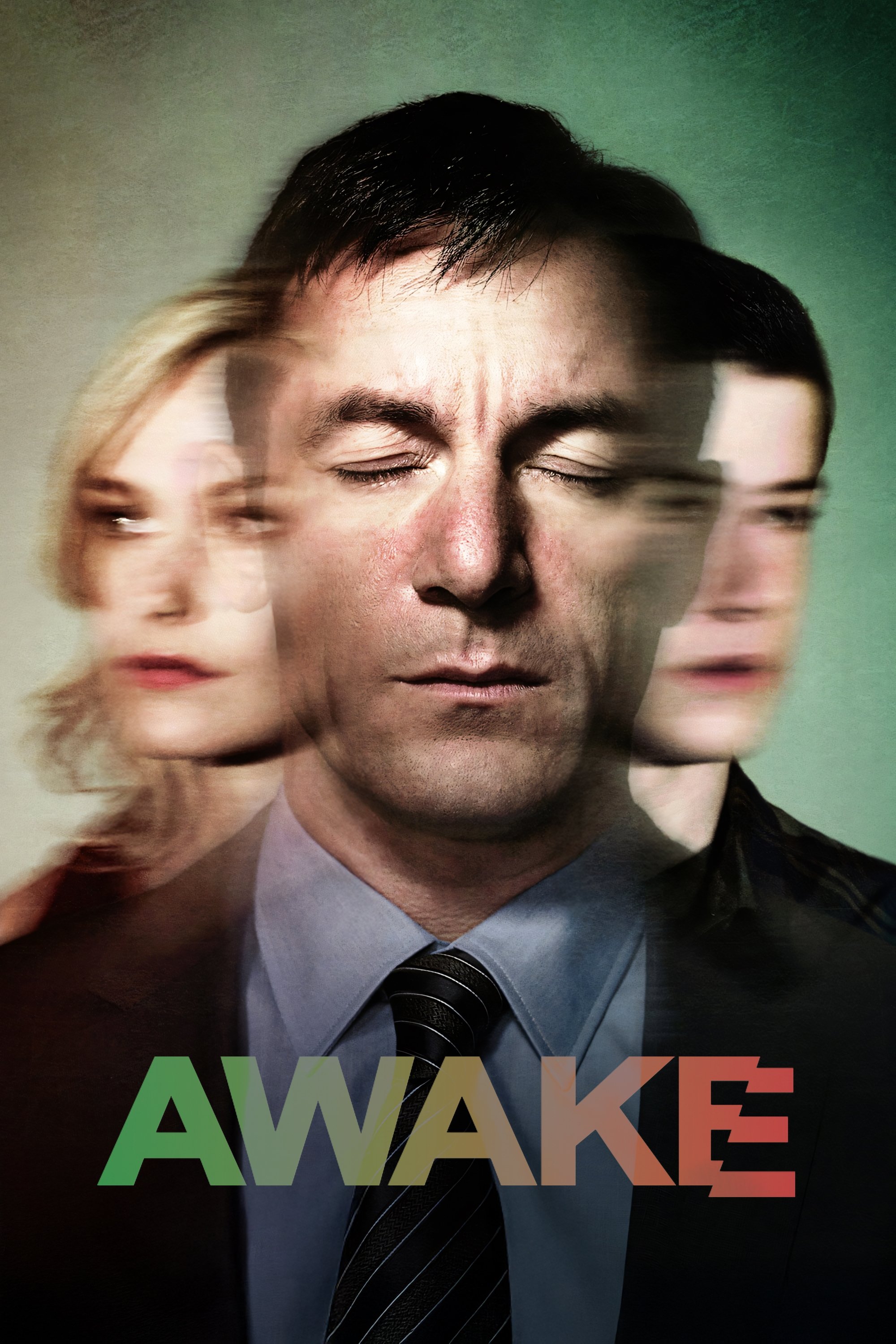
Police detective Michael Britten finds himself living in two parallel realities after a car accident. One reality features a warm yellow tint where his wife survived the crash while the other uses a cool green tone where his son survived. The protagonist wears different colored wristbands to help himself keep track but the audience relies on the aggressive color grading. This visual device allows the show to cut rapidly between realities without confusing the viewer.
‘WandaVision’ (2021)
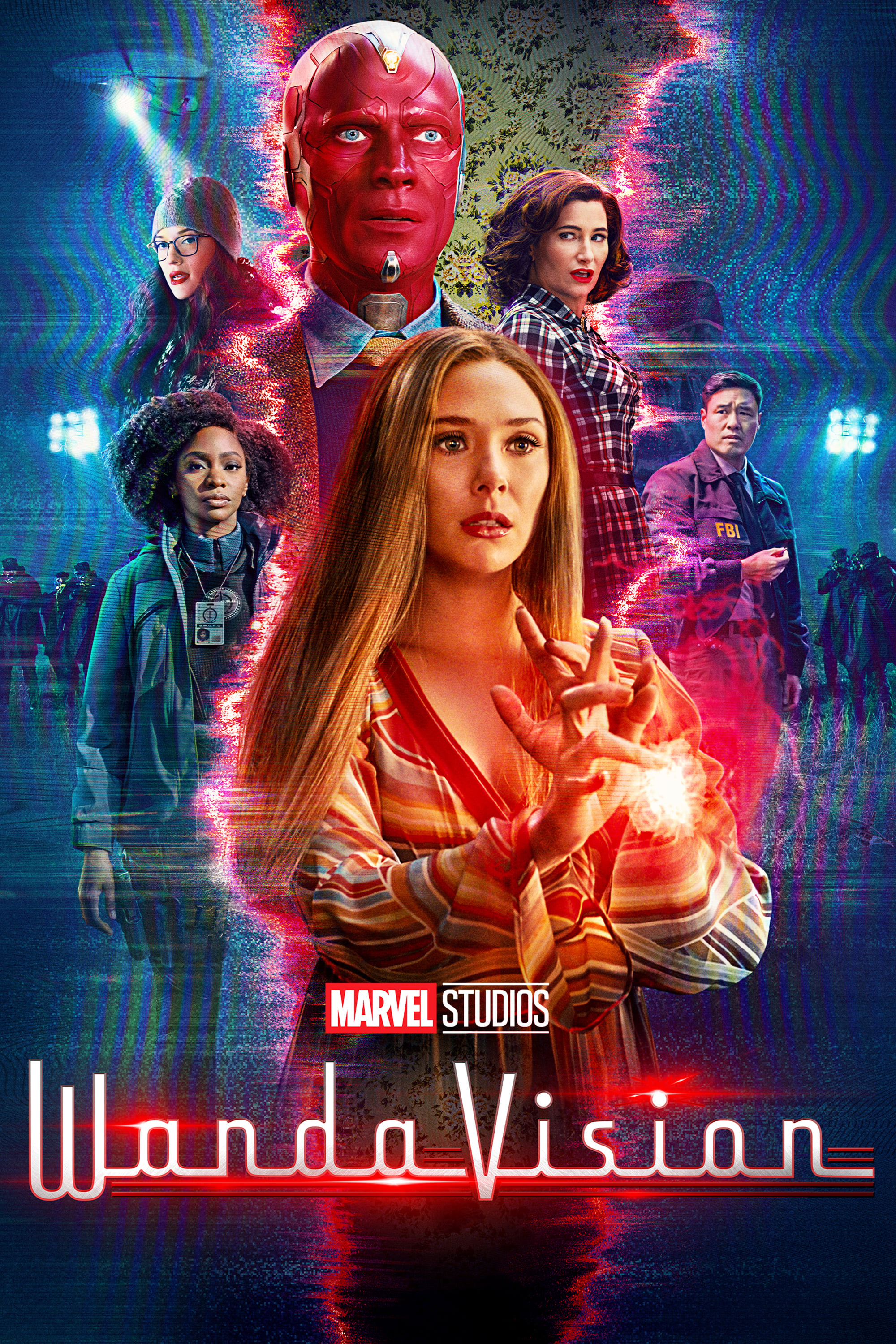
The series journeys through decades of sitcom history with lighting and aspect ratios that match each specific era. Early episodes utilize black and white photography with hard lighting typical of the 1950s and 1960s multi-camera productions. As the show progresses into the 1970s and beyond it shifts to Technicolor and eventually modern digital cinematography. These stylistic changes serve as chronological markers that reflect the protagonist’s processing of grief.
‘Fear the Walking Dead’ (2015–2023)
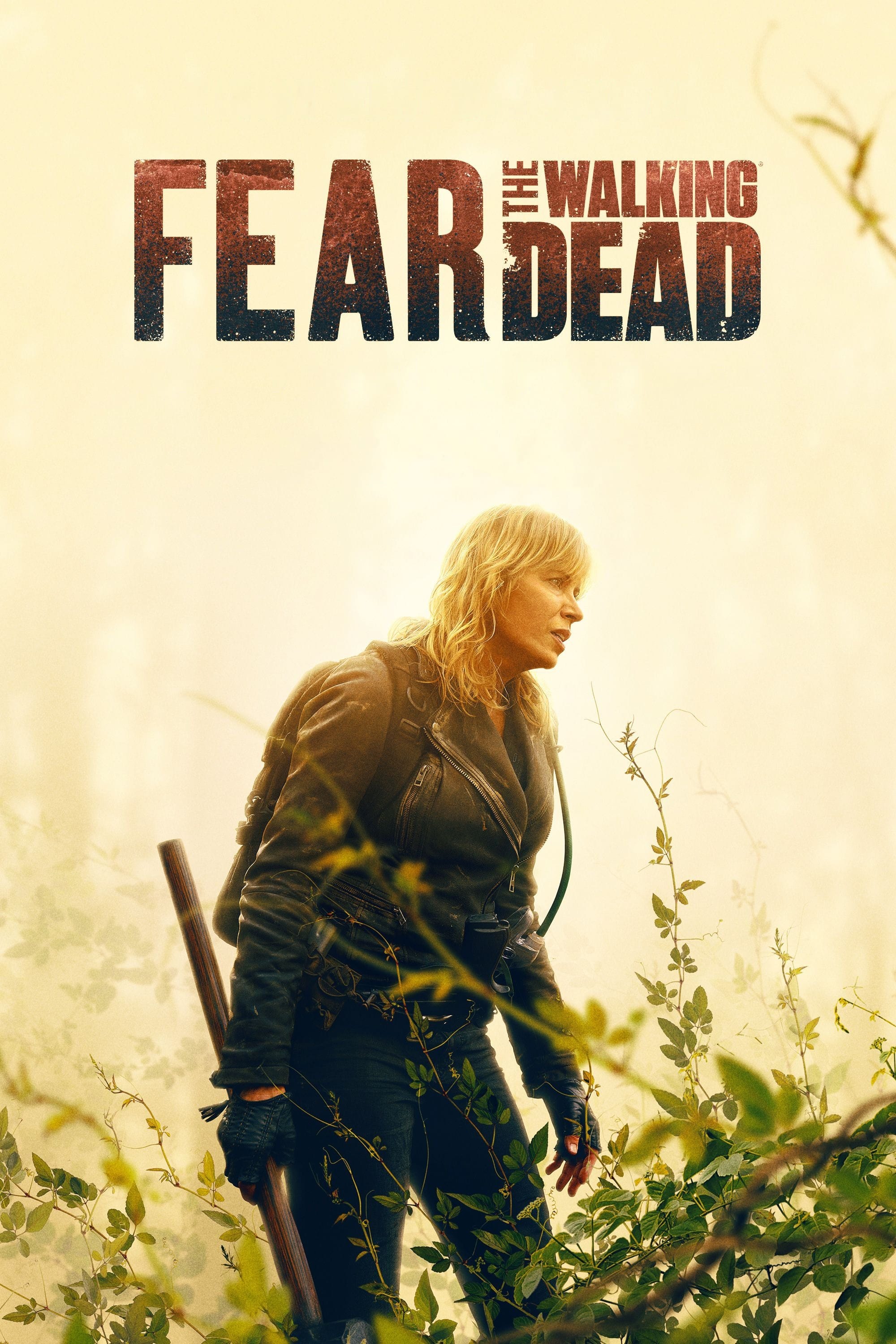
The fourth season underwent a creative overhaul that introduced two distinct timelines separated by a stadium disaster. The narrative set before the fall of the stadium features warm and saturated colors to represent hope and community. The timeline following the event switches to a desaturated and grey palette to emphasize loss and hopelessness. This drastic change in color grading became a central storytelling device for the season.
‘Arrow’ (2012–2020)
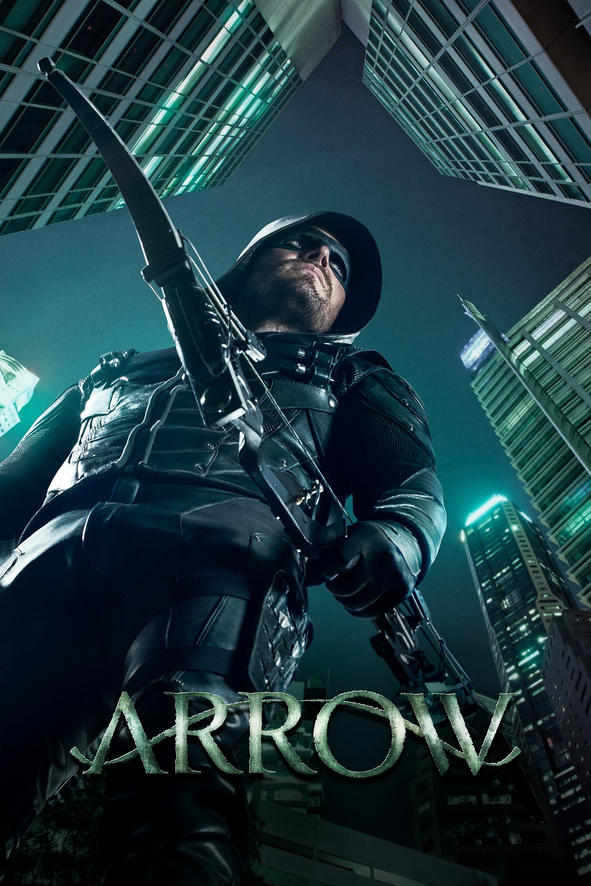
Oliver Queen’s journey as a vigilante is juxtaposed with the five years he spent missing on a remote island. The flashbacks utilize a high-contrast and grainy aesthetic with a greenish tint to reflect the harsh survival conditions. The present-day scenes in Starling City appear cleaner and more naturalistic to ground the superhero action in reality. These visual cues became a staple of the show’s structure for its first five seasons.
‘How to Get Away with Murder’ (2014–2020)
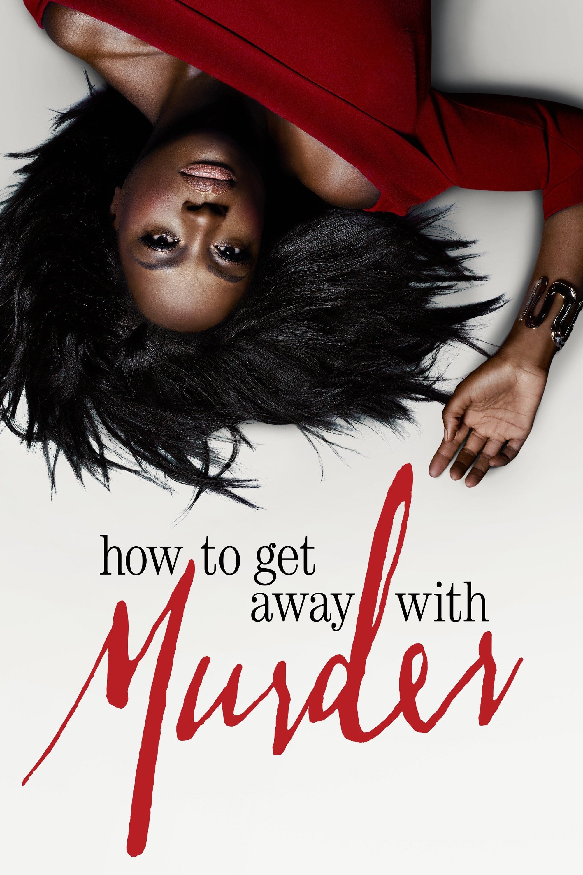
Each season typically builds toward a flash-forward event involving a death or a crime. The timelines leading up to the event maintain a standard dramatic lighting style with warm skin tones. The flash-forwards employ a cold and blue-tinted filter to signal the impending tragedy and high tension. This repetitive visual structure helps build suspense as the two timelines slowly converge.
‘Fringe’ (2008–2013)
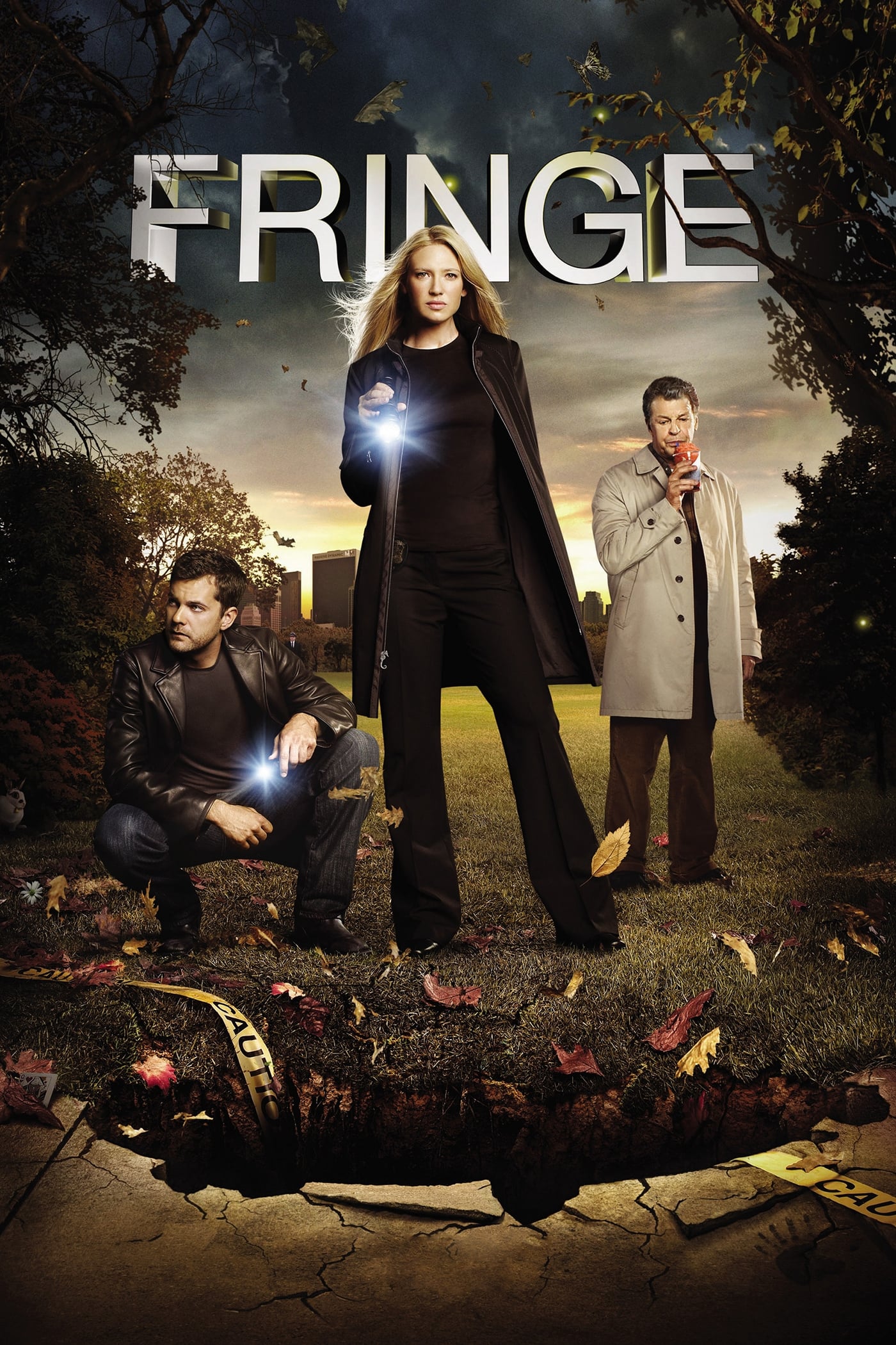
The series deals with a prime universe and a parallel alternate universe that eventually bleed into one another. Scenes taking place in the alternate universe are distinguished by a distinctive red hue and lens flares. The prime universe retains a cooler blue tone and traditional lens flares to differentiate it from its counterpart. This color-coding was vital for viewers to identify which version of the characters they were watching.
‘Lost’ (2004–2010)
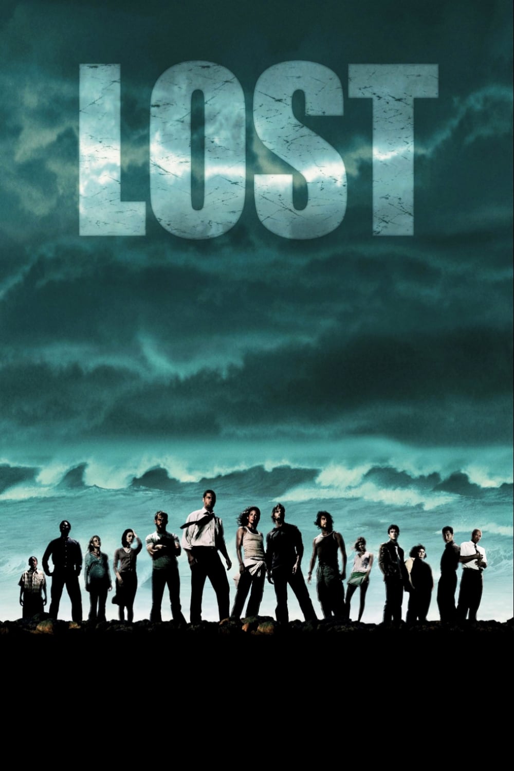
The final season introduced a narrative device known as the flash-sideways which depicted an afterlife purgatory. These sequences are characterized by a soft and blooming light that gives the environment an ethereal quality. The on-island reality maintained the gritty and tropical aesthetic established in previous seasons to ground the survival stakes. The lighting difference subtly hinted at the metaphysical nature of the alternate timeline before the finale reveal.
‘Bodies’ (2023)
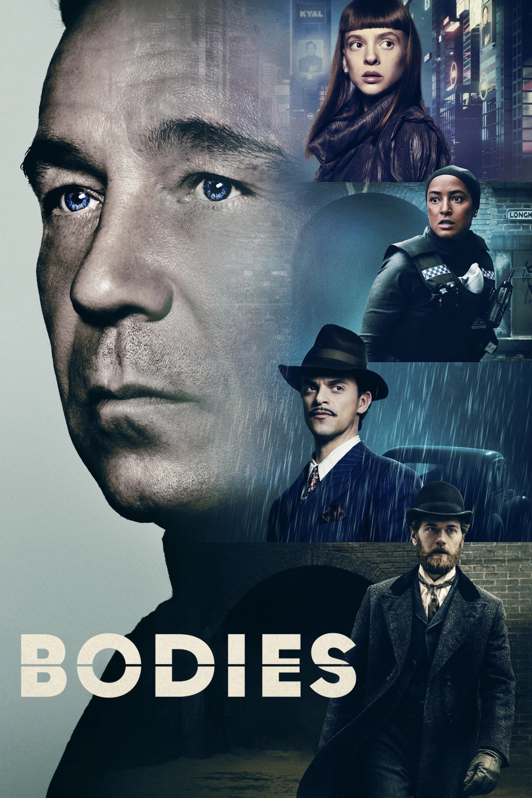
Four detectives investigate the same body found in Longharvest Lane across four different years. The 1890 timeline uses gaslight warmth while 1941 is presented with a noir-inspired gloom. The 2012 section looks standardly modern but the 2053 timeline features a cool and futuristic blue grade. These specific visual identities allow the series to intercut rapidly between four distinct eras without confusion.
‘Westworld’ (2016–2022)
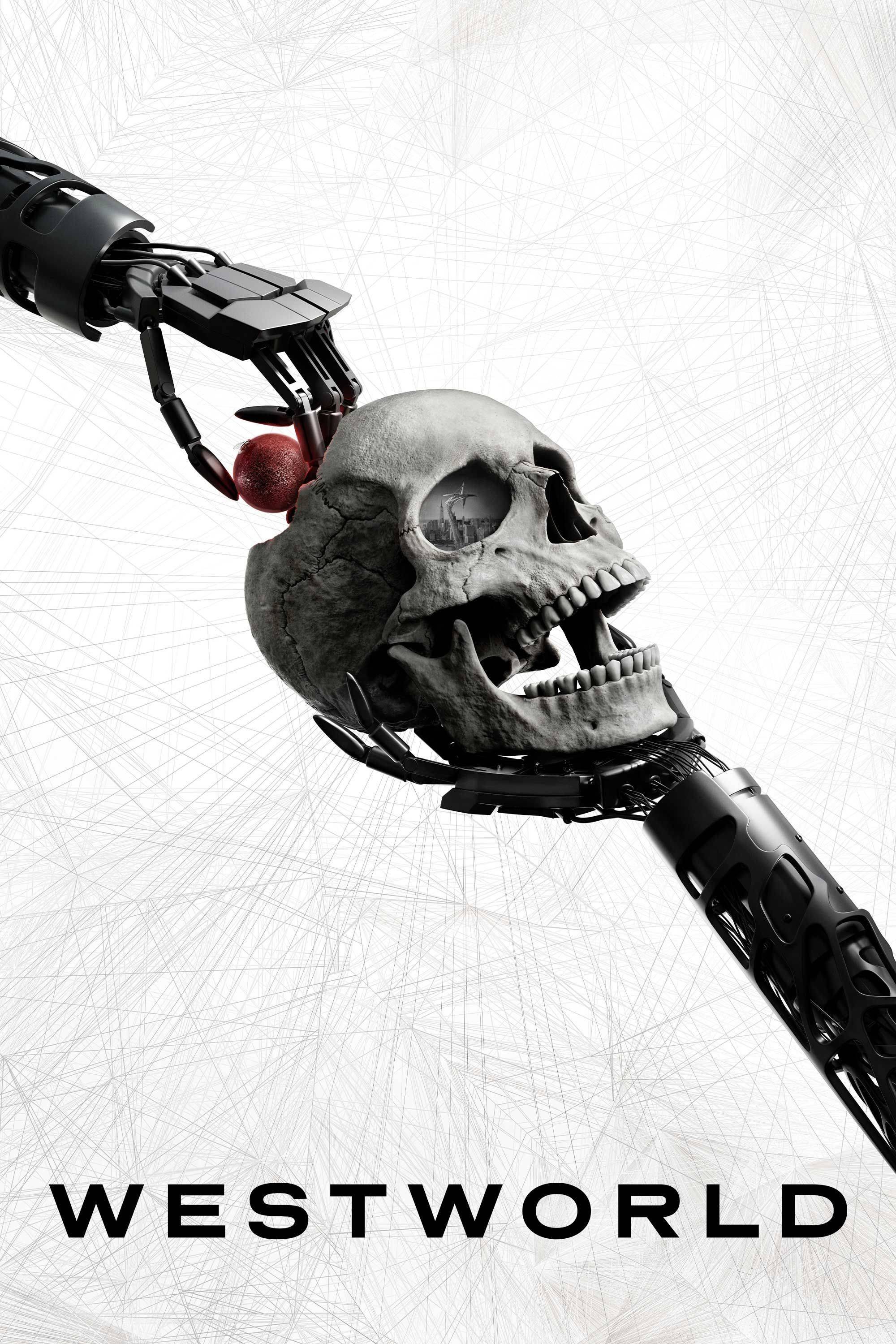
The narrative frequently deceives the audience regarding the chronological order of events involving the android hosts. Subtle changes in aspect ratio and lighting warmth act as clues to distinguish between simulations and the physical world. The sequences inside the digital Cradle or the Sublime often possess a cleaner and more radiant lighting than the dusty real world. Observant viewers can decode the timeline twists early by tracking these visual inconsistencies.
‘The Handmaid’s Tale’ (2017–Present)
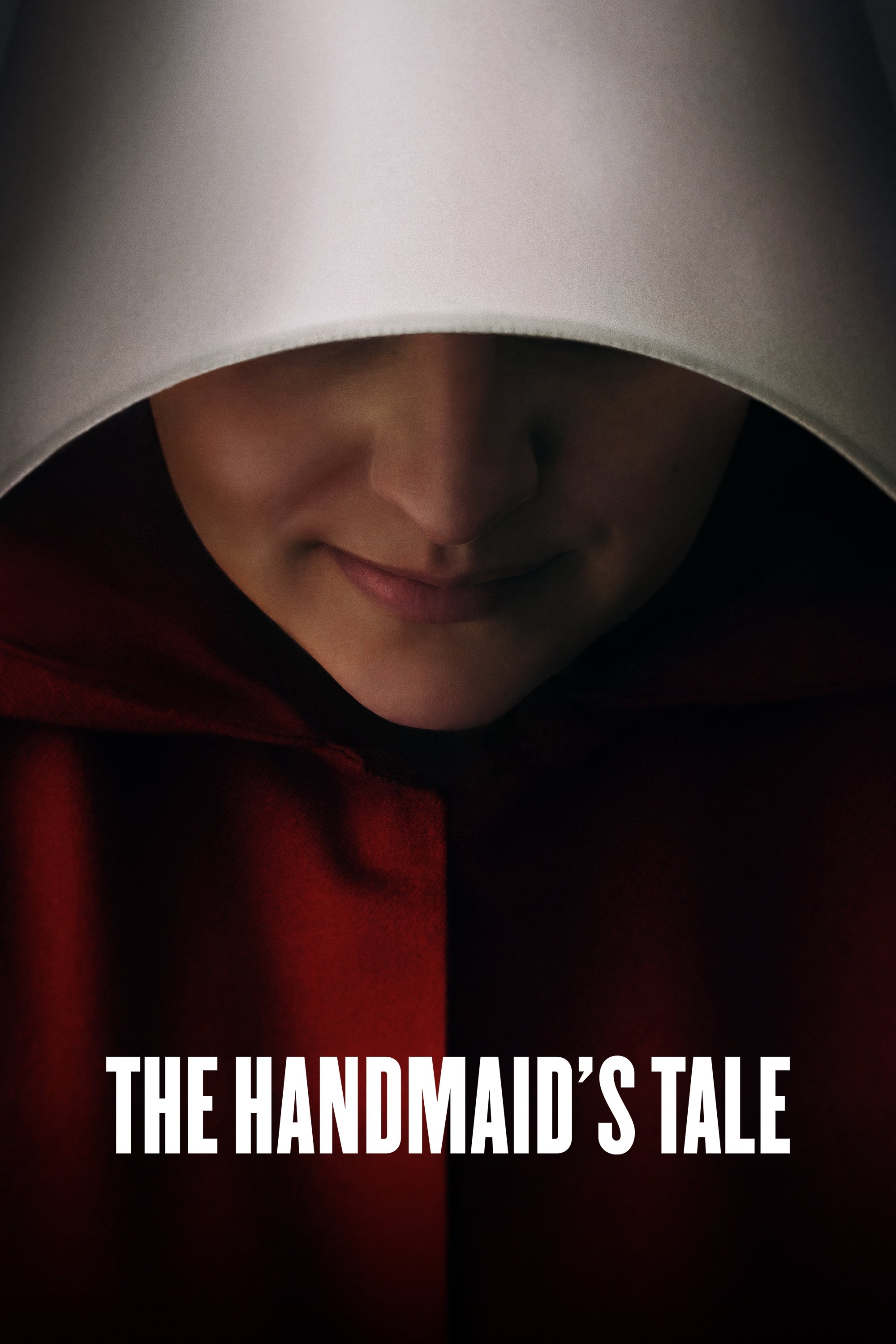
The oppressive world of Gilead is often shot with high contrast and shadowy lighting to reflect the bleak reality. Flashbacks to the time before the regime took over feature brighter and warmer natural light. This visual separation emphasizes the freedom that was lost and the stark difference in the protagonist’s quality of life. The lighting shifts serve as an emotional anchor during the show’s most harrowing sequences.
‘Station Eleven’ (2021–2022)
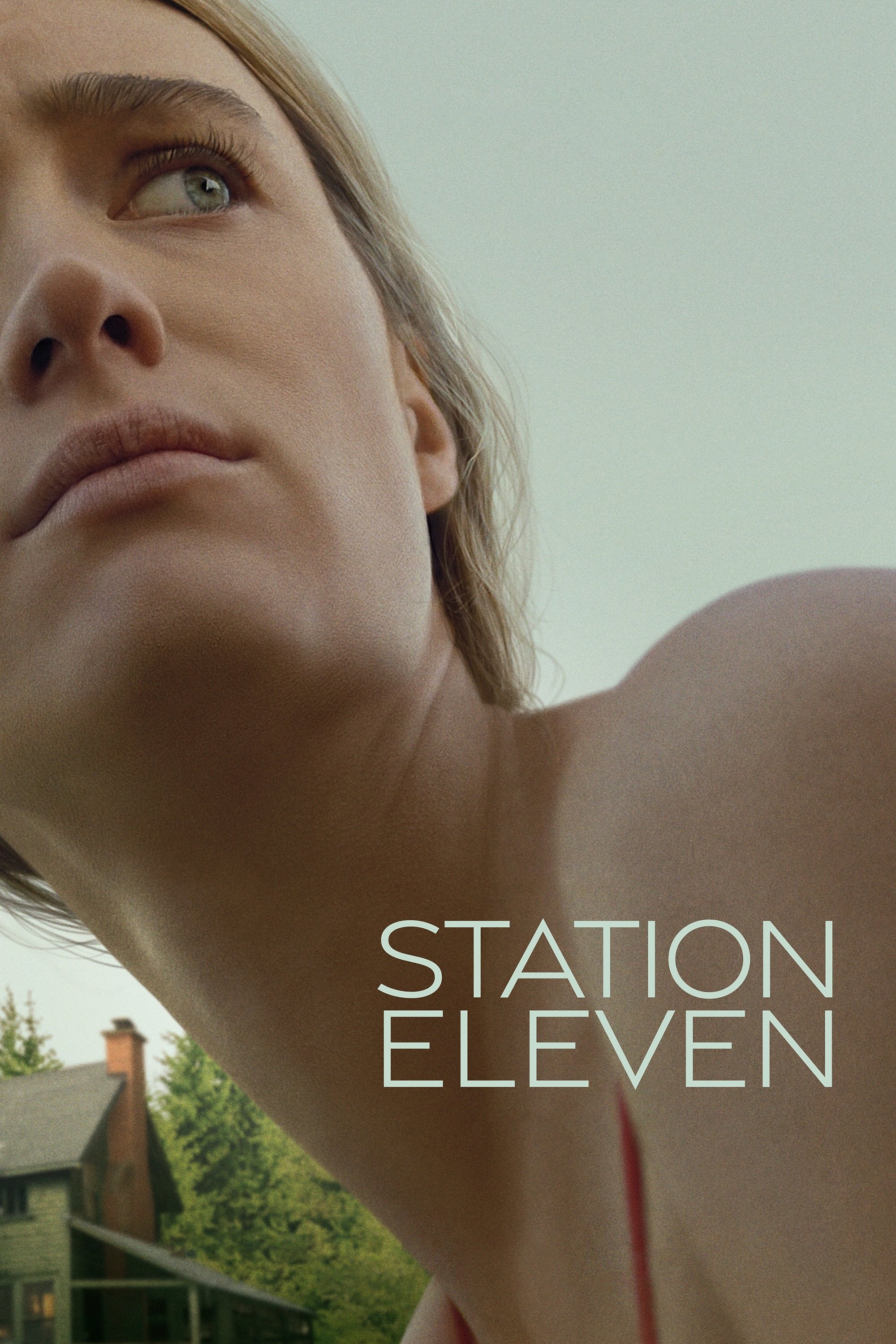
The story oscillates between the onset of a devastating flu pandemic and a post-apocalyptic future twenty years later. The pre-pandemic world is lit with artificial fluorescents and the cold blue light of winter nights. The future timeline is bathed in organic sunlight and lush greens to show nature reclaiming the world. This inversion of the typical apocalyptic aesthetic highlights the beauty found in the new world.
‘Homecoming’ (2018–2020)
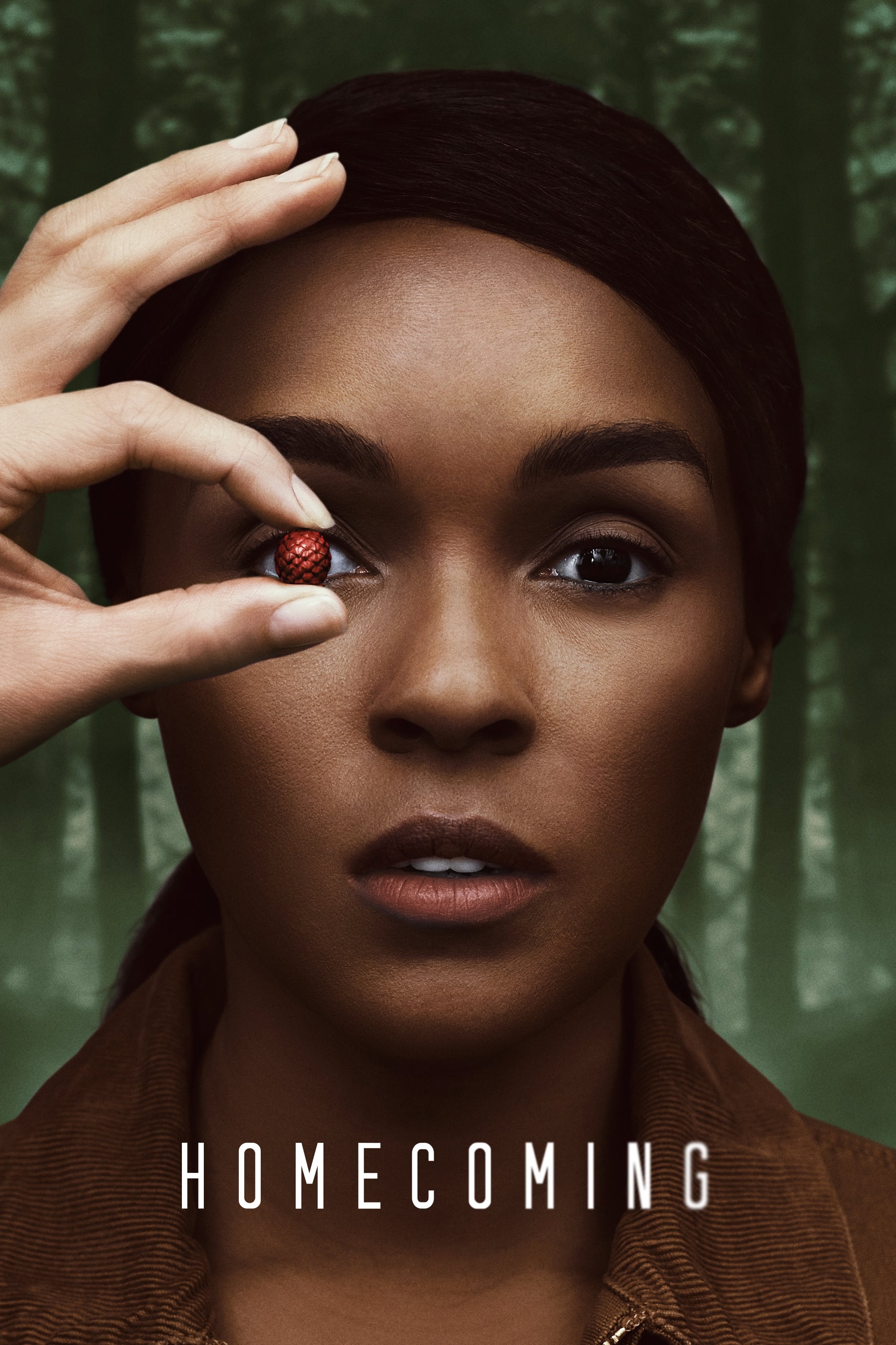
The first season utilizes two different aspect ratios and lighting styles to separate the timelines. The past is presented in a full widescreen format with sharp and crisp visuals. The future timeline creates a claustrophobic feeling with a square 1:1 aspect ratio and a flatter lighting profile. These visual constraints mirror the protagonist’s fragmented memory and loss of agency.
‘Watchmen’ (2019)
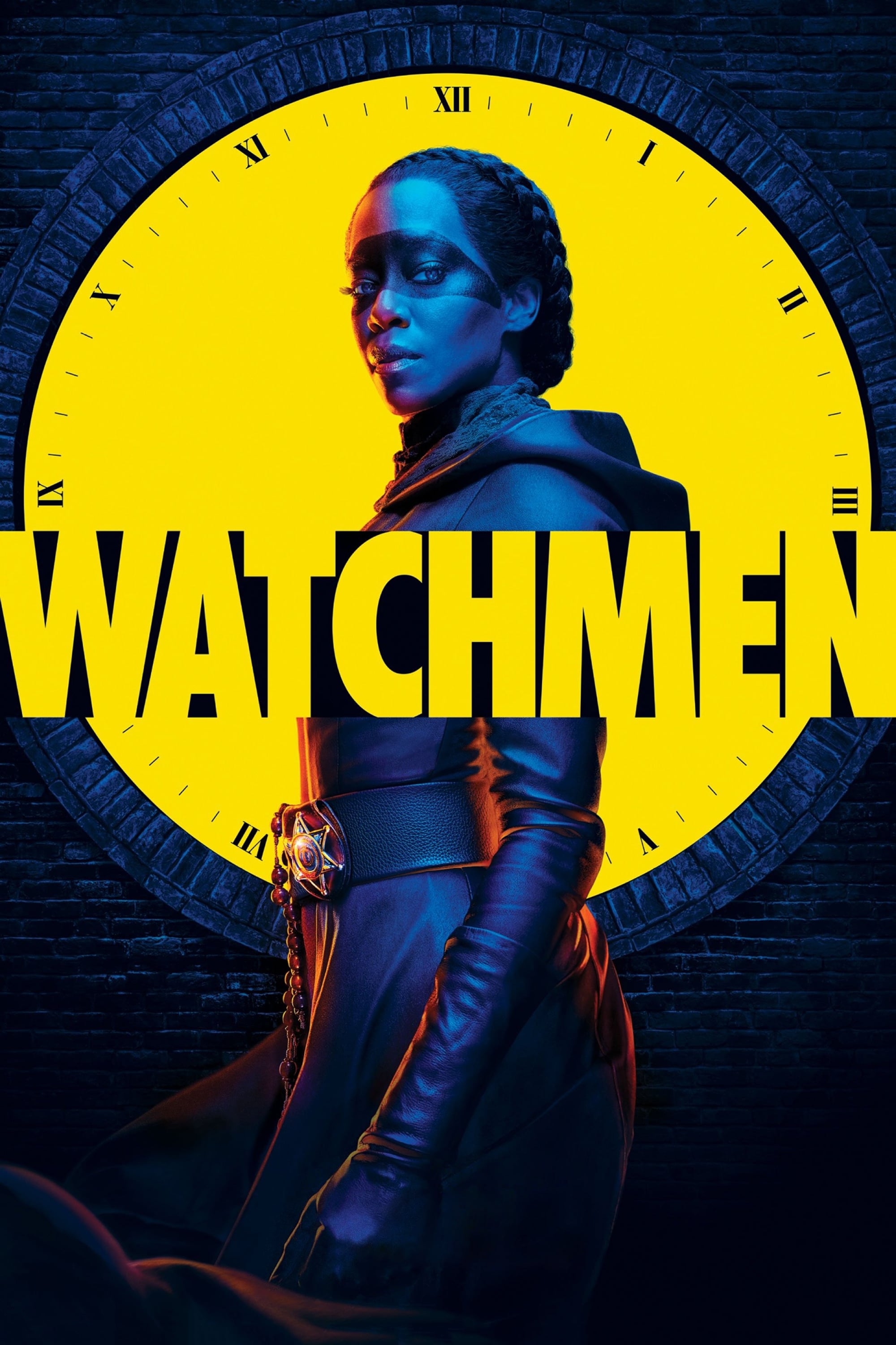
The series employs a specific visual language for flashbacks involving the character Will Reeves. These sequences are presented in high-contrast black and white with isolated elements of color to mimic the look of old film. The present-day narrative maintains a grounded and cinematic look that contrasts with the stylized history. This technique effectively places the audience in the subjective memory of the character.
‘Castle Rock’ (2018–2019)
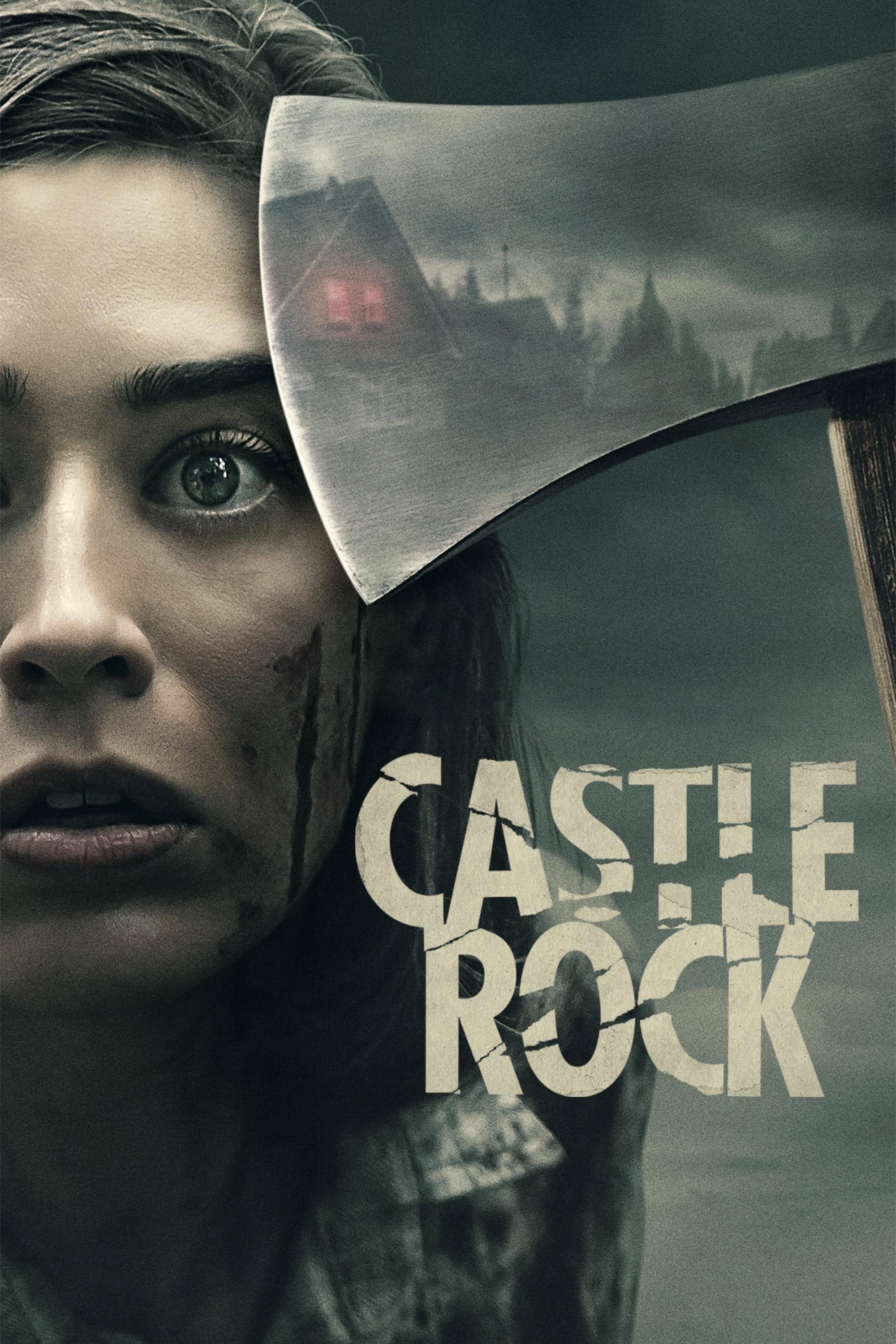
The psychological horror anthology intertwines characters and themes from the Stephen King multiverse. Flashbacks often utilize a hazy and dreamlike lighting quality to differentiate them from the sharp reality of the present. The color grading in the past tends to be warmer to suggest a false sense of nostalgia before the horror sets in. These shifts help manage the complex lore and backstory essential to the town’s mystery.
‘The Affair’ (2014–2019)
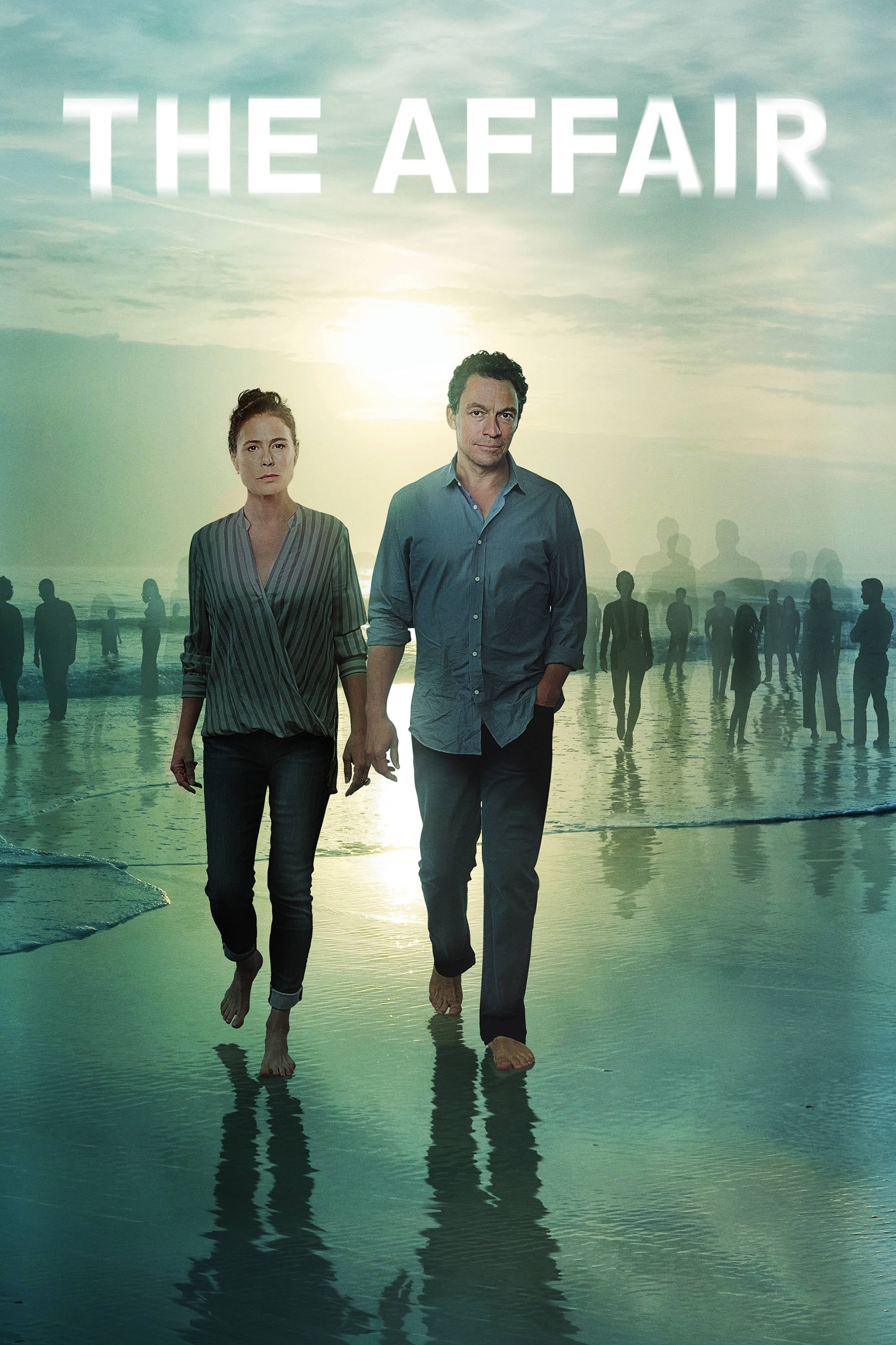
The show explores the emotional effects of an extramarital relationship from distinct perspectives and timelines. Each character’s viewpoint is accompanied by subtle changes in lighting and clothing colors to reflect their bias. The lighting in Noah’s memories often appears sunnier and more idyllic compared to the gloomier tone of Alison’s perspective. These visual nuances underscore the unreliability of memory and personal truth.
‘Damages’ (2007–2012)
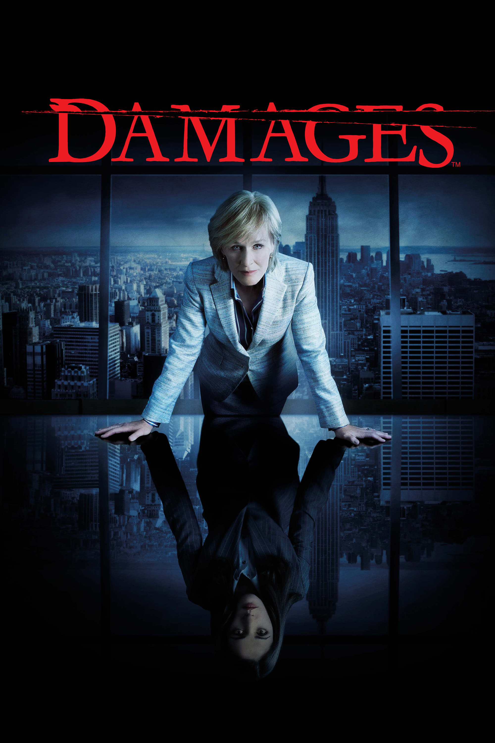
The legal thriller is known for its non-linear storytelling that flashes forward to a violent conclusion. The present timeline follows a linear progression with naturalistic lighting suitable for a corporate drama. The flash-forwards are heavily treated with high contrast and saturation to create a feverish intensity. This aggressive visual style creates a sense of dread that hangs over the procedural elements of the show.
‘Archive 81’ (2022)
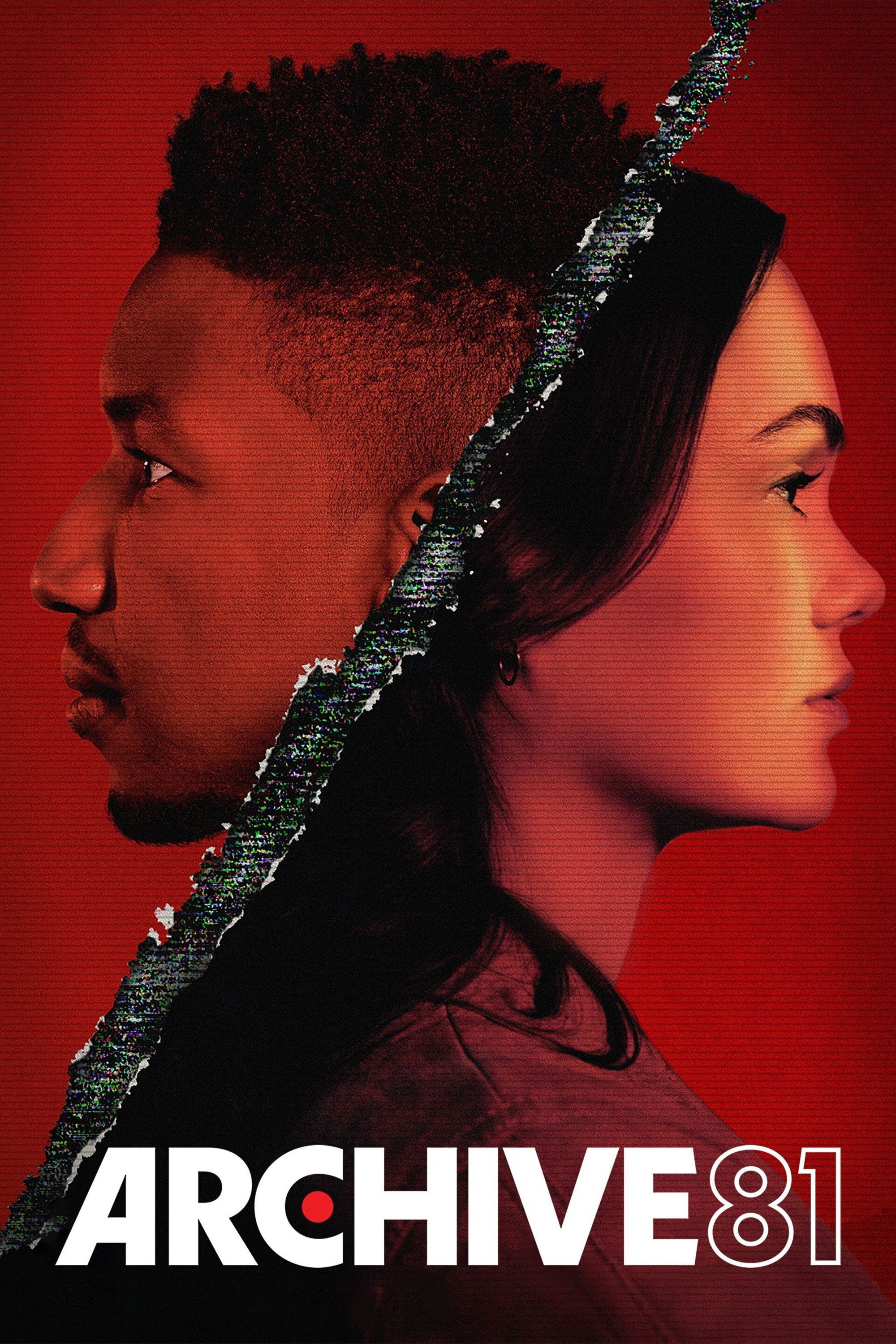
A deeply atmospheric horror series that unfolds through restored videotapes from the 1990s. The timeline of Dan viewing the tapes is cool and shadowed within a remote research facility. The footage featuring Melody in the Visser apartment building has a distinct analog warmth and grain structure. The interplay between the digital present and the magnetic tape past drives the supernatural connection between the characters.
‘True Detective’ (2014–Present)
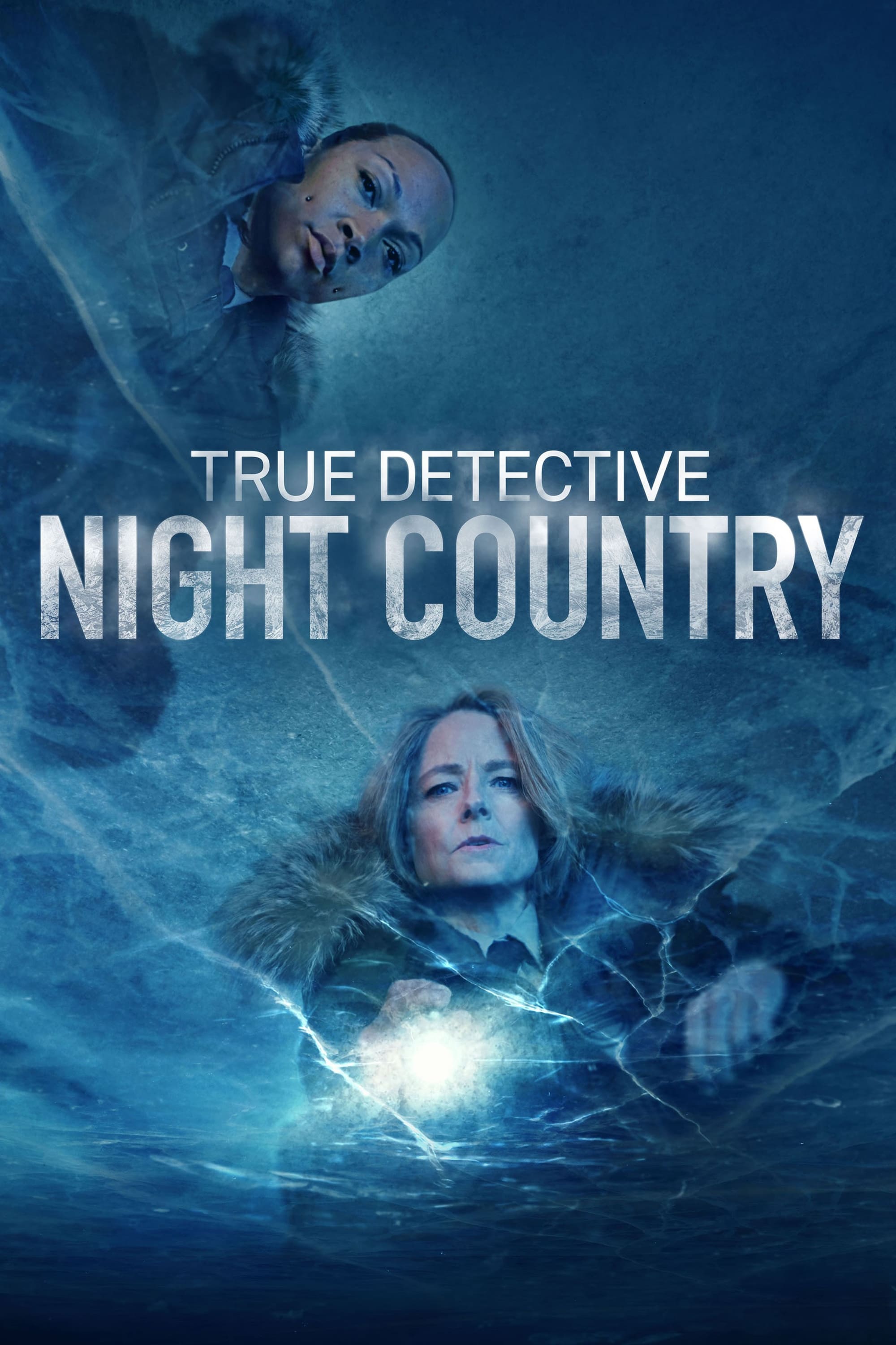
The first season spans seventeen years and uses makeup and lighting to age the detectives and the environment. The 1995 timeline has a distinct yellow and hazy quality that captures the Louisiana heat. The 2012 interview sequences are shot with sterile and cold lighting that reflects the cynicism of the older characters. These atmospheric changes are crucial for understanding the degradation of the protagonists over time.
Please share your thoughts on which series utilized these lighting techniques best in the comments.