Anime Worlds Where Colors Represent Emotional States
Anime can turn color into a kind of emotional shorthand, so you feel a character’s mood before they even say a word. Sometimes that’s baked into the story’s rules, and sometimes it comes from the show’s visual language, where palettes, lighting, and saturation shift with stress, hope, grief, or relief. The titles below are all great examples of worlds that “speak” in color, whether it’s through literal auras, measurable psychological readings, or carefully controlled scene design.
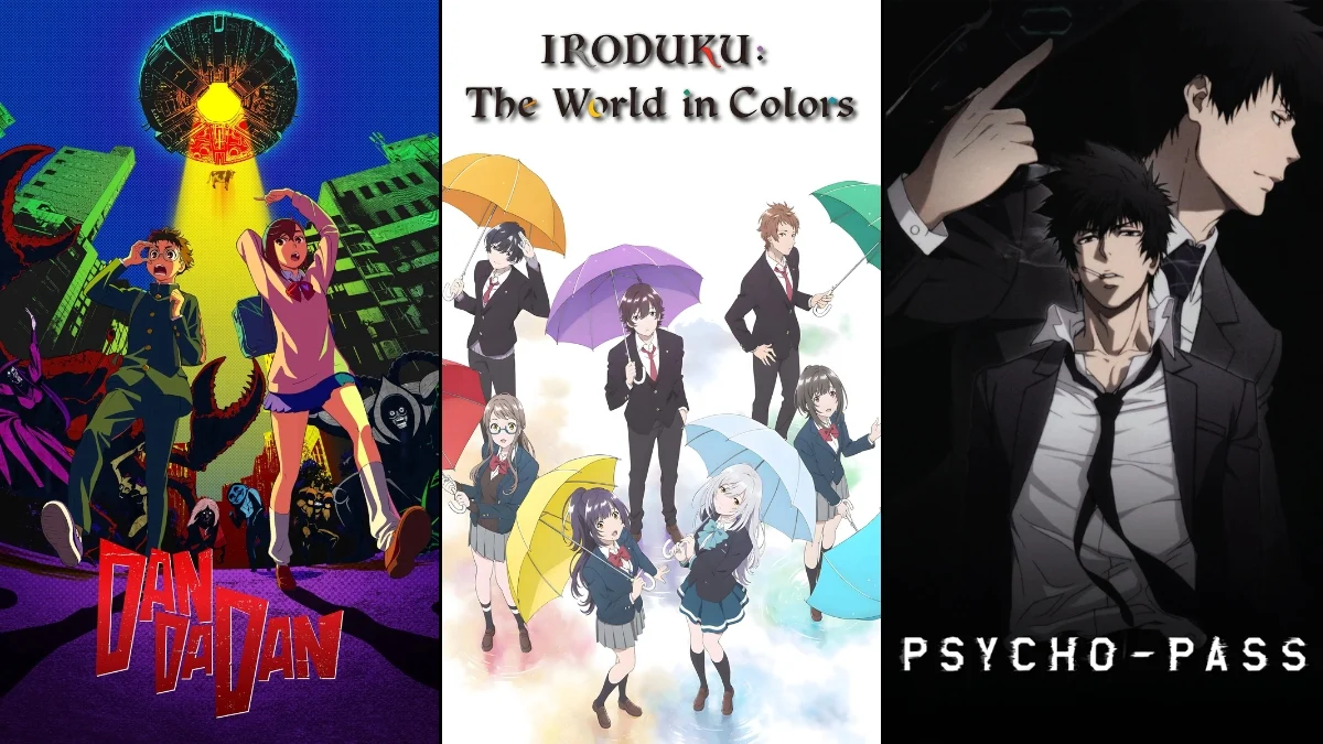
‘Iroduku: The World in Colors’ (2018)
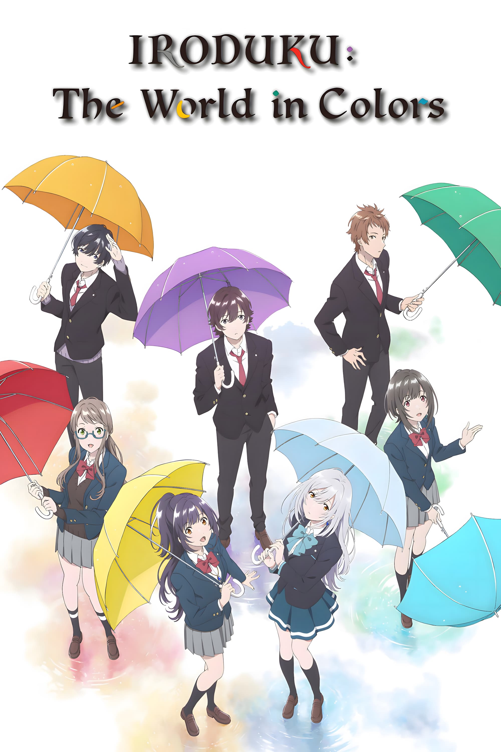
In this story’s future-Nagasaki setting, Hitomi’s emotional numbness is tied directly to how she perceives color, so the world itself becomes a readout of what she can and can’t feel. The series uses her loss of color as a concrete problem to solve, not just a metaphor, which makes every restored hue feel like progress you can track. It’s produced by P.A. Works, and it leans on art, photography, and small moments of connection to “bring the world back” visually as relationships deepen. If you’re watching for color-as-emotion, it’s especially useful to notice when scenes move between muted tones and fuller palettes as her sense of belonging changes.
‘Psycho-Pass’ (2012–2013)
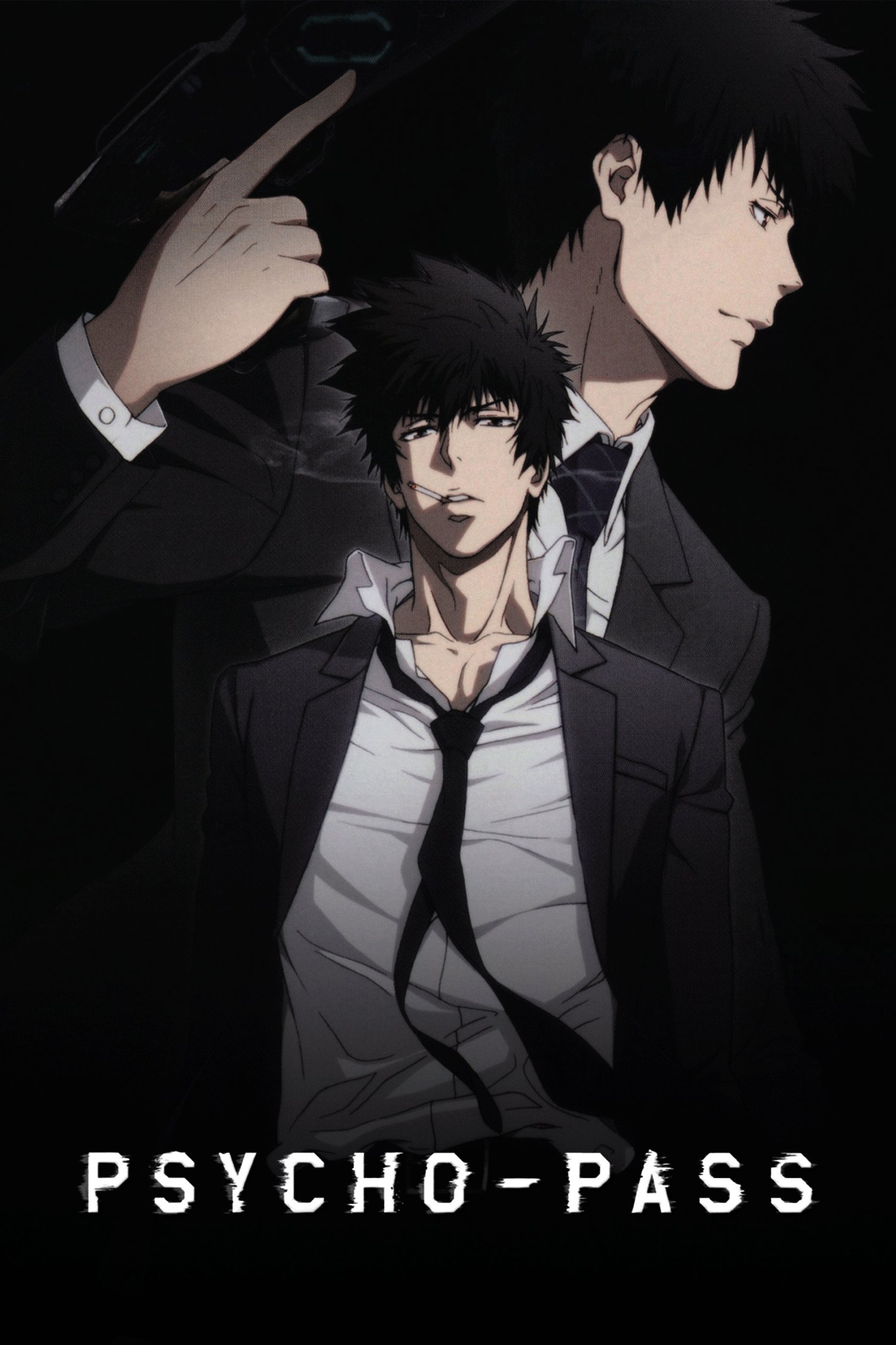
Here, a person’s mental state is treated like measurable data, and color becomes part of the system: the society tracks psychological stability through concepts like a “Hue” that can cloud under stress. Because law enforcement decisions hinge on those readings, color-coded mental health isn’t just style—it affects who gets flagged, detained, or targeted. The series was produced by Production I.G., and it builds tension by making emotional drift feel observable and consequential in everyday life. When you watch, pay attention to how the setting frames “normal” as clean and controlled, while instability is treated like visible contamination.
‘The Colors Within’ (2024)
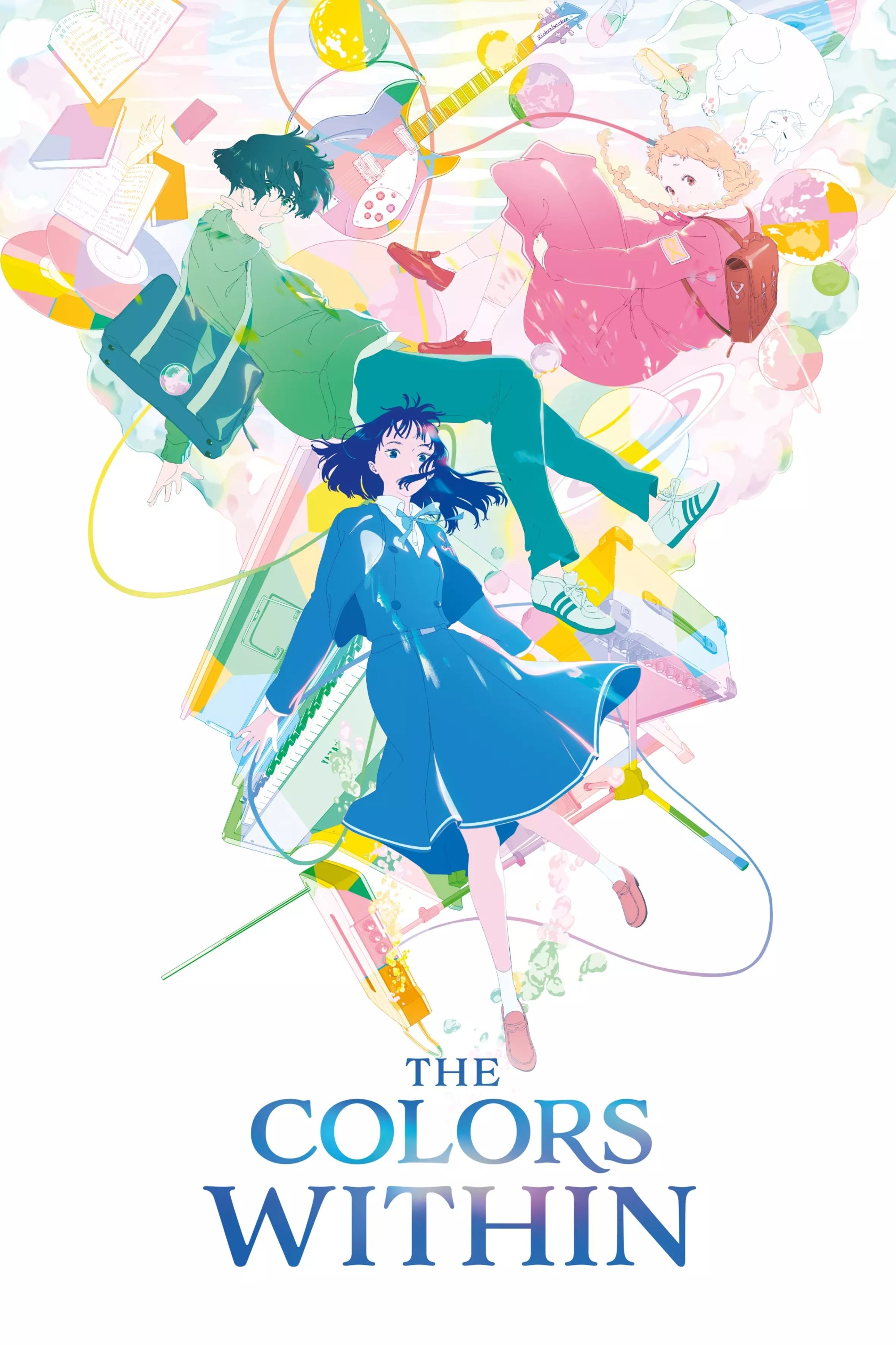
This film makes the idea literal: Totsuko experiences people as colors, with hues tied to what she senses in their inner lives. Because her synesthesia shapes who she’s drawn to, color becomes a practical guide to connection, not just an aesthetic choice. Produced by Science Saru and directed by Naoko Yamada, it also links the emotional “color” of people to music-making, so mood and harmony feel intertwined. If you want an anime world where color is an emotional language characters live with, this is one of the clearest modern examples.
‘Puella Magi Madoka Magica’ (2011)
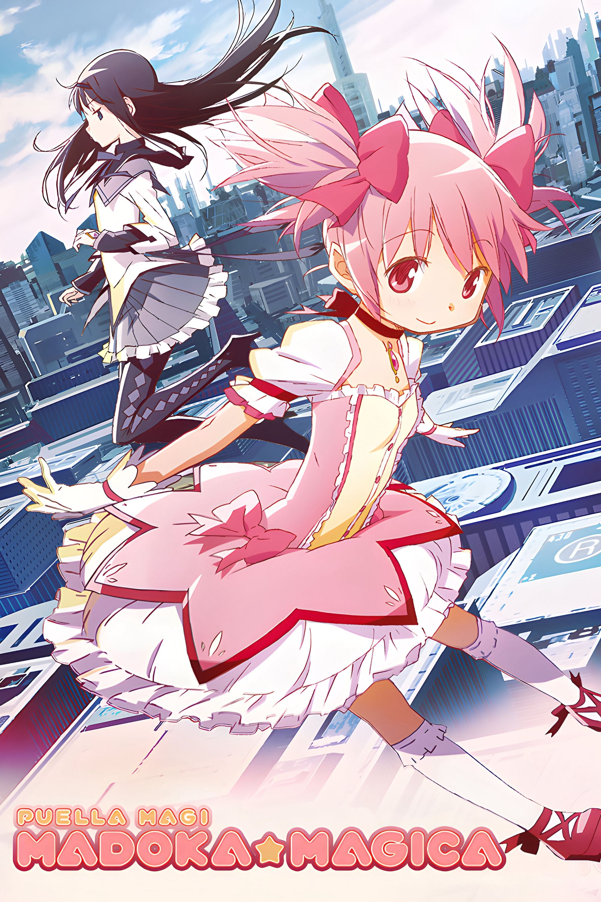
In this universe, a magical girl’s power source doubles as an emotional gauge, where overuse and despair visibly pollute what keeps her going. The system is designed so emotional suffering isn’t abstract—it’s something that accumulates and has a visible “tipping point” built into the rules. Animated by Shaft, the series turns hope and despair into a resource economy, with the look of key objects shifting as mental burdens mount. Watching with “color equals emotion” in mind, the important detail is that the world treats emotional collapse as an observable, escalating condition with a defined consequence.
‘Horimiya’ (2021)
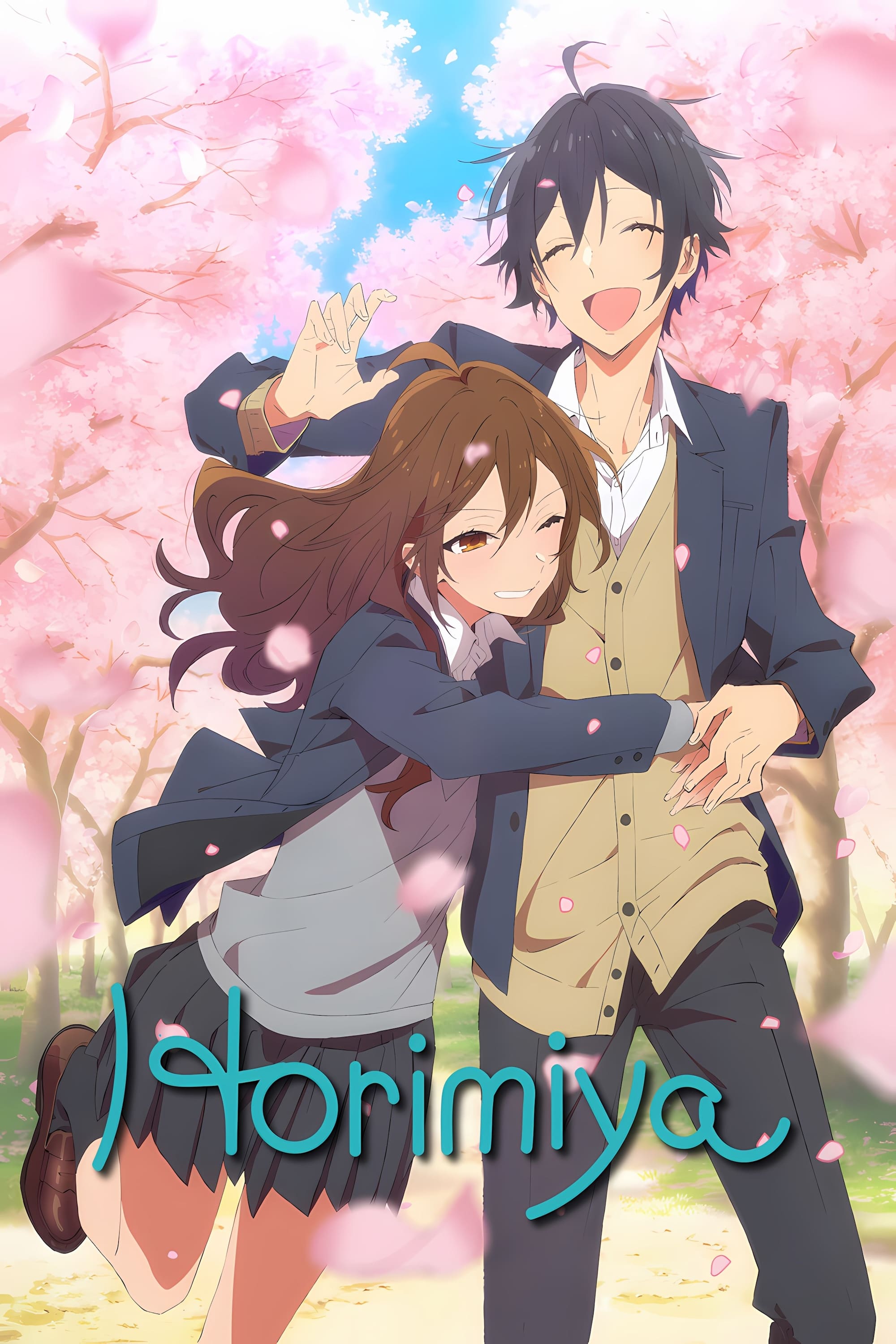
This series often assigns characters distinctive color identities and uses coordinated palettes to quickly signal shifts in comfort, vulnerability, or tension during everyday scenes. Because it’s grounded in school-life interactions, the color language tends to be subtle, helping you read who feels safe, who feels exposed, and when a moment turns emotionally serious. Produced by CloverWorks, it uses visual consistency—rather than big fantasy effects—to keep emotional states legible in a busy social environment. It’s a useful watch if you like color doing quiet narrative work in a realistic setting.
‘Dandadan’ (2024)
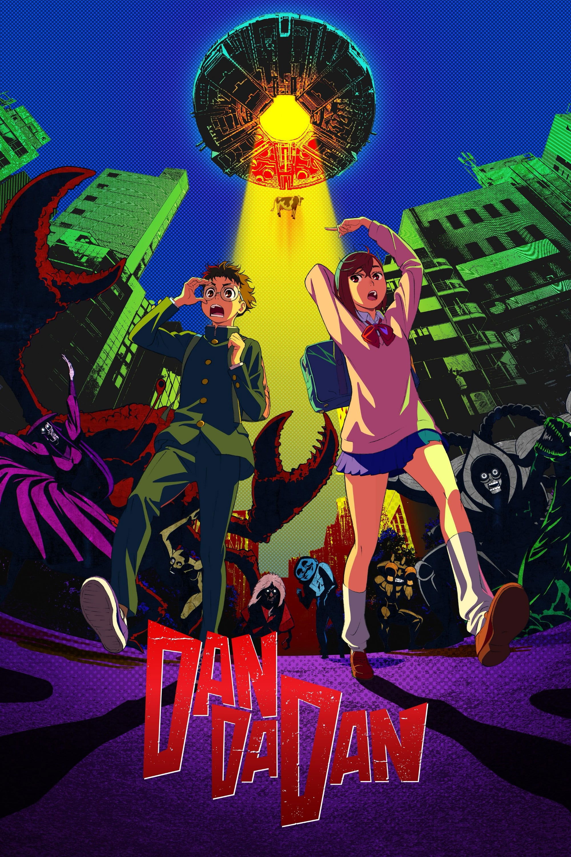
This world swings between normal life and the supernatural, and the show’s color choices help mark those emotional gear-shifts—panic, adrenaline, dread, and absurdity—at high speed. Produced by Science Saru, it’s built to feel volatile, so the palette can pivot hard when a scene flips from comedy to horror or back again. That makes color feel like a mood alarm: the look of the world tells you how “safe” reality currently is for the characters. If you want color that tracks emotional whiplash in an action-horror framework, it’s a strong example.
‘Anohana: The Flower We Saw That Day’ (2011)

Because the story centers on grief and unresolved feelings, the series leans on color and atmosphere to separate everyday life from the emotional weight the group is carrying. The world often feels brighter and more open when connection is possible, and heavier when characters retreat into guilt or avoidance. Produced by A-1 Pictures, it uses its setting to keep emotional distance visible even when characters aren’t saying much out loud. For color-as-emotion viewing, it helps to notice how group scenes “feel” visually different from isolated ones.
‘March Comes in Like a Lion’ (2016–2018)
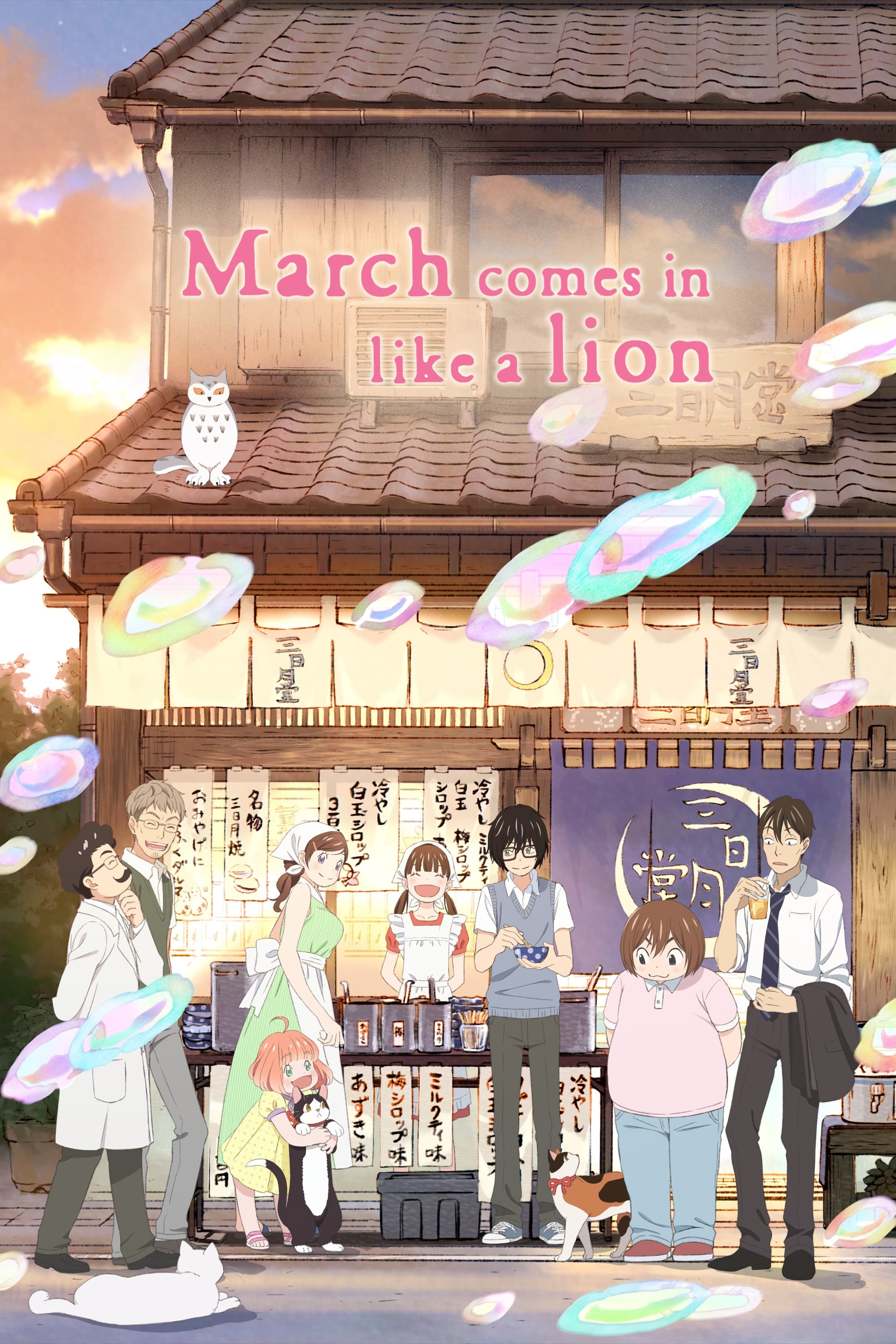
This series treats loneliness and warmth as environments you can see, using a watercolor-like approach to make emotional weather feel physical. Rather than relying on a single gimmick, it builds distinct visual spaces—home, school, competition—so each place carries its own emotional temperature. The anime adaptation is associated with Shaft’s production style, and it uses soft textures and controlled palettes to reflect shifts from numbness to support. If you’re tracking color as emotional state, the key is how the world looks different when Rei is spiraling versus when he’s being cared for.
‘Mob Psycho 100’ (2016–2022)
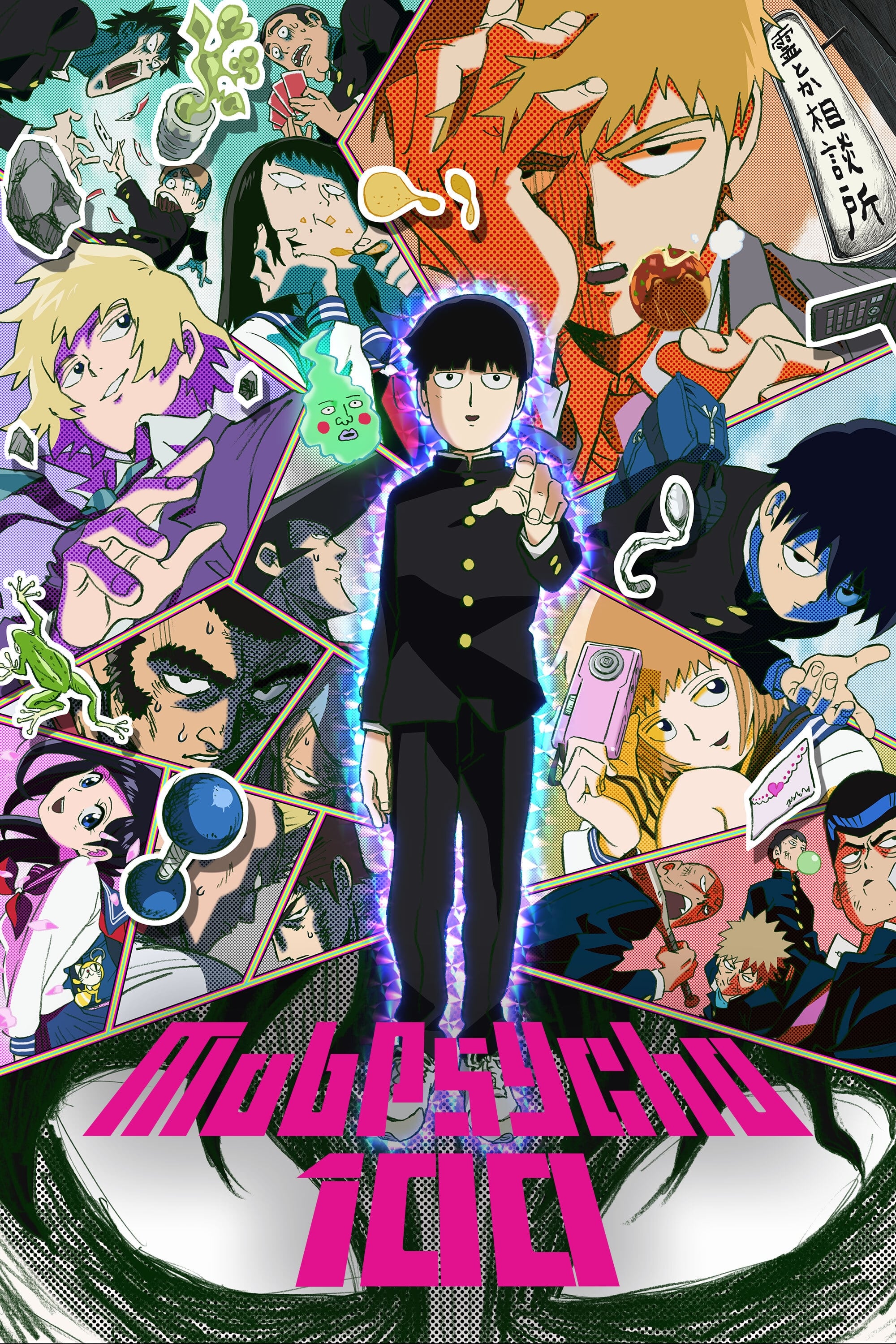
Emotions in this world don’t just get expressed—they erupt, and the show uses sudden, intense color effects to make those surges unmistakable. Produced by Bones, it ties big visual escalations to Mob’s internal pressure, so emotional regulation becomes something you can read through the look of the scene. The series also mixes textures and styles during psychic peaks, which helps separate everyday calm from overwhelming feeling. If you want a show where emotional intensity is practically a special effect, it’s one of the most direct.
‘Ping Pong the Animation’ (2014)
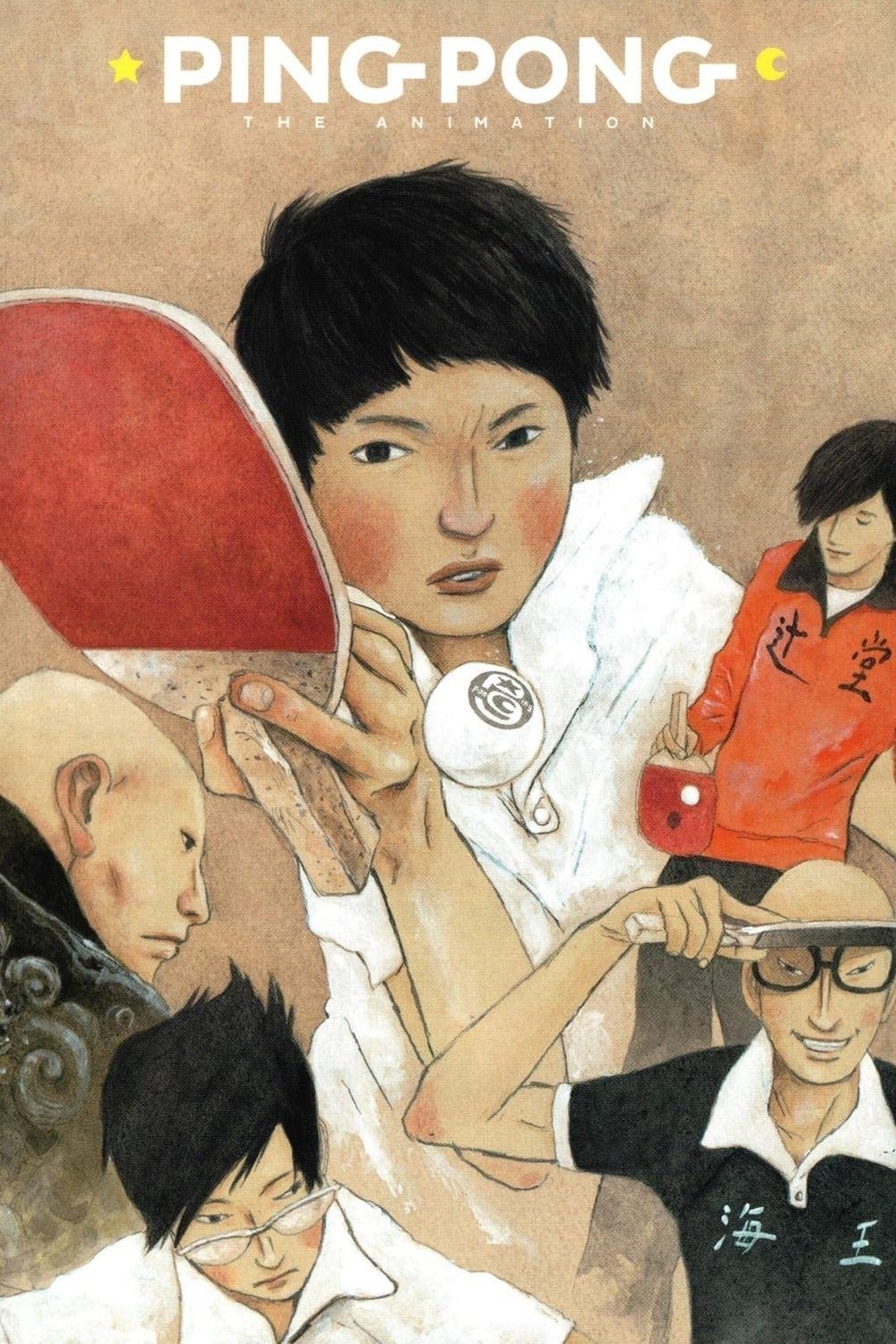
This adaptation uses a highly expressive visual approach where color and design choices help externalize what the players can’t easily say—fear, ambition, emptiness, and drive. Produced by Tatsunoko Production and directed by Masaaki Yuasa, it’s built around the idea that movement, background, and color can communicate inner states as powerfully as dialogue. That makes matches feel like emotional confrontations as much as sports events, because the world’s look shifts with mindset. It’s especially good if you like color used to map character psychology across an arc.
‘The Tatami Galaxy’ (2010)
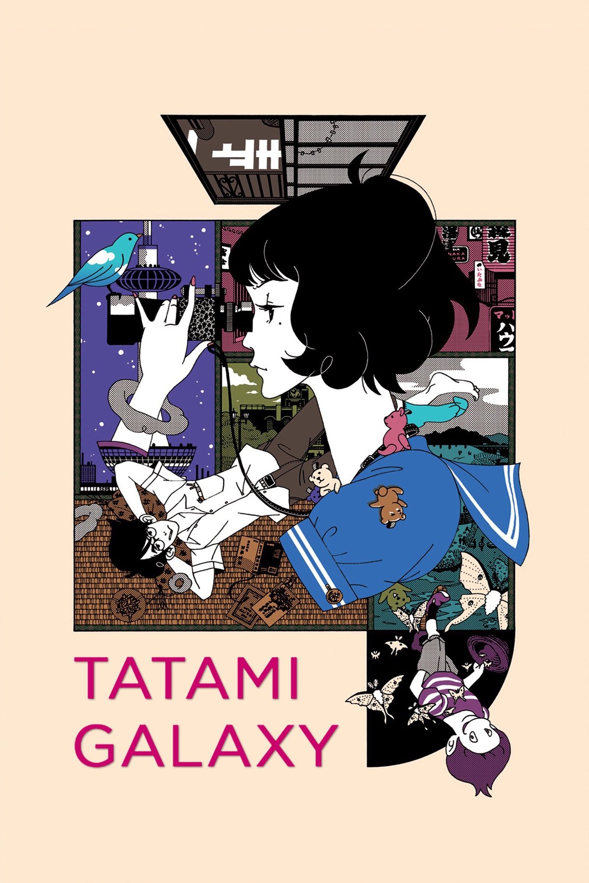
This series uses an unusually bold “color scheme” and stylized layouts to match the protagonist’s spiraling thoughts and looping regrets. Produced by Madhouse and directed by Masaaki Yuasa, it treats the world as elastic—visual intensity rises and falls with anxiety, obsession, and self-justification. Because the story structure revisits choices, color becomes one of the quickest ways to signal how the same life can feel emotionally different under a new lens. If you want a world where visual tone mirrors decision-paralysis and longing, this is a defining title.
‘Mononoke’ (2007)
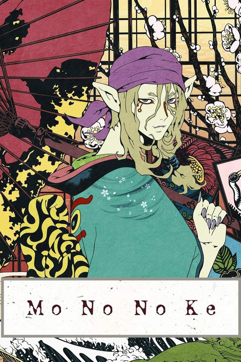
This horror-mystery world leans into psychedelic design, using striking palettes and patterned backgrounds so emotional disturbance feels embedded in the environment. Produced by Toei Animation, it frames each case like an unfolding psychological portrait, where the visual “noise” intensifies as human truths surface. Because the Medicine Seller can’t resolve a threat without understanding it, the show’s look reinforces that emotions and motives shape the world’s danger level. It’s a great pick if you want color that feels like a warning system for hidden trauma.
‘Bocchi the Rock!’ (2022)
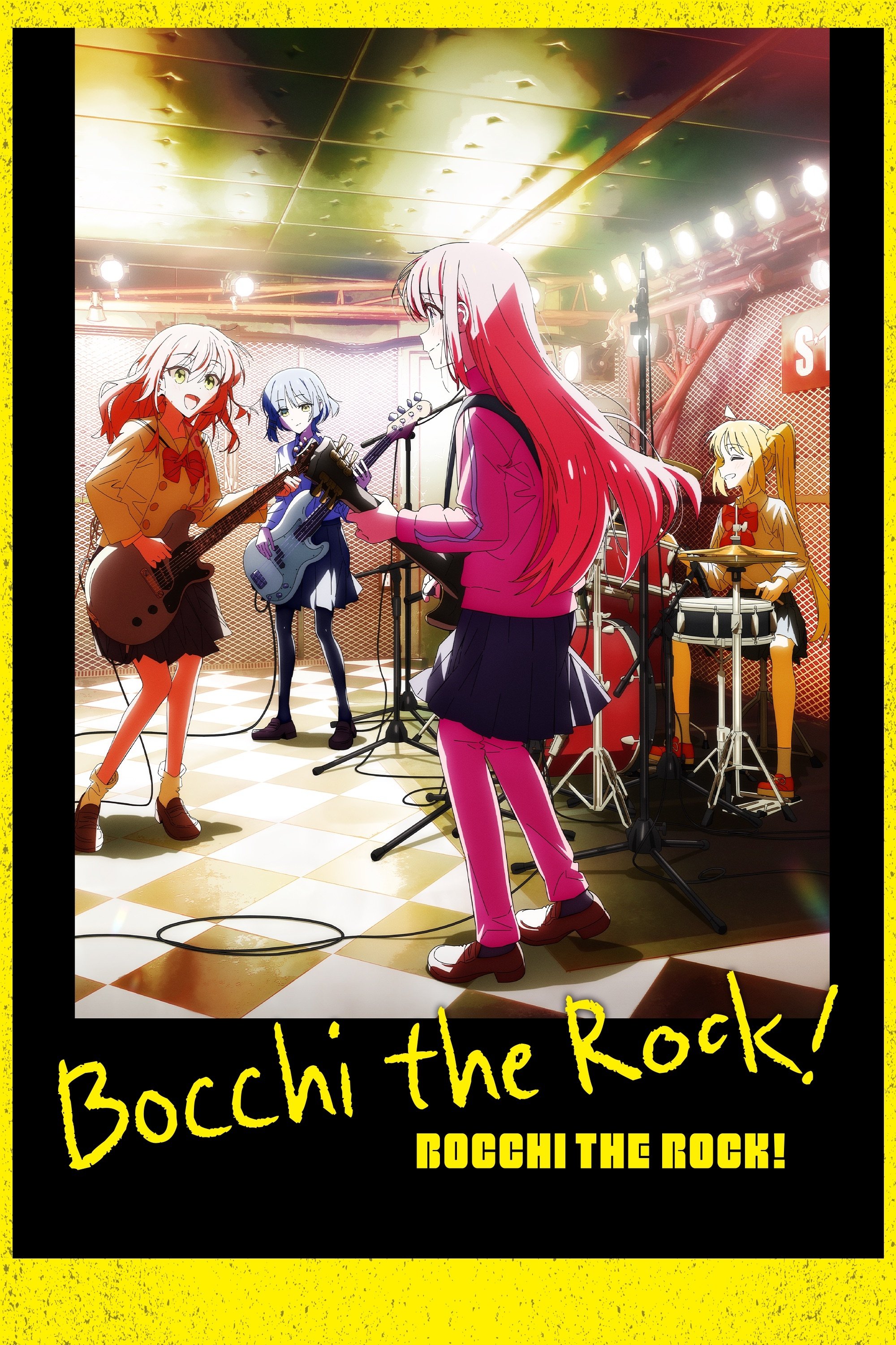
This series uses consistent palette choices across “normal” scenes and anxiety-driven distortions, so you can track Bocchi’s emotional state even when she’s trying to mask it. Produced by CloverWorks, it blends grounded band-life with sudden visual shifts that translate social fear into something you can instantly read. That makes color part of the comedy and the character study at the same time, because the world visibly changes when panic spikes. If you’re interested in how color can communicate internal overwhelm without heavy exposition, it’s a practical case study.
‘Keep Your Hands Off Eizouken!’ (2020)
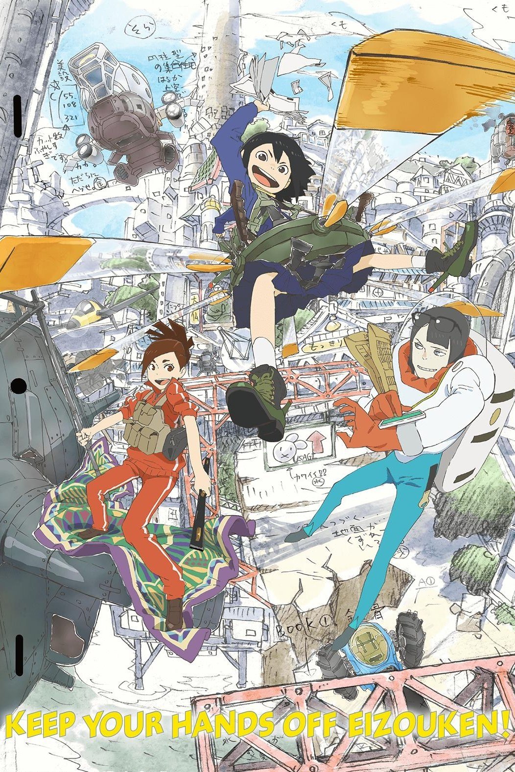
This anime constantly flips between everyday reality and vivid imagination spaces, using color and design to show when creative excitement takes over. Produced by Science Saru, it treats the act of visualizing as an emotional event, so ideas feel bright, textured, and alive compared to routine school life. That contrast makes it easy to “read” motivation and wonder through the world’s look, not just through dialogue about goals. If you want color that functions like a creativity meter, it’s one of the most straightforward examples.
‘Your Name.’ (2016)
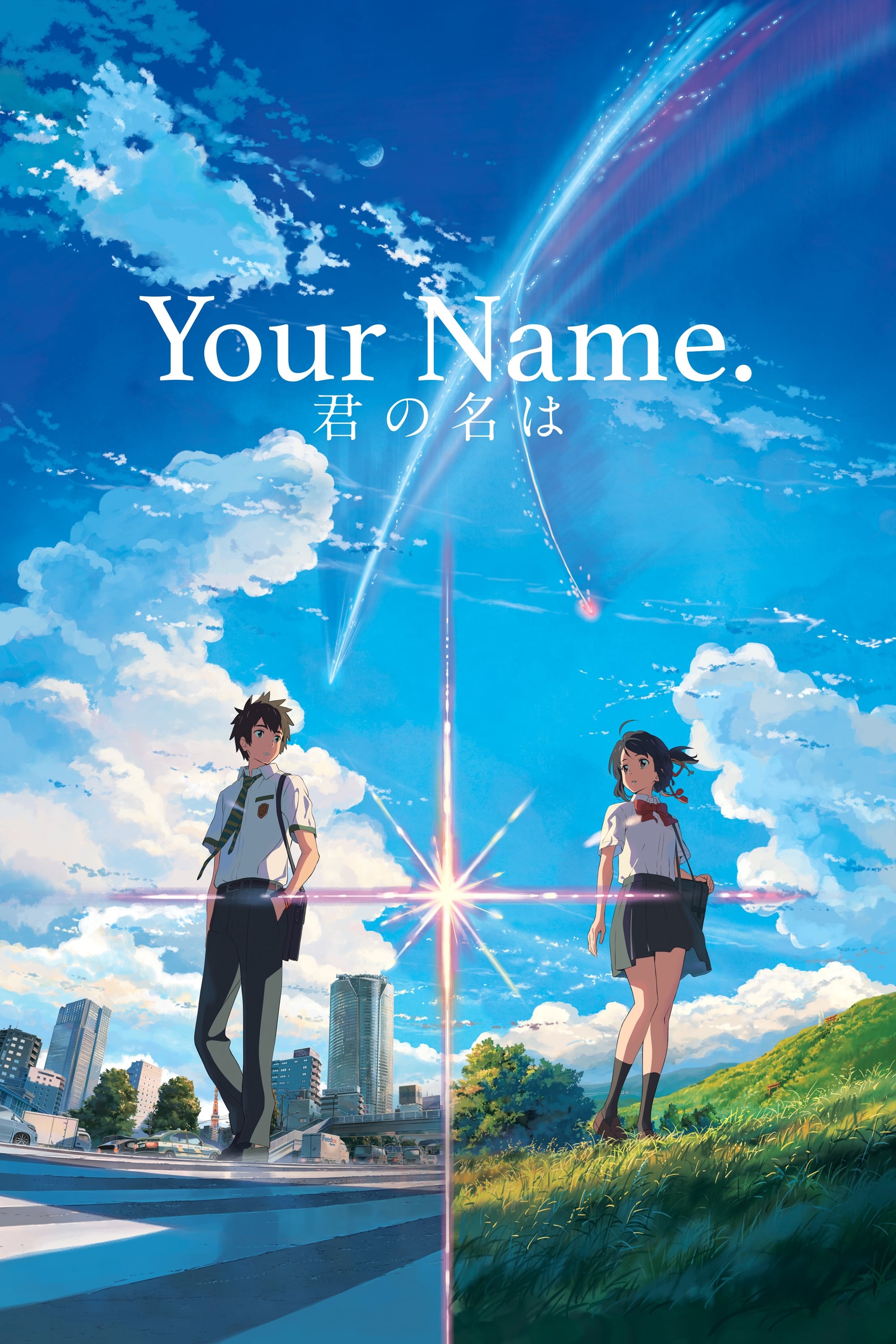
This film uses color to separate emotional modes—daily familiarity, yearning, awe, and crisis—so the world’s lighting and palette feel tied to what the characters are experiencing. The setting contrast between city and countryside also gives different emotional textures, making shifts in belonging and distance feel visual as well as narrative. Directed by Makoto Shinkai, it’s frequently discussed for how its colors support mood and thematic tension without needing constant explanation. If you’re watching for emotion-driven color, pay attention to how key moments lean into specific tonal ranges to cue what kind of feeling the scene is built around.
‘A Silent Voice: The Movie’ (2016)
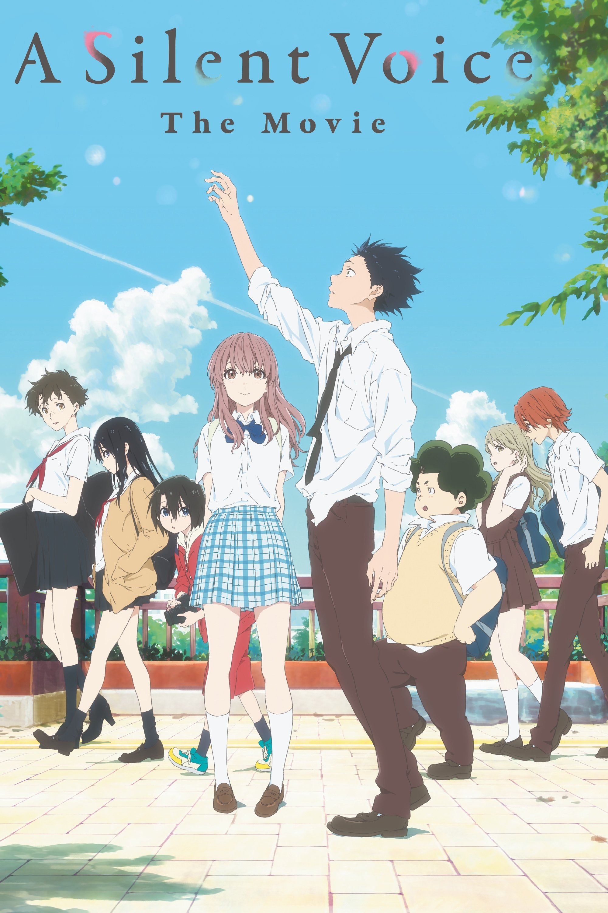
The film’s emotional clarity comes partly from deliberate production choices around color coordination and visual effects, which help communicate heaviness, shame, and gradual openness. Because the story deals with communication barriers, it often relies on visual signals to convey what characters can’t comfortably express. Produced by Kyoto Animation and directed by Naoko Yamada, it’s a strong example of how color work supports emotional storytelling at a technical, craft level. If you’re interested in color as an intentional emotional tool, the behind-the-scenes discussion around its painting and effects is especially relevant.
‘Violet Evergarden’ (2018)
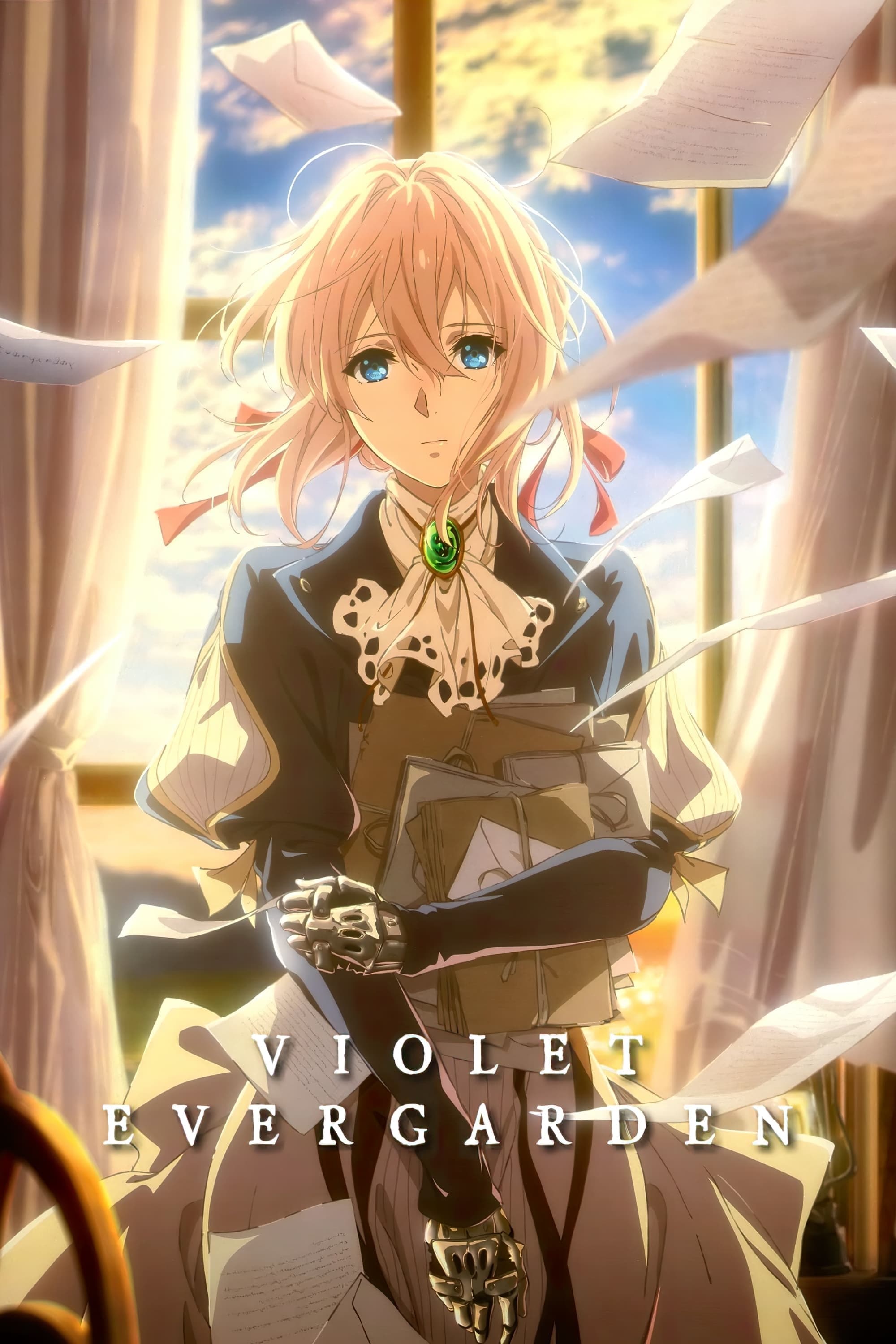
This world uses controlled palettes to shape the emotional temperature of each assignment Violet takes on, often shifting the look of scenes to match what a letter is really carrying underneath the words. Produced by Kyoto Animation, it treats empathy like a process, and the visuals help mark when a moment is tender, restrained, or quietly devastating. That makes the setting feel responsive: the world’s softness or sharpness tracks the kind of emotion being uncovered. If you want a show where color supports the idea of learning feelings over time, it fits neatly.
‘Liz and the Blue Bird’ (2018)
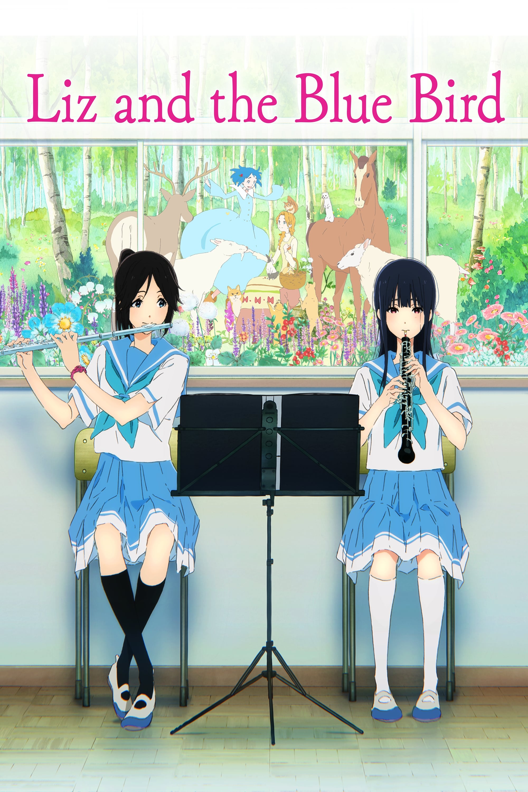
This film uses contrasting visual approaches—more grounded classroom imagery alongside airy watercolor-like sequences—to separate emotional reality from inner longing. Because it focuses on a strained friendship, the color design helps keep subtle discomfort and tenderness legible without turning everything into speeches. Produced by Kyoto Animation, it’s structured so small shifts in tone, softness, and visual “distance” do a lot of emotional work. If you like color that signals hesitation and closeness in quiet scenes, it’s a strong reference point.
‘The Tale of the Princess Kaguya’ (2013)
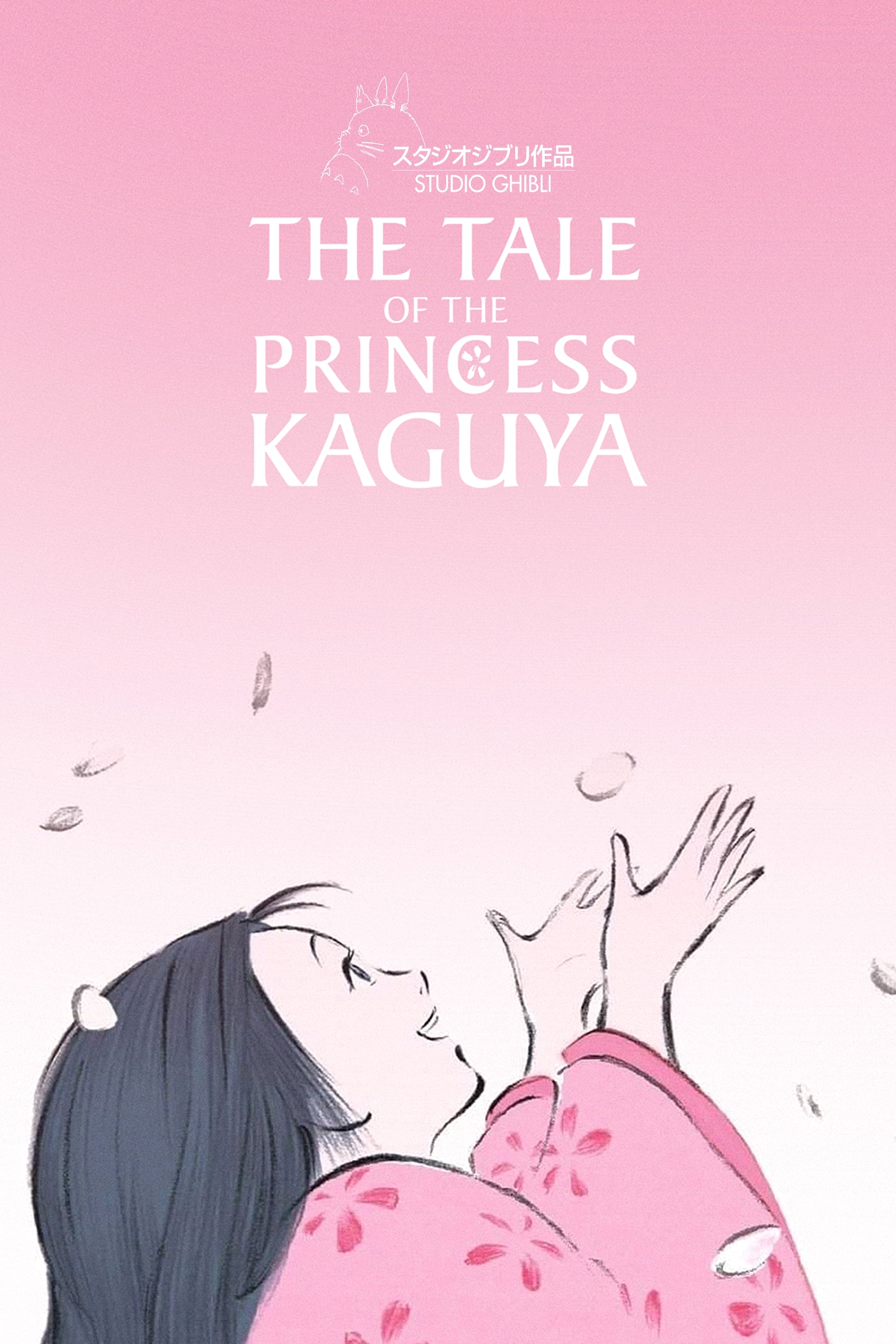
The film’s sumi-e and watercolor-inspired approach makes the world feel like it changes texture with emotion, using calmer strokes for gentler moments and harsher marks for distress. Directed by Isao Takahata at Studio Ghibli, it treats visual style as part of the storytelling engine rather than a decorative layer. That means the “feel” of a scene—peaceful, pressured, frantic—can be read directly in how the world is rendered. If you want an anime where the art’s color and line work behave like emotional states, it’s one of the best-known examples.
‘Colorful’ (2010)
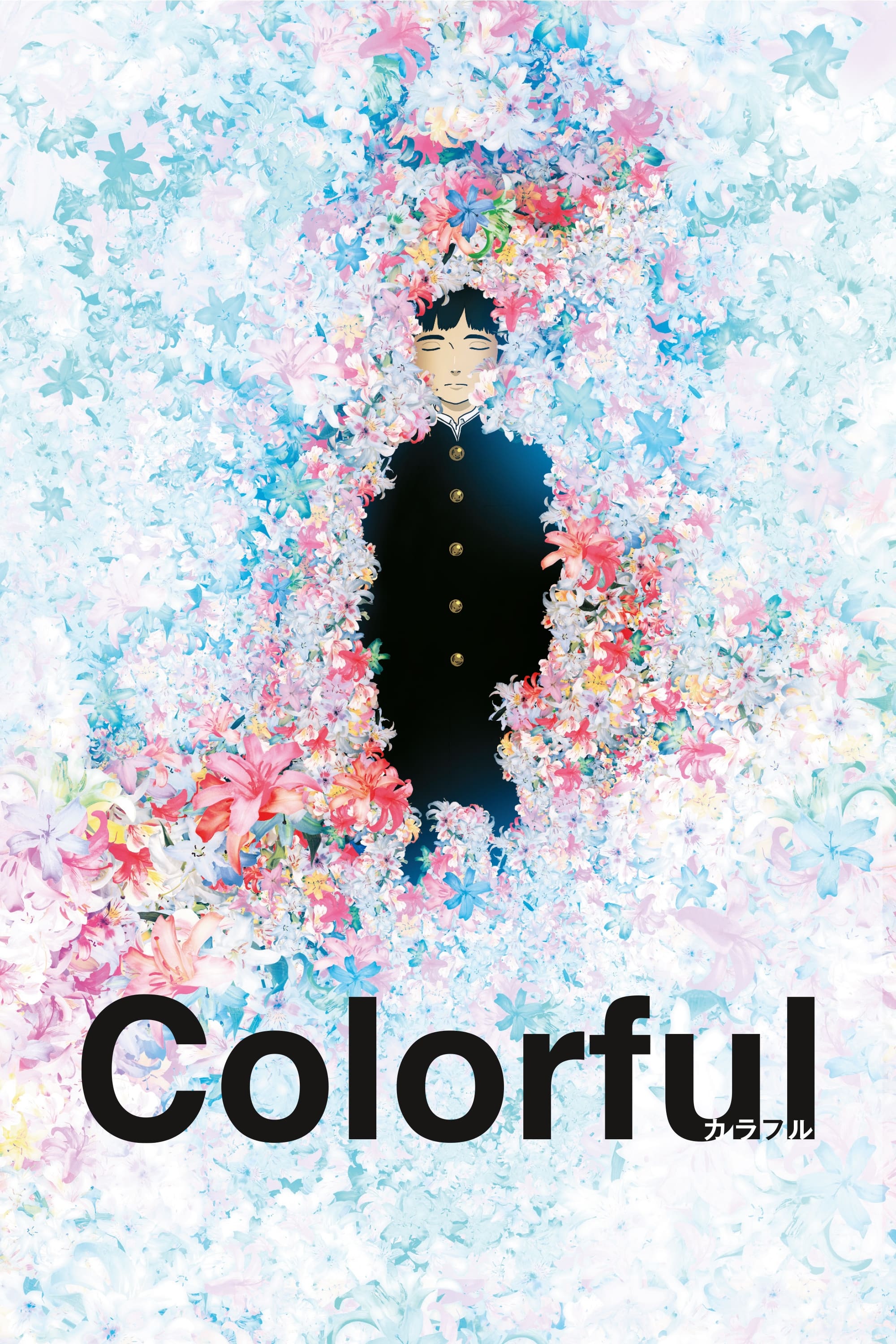
This film uses restrained, sometimes washed-out color choices to match heavier emotional material, so the world’s look helps you sense when life feels drained versus when it opens up again. Produced by Sunrise and directed by Keiichi Hara, it centers on a second-chance premise where emotional honesty is the real turning point. That makes color feel tied to recovery: the visuals can reinforce how burdened or clear-headed the protagonist is becoming. If you’re looking for color that supports emotional healing rather than fantasy mechanics, it’s a useful pick.
Which anime world on this list uses color in a way that stuck with you the most—share your pick in the comments.