
15 Animated Series That Switched Art Styles Mid-Run and Nailed It

Animation is an evolving medium where technology and artistic vision often shift during the lifecycle of a long-running show. Production studios may change hands or creators might decide to refresh the visual identity to match a new narrative tone. While drastic changes in character designs or animation techniques can sometimes alienate fans, there are instances where these risks pay off immensely. The following series successfully navigated major stylistic transitions and often emerged looking better than ever.
‘American Dragon: Jake Long’ (2005–2007)
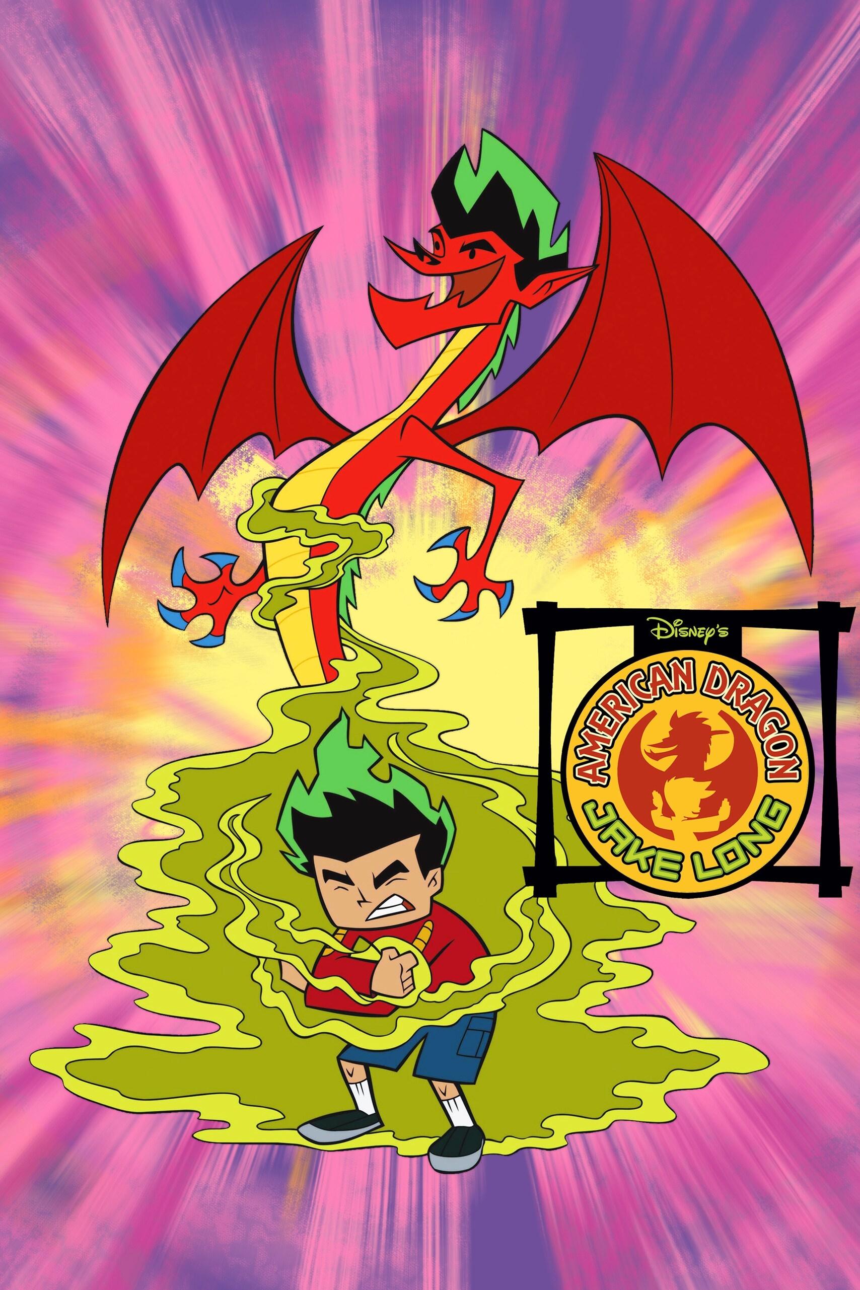
Disney Channel decided to overhaul the visual identity of ‘American Dragon: Jake Long’ for its second season. The production team adopted a flatter and more stylized look that removed many detailed outlines found in the debut season. Jake and his dragon form received sharper angles that allowed for more dynamic action sequences during magical battles. This distinct shift gave the series a unique energy that set it apart from other cartoons of the mid-2000s.
‘One Piece’ (1999–Present)
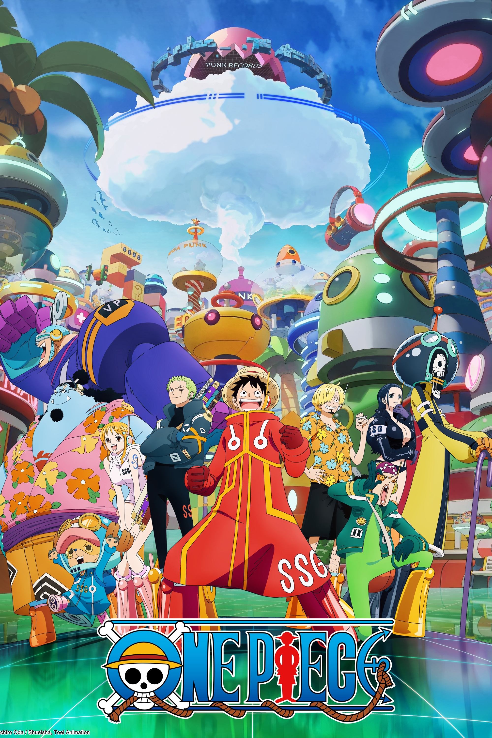
The Wano Country arc marked a significant departure in visual presentation for the long-running pirate saga. Toei Animation implemented line filters and fluid sakuga techniques that mimicked traditional Japanese ink paintings. The color palette became vibrant and saturated to reflect the feudal setting of the isolated nation. Viewers praised the cinematic quality and heavy outlines that revitalized the series after nearly two decades on air.
‘Attack on Titan’ (2013–2023)
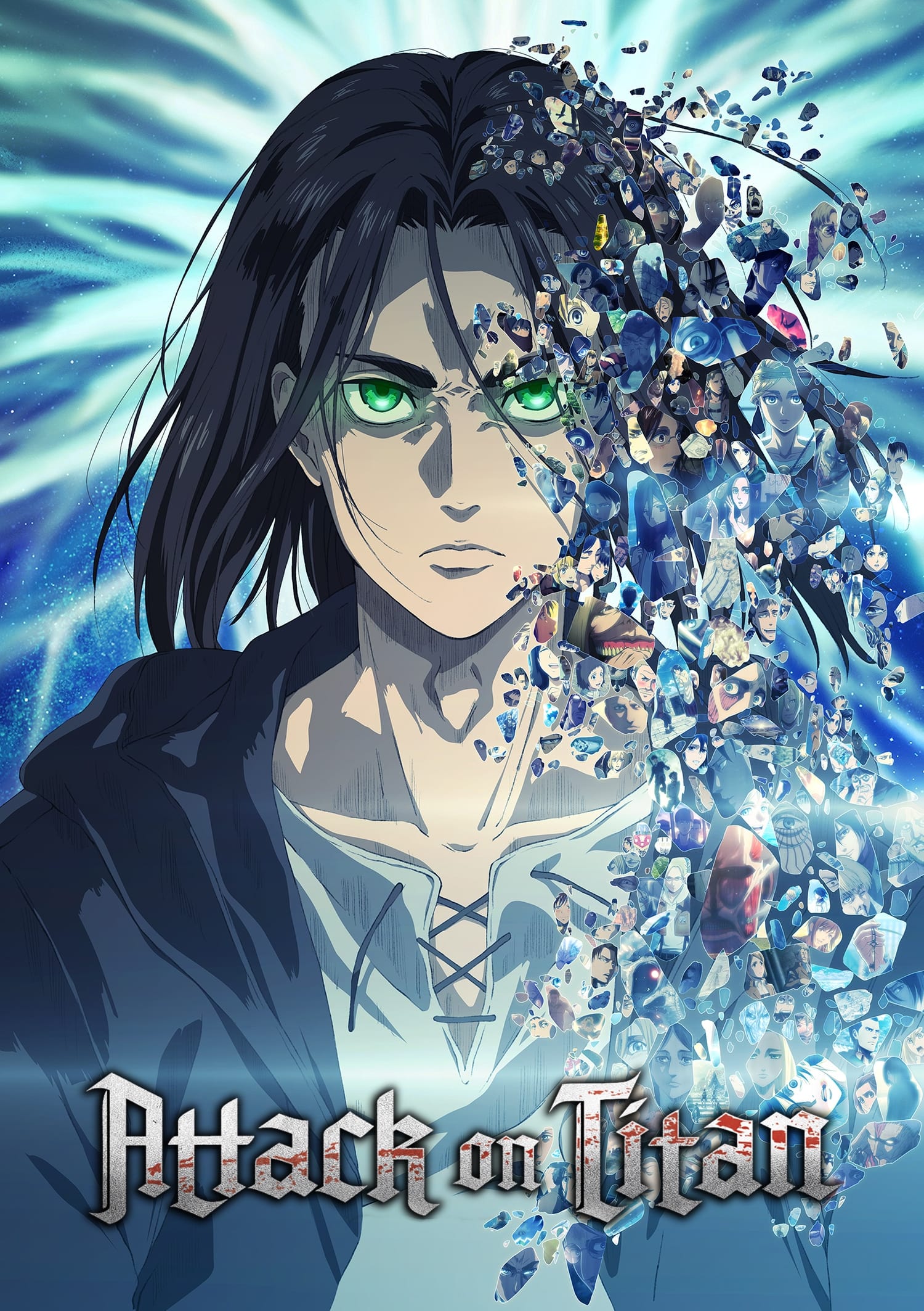
The production responsibility shifted from Wit Studio to MAPPA for the final season and resulted in a noticeable change in character models. The new art direction utilized more CGI for the Titans to handle the massive scale of the conflict. Characters appeared slightly older and more battle-hardened to reflect the time skip and darker narrative themes. This grittier approach complemented the mature and political turn the storyline took in its concluding chapters.
‘Pokémon’ (1997–2023)

‘Pokémon the Series: Sun & Moon’ introduced a fluid and expressive animation style that surprised many long-time viewers. The character design for Ash Ketchum became softer and more rounded to facilitate exaggerated comedic reactions. This loosening of the rigid model sheets allowed animators to create energetic and fluid movement during battles. The vibrant tropical setting benefited greatly from this relaxed approach and breathed fresh life into the franchise.
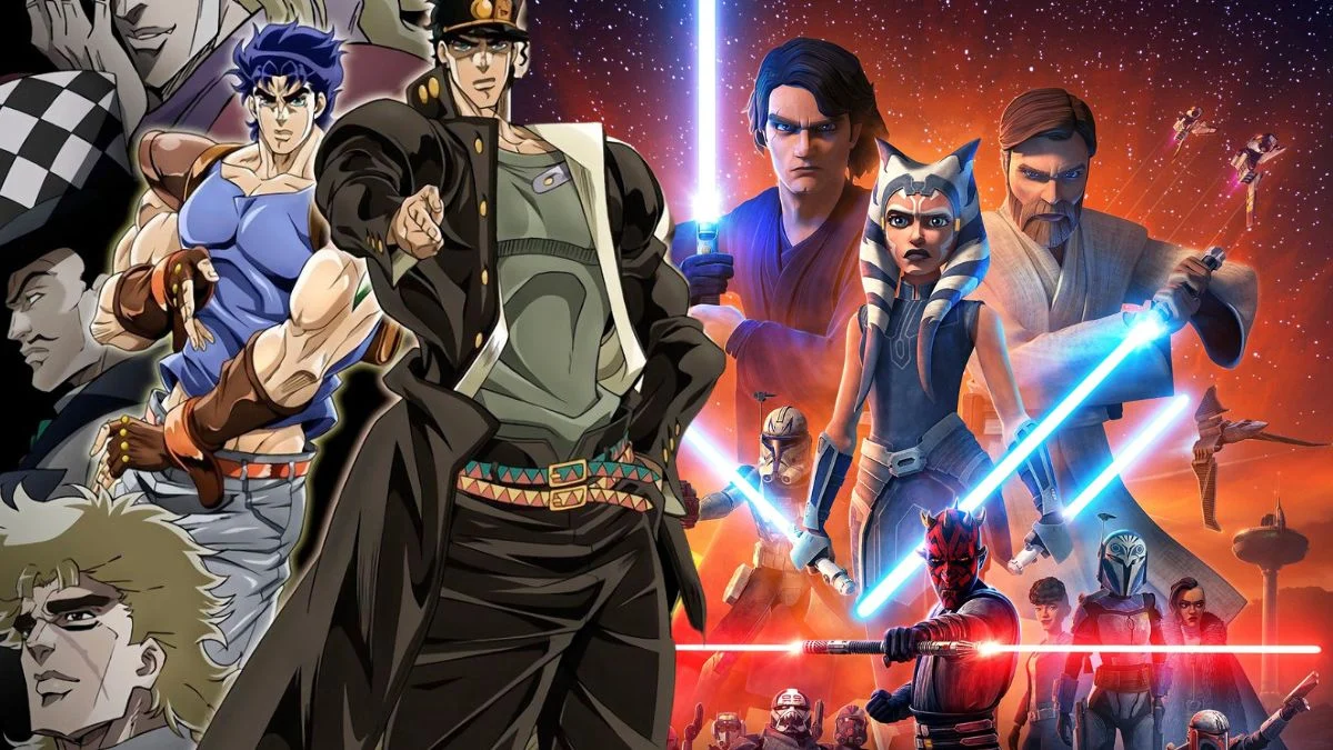
‘JoJo’s Bizarre Adventure’ (2012–Present)
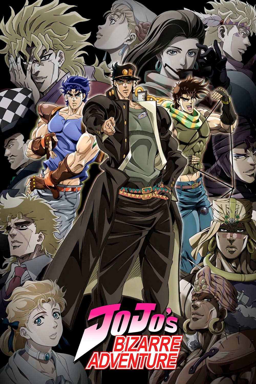
David Production alters the art style of this anime with every new part to match the evolution of the original manga. The transition to ‘Diamond is Unbreakable’ brought a pop-art aesthetic with psychedelic skies and softer character features. This contrasted sharply with the muscular and heavy shading seen in the earlier ‘Stardust Crusaders’ arc. These constant reinventing visuals ensure that each generation of the Joestar lineage feels distinct and historically grounded.
‘Bleach’ (2004–2012, 2022–Present)
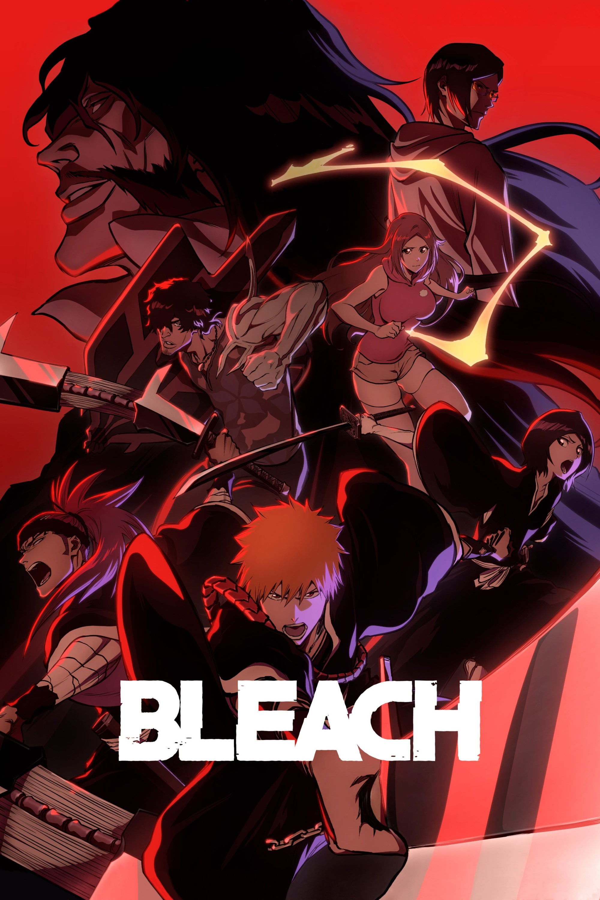
The return of ‘Bleach’ for the Thousand-Year Blood War arc featured a massive upgrade in visual fidelity compared to the original 2004 run. Studio Pierrot utilized modern digital lighting and composite effects to create a cinematic experience. The character shading became more intricate and the color grading adopted a darker and more contrast-heavy look. This modernization successfully brought the classic shonen anime into the contemporary era with high-quality production values.
‘Samurai Jack’ (2001–2017)
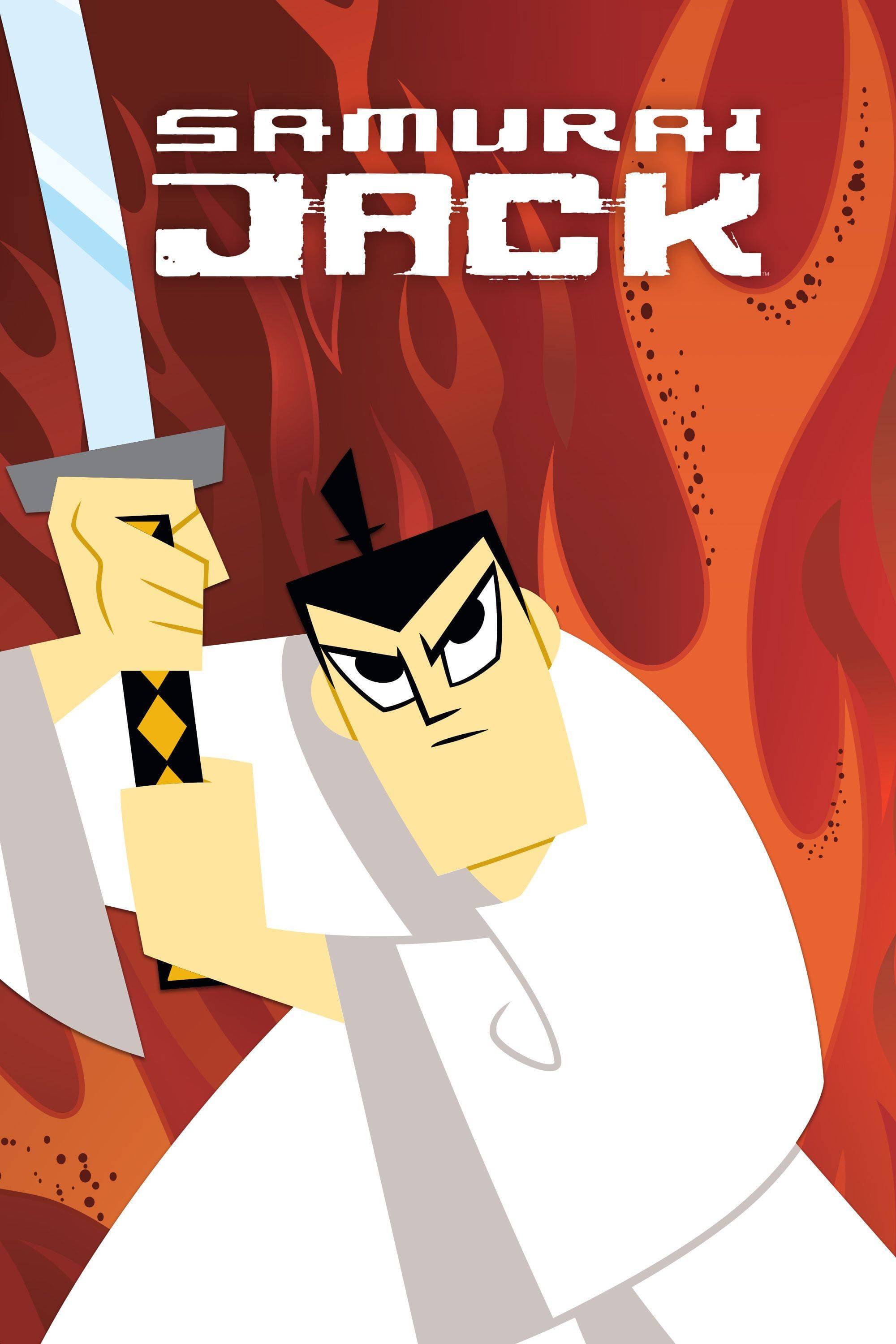
The revival of ‘Samurai Jack’ for a fifth season on Adult Swim came with a refined and more mature visual presentation. Genndy Tartakovsky maintained the signature lineless style but added more detailed textures and atmospheric lighting. The aspect ratio widened to a cinematic scope that emphasized the loneliness of the protagonist’s journey. This evolution honored the original minimalist beauty while utilizing modern technology to enhance the storytelling.
‘ReBoot’ (1994–2001)
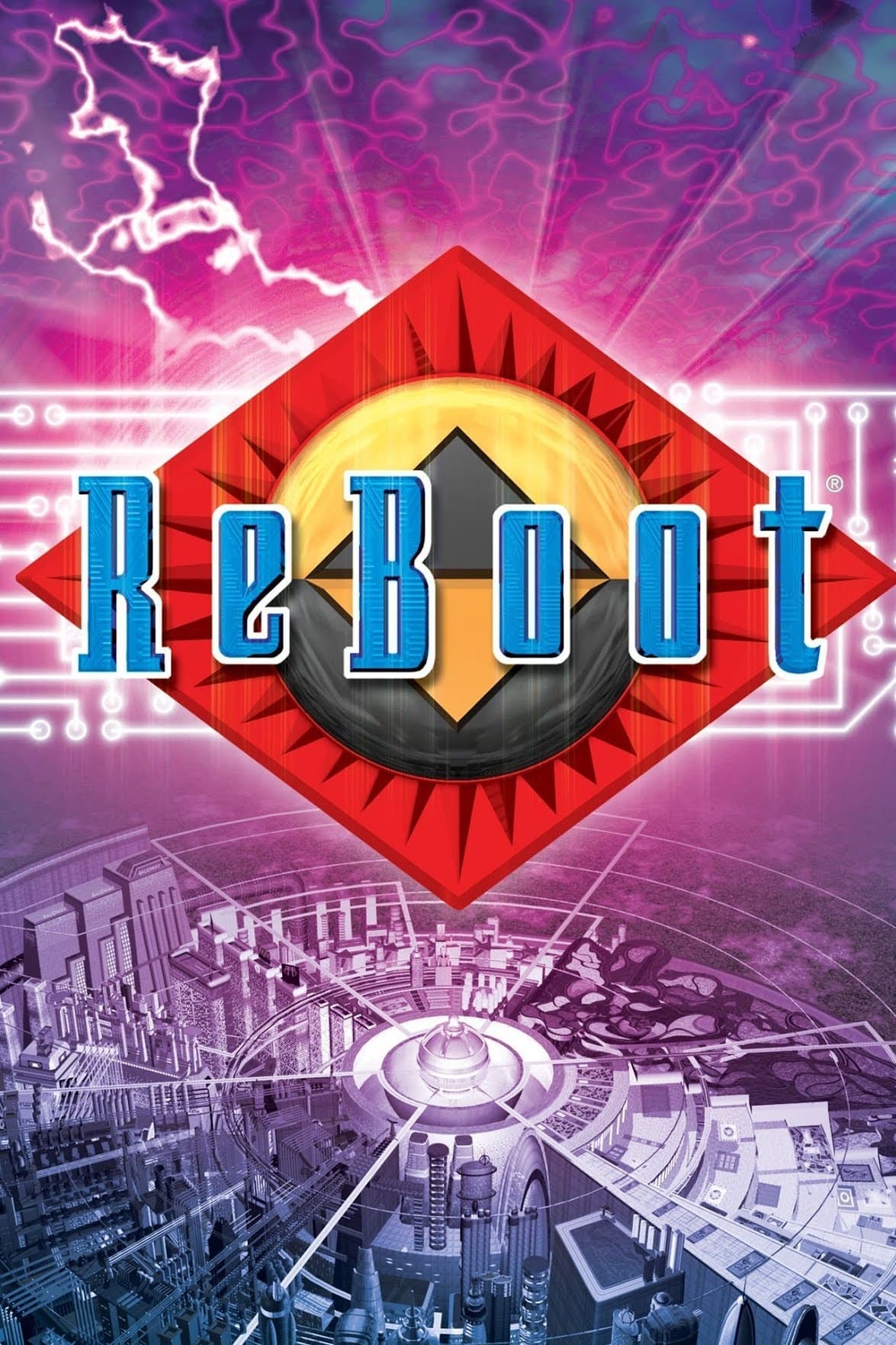
This pioneering CGI series underwent a drastic visual improvement as technology advanced during the 1990s. The third season showcased detailed character models and complex lighting that were impossible during the earlier episodes. Matrix and AndrAIa received older and more rugged designs that mirrored the darker tone of the plot. The improved rendering capabilities allowed Mainframe Entertainment to tell a more ambitious and serious sci-fi story.
‘The Simpsons’ (1989–Present)
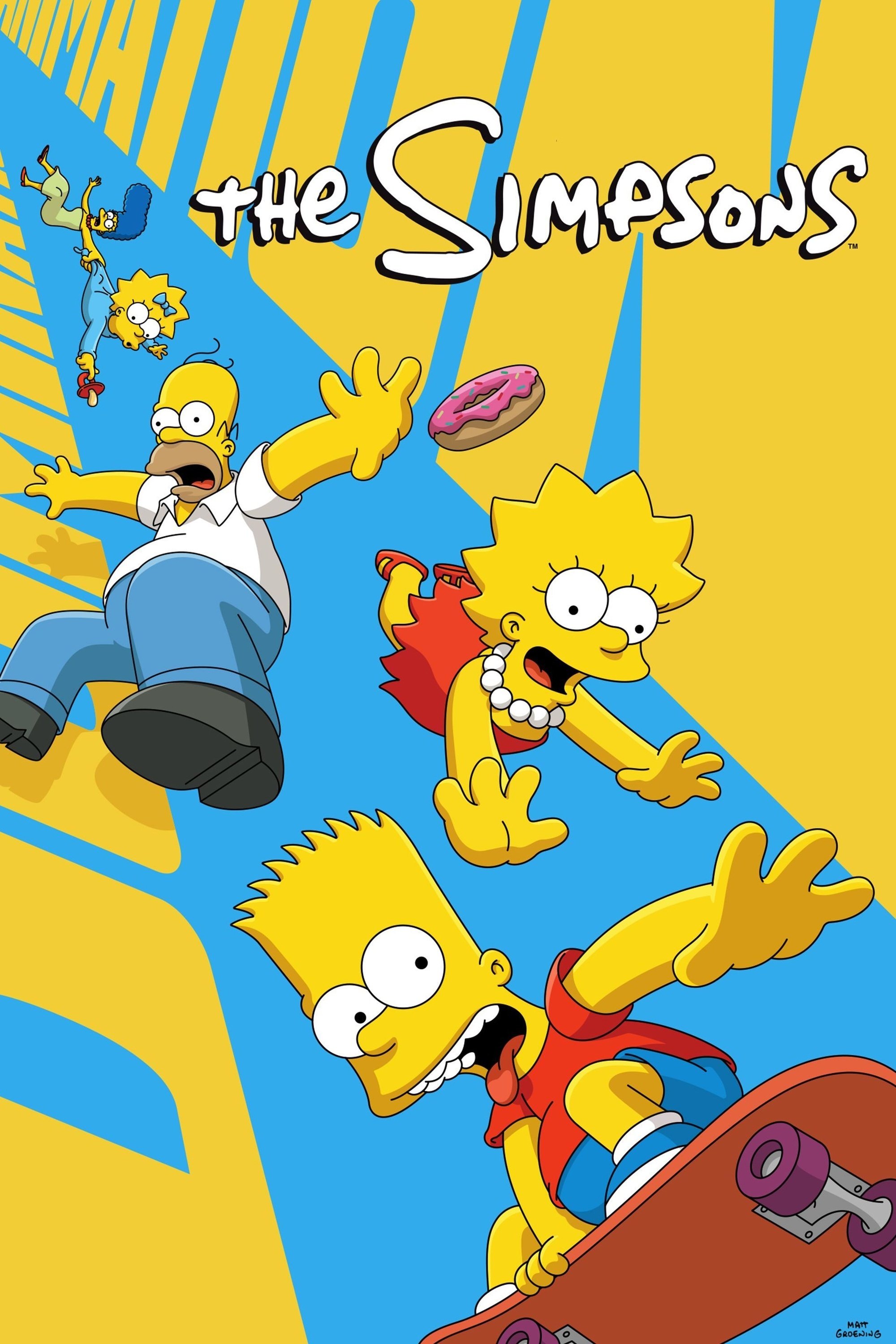
The animation quality of ‘The Simpsons’ evolved from the rough and jittery movements of the Tracey Ullman shorts to a polished digital look. The transition to high definition in 2009 permanently cleaned up the character models and background details. Hand-painted cels were replaced by digital ink and paint that allowed for vibrant colors and consistency. This modernized appearance has kept the family looking sharp and recognizable for over three decades.
‘South Park’ (1997–Present)
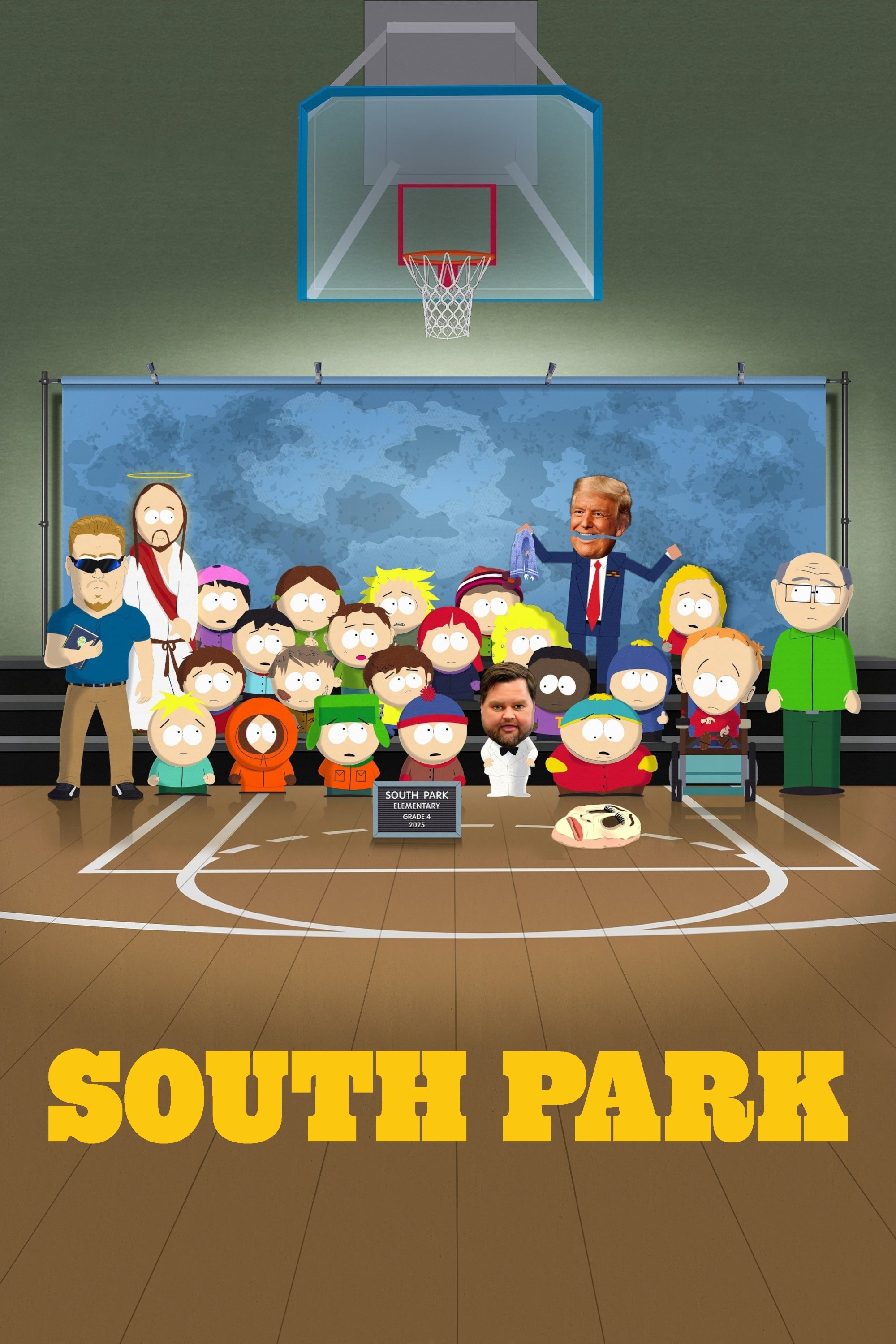
Trey Parker and Matt Stone originally created the pilot using actual construction paper cutouts and stop-motion photography. The series immediately switched to computer animation that perfectly emulated the original crude aesthetic but allowed for faster production. Later seasons introduced higher resolutions and more complex visual effects while retaining the charm of the cutout style. This technological shift enables the creators to produce episodes in just six days to stay topical.
‘Star Wars: The Clone Wars’ (2008–2020)
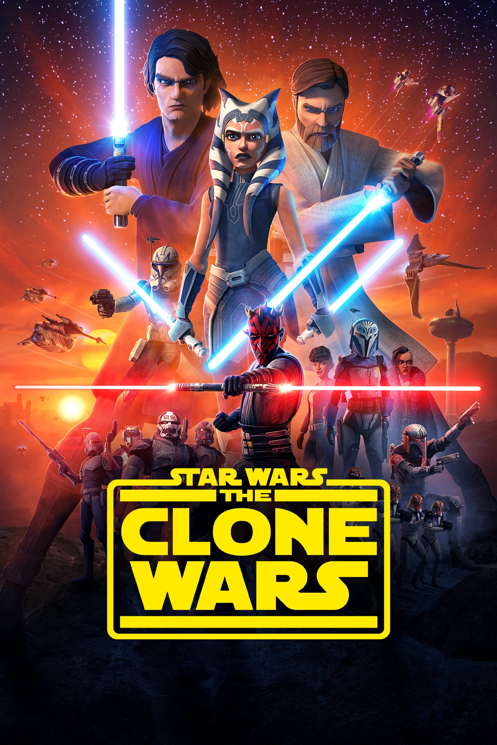
The visual fidelity of ‘Star Wars: The Clone Wars’ improved dramatically between the early seasons and the final revival on Disney+. Lighting engines and character models received significant upgrades that added realism to the textures and environments. The final season featured lightsaber duels that utilized motion capture data for unprecedented fluidity. This gradual refinement turned the show into one of the most visually impressive CGI series ever produced.
‘My Teen Romantic Comedy SNAFU’ (2013–2020)

The switch from Brain’s Base to studio feel between the first and second seasons resulted in a complete character design overhaul. The new art style featured softer lines and more detailed lighting that enhanced the emotional atmosphere of the show. Character expressions became more nuanced to match the shifting tone from comedy to serious drama. Fans generally welcomed this glow-up as it better suited the complex interpersonal relationships of the story.
‘Initial D’ (1998–2014)
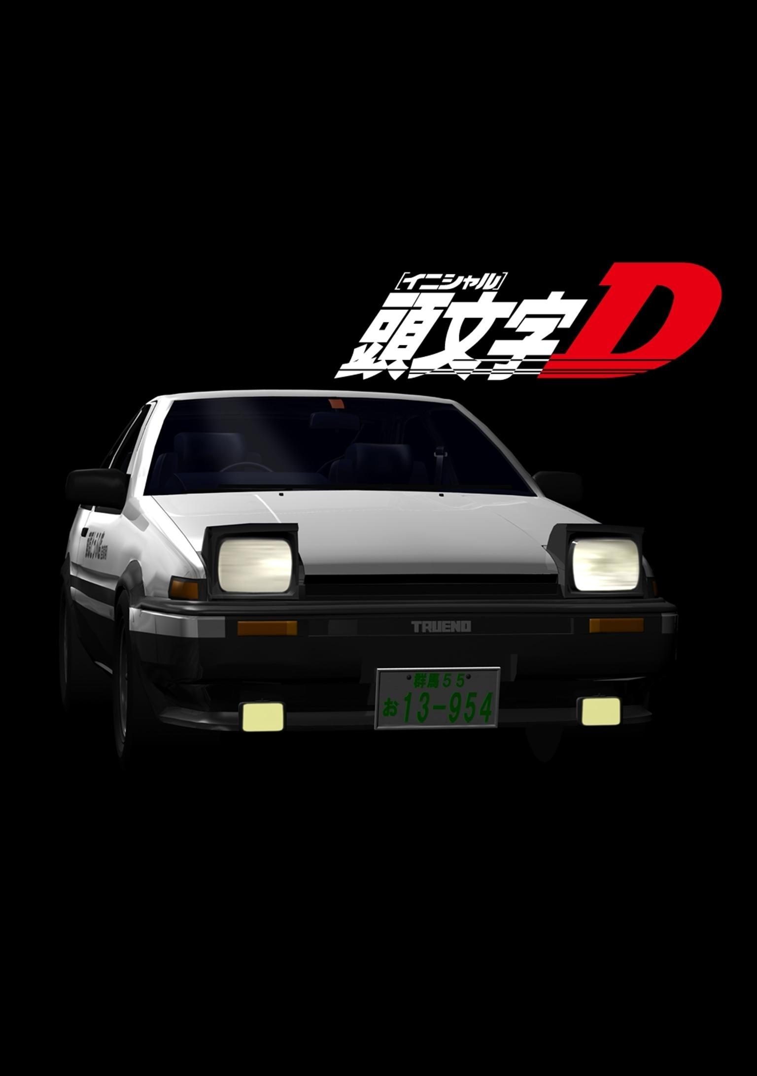
The integration of CGI cars was a staple of ‘Initial D’ but the quality varied wildly throughout its run. Early stages featured blocky vehicles that clashed with the traditional 2D character animation. By the time the series reached the ‘Final Stage’ the 3D models were seamless and blended perfectly with the environment. This technical progression made the intense mountain racing battles feel much more immersive and adrenaline-pumping.
‘RWBY’ (2013–Present)
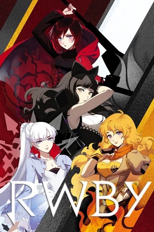
Rooster Teeth switched animation software from Poser to Autodesk Maya after the third volume of ‘RWBY’. This change allowed for a distinct cel-shaded look that replaced the shiny and rigid models of the early chapters. The characters gained more expressive facial rigs and the environments became far more expansive and detailed. The visual upgrade signaled a maturity in production that matched the expanding scope of the fantasy narrative.
‘Vinland Saga’ (2019–Present)
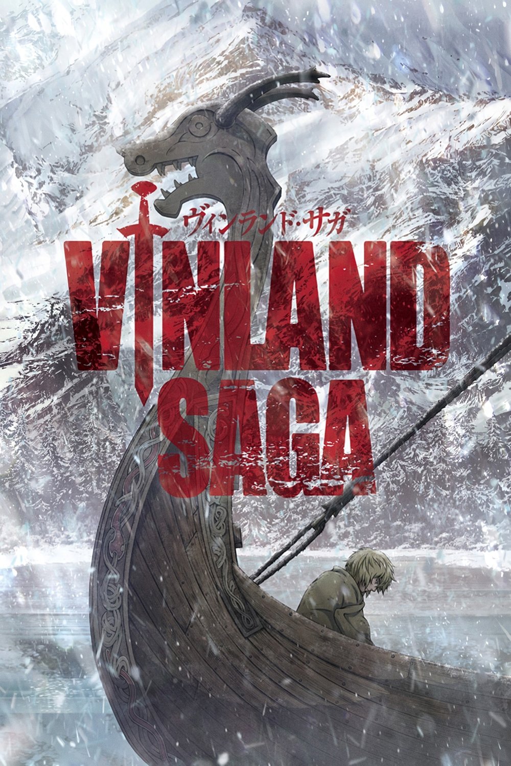
The production of ‘Vinland Saga’ moved to MAPPA for its second season and brought a subtle but effective shift in art direction. The animation focused more on the pastoral and character-driven moments of the farmland arc. While the action remained visceral the new style emphasized the emotional weight of Thorfinn’s path to redemption. The detailed background art captured the beauty of nature which contrasted with the violence of the prologue.
Tell us which artistic transformation you think improved the show the most in the comments.