
Anime Series That Were Censored to Remove “Problematic” Character Designs
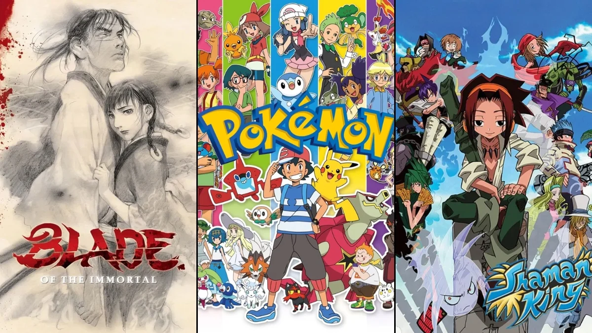

The globalization of Japanese animation often necessitates visual adjustments to align with different cultural standards and broadcasting regulations. While many edits involve the removal of violence or dialogue changes, several iconic series have undergone significant character design modifications to address perceived problematic elements. These changes frequently target religious iconography, suggestive attire, or designs that could be interpreted as racially insensitive. By examining these alterations, viewers can see the complex intersection of artistic intent and international sensitivities in the medium of anime.
‘Pokémon’ (1997–Present)
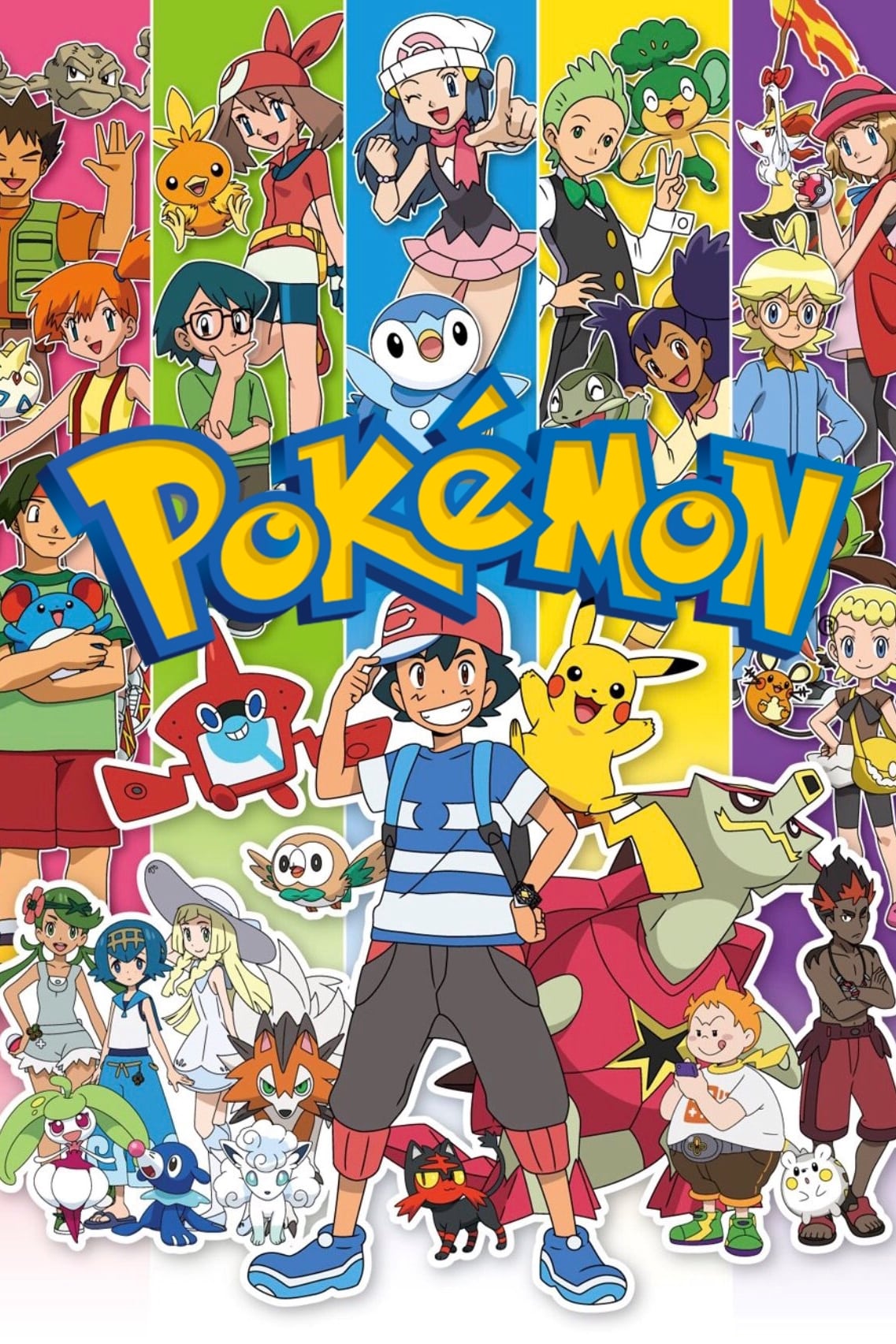
The character Jynx underwent a significant design overhaul after critics pointed out its resemblance to racial caricatures. Originally depicted with black skin and large lips, the character was later recolored to have purple skin in all subsequent media appearances and international releases. This change was implemented to avoid negative associations with blackface and to make the series more inclusive for global audiences. The transition began during the ‘Orange Islands’ arc and has remained the standard for the character’s design in games and animation ever since.
‘Dragon Ball Kai’ (2009–2015)
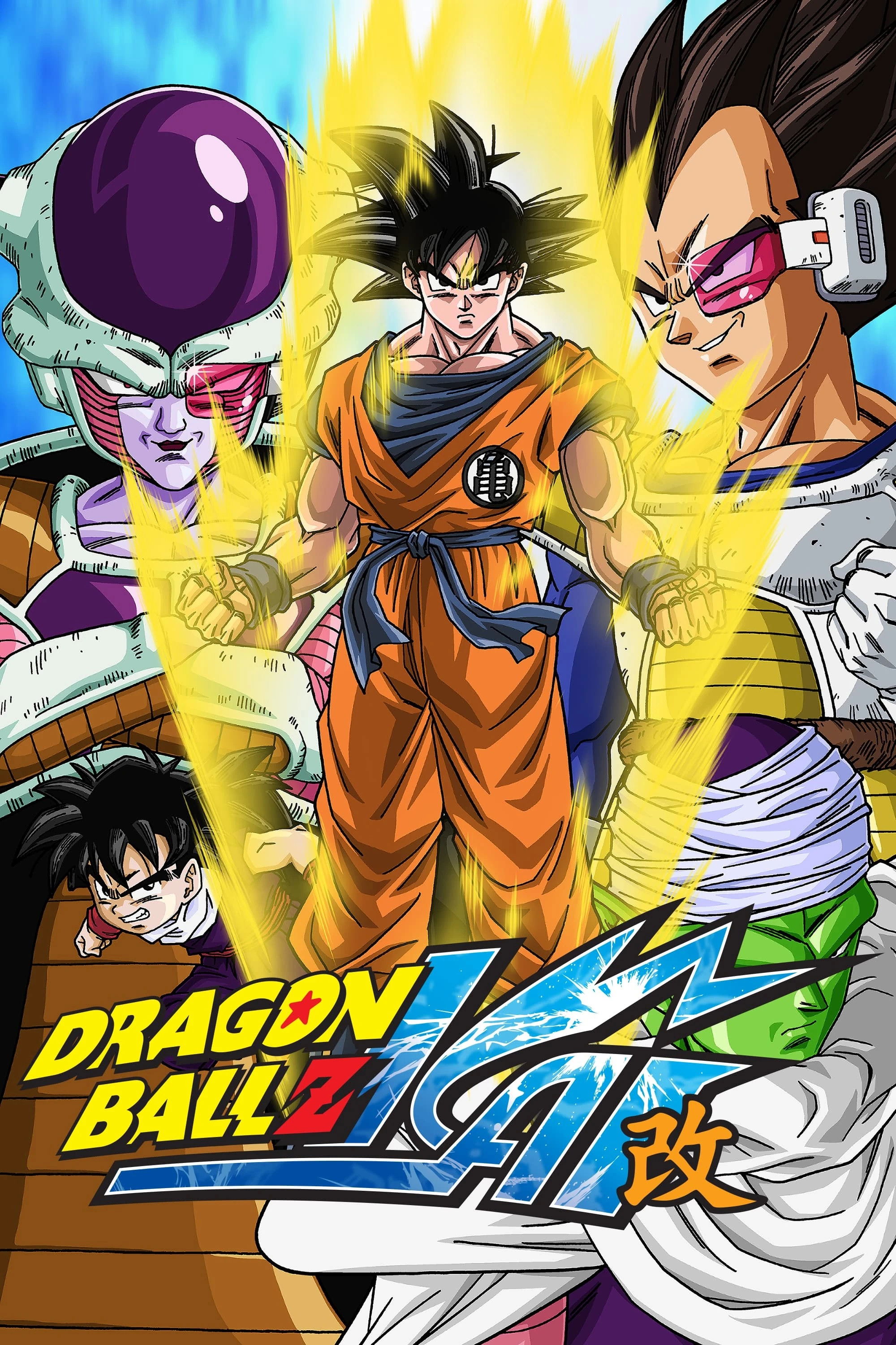
In the international broadcast of this condensed version of the classic series, the character Mr. Popo was digitally altered by some networks. Specifically, the 4Kids Entertainment version changed his skin color from its original black to a bright neon blue to avoid potential comparisons to 19th-century minstrelsy. This radical shift in character design was exclusive to certain Western television airings and was not reflected in the original Japanese production. The modification remains one of the most stark examples of color-based character censorship in the franchise.
‘Yu-Gi-Oh! Duel Monsters’ (2000–2004)
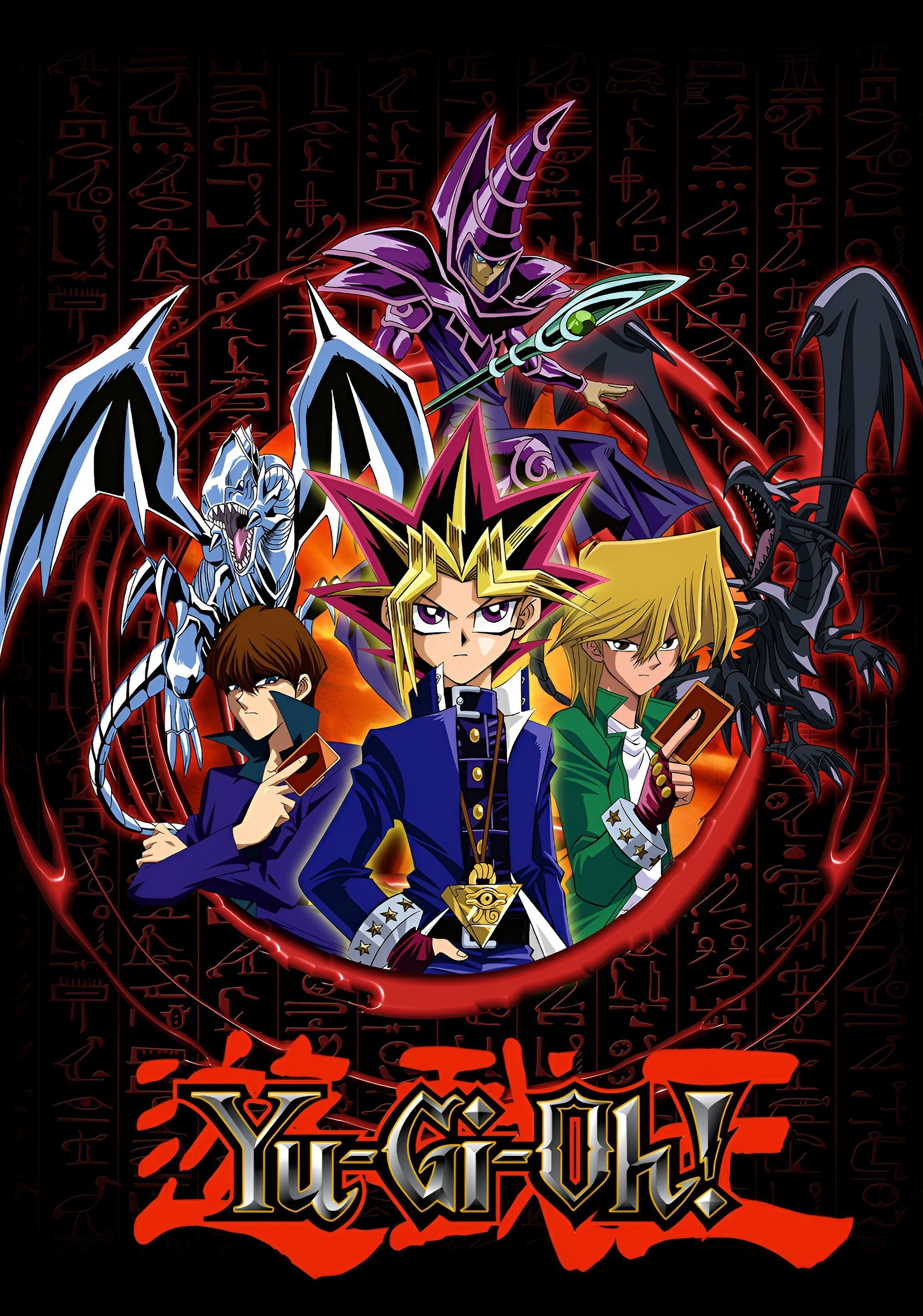
‘Yu-Gi-Oh! Duel Monsters’ features numerous monster designs that were adjusted for international audiences, most notably the ‘Dark Magician Girl’. Her original design featured a pentagram on her chest and a more revealing outfit, which were both altered for the Western release. The pentagram was replaced with a generic blue jewel, and her cleavage was digitally covered to maintain a TV-Y7 rating. These changes were consistent across several female monster characters in the series to comply with strict broadcasting standards regarding religious symbols and suggestive themes.
‘One Piece’ (1999–Present)
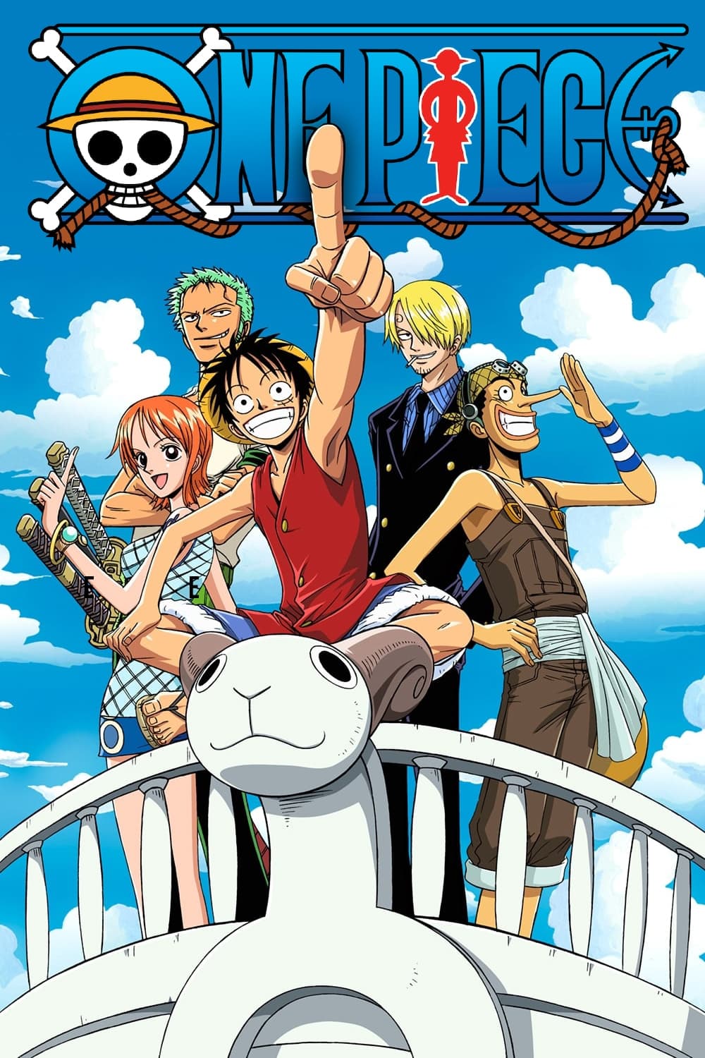
The character Portgas D. Ace originally featured a large tattoo on his back depicting a manji symbol, which is a traditional Buddhist sign for peace and prosperity. Due to its visual similarity to the Nazi swastika, the design was changed to a set of crossed bones for the international anime release and subsequent manga chapters. This adjustment was made to prevent misunderstandings in Western territories where the symbol carries a vastly different historical context. The crossbones design eventually became the definitive version of the Whitebeard Pirates’ emblem across all media.
‘Naruto’ (2002–2007)

Similar to other series utilizing traditional Japanese iconography, ‘Naruto’ faced design challenges regarding the character Neji Hyuga. In the original manga, the “Caged Bird” seal on his forehead was a manji symbol, representing the restrictive nature of his clan’s hierarchy. For the television adaptation, producers changed the seal to a simple “X” shape to avoid the controversial connotations associated with the original symbol in international markets. This change was applied consistently throughout both ‘Naruto’ and the sequel series ‘Naruto: Shippuden’ to ensure global marketability.
‘Bleach’ (2004–2012)
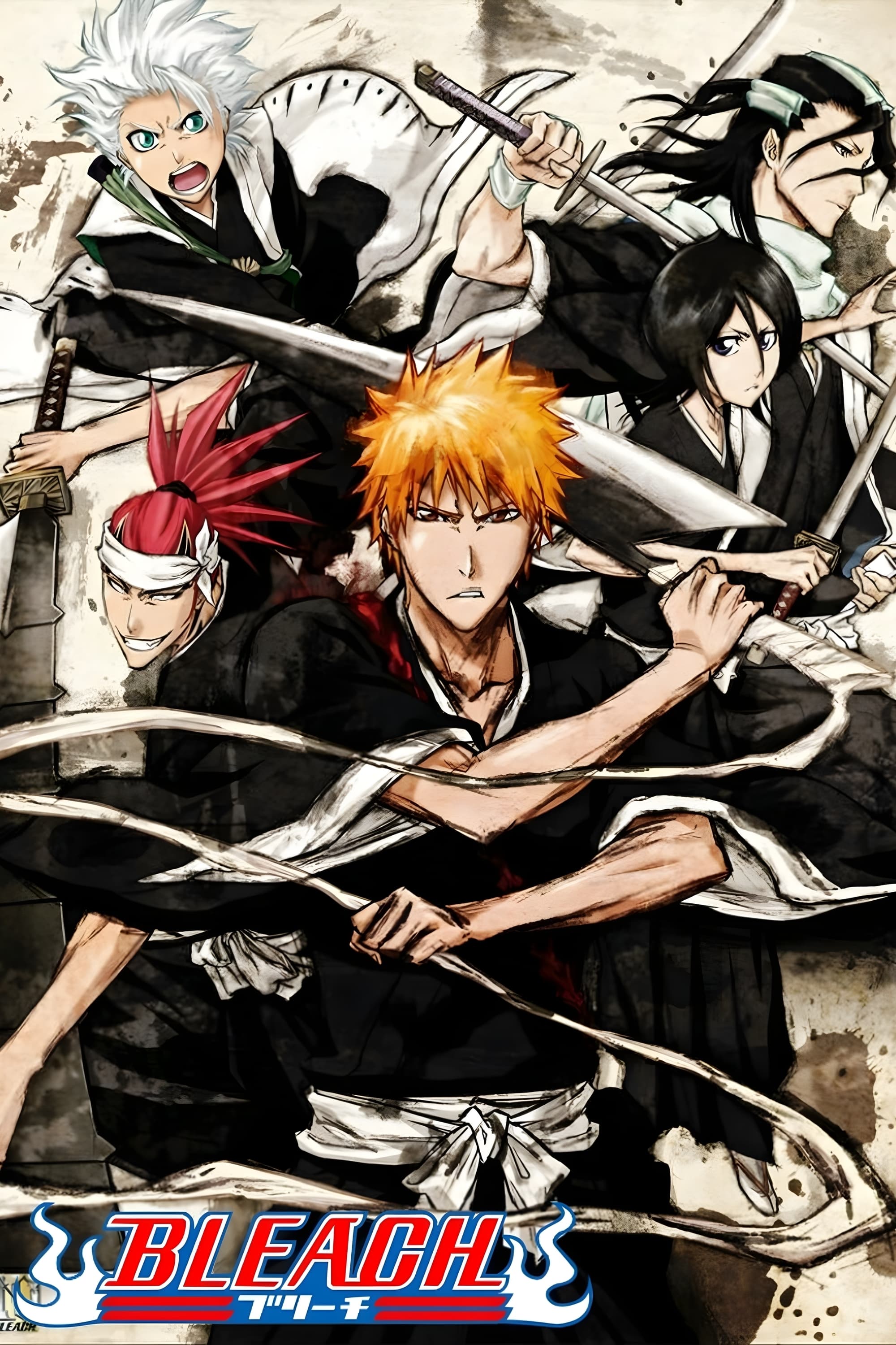
The character Tier Harribel, one of the high-ranking Arrancars, saw her design heavily modified between the manga and the animated series. Her “Resurrección” form originally featured a highly revealing torso that exposed the lower half of her breasts and much of her midriff. The anime production team added extra layers of white bone-like armor to cover these areas, making her design more suitable for a televised time slot. These adjustments were part of a broader effort to reduce the explicit nature of certain character designs within the show.
‘Sonic X’ (2003–2004)
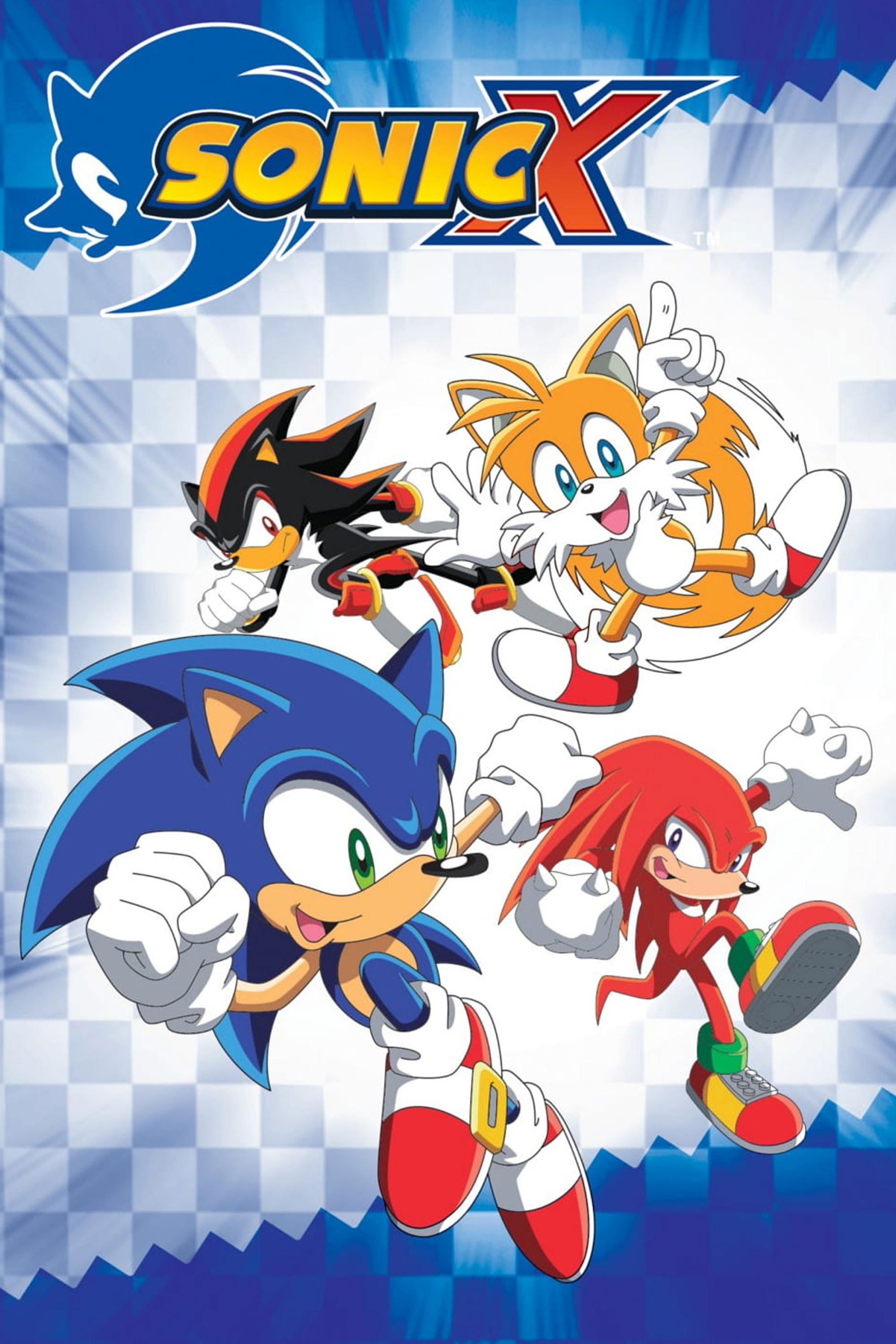
Rouge the Bat is a recurring character in the ‘Sonic the Hedgehog’ franchise whose design was altered for the American broadcast of the anime ‘Sonic X’. In the original Japanese version, her character model included visible cleavage lines that emphasized her mature feminine design. The localized version by 4Kids Entertainment removed these lines and adjusted her bodysuit to cover more of her chest area. These changes were intended to align the character’s appearance with the expectations of a younger demographic in the United States.
‘Blade of the Immortal’ (2008)
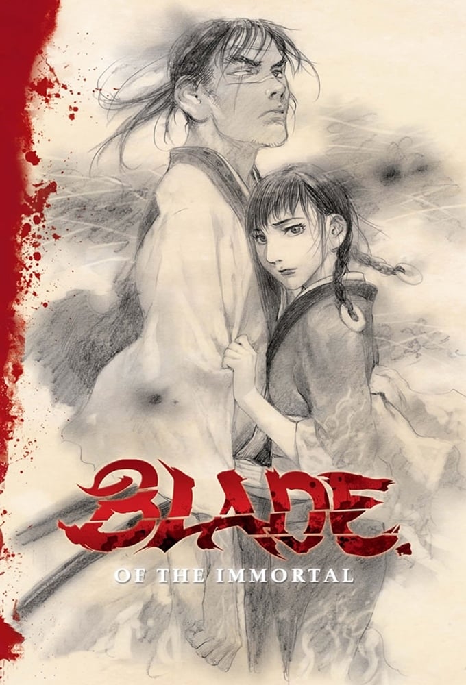
The protagonist of this series, Manji, derives his name and signature design from the manji symbol displayed prominently on his kimono. Because the symbol is frequently mistaken for a swastika in Western cultures, many versions of the anime were edited to remove or alter the emblem. In some international releases, the symbol was digitally erased or modified into a different geometric shape to prevent offense. This specific design edit is common for series that feature historical Japanese settings where such traditional symbols are historically accurate.
‘Sailor Moon’ (1992–1997)
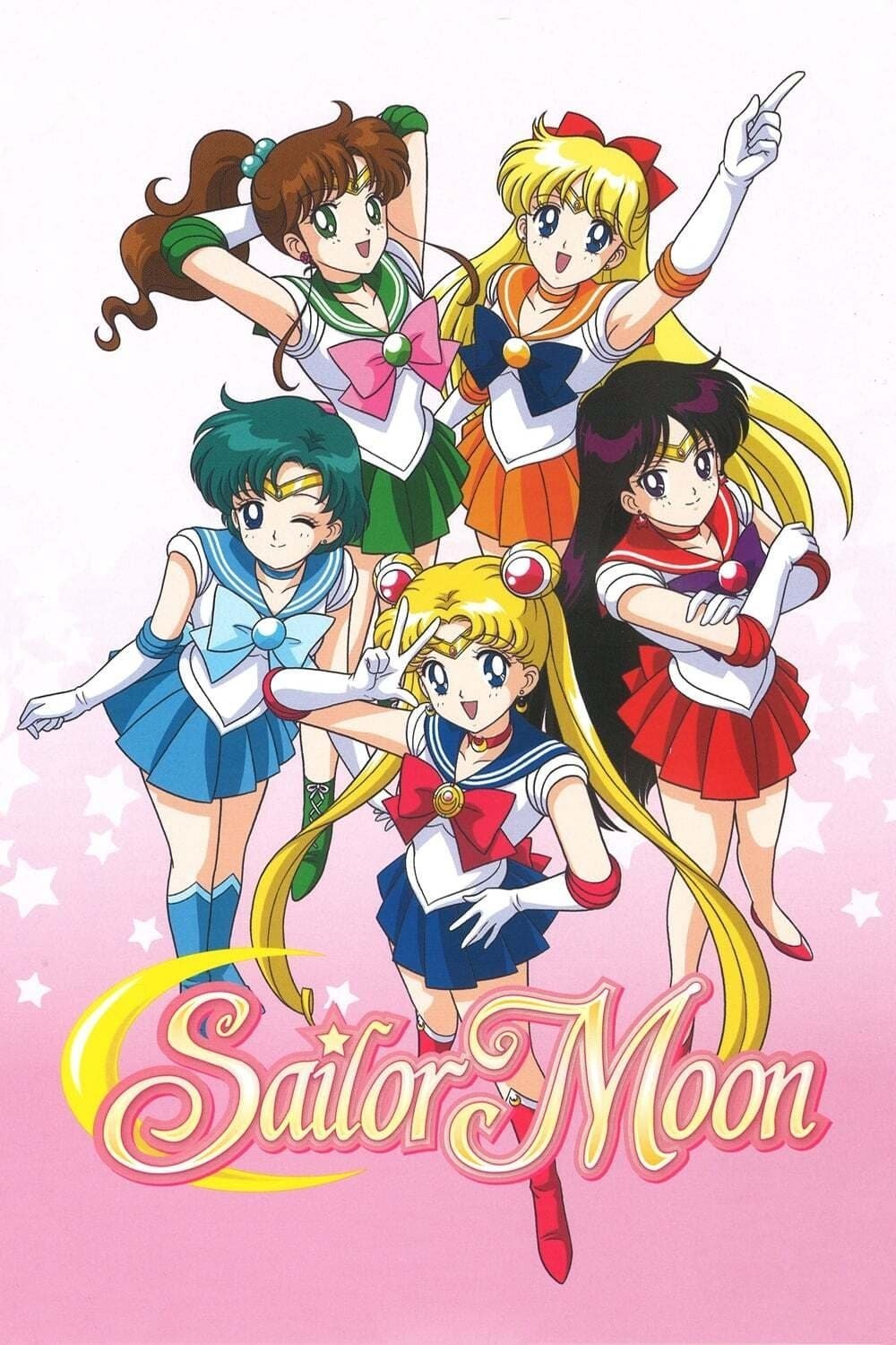
While many edits in ‘Sailor Moon’ involved dialogue, the character Zoisite underwent a complete visual and gender transformation in several international dubs. To avoid depicting a same-sex relationship with Kunzite, the character’s design was presented as female through the use of feminine voice acting and minor artistic adjustments. This change allowed the localized version to maintain the closeness of the two characters while adhering to the social standards of the 1990s. This remains a classic example of how character identity and design are often linked during the censorship process.
‘Tokyo Mew Mew’ (2002–2003)
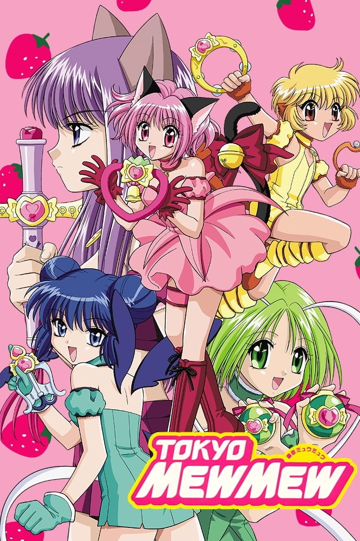
In the localized version titled ‘Mew Mew Power’, the character designs for the main heroines were subtly adjusted to be less suggestive. Mew Ichigo and her teammates originally wore short, ruffled outfits that were lengthened or given additional coverage in promotional material and certain frames. These modifications were part of a larger effort to market the show to a younger female audience in the West, where standards for “magical girl” attire differed from Japan. Such edits were intended to minimize the “fan service” elements present in the original production.
‘Fire Force’ (2019–2020)
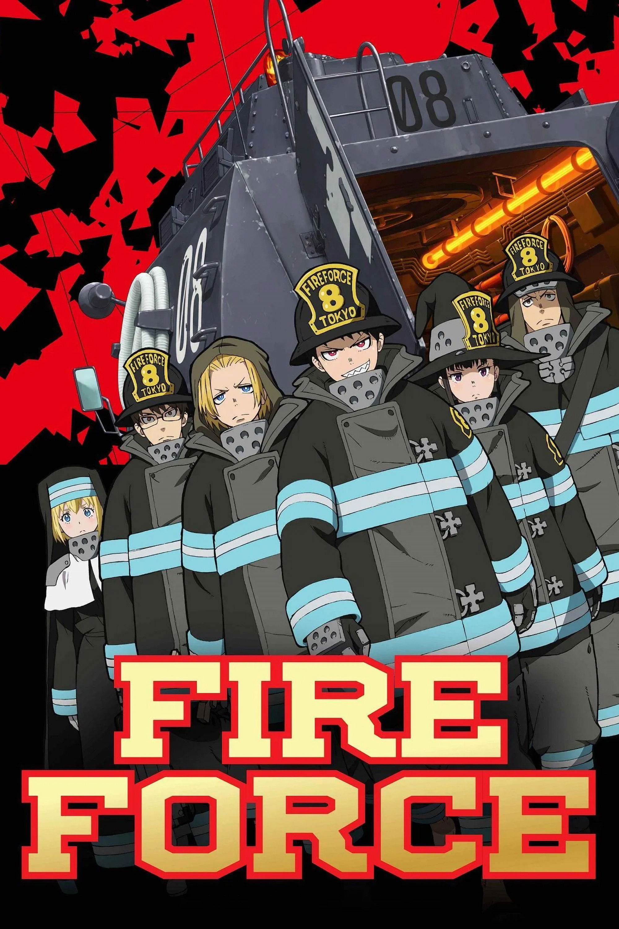
The character Tamaki Kotatsu is frequently at the center of design-based censorship due to her “Lusty Lure” trait, which often results in her clothes being removed or damaged. In various international streaming and broadcast versions, specific frames were darkened, blurred, or partially cropped to hide her skin. Some scenes were even redrawn to add extra steam or light flares to obscure her character model during fanservice moments. These edits were implemented to comply with platform-specific content guidelines regarding partial nudity and suggestive imagery.
‘Street Fighter II: V’ (1995)
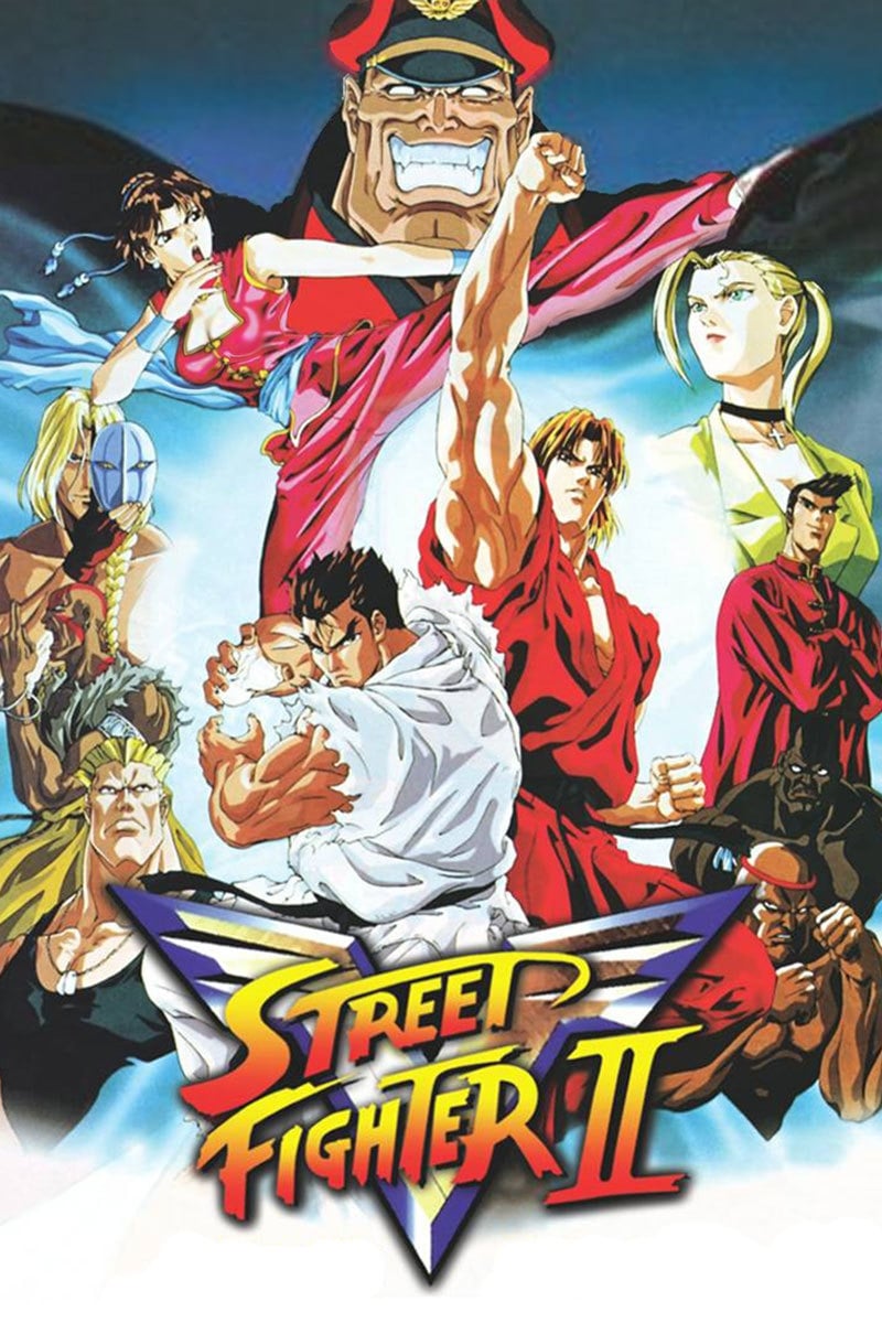
In this animated adaptation of the popular fighting game franchise, the character Cammy White received design modifications for her United States home video release. Her signature green leotard, which was designed as a high-cut thong in the Japanese version, was edited to provide more coverage. Digital “paint” was used to extend the fabric of her outfit over her hips and backside in several action sequences. These adjustments were made to ensure the series could maintain an “unrated” or lower-tier age rating for the retail market.
‘Shaman King’ (2001–2002)
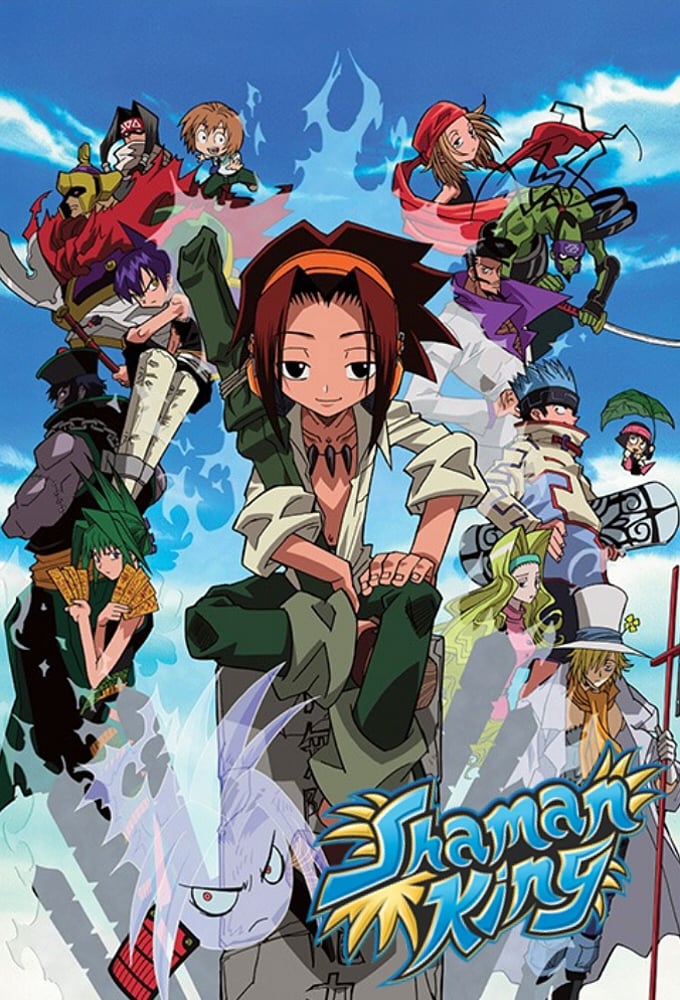
Ren Tao, a major rival and later ally in ‘Shaman King’, carries a design that incorporates various traditional symbols that were deemed problematic for international viewers. In the original series, several of his techniques and his family’s iconography utilized the manji symbol, which appears on his forehead or as part of his spirit’s armor. For the Western release, these symbols were either completely removed or replaced with generic stars and geometric patterns. This design shift was necessary to facilitate a wider release on children’s television networks in the early 2000s.
‘Yu-Gi-Oh!’ (1998–2004)
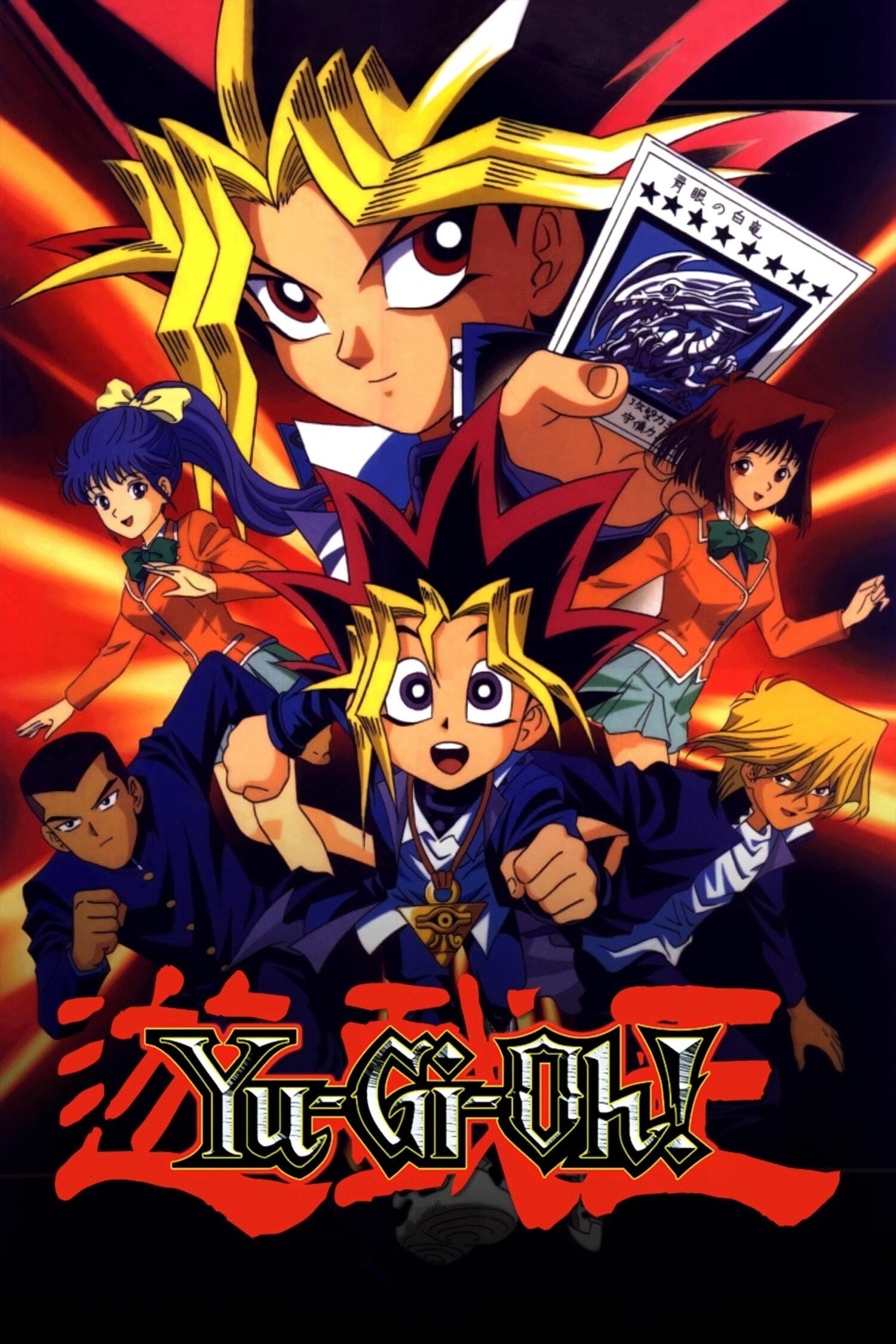
The ‘Harpy Lady’ cards and their associated character designs in the anime are famous for their extensive visual revisions. Originally depicted wearing revealing leather-style outfits with significant skin exposure, they were redesigned with full-body purple or green jumpsuits for the international airings. This change removed the “bondage-lite” aesthetic of the original Japanese designs to make the monsters more appropriate for a Saturday morning cartoon lineup. These edits were so comprehensive that they were eventually applied to the physical trading card game as well.
‘Tenchi Muyo!’ (1992)
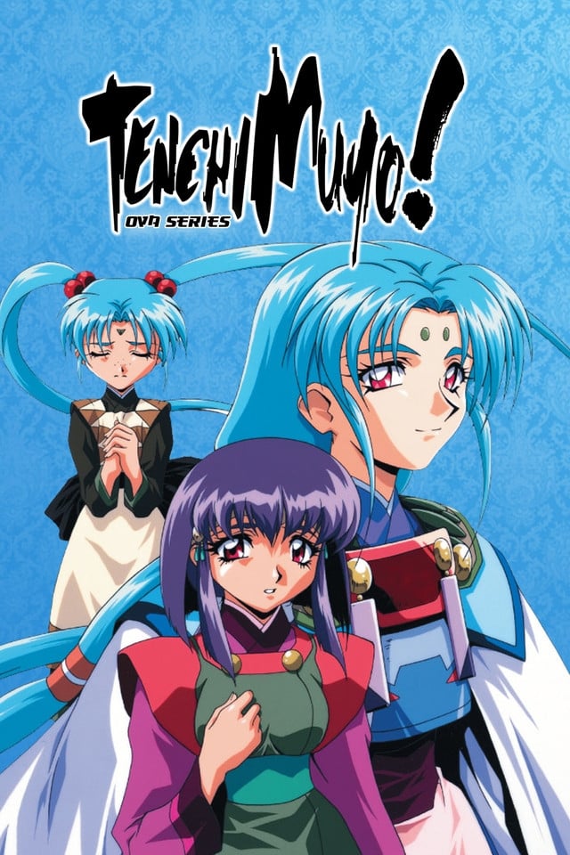
The ‘Tenchi Muyo!’ franchise often features characters like Ryoko and Ayeka in various states of undress or wearing highly revealing clothing in the original Japanese OVA and TV versions. When the series was brought to American television via Cartoon Network’s Toonami block, these character designs were frequently altered. Clothing was digitally added to characters during transformation sequences or bathing scenes to meet broadcast standards. These edits allowed the series to transition from an older-skewing home video market to a broader televised audience.
Tell us which of these design changes surprised you the most by sharing your thoughts in the comments.