
20 Anime That Are All Style and No Substance


Some anime grab attention instantly with striking art, sleek character designs, and eye-catching action. These projects often showcase top studios, well known directors, and experimental techniques that push visuals forward in memorable ways.
This list highlights titles that became known first for how they look. You will find details on studios, formats, episode counts, music teams, and release information that explain how each project came together and why its presentation stands out.
‘Guilty Crown’ (2011–2012)
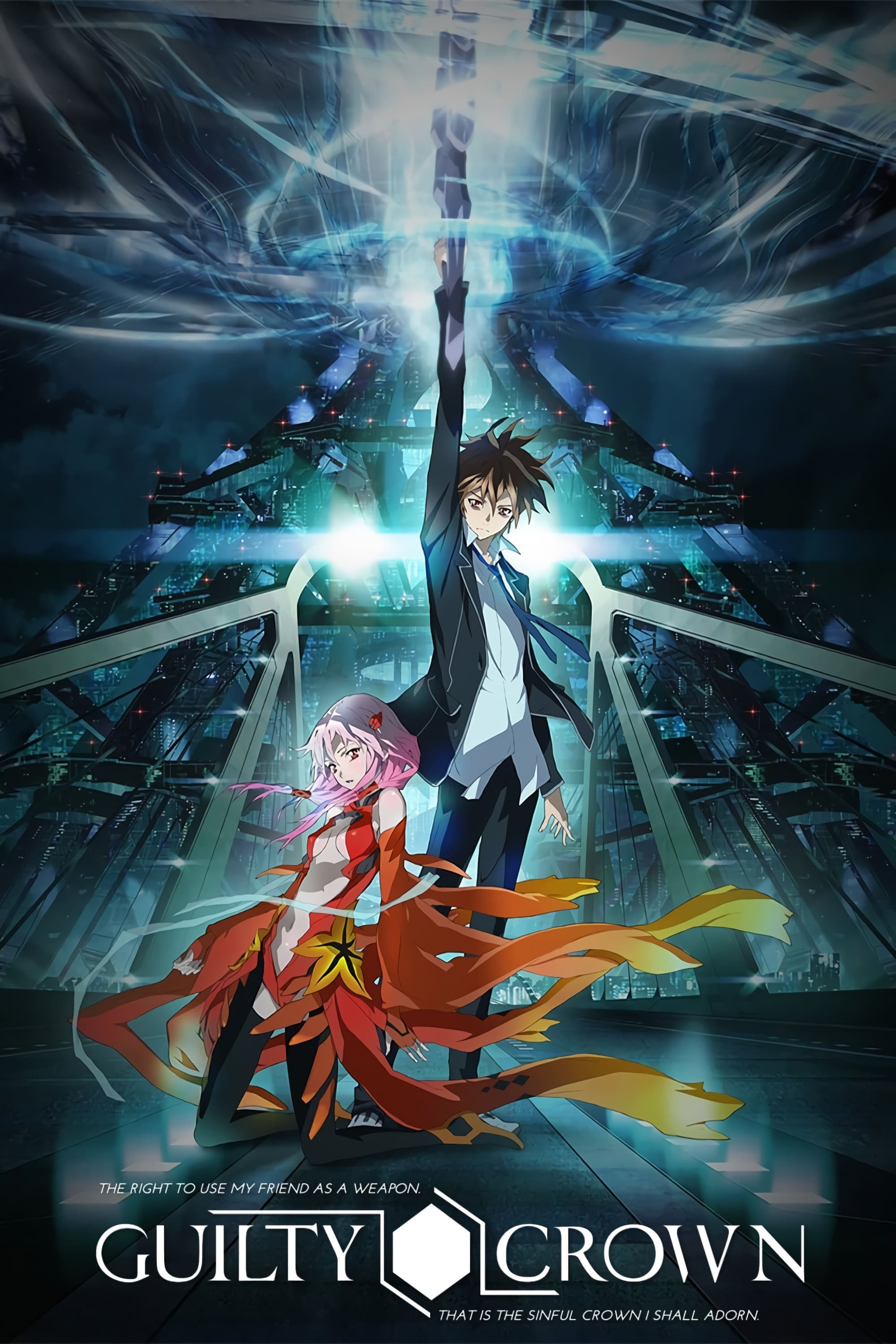
Produced by Production I.G for Fuji TV’s noitaminA block, this original series ran for 22 episodes and used a near-future setting with mecha elements and bio-weapon concepts. Supercell’s ryo handled theme music, and illustrator redjuice provided character designs that shaped the show’s signature look.
The project used extensive digital compositing and glowing particle effects across large action set pieces. Blu-ray releases included revised cuts of select episodes, and tie-in light novels and manga expanded the world introduced on television.
‘K’ (2012)
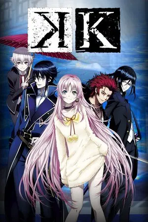
GoHands produced this 13-episode original series with a color-coded “Seven Kings” concept and heavy use of camera tilts, lens flares, and gradient filters. The franchise began with the TV run and continued through films and follow-up seasons under the ‘K Project’ banner.
Background art leaned on saturated cityscapes and glassy interiors, while character motion favored smooth panning and slow pivot shots. The property developed an extended media mix that included stage plays, manga adaptations, and soundtrack albums built around electronic and rock cues.
‘Kabaneri of the Iron Fortress’ (2016)
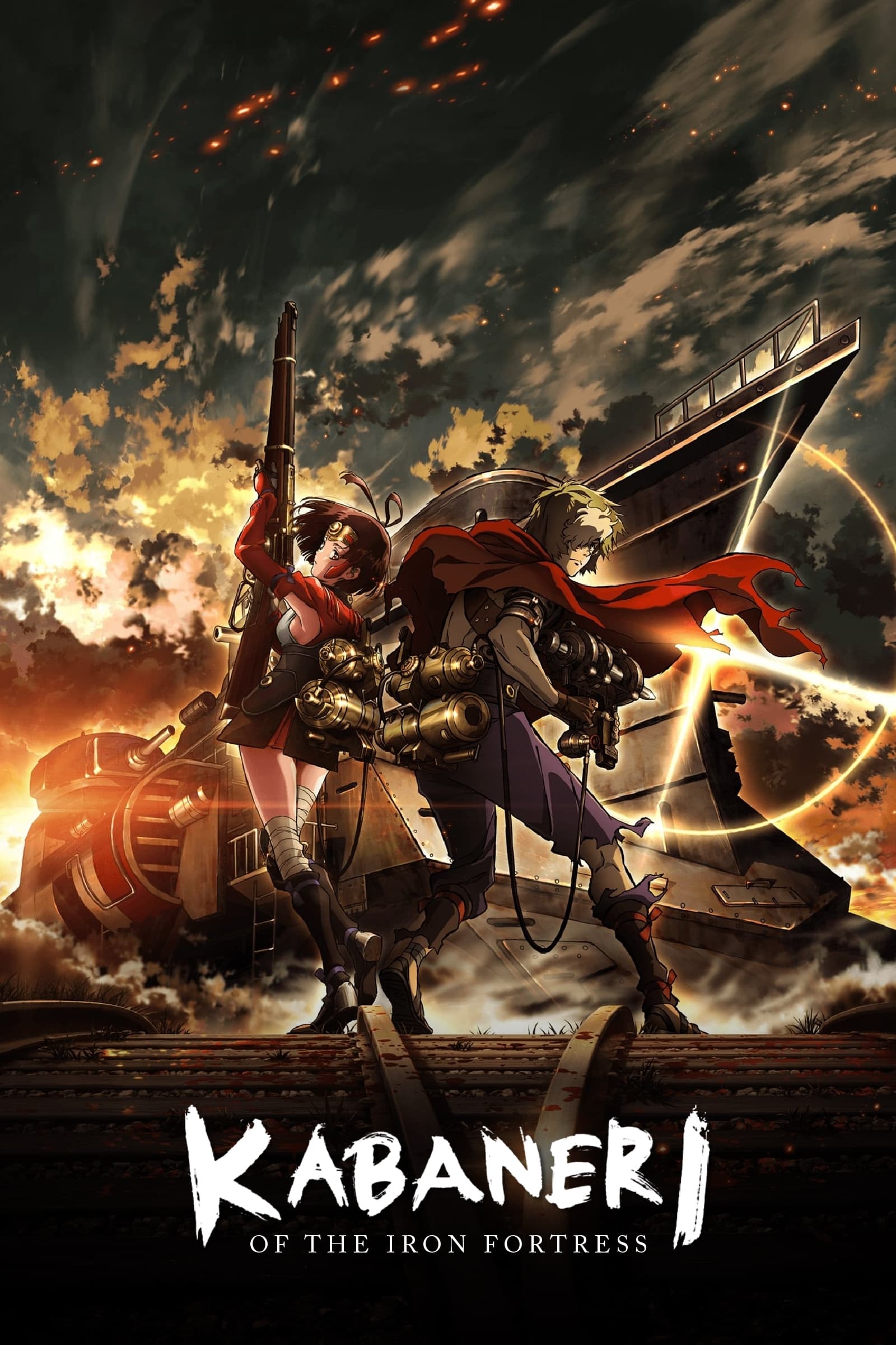
Wit Studio created this 12-episode original for Fuji TV’s noitaminA block with a theatrical compilation later released. The production team employed bold linework and steam-era weapon designs, with music by Hiroyuki Sawano and mechanical designs credited to industry veterans.
The series used digital paint over hand-drawn frames to emulate a textured film look. A smartphone game, manga side stories, and two follow-up films expanded the setting and introduced additional locomotive and fortress assets first previewed in promotional reels.
‘Aldnoah.Zero’ (2014–2015)
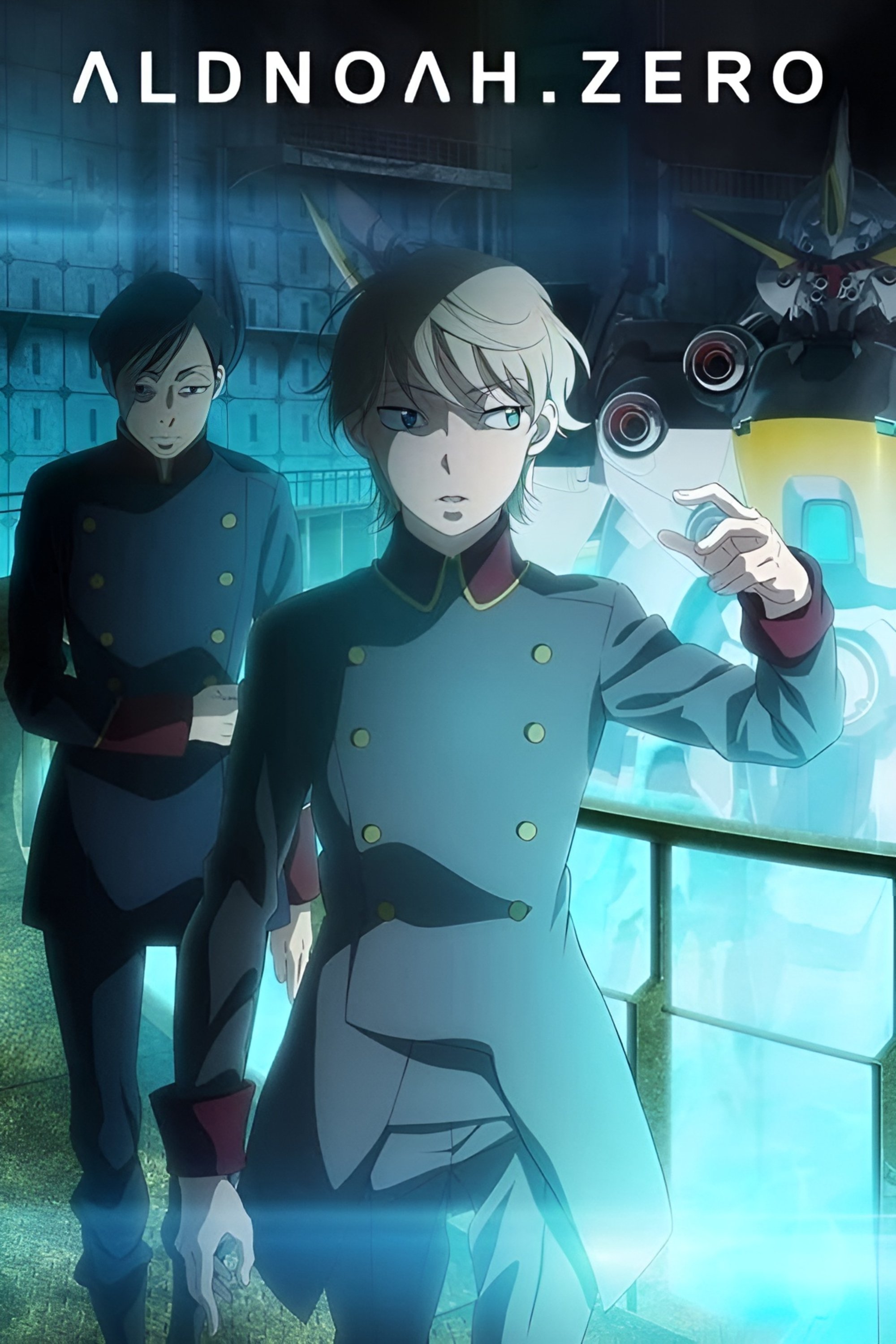
A-1 Pictures and TROYCA co-produced this 24-episode mecha series split across two cours. The staff brought in Sawano for the score and featured detailed Martian and Terran machine designs with distinct transformation sequences.
The broadcast emphasized wide shots of orbital battles with layered compositing and crisp HUD graphics. Home video releases included clean opening and ending animations, and related guidebooks showcased cockpit layouts and weapon schematics used across key episodes.
‘Darling in the Franxx’ (2018)
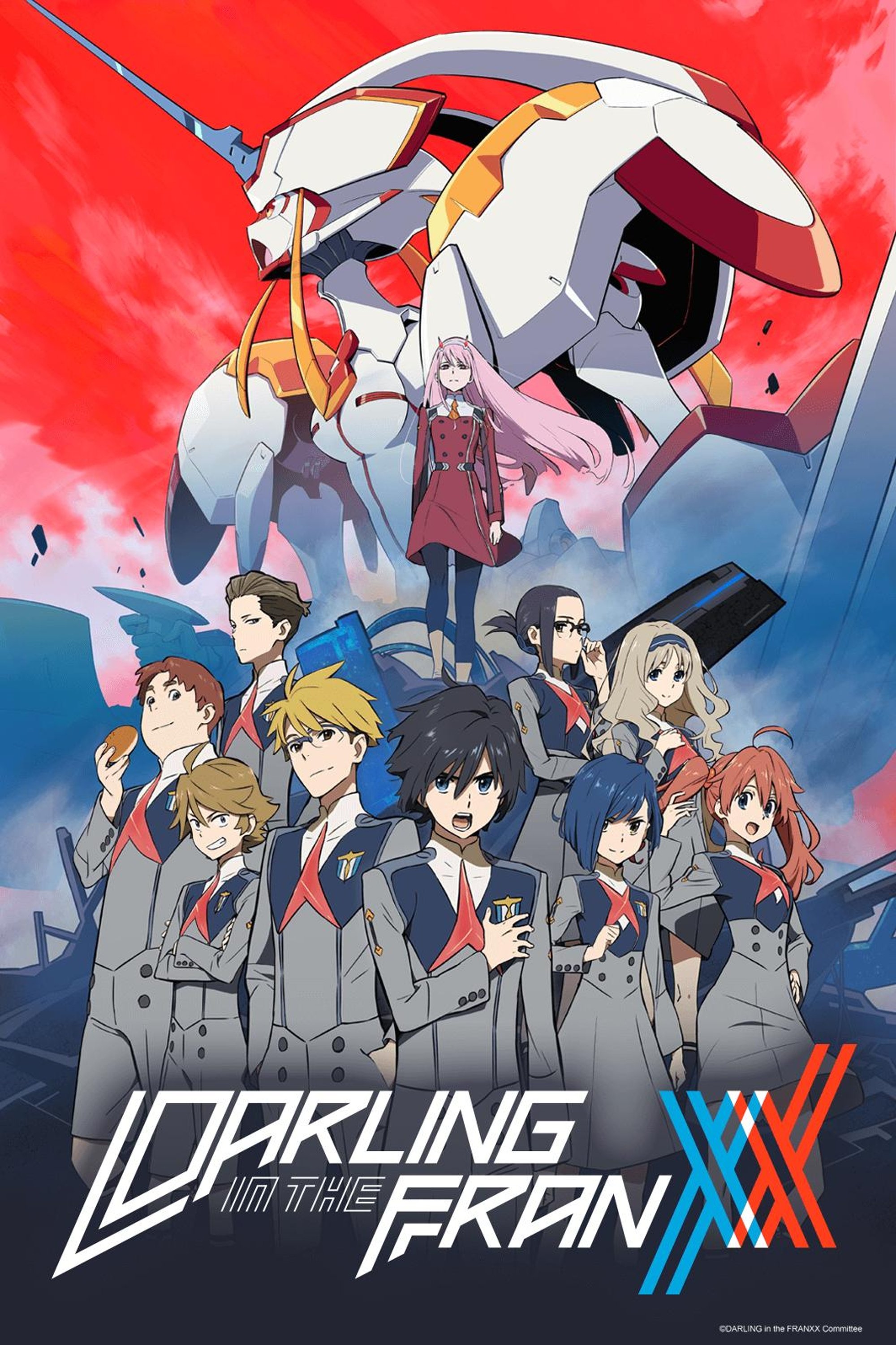
Trigger and A-1 Pictures collaborated on this 24-episode mecha project with character designs by Masayoshi Tanaka. The series aired on multiple Japanese networks and was distributed internationally through major streaming services with quick home video turnaround.
Mechanical designs credited to Shigeto Koyama and others leaned into high contrast palettes and bold silhouettes. The production scheduled frequent special animation cuts for launch sequences and aerial maneuvers, and tie-in art books documented the color scripts and layout boards.
‘takt op.Destiny’ (2021)
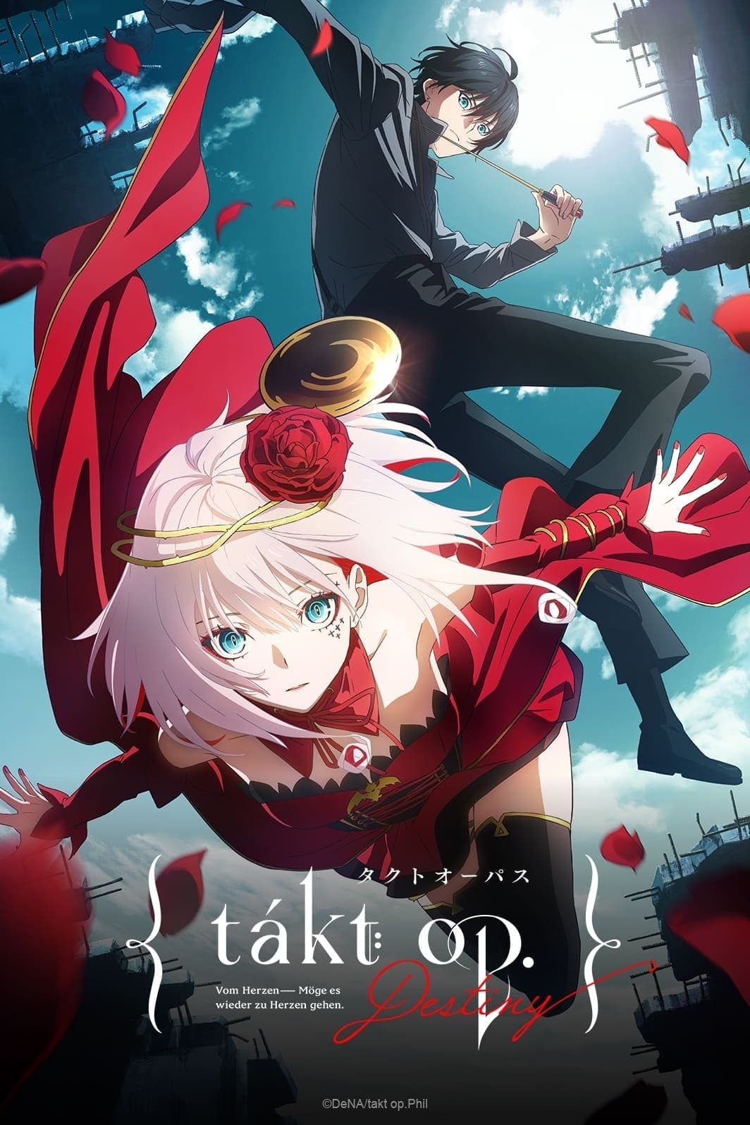
Madhouse and MAPPA partnered on this 12-episode series tied to a broader multimedia initiative with a mobile game launch in Japan. Composer Yoshihiro Ike provided orchestral motifs that matched the show’s music-themed combat premise.
The visual approach highlighted concert halls, urban nightscapes, and costumed “Musicart” avatars with ornate weapon flourishes. Key animators delivered polished combat cuts, and official materials detailed costume breakdowns, prop sheets, and CG workflows for instrument effects.
‘God Eater’ (2015–2016)
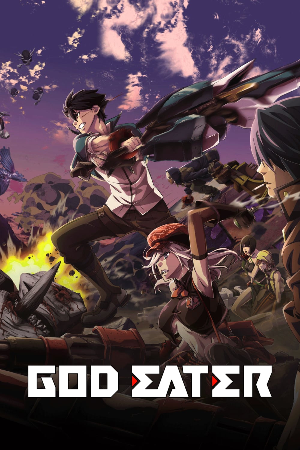
ufotable adapted Bandai Namco’s action game into a TV series that used the studio’s thick “watercolor-like” digital shading. The broadcast run totaled 13 main episodes with additional content rolled out later, and the game tie-ins received cross-promotion through events and merchandise.
The production leaned on CG monster rigs blended with hand-drawn weapons and effects layers. Staff interviews highlighted the pipeline built to integrate toon-shaded models with dynamic camera paths, which shaped the show’s distinctive action look.
‘Children of the Whales’ (2017)
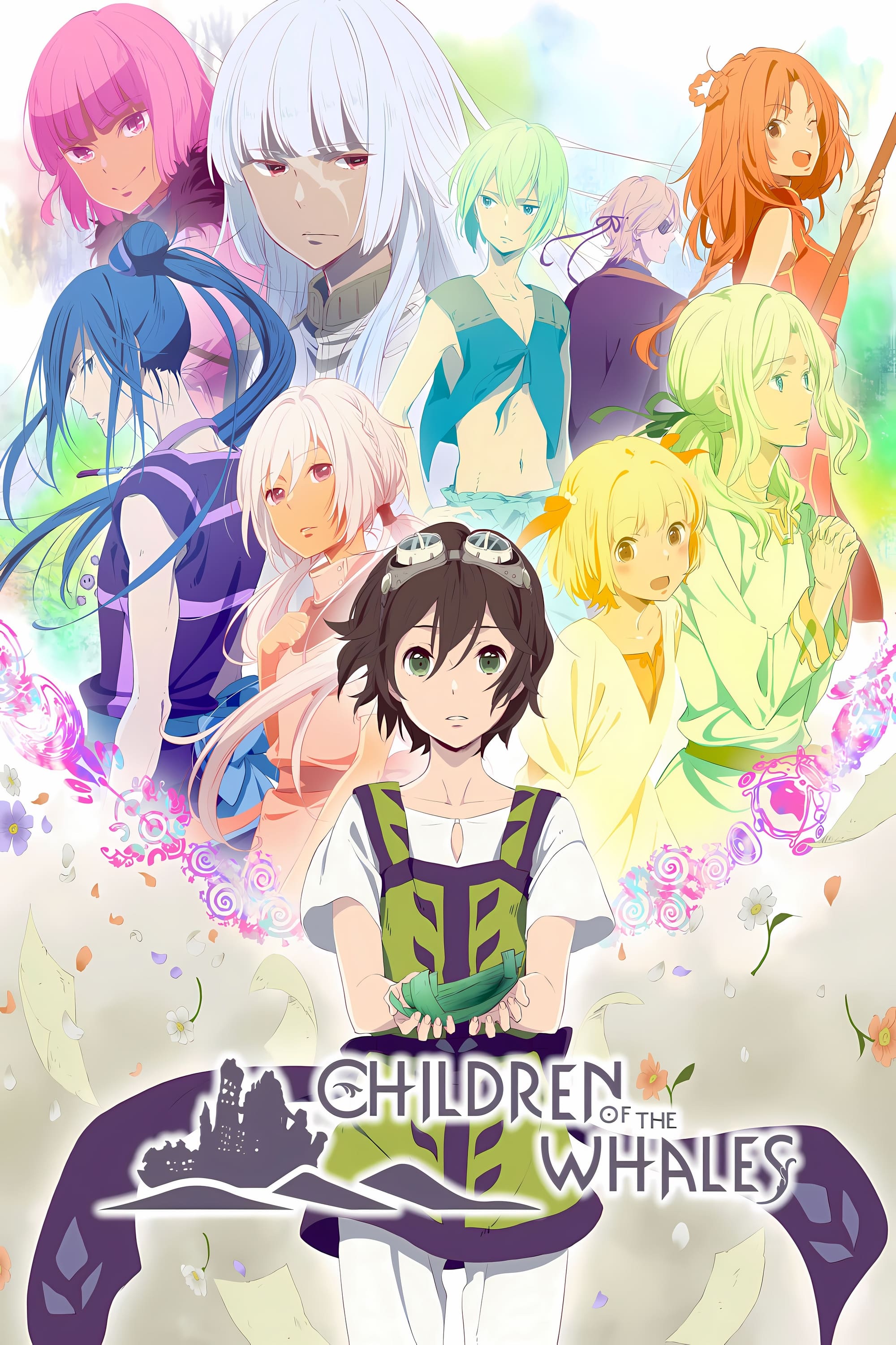
J.C.STAFF produced this 12-episode adaptation of Abi Umeda’s manga with distribution on Netflix in many regions. The series featured soft gradient backgrounds and pastel textures that matched the desert-sea setting and drifting island architecture.
The art team prioritized watercolor palettes for sand, sky, and interior wood tones, while the score used choral passages and percussion to frame key scenes. Official guide materials outlined the floating craft’s floor plans and the glyph systems that appear throughout the story.
‘B: The Beginning’ (2018)
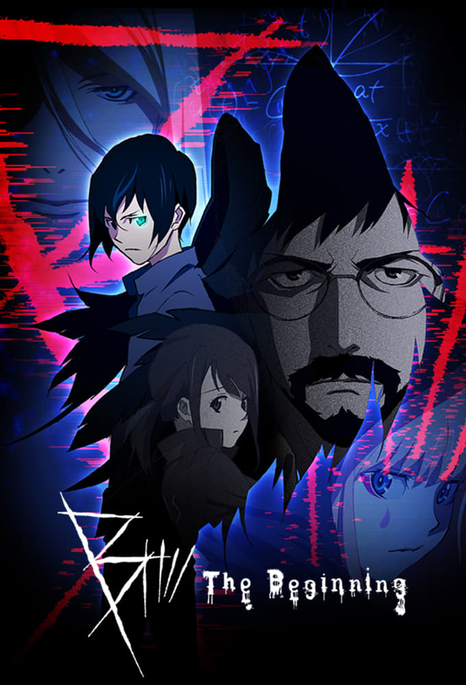
This Production I.G original released globally as a streaming title with a later follow-up season. The project mixed crime investigation and action set pieces with a heavy graphic design identity across logos, UI elements, and credit sequences.
The series leaned on stylized motion blur, sharp perspective shifts, and high-contrast lighting in chase scenes. Ancillary art collections compiled character turnarounds, weapon props, and location boards for the fictional kingdom that anchors the narrative.
‘Blame!’ (2017)
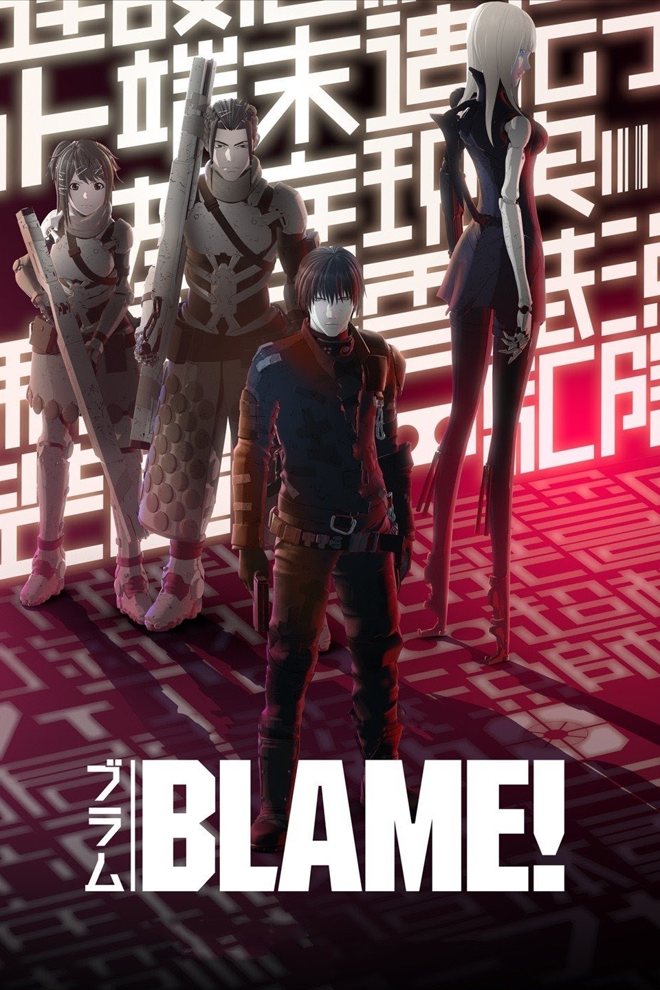
Polygon Pictures adapted Tsutomu Nihei’s manga into a feature-length CG film released worldwide on streaming and later on disc. The production recreated massive industrial environments with procedural modeling and sparse dialogue tied to the source’s minimalist approach.
Technical notes from the studio describe extensive use of physically based rendering for metal and concrete surfaces. The team also documented a motion capture workflow for certain sequences and layered it with hand-keyed adjustments to preserve the manga’s angular poses.
‘Rakuen Tsuiho: Expelled from Paradise’ (2014)
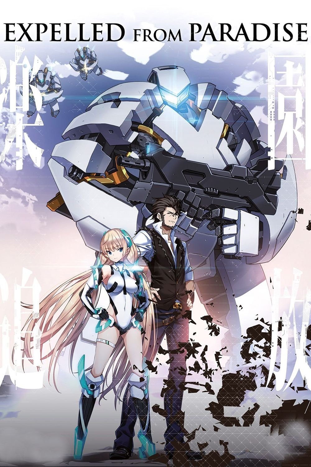
This theatrical film from Toei Animation and Graphinica featured a screenplay by Gen Urobuchi and character designs by Masatsugu Saito. The project used full CG characters with facial rigs tailored to 2D-style expressions for a hybrid look.
Production materials showed vehicle and mecha assets built for long camera moves across desert landscapes and orbital structures. The release included soundtrack albums and art books that presented shader references and color charts for skin and armor.
‘Appleseed’ (2004)

Shinji Aramaki directed this theatrical adaptation of Masamune Shirow’s work with early use of cel-shaded CG characters. The film introduced Olympus as a clean, glass-heavy cityscape with complex mecha and weapon props designed for extended action beats.
The production team released follow-ups that refined the model library and lighting approach. Home video extras documented the evolution of the cel-shade pipeline, including edge detection for linework and reflection maps for chrome surfaces and visors.
‘Redline’ (2009)
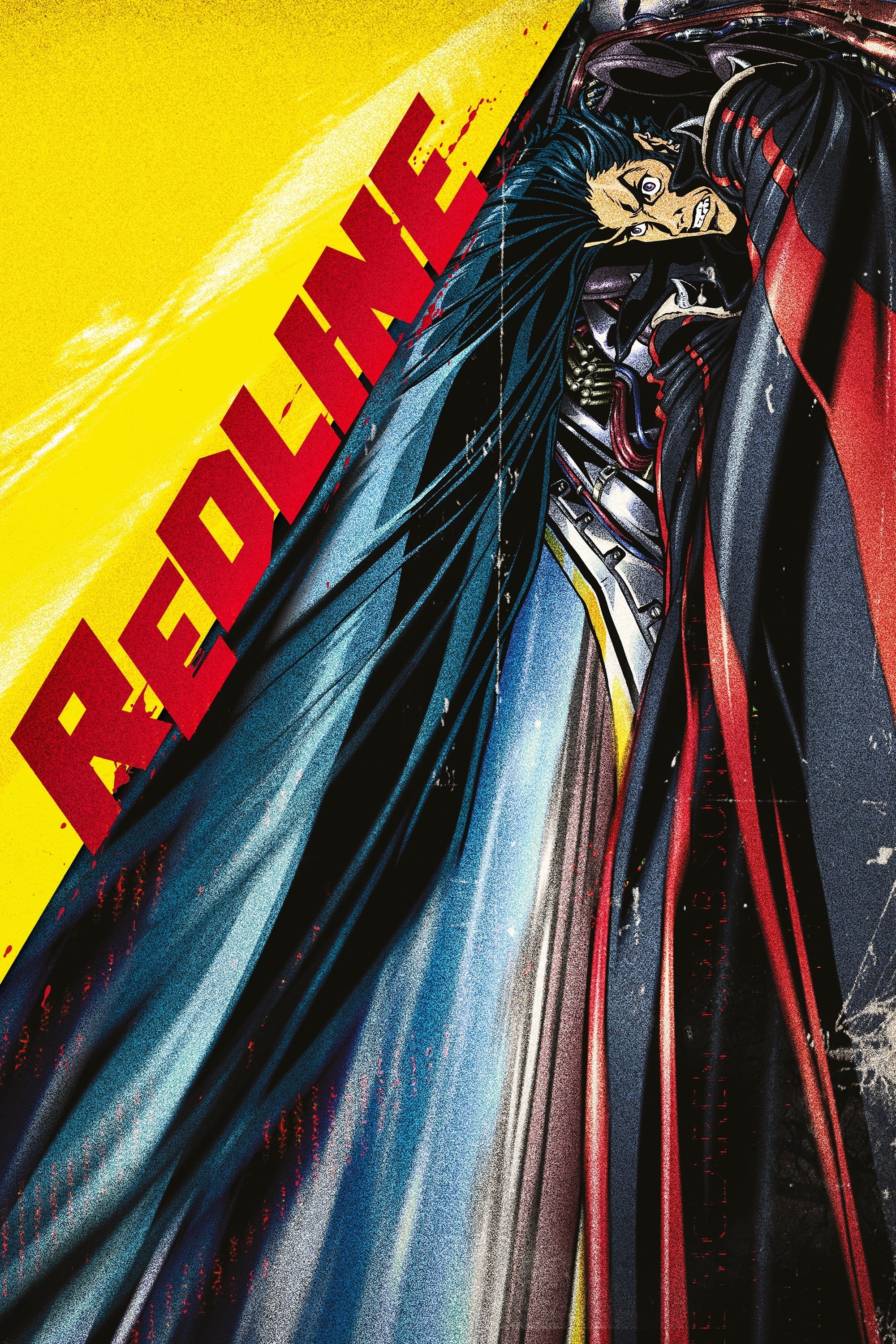
Madhouse invested a lengthy production period into this theatrical racing film directed by Takeshi Koike. The feature used hand-drawn vehicles and characters with dense frame counts and exaggerated camera movement across planetary tracks.
The soundtrack leaned on high-tempo electronic tracks that matched the race sequences, and art books collected extensive layout boards and vehicle turnarounds. Festival screenings preceded the wider release, and the film later received multiple remaster editions on disc.
‘Karas’ (2005–2007)
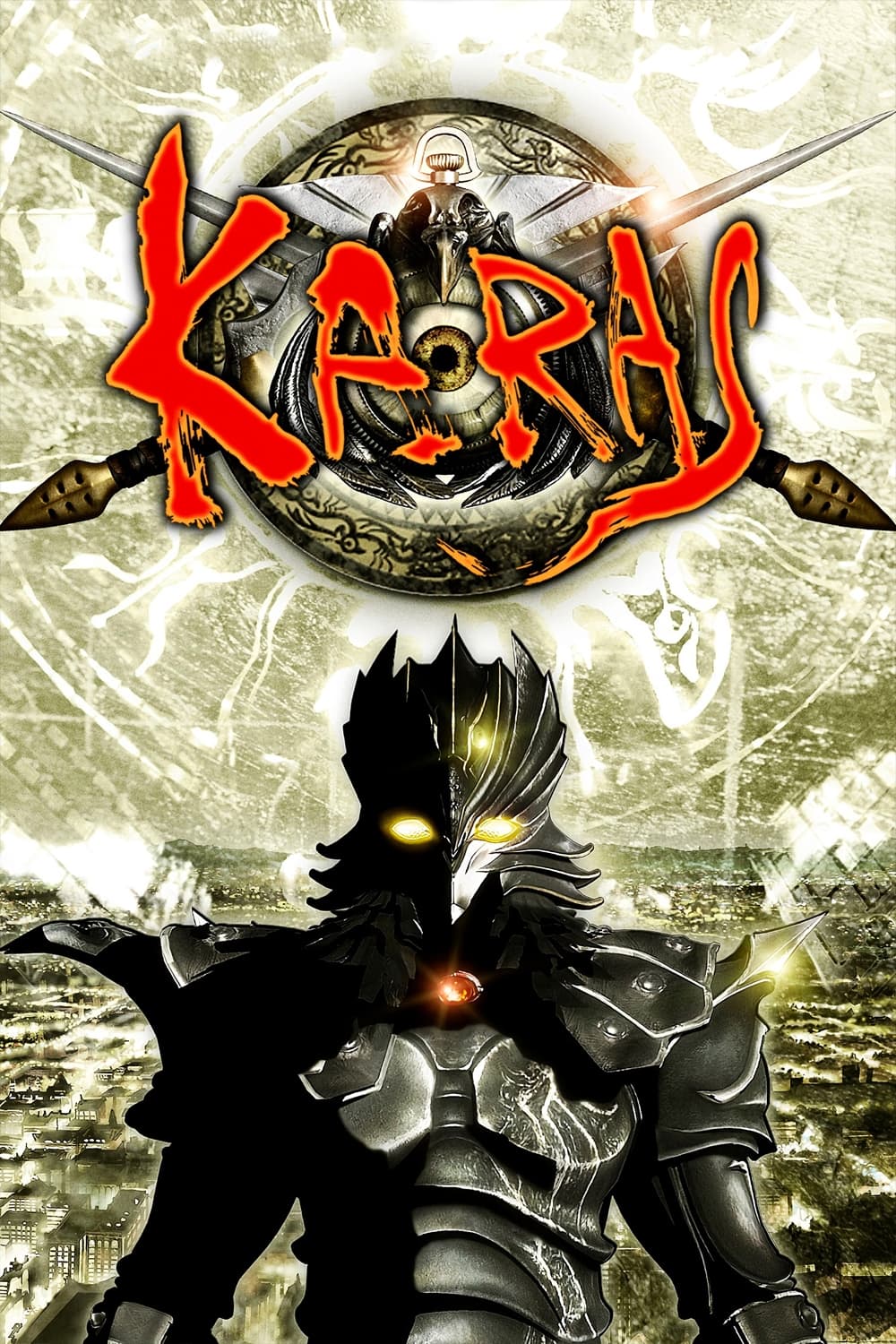
This six-episode OVA from Tatsunoko Production commemorated the studio’s anniversary with a hybrid of CG and hand-drawn action. Urban night settings and armored transformations defined the project’s visual identity, supported by orchestral scoring and choral accents.
Each episode delivered set pieces that combined 3D camera paths with 2D effects layers, and staff notes described the compositing steps used to blend them. Collector releases included clean openings, design galleries, and interviews that charted the OVA’s production timeline.
‘Cencoroll’ (2009–2019)
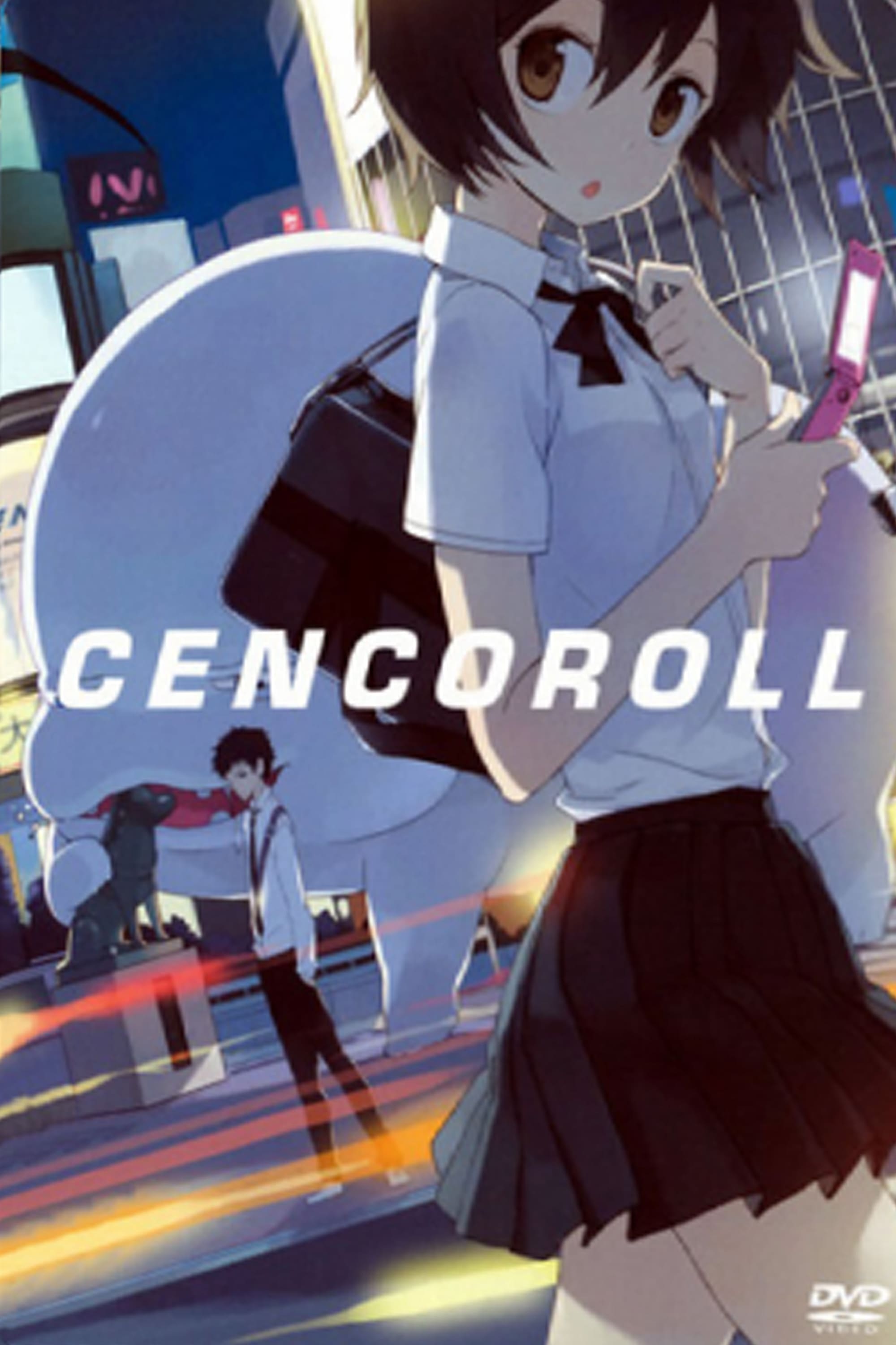
Atsuya Uki wrote, directed, and animated this independent film which later continued as ‘Cencoroll Connect’. The work featured shape-shifting creatures rendered with simple lines against minimalist city backdrops, and distribution included theatrical screenings and limited home media.
Production focused on small teams and multi-role staff responsibilities, which allowed consistent character art across long shots and close-ups. Official pamphlets and interviews highlighted the design logic for creature transformations and the restrained color usage.
‘Beyond the Boundary’ (2013)

Kyoto Animation adapted Nagomu Torii’s light novels into a 12-episode TV series with later OVA and film content. The studio’s effects team produced liquid and glass particle animation for combat scenes, and the music incorporated strings and piano motifs.
Character designs emphasized soft gradients and reflective eye highlights that became a key part of the brand’s marketing art. The production pipeline leveraged digital compositing for rain, mist, and bloom effects, and guidebooks documented prop sheets and location art.
‘Bayonetta: Bloody Fate’ (2013)
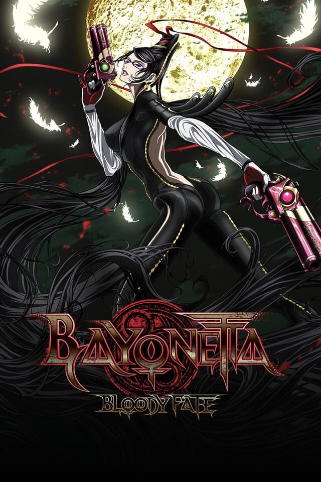
Gonzo adapted the PlatinumGames title into a theatrical anime film with emphasis on stylized gunplay and ribbon-like hair effects. The movie carried over the game’s costume silhouettes and weapon names while streamlining the setting for a feature runtime.
Promotion included collaboration merchandise and soundtrack editions released alongside home video. Art materials outlined pose sheets for action beats and diagrams for camera timing during witch time sequences recreated for animation.
‘Fireworks’ (2017)
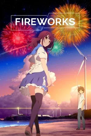
Shaft produced this theatrical remake of a 1993 TV drama special with Akiyuki Shinbo credited on chief direction. The film used the studio’s geometric compositions and reflective lighting, with a theme song that charted strongly in Japan.
Background layouts leaned on seaside townscapes with repeated motif shots and long takes. The production partnered with advertising campaigns and music television appearances, and the home release featured multiple audio tracks and clean credit sequences.
‘The Garden of Sinners’ (2007–2013)
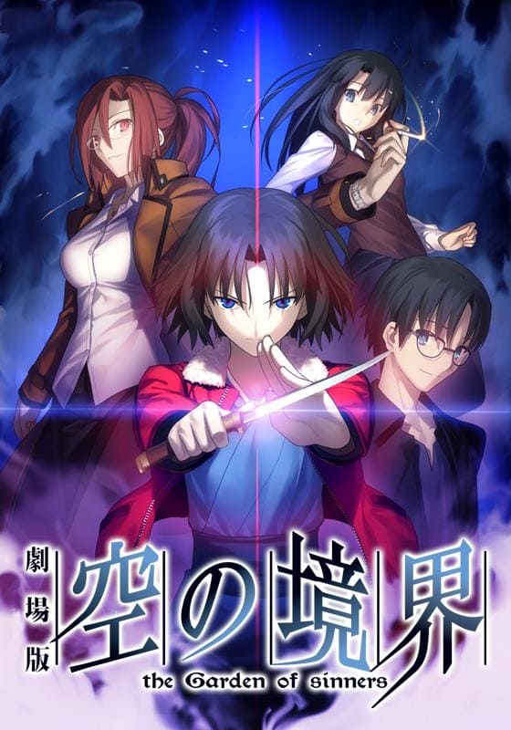
ufotable adapted Kinoko Nasu’s novels into a multi-film theatrical series with later TV edits and epilogues. The project is known for night scenes, city lights, and precise effects animation for blades and magic, alongside a score by Yuki Kajiura.
The studio documented a pipeline that combined motion control camera planning with hand-drawn action inserts. Art books collected costume references, building cross-sections, and color scripts for each chapter to maintain visual continuity across the release span.
‘Violet Evergarden’ (2018)
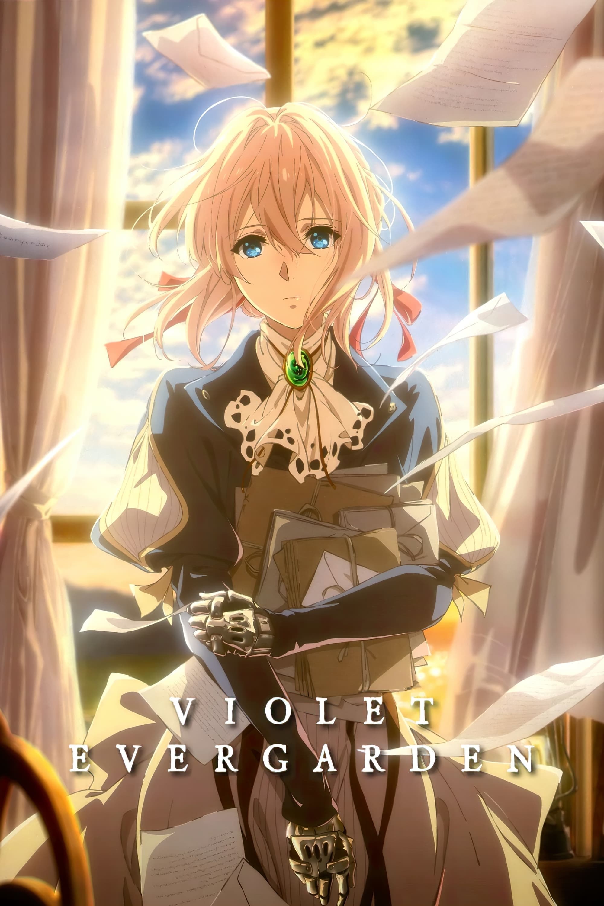
Kyoto Animation produced this 13-episode series with a later OVA and a follow-up theatrical feature. The show presented European-inspired cityscapes, elaborate military uniforms, and detailed typewriters and postal equipment that framed its letter-writing premise.
The production employed high resolution backgrounds, intricate lighting passes, and careful prop animation for mechanical keys and ribbon reels. Official materials included a design works collection, music releases, and interviews on how the team coordinated color styling across episodes.
Share which titles you would add to the list in the comments.