
Movies That Use Color Changes to Signal Emotional Shifts


Cinematographers and directors often manipulate color palettes to subconsciously guide the audience through a narrative. These visual cues can represent a change in time or location or the internal state of a character. A sudden shift from black and white to color is one of the most recognizable techniques in film history. The following films utilize these chromatic adjustments to enhance storytelling and deepen emotional impact.
‘The Wizard of Oz’ (1939)
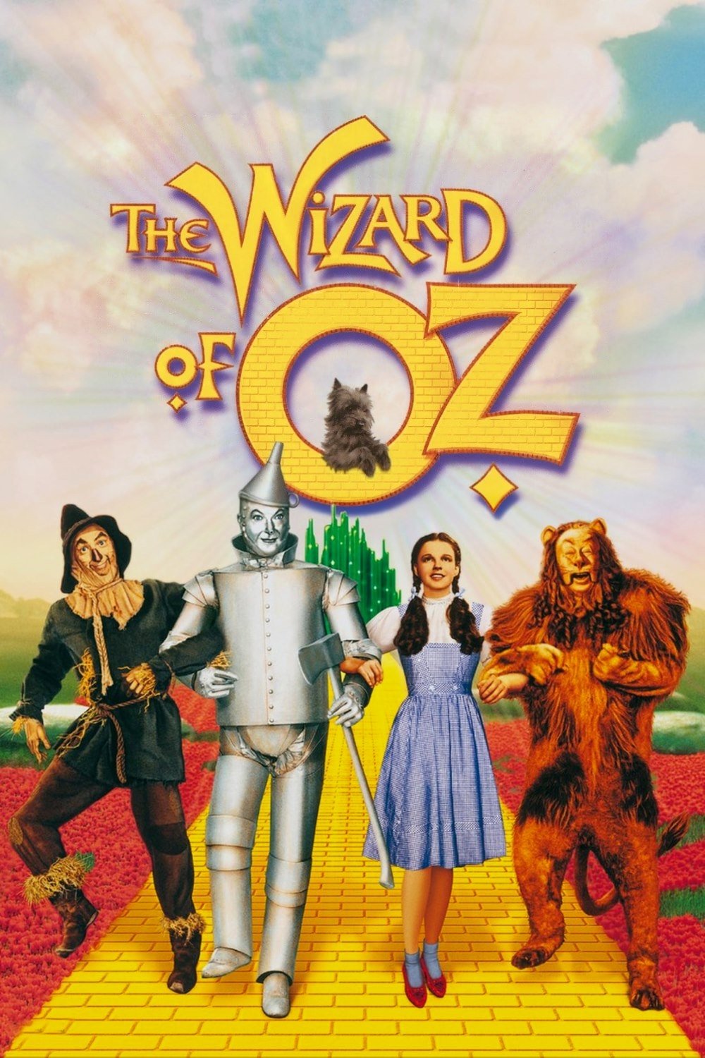
Dorothy Gale begins her journey in a sepia-toned Kansas that reflects the mundanity of her daily life. The film famously transitions into vibrant Technicolor the moment she opens the door to Oz. This shift serves as a visual marker for her entry into a world of fantasy and wonder. The return to sepia at the end signifies the comfort and reality of home after her adventure concludes.
‘Pleasantville’ (1998)
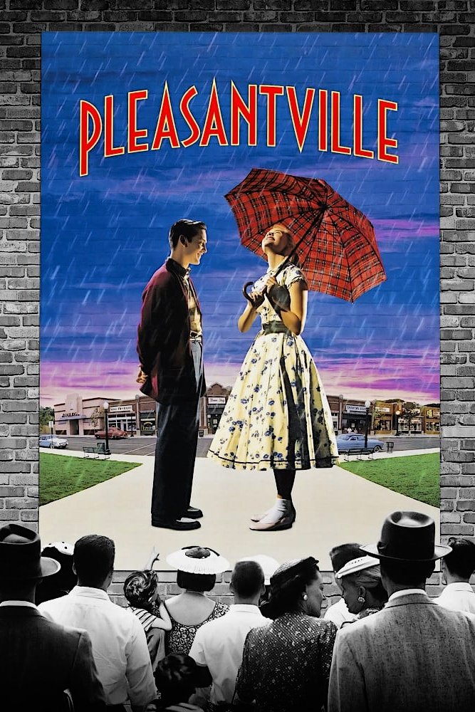
Two modern teenagers find themselves trapped in a black-and-white sitcom from the 1950s where emotions are suppressed. As the characters begin to experience passion or break social norms they slowly transform into technicolor figures. The spreading color represents the awakening of individuality and the disruption of a conformist society. Visual contrast highlights the tension between order and chaotic freedom throughout the town.
‘Traffic’ (2000)
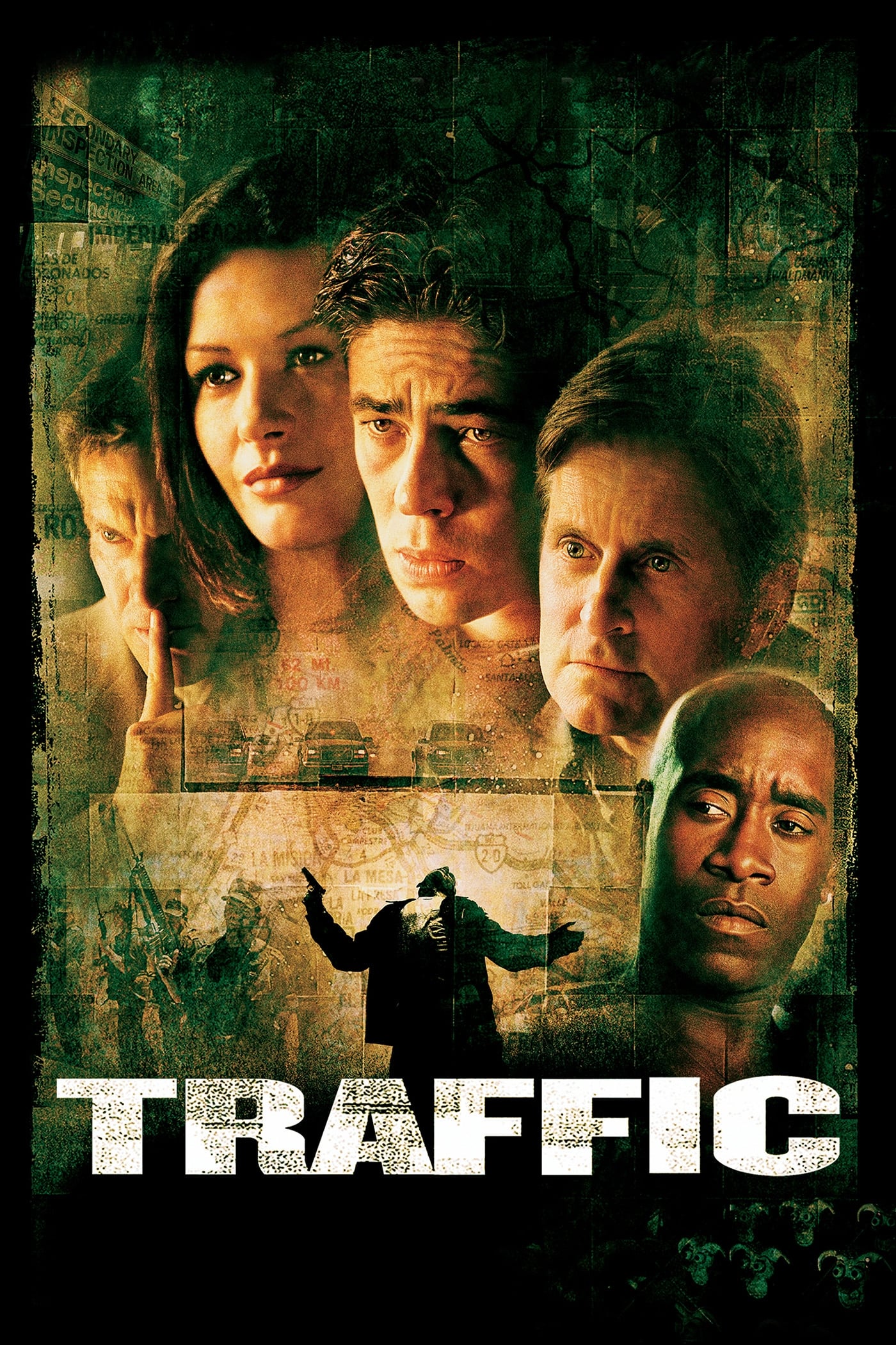
Director Steven Soderbergh utilizes three distinct color palettes to distinguish separate storylines regarding the drug trade. A grainy and yellow tint characterizes the scenes set in Mexico to evoke heat and danger. The Ohio segments feature a cold blue filter that reflects the bleakness of addiction in suburbia. Scenes involving government officials in Washington DC appear in naturalistic tones to suggest perceived objectivity.
‘Memento’ (2000)
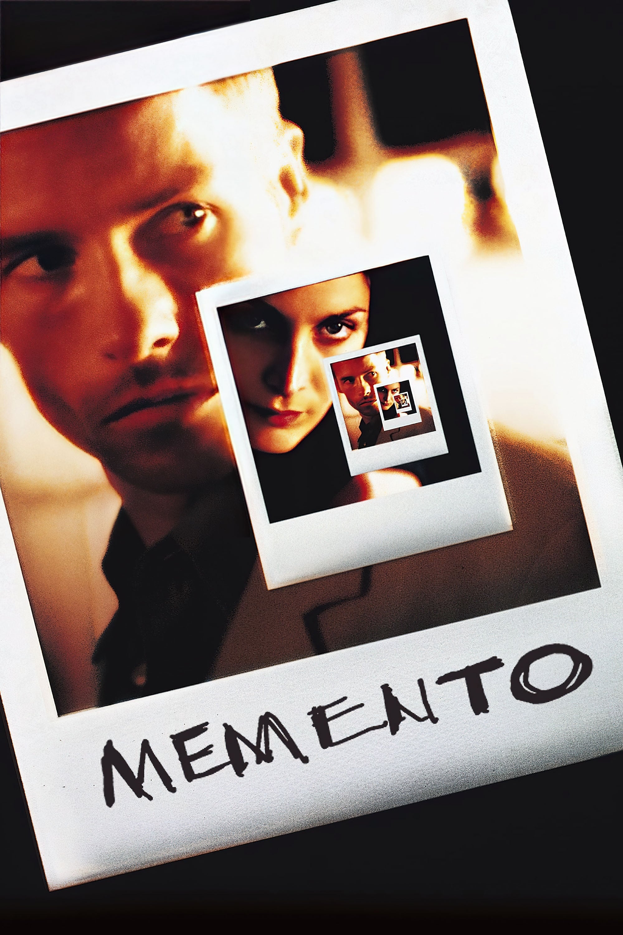
The narrative alternates between two timelines to simulate the protagonist’s anterograde amnesia. Black-and-white sequences move forward in time while color sequences tell the story in reverse order. This visual distinction helps the audience distinguish between the objective reality and the subjective experience of the main character. The two timelines eventually converge at the exact moment the color grading unifies the story.
‘Hero’ (2002)

This martial arts epic presents multiple versions of the same event using dominant primary colors. Each version of the story utilizes a specific hue like red or blue or white to reflect the emotional truth of the narrator. The red sequence emphasizes passion and jealousy while the blue sequence highlights melancholy and sacrifice. These color shifts guide the viewer through the unreliable narration until the final truth is revealed.
‘The Matrix’ (1999)
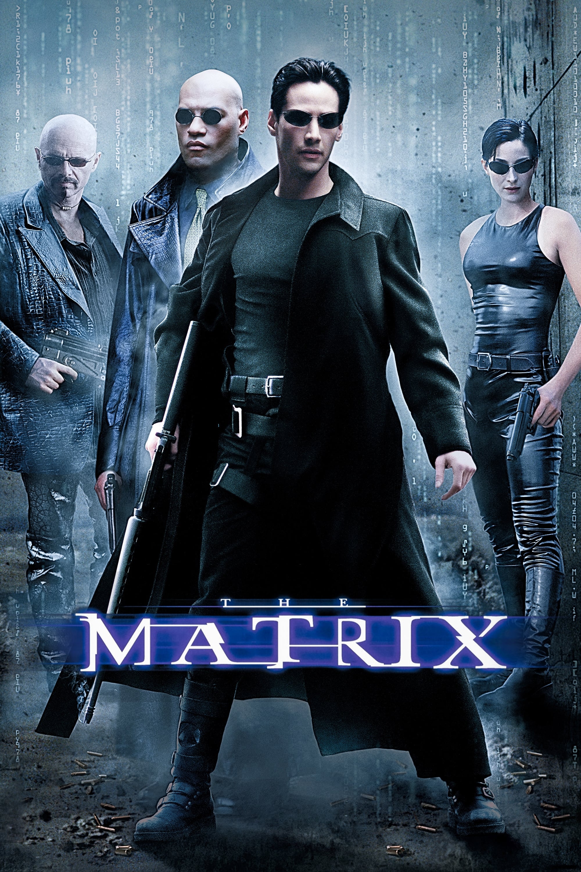
The filmmakers created two distinct visual worlds to separate the simulated reality from the actual world. Scenes taking place inside the computer simulation feature a sickly green tint to resemble monochrome monitors. The real world aboard the Nebuchadnezzar uses blue and cold tones to reflect the harshness of reality. This color coding allows viewers to instantly recognize where the characters are located within the complex narrative.
‘Stalker’ (1979)

Andrei Tarkovsky depicts the bleak reality of the primary world through high-contrast sepia tones. The visuals shift to full color once the three men enter the mysterious Zone where laws of physics do not apply. This transition marks the boundary between a spiritual wasteland and a place of magical potential. The use of color underscores the metaphysical journey the characters undertake in search of their deepest desires.
‘A Matter of Life and Death’ (1946)
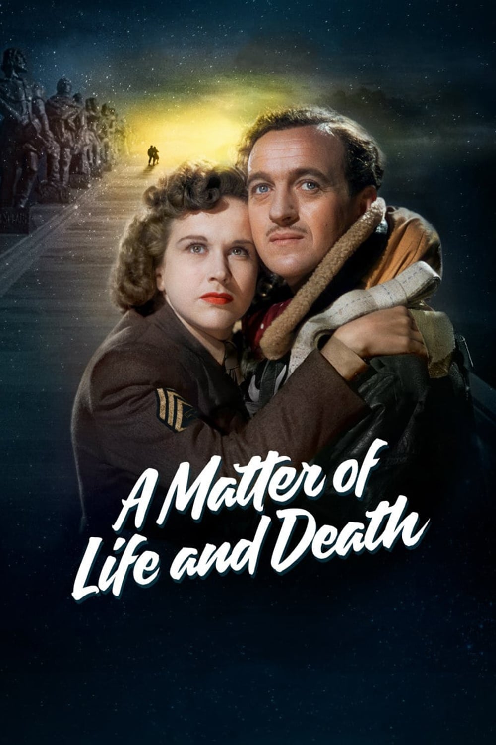
This British classic reverses the traditional association of color with vitality and black-and-white with lifelessness. The scenes set in the afterlife appear in monochrome to suggest a bureaucratic and orderly existence. Events taking place on Earth are shown in rich Technicolor to emphasize the passion and messiness of life. The visual switch highlights the protagonist’s desperate desire to remain in the vibrant world of the living.
‘Wings of Desire’ (1987)
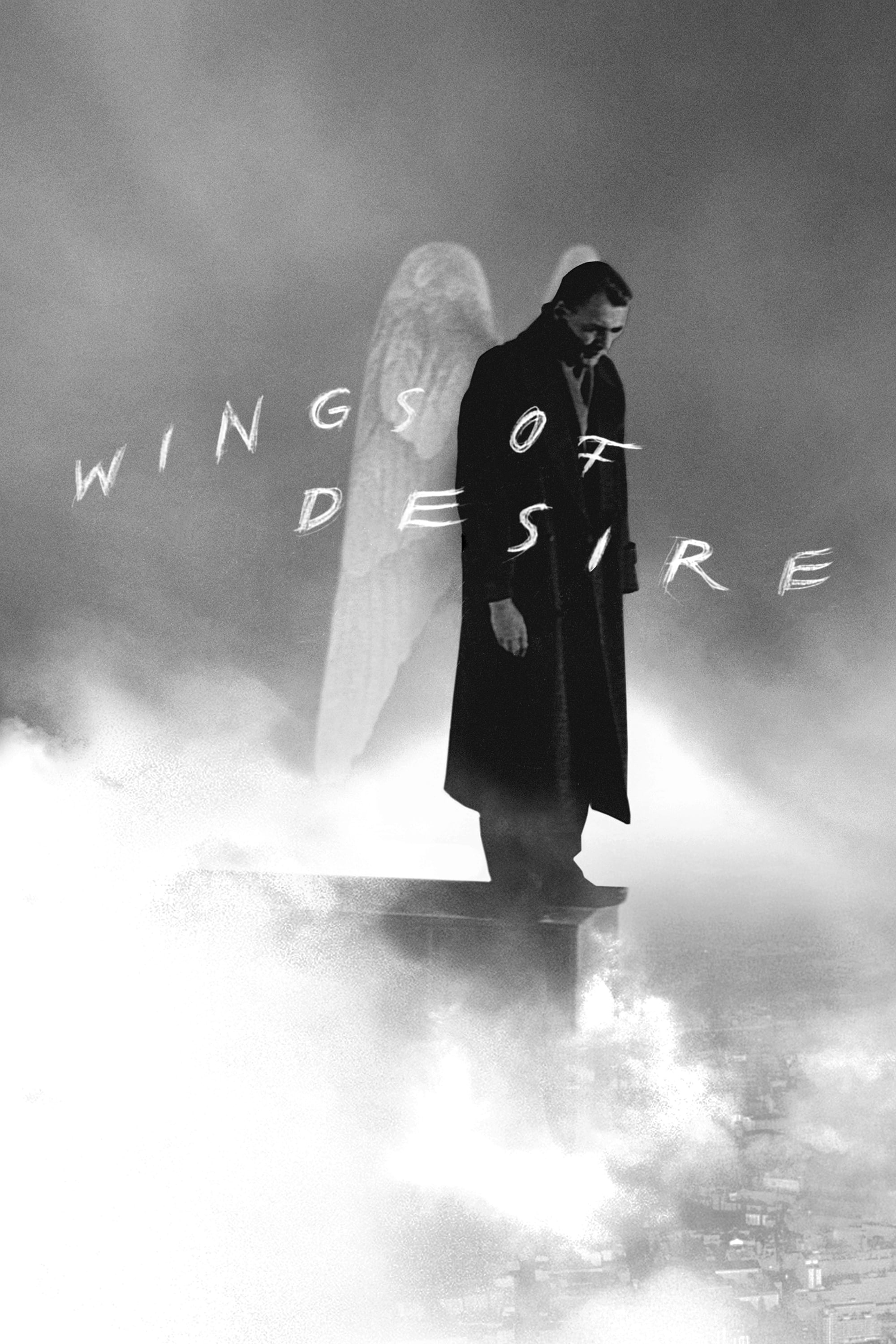
Angels roam the streets of Berlin observing the lives of humans in black-and-white. The lack of color represents their spiritual existence which is devoid of physical sensation or mortal constraints. Brief bursts of color appear when an angel experiences a moment of human connection or sensory awareness. The film transitions fully to color when the protagonist chooses to become mortal to experience love.
‘Schindler’s List’ (1993)

Filmed almost entirely in black-and-white to reflect the historical gravity of the Holocaust. A young girl in a red coat appears as the sole splash of color during the liquidation of the Krakow ghetto. Her presence draws the focus of the protagonist and serves as a catalyst for his moral awakening. This singular use of color personalizes the massive tragedy and signifies the shift in Schindler’s conscience.
‘Oppenheimer’ (2023)
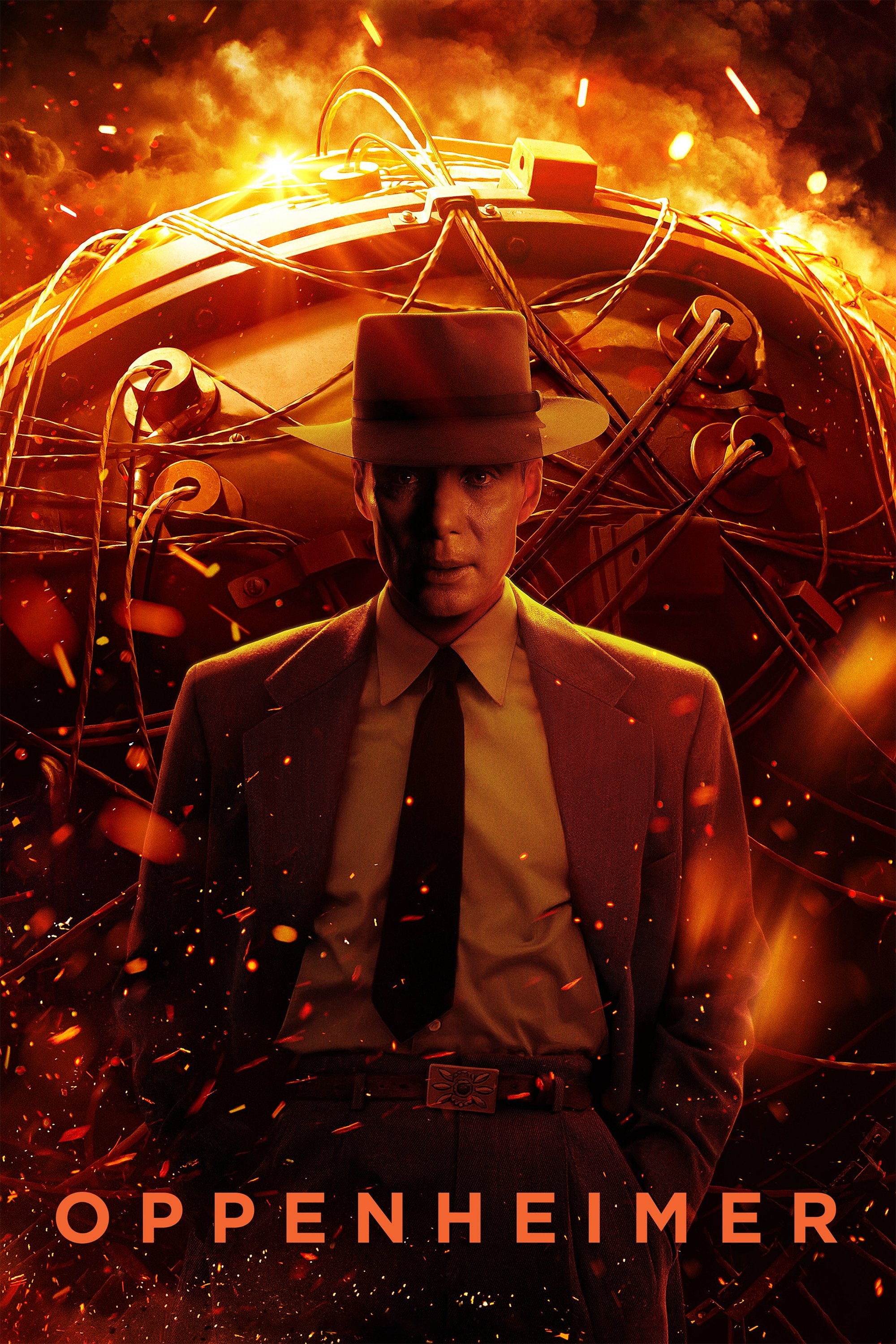
Christopher Nolan separates the timeline into two perspectives using color and monochrome film stocks. The color sequences represent the subjective experience of J. Robert Oppenheimer during the development of the atomic bomb. Black-and-white scenes depict the objective viewpoint of Lewis Strauss during the later confirmation hearings. This visual dichotomy helps audience members navigate the complex non-linear structure of the biographical drama.
‘Inside Out’ (2015)
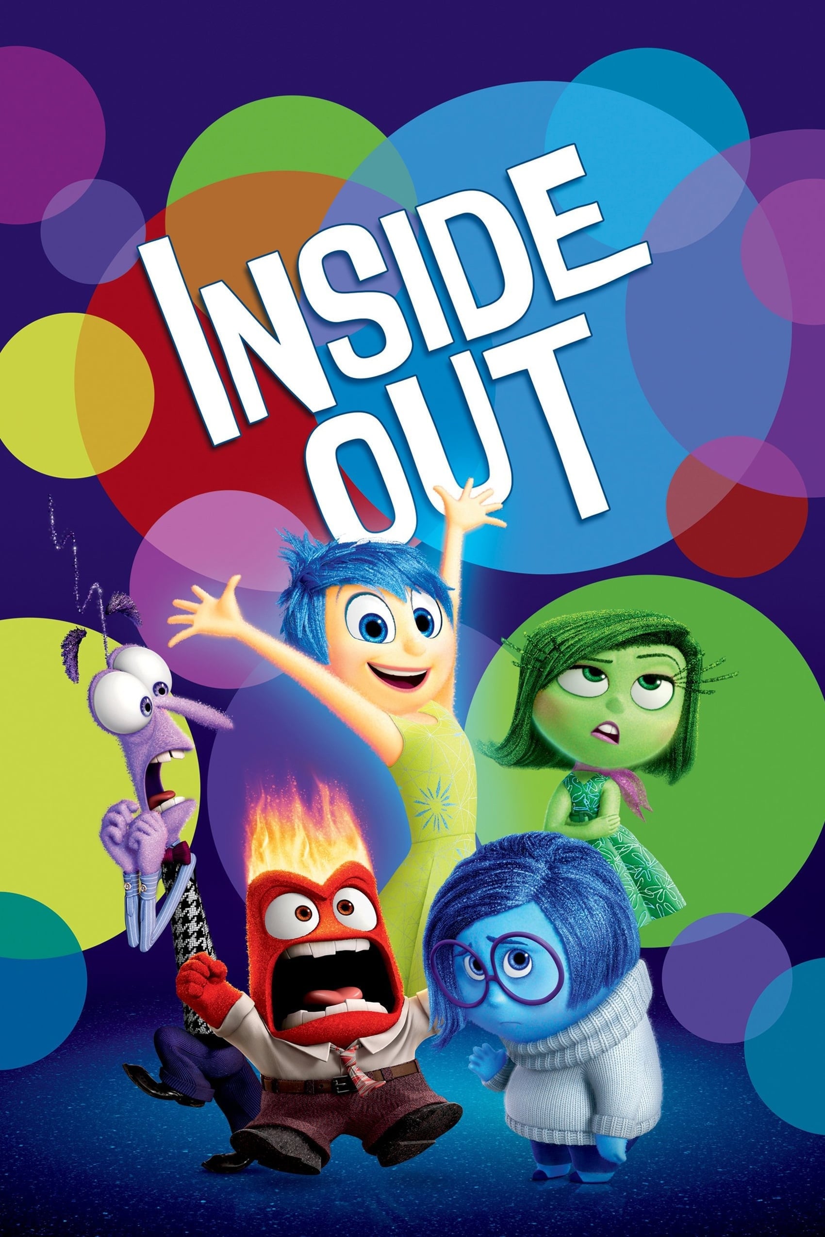
Pixar characterizes distinct emotions through specific colors that dominate the screen depending on who is in control. Joy glows yellow while Sadness appears blue and Anger burns red. The film uses these colors to show how the protagonist’s memories change from mono-colored simplicity to complex multi-colored swirls. The blending of hues at the climax signifies emotional maturity and the acceptance of mixed feelings.
‘The Aviator’ (2004)

Martin Scorsese recreates the look of different film processes to match the eras depicted in the biography of Howard Hughes. Early scenes utilize a two-strip Technicolor look with emphasized cyans and reds to mimic the cinema of the 1920s. As the story progresses into the 1940s and 1950s the color palette shifts to a rich three-strip Technicolor aesthetic. These changes ground the audience in the specific time period while reflecting the evolving career of the protagonist.
‘Vertigo’ (1958)
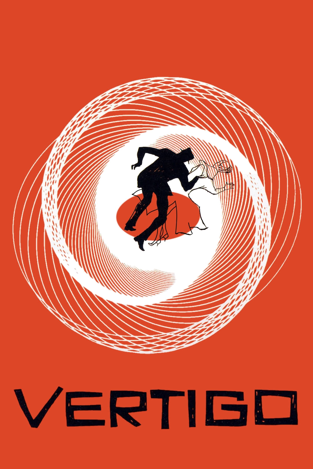
Alfred Hitchcock employs green and red lighting to symbolize the psychological state of the obsessed protagonist. Green light often surrounds the female lead to give her a ghostly quality that represents a lost love. Moments of danger or passion are punctuated by intense flashes of red that disrupt the cool tones. The manipulative use of color heightens the dreamlike and unsettling atmosphere of the mystery.
‘Moonlight’ (2016)
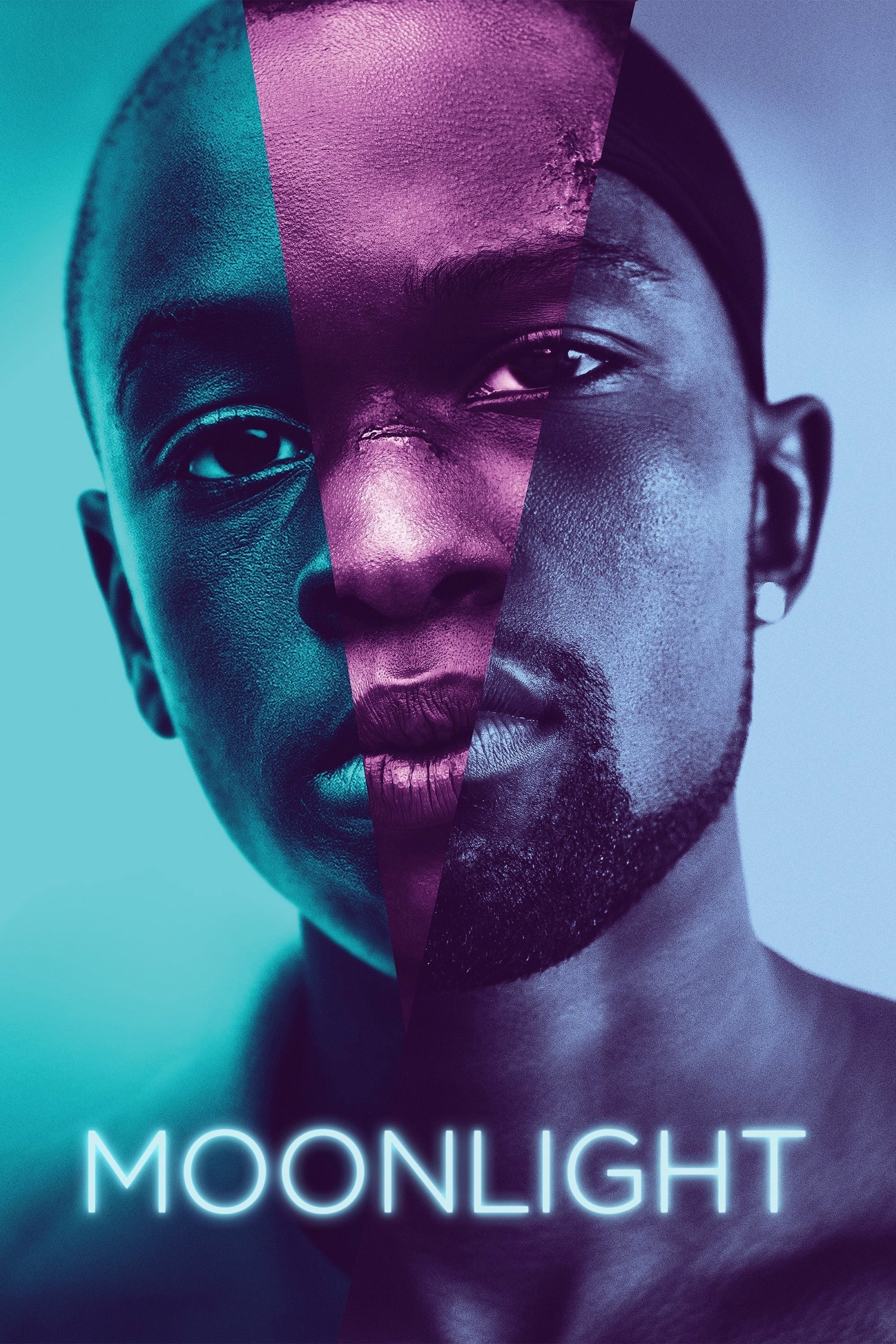
Three distinct film stocks imitate different eras of film to differentiate the three chapters of the protagonist’s life. The first segment uses Fuji film stock to create a warm and high-contrast look that emphasizes skin tones. The second chapter shifts to Agfa stock which introduces cyan and teal hues to reflect emotional turbulence. The final chapter employs a Kodak stock that creates a glossy and polished aesthetic to signify adulthood.
‘Blade Runner 2049’ (2017)

Different environments are defined by aggressive color grading that reflects the mood of the location. The ruins of Las Vegas are bathed in a hazy and toxic orange that suggests a radioactive wasteland. Los Angeles is depicted in cold blues and greys to emphasize the oppressive nature of the dystopian city. The stark contrast between these palettes underscores the protagonist’s isolation as he travels between worlds.
‘Suspiria’ (1977)
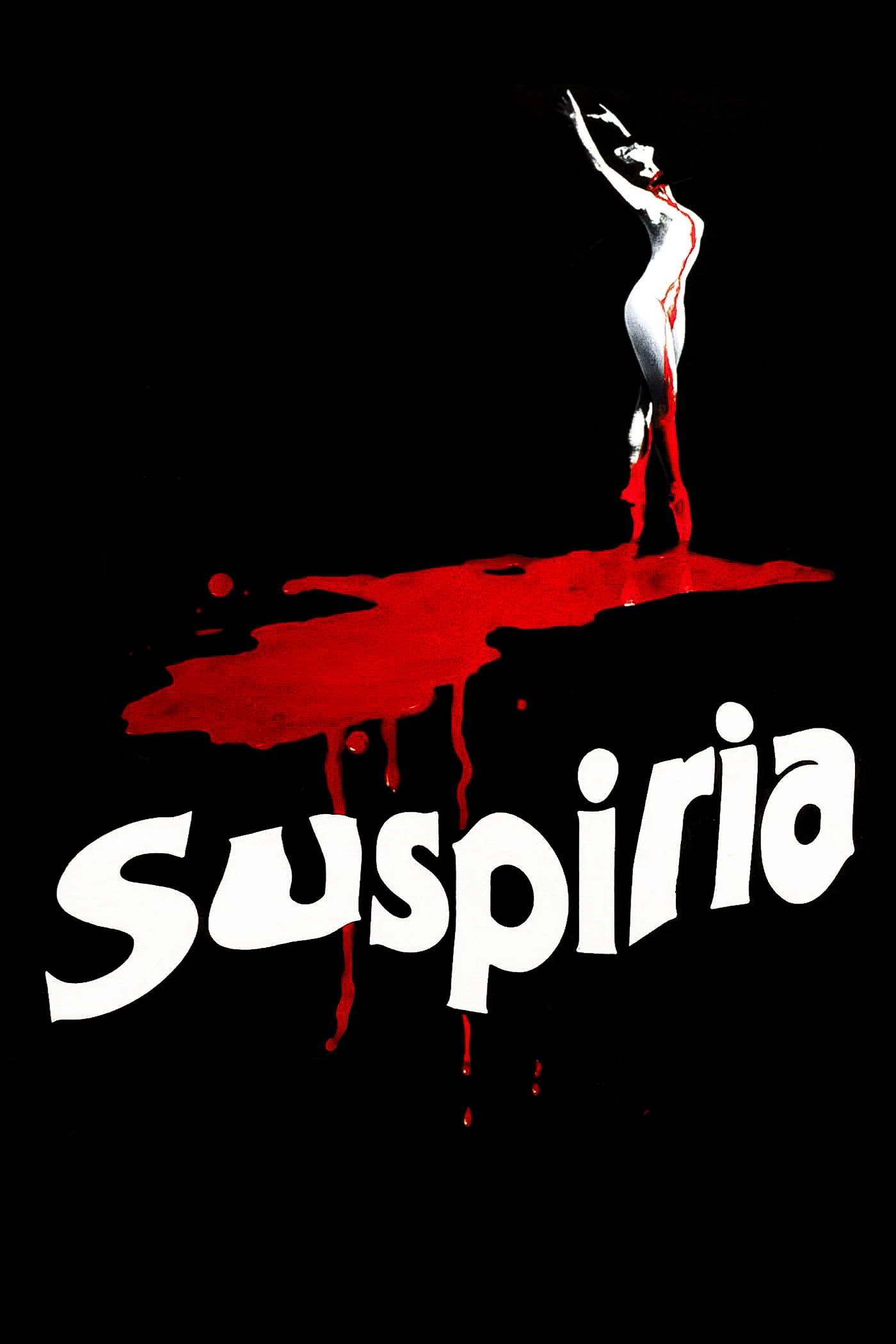
This horror classic abandons realistic lighting in favor of primary colors that flood the set design. Deep reds and blues wash over the characters to create a surreal nightmare environment inside the dance academy. The unnatural lighting intensifies during moments of violence to heighten the sensory impact on the viewer. Dario Argento uses these vivid colors to signal the presence of supernatural forces and witchcraft.
‘Do the Right Thing’ (1989)
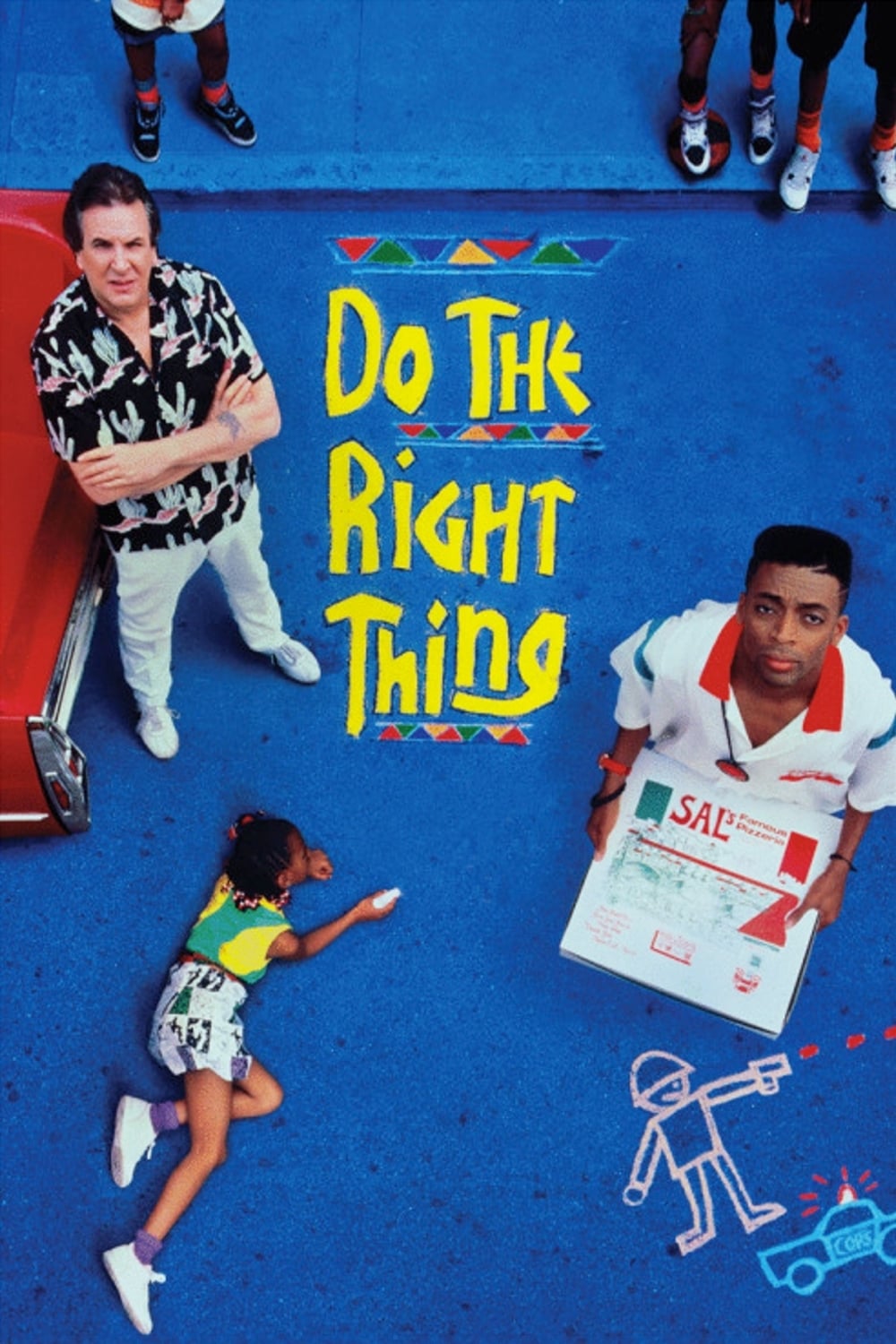
Spike Lee turns up the saturation to make the audience feel the oppressive heat of a Brooklyn summer. Warm oranges and reds dominate the frame to symbolize the rising racial tension in the neighborhood. The relentless heat acts as a pressure cooker that eventually leads to an explosion of violence. Cool colors are notably absent which leaves the viewer with no visual escape from the intensity.
‘The Grand Budapest Hotel’ (2014)
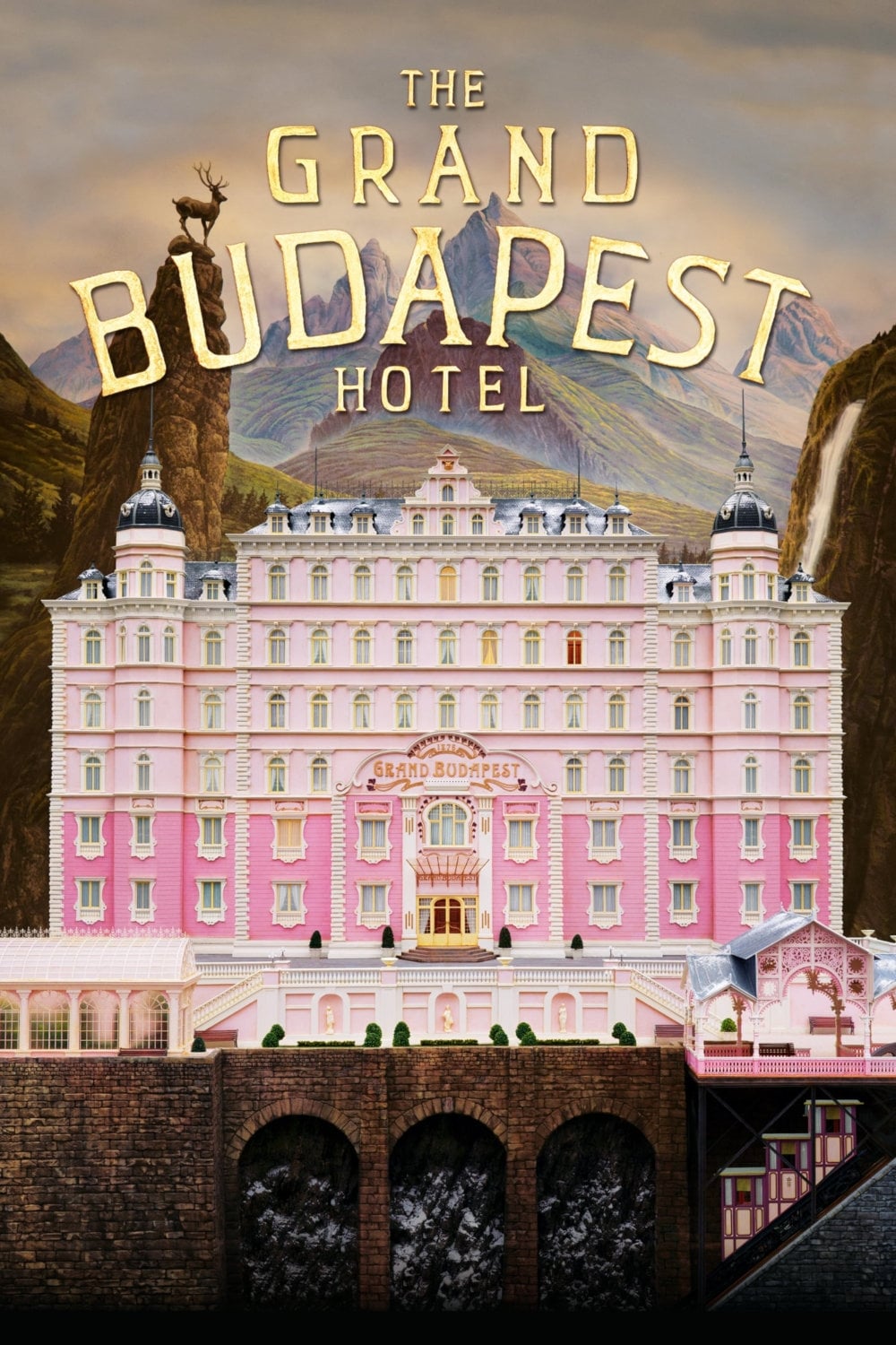
Wes Anderson uses different aspect ratios and color grades to distinguish between three different time periods. The 1930s sequences feature vibrant pinks and purples to reflect the glory days of the hotel. The 1960s scenes utilize muted oranges and greens that mimic the aesthetic of that decade. These visual cues help the audience track the narrative layers within the story within a story.
‘Poor Things’ (2023)
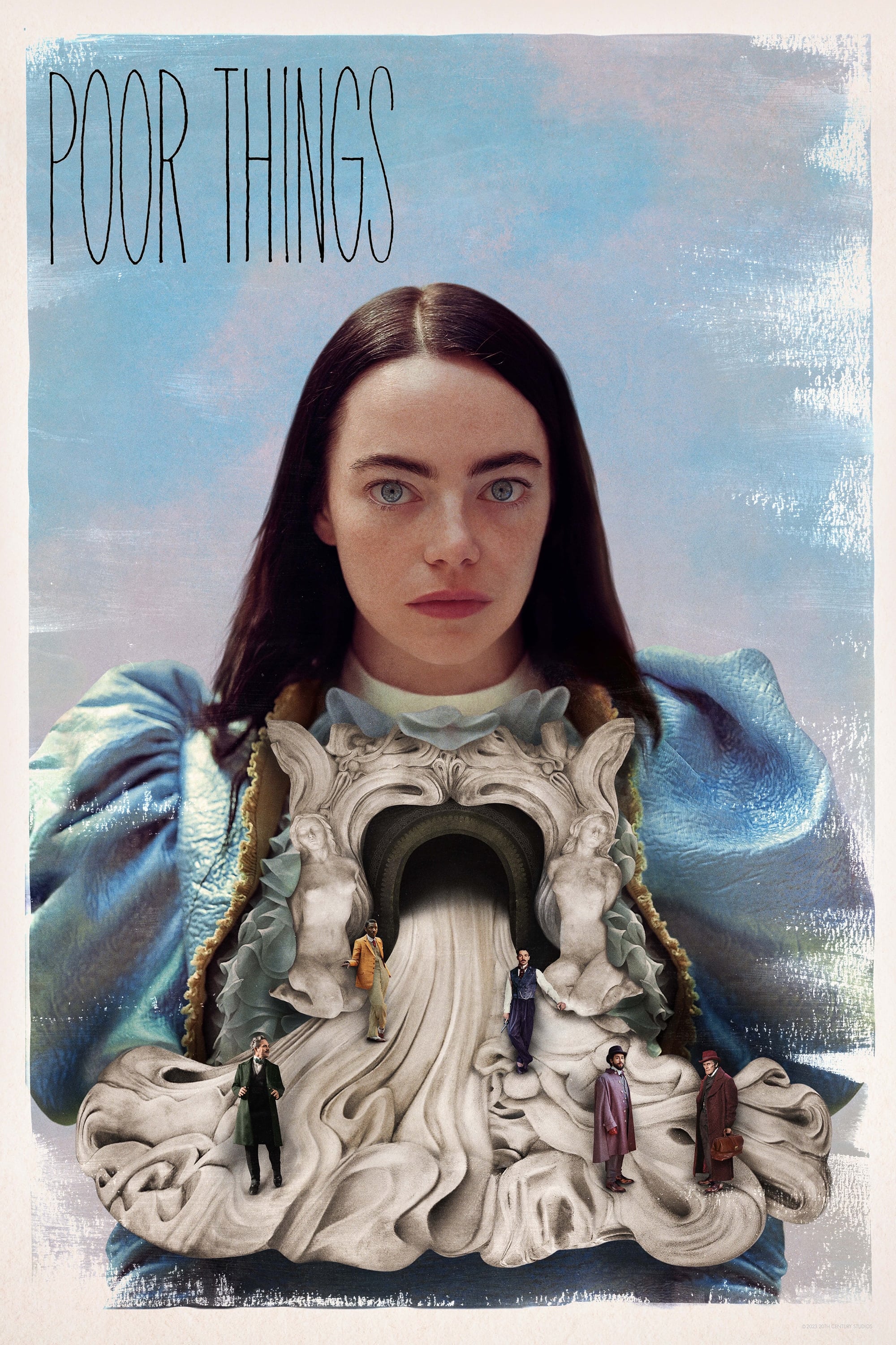
The film begins in a steampunk version of London shot in high-contrast black-and-white to reflect the protagonist’s limited worldview. As Bella Baxter embarks on her journey of self-discovery the film explodes into surreal and saturated colors. The vibrancy of the visuals intensifies as her understanding of the world and her own sexuality expands. This transition mirrors her intellectual and emotional liberation from the confines of her creator’s home.
Tell us which movie color transition you found most impactful by writing a response in the comments.