Marvel Studios Just Gave ‘Avengers: Doomsday’ Fans A Green-Tinted Surprise


The countdown to ‘Avengers: Doomsday’ has become one of the most closely tracked marketing rollouts in recent Marvel Studios history. Every teaser, poster, and cryptic detail has sent fans into a frenzy of speculation, and the studio has clearly leaned into that energy rather than shying away from it. With San Diego Comic Con on the horizon, anticipation has only intensified in the days leading up to the panel.
That buzz reached a new peak this week when fan account MCU The Direct shared word that Marvel Studios had rolled out an updated logo specifically tied to the film’s promotion. The post pointed followers toward fresh photos showing off the reveal, quickly racking up attention across social media as people tried to parse what the change might mean for the film’s marketing direction going forward.
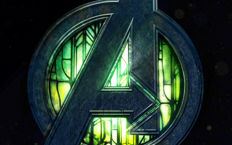
The reveal itself centered on a striking new Marvel Studios logo variant that debuted at a promotional booth unveiled at the Shanghai Expo, giving fans a physical look at what could be the film’s setting. The centerpiece of that installation swapped the studio’s usual red color scheme for a bright green treatment, marking the first time fans had seen this particular version of the branding.
The Shanghai booth reportedly went well beyond a simple logo swap. Set pieces inside the installation appeared to replicate the X-Mansion’s stained glass windows, hinting at how central the X-Men will be to the story, while another section featured a throne atop a stepped platform that fans suspect could stand in for Doctor Doom’s seat of power. The booth also included the classic Avengers “A” symbol, a countdown clock ticking toward release, and a Black Panther logo set against a Wakandan backdrop.
This is not the first time Marvel has played with its studio branding for a single project, but the scale of this rollout suggests something more permanent. The studio has typically stuck to one off flourishes rather than lasting rebrands, with ‘Thor Ragnarok’ famously reimagining the logo with blazing neon outlines to match its retro tone, but this new green variant looks poised to stick around as the primary marketing identity leading into the film’s release.
The timing lines up with one of the biggest weeks on Marvel’s 2026 calendar. The reveal arrives just ahead of San Diego Comic Con, where Marvel’s Hall H panel is widely expected to finally release the film’s first trailer, with a wide release reportedly targeted for around July 25, placing the debut just one week before ‘Spider-Man Brand New Day’ hits theaters on July 31. A complete cut of the trailer reportedly already screened for audiences at CinemaCon back in April, with Marvel choosing to sit on a wider release until the Comic Con moment arrives.
The stakes for ‘Avengers Doomsday’ remain enormous given who is involved behind and in front of the camera. The film reunites the Russo Brothers in the director’s chair for a story bringing back Robert Downey Jr, Chris Hemsworth, and a returning Chris Evans as Steve Rogers, with the pressure on for Marvel to recapture the scale and excitement of its ‘Avengers Endgame’ era when the film finally arrives in theaters on December 18.
What do you think of the new 'Avengers: Doomsday' logo?
Between the Shanghai installation, the shifting logo treatment, and the looming Comic Con trailer drop, Marvel is clearly building toward a reveal it wants fans talking about for months. Which detail from the new green logo and its Shanghai booth has you the most convinced about what ‘Avengers Doomsday’ is hiding until July 25?